Glassmorphism is a new design trend that is currently very popular. You'll see it all over websites such as Dribbble, and even big companies like Apple and Microsoft are using it.
Let me introduce you to this new design trend of glassmorphism. After last year's neumorphism design trend, which was a controversial style and lacked accessibility, this trend seems a lot more promising.
What is glassmorphism?
Essentially, the main aspect of this trend is a semi-transparent background, with a sublime shadow and border.
But you also have a blur added to the background itself so that whatever is behind the background is beautifully "morphed" into the element itself. Does that make sense?
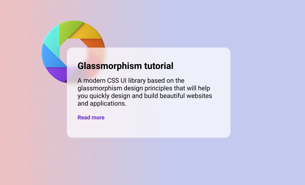
Here's an example:
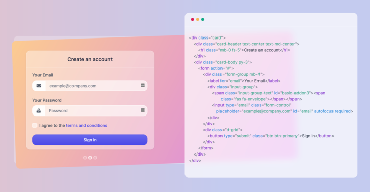
This is a real world example of glassmorphism in action, which you can also check out on the ui.glass website (it's an upcoming CSS UI library).
The blur effect that I've been talking about is what you can see behind the code on the right side of the above image. See how beautifully it morphs into the background, but at the same time still remains readable and pleasing to the eye?
This is the effect that I want to show you how to create in this tutorial. We'll see how to apply it using only HTML and CSS.
Getting started
All you will need for this tutorial is a browser and a code editor, because we're only going to use good old HTML and CSS.
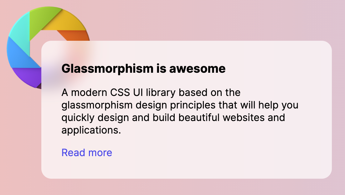
The final element that we're going to build will look like this:
First things first, let's create a basic HTML file with the following markup:
<!DOCTYPE html>
<html lang="en">
<head>
  <meta charset="UTF-8">
  <meta http-equiv="X-UA-Compatible" content="IE=edge">
  <meta name="viewport" content="width=device-width, initial-scale=1.0">
  <title>Glassmorphism effect</title>
</head>
<body>
    <!-- code goes here -->
</body>
</html>
I don't really fancy the default font family, so let's use something prettier from Google Fonts. I really like the Inter font, so let's include that in our project inside the head tag:
<link rel="preconnect" href="https://fonts.gstatic.com">
<link href="https://fonts.googleapis.com/css2?family=Inter:wght@300;400;500;600;700&display=swap" rel="stylesheet">Now, let's add some basic styles to our body tag and also create a background using vivid colors and gradients:
body {
  padding: 4.5rem;
  margin: 0;
  background: #edc0bf;
  background: linear-gradient(90deg, #edc0bf 0,#c4caef 58%);
  font-family: 'Inter', sans-serif;
}
Great! Now that we have some of the basic markup and styles set up, let's create a card element inside the body tag:
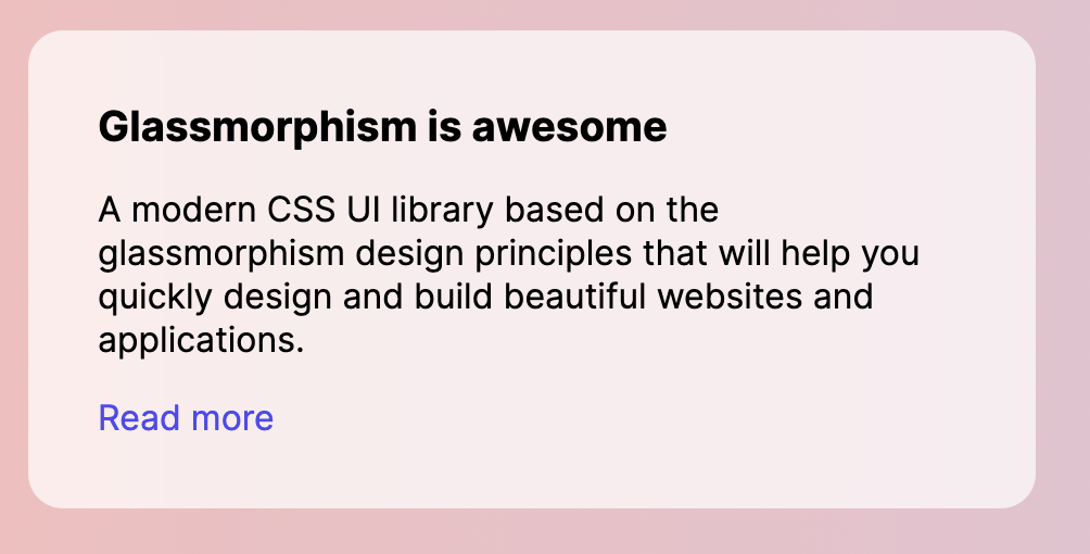
<div class="card">
    <h3 class="card-title">Glassmorphism is awesome</h3>
    <p>A modern CSS UI library based on the glassmorphism design principles that will help you quickly design and build beautiful websites and applications.</p>
    <a href="https://ui.glass">Read more</a>
</div>
The content inside the card doesn't really matter – you can add extra buttons, icons, and other elements.
Before applying the glassmorphism effect to the card, let's first apply some spacing and styles to the typography by adding the following CSS:
.card {
  width: 400px;
  height: auto;
  padding: 2rem;
  border-radius: 1rem;
}

.card-title {
  margin-top: 0;
  margin-bottom: .5rem;
  font-size: 1.2rem;
}

p, a {
  font-size: 1rem;
}

a {
  color: #4d4ae8;
  text-decoration: none;
}
Great job so far! Next up, I'm going to show you how to actually apply the special effect.
How to apply the glassmorphism effect using CSS
All you need to do is apply a semi-transparent background color and apply a blur using the backdrop-filter property. Add the following styles to the .card element using CSS:
.card {
	/* other styles */
	background: rgba(255, 255, 255, .7);
	-webkit-backdrop-filter: blur(10px);
	backdrop-filter: blur(10px);
}So we now have successfully applied the glassmorphism style to the card – but where's the effect?
We still need to have something behind the card, such as a shape or an image, in order to see it in action.
Let's add a shape using an img tag element just after the opening of the body tag:
<img class="shape" src="https://s3.us-east-2.amazonaws.com/ui.glass/shape.svg" alt="">And apply the following CSS styles to the .shape element to properly position it in the page:
.shape {
  position: absolute;
  width: 150px;
  top: .5rem;
  left: .5rem;
}
You should now see the full effect of the new glassmorphism design trend. Congratulations!
You can check out this codepen to get the code and styles directly from this guide.
Browser support
One of the major downsides of glassmorphism is that the backdrop-filter property is not supported by Internet Explorer 11, and it is also disabled by default by Firefox.
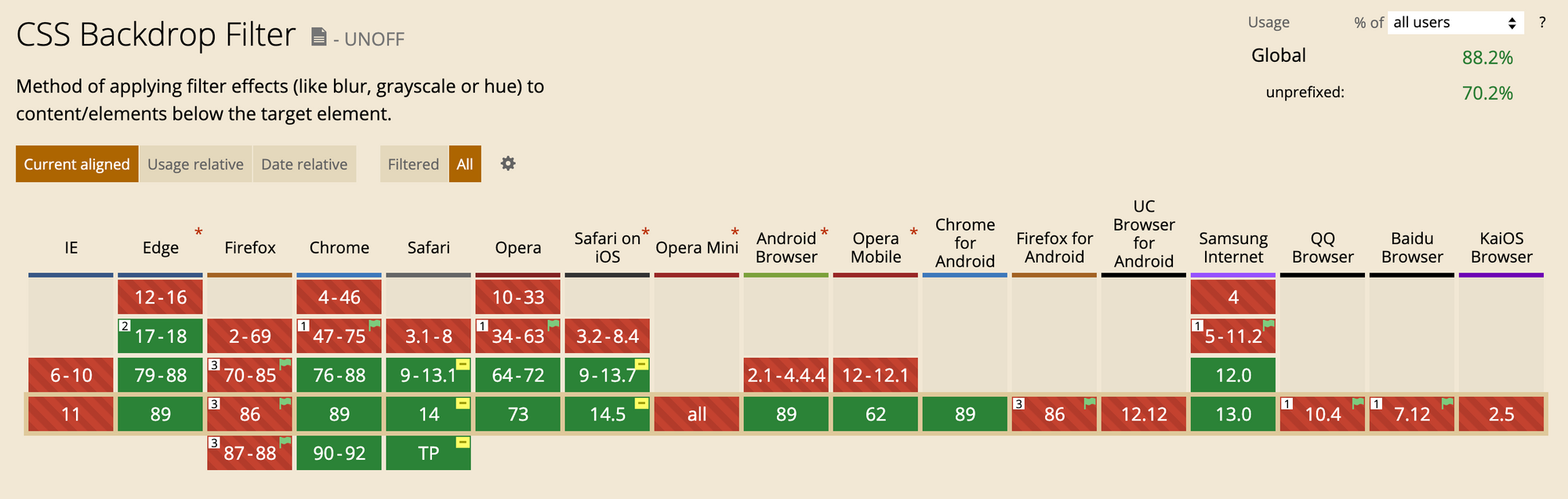
However, according to the caniuse.com website, more than 88.2% of browsers worldwide will support the styling. If Firefox decides to enable this property by default, and as usage for older browsers (such as IE 11) drops, I believe that in the coming years glassmorphism will be able to be used on a much larger scale.
Until then, feel free to use it for your personal projects, or just have fun creating some pages with this awesome new design trend.
Conclusion
I hope that this tutorial has helped you learn more about this new design trend.
If you want to explore it further, I'd like to introduce to you a project that I've been working on with my friend.
It's called Glassmorphism UI, and it will be a free and open source CSS UI library based on the new design trend. Feel free to sign up with your email to get updates about progress and be one of the first to find out when it has launched.
The library will be available via NPM, but it will be also posted on GitHub under the MIT License.