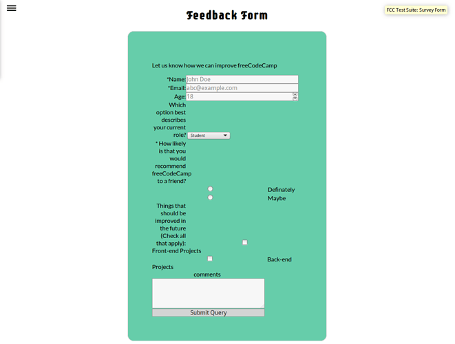
hi guys my feedback form is passing all tests but is getting ugly as hell.
Hi,
I would put more space to your form, 400px isn’t enough. Questions are squeezed and after “age” it’s difficult to find out what is what. Between yous labels and inputs I would put some paddings.
happy coding:)
I would change the label width so thats its not all bunch up and the same as what @HaiCia said 400px isnt enough.
@ShivendraDave Great start! ![]() All of the fCC tests pass and you’ve done well creating the basic form. Here are some suggestions for improvement:
All of the fCC tests pass and you’ve done well creating the basic form. Here are some suggestions for improvement:
-
HTML Markup: The best practice for structuring HTML markup is as follows (fCC Guide - Page Structure):
<!DOCTYPE html>
<html>
  <head>
    <title></title>
  </head>
  <body>
    <header></header>
    <main>
      <section></section>
      <div></div>
      <section></section>
    </main>
    <footer></footer>
  </body>
</html>
Basically, the
<body>element holds all of the page content, which is then broken down further into header, main (further separated by sections/divs), and footer. You can learn more about this in the Use the Proper Document Structure section. I also refer to the W3C Grouping Content page for more HTML markup examples. -
Fieldsets and Grouping: Your checkboxes and radio buttons need to be grouped either with the
<fieldset>element oraria-labelledby. Here’s some more information if you’re curious: -
Every Form Element Needs a Label: Labels are important for screen readers as they will not read form elements without labels. If an important form element isn’t read to a user using a screen reader, that user will not know the form element exists and will not be able to interact with that form element. This Form Elements Must Have Labels link explains more.
This is what we learned in the beta fCC curriculum, Create a Set of Radio Buttons:
Each of your radio buttons should be nested within its own label element.
-
HTML Validation Errors: There are a few validation errors you may want to review and attempt to fix by pasting your HTML into the W3C HTML Validator.
-
CSS: Overall, your CSS looks good. You’re not styling IDs and most of your CSS is not overly specific or complex.
form div + div, however, is strange to me and I feel like this could be done differently so it’s more clear what you’re wanting to do. Why did you choose to use this particular selector as opposed to giving each of the targeted elements a specific class name or something like that? I’m curious to know if this is a strategy you learned somewhere. Thanks! -
Design: As far as the design, I agree with @HaiCia and @angelinalblyth about the width of the form and adding extra padding. This is how the form looks to me in Firefox:
Overall, this a good start and I think you should consider fixing the issues noted above so you can use this project as part of your portfolio. ![]()
