I’m having a strange issue in Opera where part of my CSS fails when moving from landscape to portrait. The page looks fine when I load it in portrait orientation and then when I switch to landscape. The problem is when I go back to portrait the formatting changes in a weird way. When I hit refresh, it’s fine again. Below I have posted my code and screenshots showing what is going on. Again, this is ONLY happening in Opera. Everything is fine in Chrome, Firefox and Edge.
The main issue lies within the
element that has a #story id.
//css
#story {
        font-size: 1.5em;
        margin-top: 25px;
        line-height: 4em;
        color: white;
        padding: 0 75px;
    }

@media screen and (max-width: 980px)  {
         #story {
            font-size: 2em;
        }

//html

<p id='story'><span class='toolTipId' data-toggle="tooltip" title="A rabbit">Un conejo</span> <span class='toolTipId' data-toggle="tooltip" title="wakes up">se despierta</span> <span class='toolTipId' data-toggle="tooltip" title="and">y</span></p>

//This is a shortened version of the code. It has span tags embedded inside of it with tooltips.
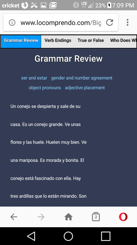
Here are the images:
When loaded in portrait (looks fine):
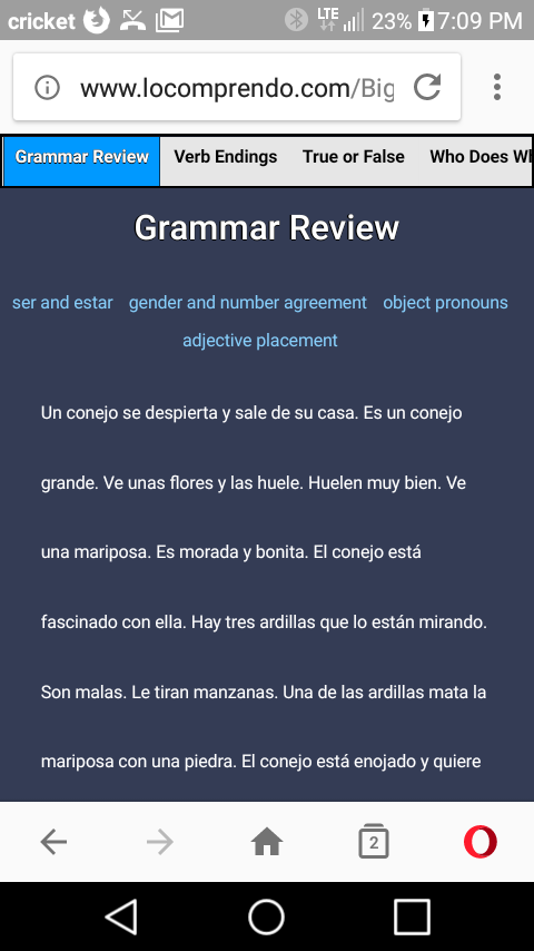
When moving from landscape back to portrait (formatting is goofed up)