Tell us what’s happening:
I am stuck with the CSS on the header section especially the resizing part. It just doesn’t work. VSCode pops 2 problems on several lines.
[css] } expected
and
[css] at-rule or selector expected
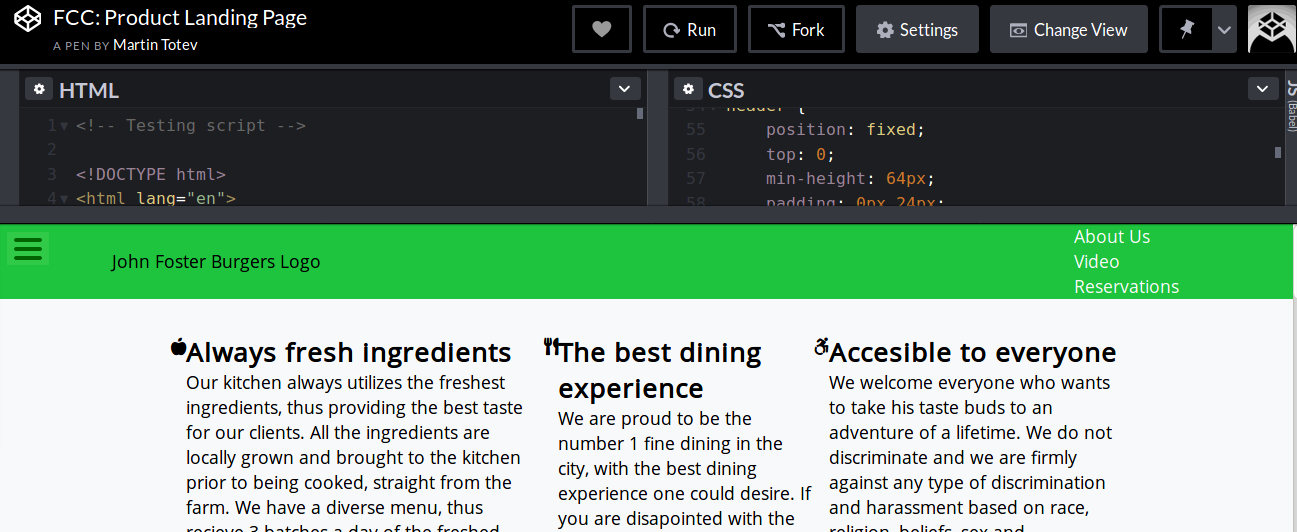
Your code so far
here is a code pen with the same code, but it does not render the logo because it is a hand make svg file that I have locally.
https://codepen.io/martintotev/pen/YOYQPQ
HTML:
<body>
    <div id="page-wrapper">
        <header id="header">
            <div id="logo-cont" class="logo">
                <img id="header-img" src="/assets/logo.svg" alt="John Foster Burgers Logo" style="width: 150px;">
            </div>

            <nav id="navigation">
                <ul>
                    <li><a class="nav-link" href="#ingredients">About Us</a></li>
                    <li><a class="nav-link" href="#promo-video">Video</a></li>
                    <li><a class="nav-link" href="#reservation">Reservations</a></li>
                </ul>
            </nav>

        </header>
...
CSS:
header {
    position: fixed;
    top: 0;
    min-height: 64px;
    padding: 0px 24px;
    display: flex;
    justify-content: space-around;
    align-items: center;
    background-color: #1ec43d;

    @media (max-width: 600px) {
        flex-wrap: wrap;
    }
}

.logo {
    width: 60vw;

    @media (max-width: 830px) {
        margin-top: 16px;
        width: 100%;
        position: relative;
    }

    img {
        width: 100%;
        height: 100%;
        max-width: 300px;
        display: flex;
        justify-content: center;
        align-items: center;
        text-align: center;
        margin-left: 24px;

        @media (max-width: 650px) {
            margin: 0 auto;
        }
    }
}

nav {
    font-weight: 400;

    @media (max-width: 650px) {
        margin-top: 10px;
        width: 100%;
        display: flex;
        flex-direction: column;
        align-items: center;
        text-align: center;
        padding: 0 52px;

        li {
            padding-bottom: 5px;
        }
    }

    ul {
        width: 35vw;
        display: flex;
        flex-direction: row;
        justify-content: space-around;

        @media (max-width: 650px) {
            flex-direction: column
        }
    }
}
Your browser information:
User Agent is: Mozilla/5.0 (Macintosh; Intel Mac OS X 10_13_6) AppleWebKit/605.1.15 (KHTML, like Gecko) Version/11.1.2 Safari/605.1.15.
Link to the challenge:
 . As for your problem, adding ‘width: 100%’ in the header css solved the problem. The header works fine even when I resize it.