Hi everyone
Re-submitting for feedback after customising the look and feel.
Would also really appreciate some guidance how to choose the width for the breakpoint on the media query
thank you
Steve
Hi everyone
Re-submitting for feedback after customising the look and feel.
Would also really appreciate some guidance how to choose the width for the breakpoint on the media query
thank you
Steve
Hello Steve,
Just checked your work, and I would share my thoughts about it.
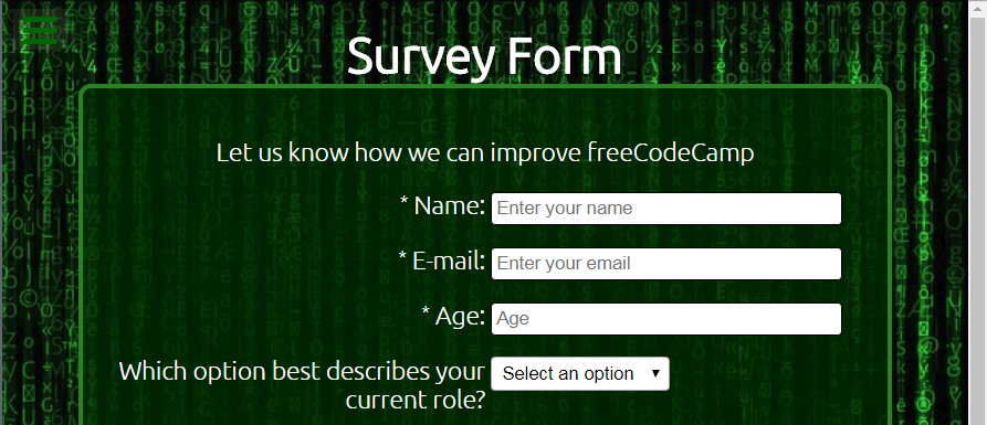
I see you set placeholder for text fields, very good. but please note the textarea, it has no placeholder, instead it has default value. remember default value is not placeholder, please fix it.
The combobox come with a disable default option, very good.
Just as you set and associate label tag for text fields, please do the same for radio, checkbox , textarea and combobox too. Please fix.
I like the background image you used, but I think the white text over that background colour is not a good idea! I suggest you apply a transparent dark green for your form, and maybe more width for border, and more radious maybe?! my suggestion:
Page is responsive, AWESOME, very good, but I think the method you used could be broken in some situations.
I see you let the elements 50% 50% as width on form, this is kind of retro hacky way that works, but not recommended, I suggest you go for grid.
In mobile view, I suggest you let the elements fit with form width, or make them center at least.
If you resize your page, and see in mobile view(small portion) the space at left side of the text fields are not the same as right side.
I think the submit button comes out of page colour scheme and theme, it’s too bright, and the issue is the white text colour which causes it’s not very easy to read becasue of lack of contrast.
I suggest you give it a dark green as bg ,and white text, larger and bold text, and make it sharp! my suggestion:

HINT: don’t try to resize a button using width and height, instead use padding. I see you gave 100 x 32 px to submit button, please don’t it could break your button layout. instead go for padding like padding:1em 3em
For mobile view, adding more space between radio and checkbox buttons could be great.
Overall I like the work Steve, very good. but I suggest to rework the layout with grid.
Please have a quick read on this survey form challenge article comes with some template layout could be handy, plus some more tips.
Keep going on grat work, happy programming.
Thank you for the great feedback.
I will rework into a grid and get back to you
cheers
Steve
Hi NULL-dev
It took some time but I’ve converted to grid and tried to tidy up the other elements from your feedback and blog.
I used grid area layout, but it still feels a bit clunky to me 
Appreciate your thoughts
cheers
Steve
Updated link below
Hello Steve,
Very good progress.
But i’m agree with you about the layout, it’s not great enough yet, but indeed the move you got fo grid was one big step.
The way you used the grid is a little hard(the hard way). This ways is good when you need complex layouting. but for your case, it’s just a simple 2-col/1-col layout.
Let me give you a tip.
Don’t place any element that needs to be center(alone) inside a grid container. for example like your description text of your form(“Let us know how we can improve freeCodeCamp”). Or the submit button. You see the description text is just a simple paragraph, so no any especially layouting!
Add one container tag(like a div tag) inside the form tag(and let’s call it grid_container), and put all elements should be layouted as grid-cell(like labels, and input fields).
Now grid_container goes like grid display, but this time you may get hand of auto repeat mode for grid, check this example.
Take some hand of media queries to either tell the grid_container show the two-column, or one-column.
Also recheck your input elements, I see you set width:80%, instead you may use padding of its parrent.
Keep going on great work, happy coding.
Hi NULL_dev
Thank you for the feedback, its really helping me with the coding!
I will change the grid from using grid-area to a simple 2/1 and make the other changes.
One question I have is, how do you pick the width for the @media breakpoints? Is it based on standard device widths or more driven by the page layout? I feel like i am just kludging it to fit:grinning:
I have completed the first version my product landing page, i would love to get your feedback!
thank you
Steve
It depends, but usually if I assume desktop should go for 2-col(like this survey form), I might add one media query for mobile when less then 5in for example. Sometimes you may need more media queries, but I think in most cases, only one for mobile devices could solve the issue.
About your product landing page, please make a new post about this, and I will have a look over it when I get some good free times. But I suggest you first complete and fix the survey form for now, this is a good practice.
Keep going on great work, happy coding.
Excellent, i will set the media query based on that and I will focus on the survey form!
cheers
Steve
Hi NULL_dev
I’ve had a break and made the changes It is now a simple 2 column grid with no max-widths. When you have some time I would appreciate your thoughts please!
cheers
Steve
I would suggest that the questions were on top of the answers. It is more formal that way.
Hi Michael
thank you… i agree. Most of the other examples i have seen outside code camp have the questions on top. I think the mobile view actually looks better!
kind regards
Steve