Here is my Portfolio project; I’d very much appreciate any feedback you kind people have…
In particular, what do you think of my CSS? Is it laid out ok? Is there anything unnecessary in there / anything that could be streamlined. Also, what do you think of the responsive aspects of the design.
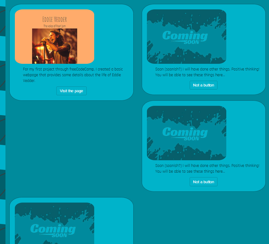
With the responsive design, in particular, my ‘portfolio’ section breaks when it reduces to a medium size:
UX wise, your current about section reads and is formatted more-so like a header, and the about button only dropping someone down a few pixels when they click it from start is a bit odd. I’d consider creating a second about section below it and just calling the current section a sweet header
UI wise, when viewing the projects there’s a large gap of space next to each image. Consider floating the image to one side or the other so that the text wraps around it to fill the void there, or maybe center the image inside the container. Might also want to add a way to include your projects title names.
As for your stacking/breaking div gallery issue, my preferred solution is to first set the width of the gallery container, then base the total width of your gallery items to less than 50% of that width (which should factor in the gallery container padding, as well as the gallery item’s padding, margin, and border width), and then set them to display inline-block. If you use a percentage value for the width then the contents of each gallery item can then be set to be centered within the div and will remain centered as the screen width changes. In this instance, I recommend also including a min-width value that is a set value (non-percentage) in order to have them stack up instead of squishing beyond readability on really small screens. If you want them to stay uniform vertically as well, you’ll have to set the gallery item height to set value. As a last note it’s generally best in all of these instances to use margins over padding,.
@raddevon@L0TU5 Thanks for your feedback - very much appreciated. I shall make some changes and respond to this thread again shortly to outline what edits I made.
Hello people who may or may not read this! @raddevon and @L0TU5 - thanks again for your input. It may be three months later, but I finally made some changes to my design:
Most significantly, I switch from Bootstrap to a combination of flex and grid. I also added an about section to deal with the UX confusion you outlined, L0TU5 - hopefully the experience is a bit clearer now.
There are still a couple of issues bothering me:
When it jumps down to the in page links, the nav bar covers the titles of each section
When I go down to a smaller viewscreen size, most of the page looks kinda rubbish (I wanted the picture of me to drop before the text in the header section, and obviously the about section and the portfolio are not currently working at smaller sizes.
If you guys do read this, and feel so inclined, any feedback you give would be greatly appreciated. Thanks!
To fix the on-page link positioning, you can use this trick:
a[name] {
  margin-top: -60px;
  padding-top: 60px;
}
You might need to tweak the values to get it to line up right. Just make both the same if you want the spacing to appear the same as it was previously. The padding-top of 60px makes the top of the element start 60 pixels above the element. This is where the top of the viewport will be scrolled to when you link to it. The negative margin-top value then pulls the elements above this one down by the same amount, effectively moving the top of the element higher up the page while bringing the other elements down into that element’s box.
The biggest issue you have right now is that your text doesn’t contrast very well with the background. It’s extremely difficult to read. You can test for proper contrast ratio in Chrome dev tools. In general, I’d recommend reducing the contrast in your background image and making all your text white (or really close to it).
Thus far, I’ve changed the contrast stuff and text and background (just need to do for my headers also) - thanks @raddevon for pointing me towards Chrome Dev Tools - I really need to spend more time getting to know these as I didn’t even realise that there was a colour picker or that you could change the colours of the page elements right in the browser! Handy! Managed to use the contrasting part of the colour picker - so glad I know that that is there now.
Also used your quick fix on the in page links - that is sorted now (haven’t made these changes live yet).
Next job is to tackle the resonsive elements again. @raddevon I’m gonna make some time to read through that article you sent me. Despite spending quite a bit of time with CSS Grid, I still don’t feel like I’ve got a handle on it.
@benjamin-summers thanks for your revisions - I was hoping to get the page done without Bootstap, but I will certainly be refering to this anyway (especially if I end up going back to Bootstap!).
Thanks all, and I’ll post again when I’ve made my revisions live.