Hello!
I’ve finished my website and if you have time I’d love to hear some feedback.
I started to apply to some jobs with it and I’m not feeling very confident. 
Thank you very much!
-
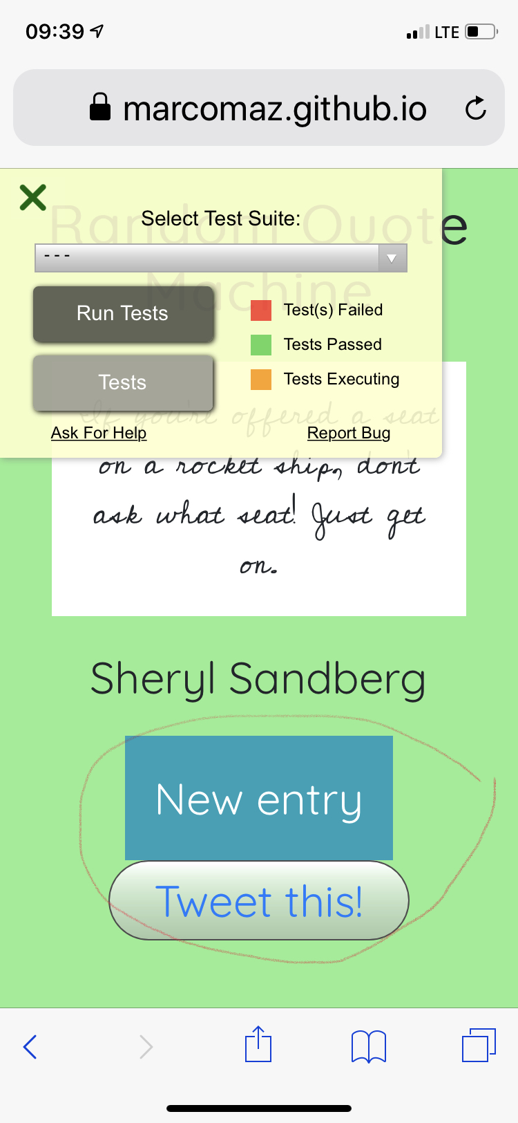
In the projects section, some of the content is partially covered by another element. You could add some margin or padding to solve this.
-
I would add a picture of yourself to make your portfolio more personal.
-
You could potentially hide a nice little easter egg at your skills section using
:hover
1 Like
Your “JavaScript” block is off center on mobile. Otherwise looks solid to me.
1 Like
The website looks good, but honestly, for me, the colors are overkilling, in my humble opinion, I would change that.
Also, in the set os skills, the changing background on hover gives the impression that is clickable, unless you make them clickable later or something, I think you shouldn’t have that hover.
1 Like