I don’t know why it took me so long to finish this  Any feedback will be appreciated!
My Product Landing Page HERE
I don’t know why it took me so long to finish this Any feedback will be appreciated!
My Product Landing Page HERE
One issue to fix :
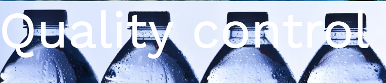
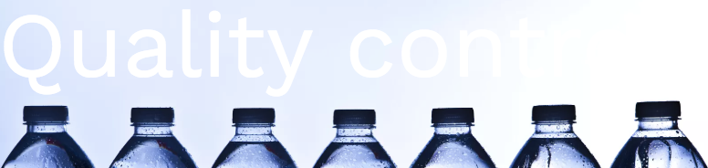
Menu container overlapping text . see here

I really like it. Simple but attractive.
One critique:
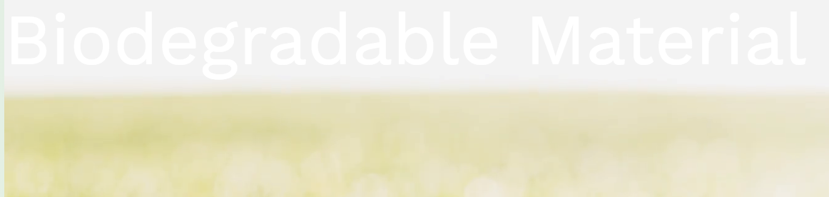
Aside from the navbar on mobile mentioned above, you might also need to think about the text colour on your pictures, which is sometimes very hard to see (depending on the screen size).
On a full screen:
Maybe you could change the colours with the media query, or have them outside the picture (though when it works it looks very slick).
Keep up the good work 
These feedback are amazing! Thank you for replies. I made some changes including shadowing the text and making font-size adjustment for small-size viewport. Besides, I’m curious about how to test viewport for different sizes. I was just dragging the screen over and over. Sometimes it feels tedious and easy to miss something.