Hello Guys !
I just finished the project “Product Landing Page” and receiving your feedback and reviews would be great.
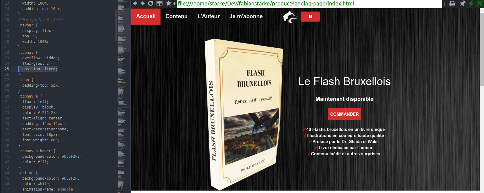
I worked with Gitlab, all the code is hosted there, just need to launch with your browser.
Access to the code: https://gitlab.com/fabianstarke/product-landing-page
Access to the website: http://flash-bruxellois.surge.sh/
By the way, I didn’t realize how I could easity fix my header, when I add {position; fixed, top:0;} everything gets messed up. Help would be appreciated
Thanks so much !
I love the UI! Good job with the color scheme.
About the code, the reason it gets messed up with position: fixed is that the navbar is now out of the normal flow of the page, and the next section starts underneath it. Basically, just do margin-top: (height of ) navbar on the next section.
Also, I would put i some smooth scrolling with jQuery. Kevin Powell has a great Youtube tutorial.
Good job!
Hey there, thanks so much for your feedback and the review.
In fact I could also add the position: fixed; on the topnav class and it wouldn’t need me to add sompe margin (but maybe doing that on the header is better). The other thing is that when I do that, the wolf logo won’t display on the right on smaller screens and the cart button won’t stay on the right, how could I do to improve this ?
Thanks so much for your help !!
Hi. C’est tres bon!
The only thing I notice is that when I fill the screen on my large monitor, the background seems to have a join.
It is a minor thing but should be easy to fix.
So, I don’t have that problem when I do margin-top: 50px on #homepage and position: fixed on topnav. But you could maybe use justify-content: space-between with flex.
Also, I hadn’t looked at the mobile view. I think people expect the menu bars on the right. Just what I think. Maybe not.
In fact it changed on the mobile view, was still messing up !
Yes you are right I want the menu on the right side, but got messed up with this position thing.
Today I could fix the issue, I also followed your advice on the smooth scroll !
I have some minor fix to do tomorrow and will share the end result here
Looks fine for me! The only thing I see on mobile is that there’s no transition/animation for the menu, and some people would make the icon bigger. Looks good.
Yes I know, but I have no clue for the moment how to solve the menu issue, Did you click on the icon and see than it gets messed up and the header doesn’t stay fixed anymore ?
The menu I am not sure you need to change the colours. I would keep the colour consistent - either black background or red background but not switching between the 2.
You could tweak the code and learn as you go, but I think there is a faster way. You should get REAL familiar with Bootstrap. It has responsiveness built right into it. There is a really fast method for creating websites and be a full developer.
Create or get a Design Comp. This will be a Photoshop (PSD) or Sketch file.
Take that design comp and make it an html website with Bootstrap.
You can then take that Bootstrap site and transition it into WordPress.
The point is that Bootstrap will give you a functional and responsive static website for your clients very quickly. You can learn more about responsiveness later. Plus, you can take a Bootstrap site and move it into Drupal, Joomla, React, or NodeJS. You have a lot of options.
The main downside to Bootstrap is code bloat which increases load time. I haven’t found it too much of an issue unless your main goal is to get the load time to the fastest you can. Again, this can be learned later.
Thanks for that !
I need to find out an easy solution right now only for this menu icon that would display the menu on small device without bugging like I have now.
I started with React before html and css, so i find it helpfull trying to build everything with only html and css, thats why i wanted to take that exercice.
I currently am working on the portfolio page using react, i know its not necessary but it trains me !!
You’re going to learn to get REAL friendly with google throughout your career. Just google what you are trying to do, like “make main Nav responsive”.
Learning Angular, React or NodeJS before being fluent in Vanilla JavaScript is a total mistake that I almost made too.
Definitely Bootstrap. It will allow you to make prototype sites in a fraction of the time it takes with anything else. Then you can pop the site on you host and let your client’s play around with it and give feedback for next revision. It’s what the majority of freelancers use.
This is very nice dude. The email input text is way too small, same with the button. I would also suggest changing it from ‘I subscribe’ to ‘Subscribe’ on the navigation bar.
Many thanks for your feedback, I will change the input text and the button.
Yhe only thing with I subscribe in the original language which is french only putting subscribe is not nice. I have to check how other sites write this.


 any idea how to fix the menu issue on mobile ?