We are redesigning freeCodeCamp to make it more closely resemble the command line interfaces and code editors that professional developers use for work.
This is the current freeCodeCamp.org codebase - the only thing we’ve done is change some CSS.
Here are some things you may notice:
It’s night mode. We want to use night mode by default. Most code editors and terminals are in night mode by default, and we think it’s easier on the eyes for long coding sessions. (You can still switch to light mode from the settings or using a hotkey.)
The fonts are huge. Going forward, all fonts will be at least 18px for readability. This is now possible because we are going to put a lot fewer elements on screen.
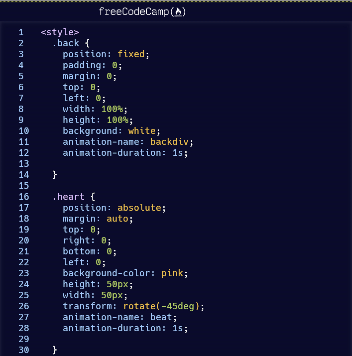
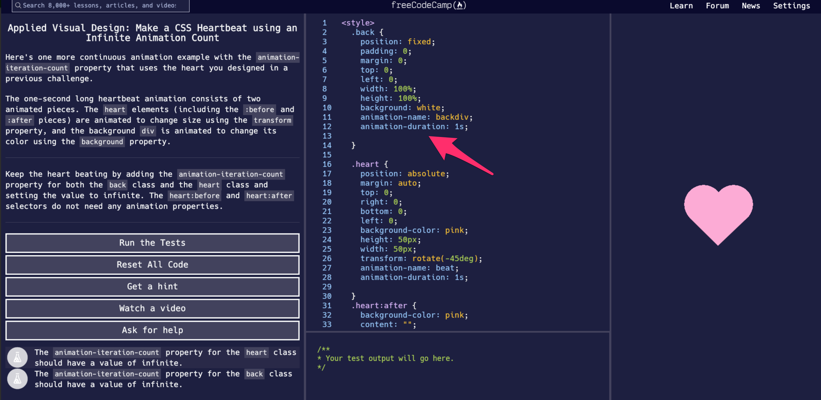
We’re using a monospace font called Hack. Monospace fonts are slightly harder to read when you have lots of long paragraphs of text, but version 7.0 of our curriculum will involve a lot less reading and a lot more coding. We will still use a Proportional font (Lato) for longer text like Guide articles.
A huge thanks to @abdolsa for overhauling all this CSS and for updating our Design Style Guide with additional screenshots and details.
I’m excited to hear your thoughts on this new visual direction, and happy to answer any questions you all may have.
We are moving to a single-column layout where the code editor is the majority of the screen.
The current test you’re working on - along with the buttons, HTML preview, console output - will appear in between the lines of relevant code. (You’ll still be able to scroll around through the code and click through to other files.) You can read more about the upcoming curriculum improvements here.
Thanks Quincy, I love the new ideas. Especially the 18px!! My 53 year old eyes are grateful for that.
And I agree with Tirjasdyn that the light blue on blue (the code) is hard on the eyes. Same for the white on the blue-grey on the left side. Maybe you could use lots of contrast for the default settings and give us some choice in colour schemes.
The big user experience changes will wait until we have more of the curriculum update ready.
I assume you mean the new curriculum ?
Yes - I’ve been calling it a “curriculum update” because the certifications and their projects aren’t changing - just non-required parts of the curriculum.
Just to clarify, along with this redesign, all the latest changes to the Guide and Curriculum changes in the current master branch would get rolled out to production possibly in the next few weeks?
We will roll out the master branch improvements first. Then we will roll out the UI redesign.
@thecodingaviator, I think part of the nav got cut off in the screen shot - you can see the search box border is missing on the top. The words on the nav look fine to me, perhaps the search box could use slightly more space on top and bottom.
I don’t think I have a problem with the light blue text on the blue background like @Tirjasdyn mentioned. I sort of have the opposite problem with the white text in left panel, it’s too much contrast. Especially around and between the “run the test”, “reset all code”, etc. buttons. I think the text in that panel should be a little less white.
That’s really my only concern. Overall, it looks real good - nice job @abdolsa!
I specifically like how the text in code tags stays the same color as the rest of the description and just gets the added background… The same background color across the panels look great. Everything just looks way cleaner.
How about this… move the console to the bottom of the preview panel? The preview is often not filled vertically, and it would free up some more space for the editor.
Love this, I agree with @moT01 about the white text in left panel. Next is only about the icon below ask for help button, we could use some fcc green .
We are basically experimenting with going darker in the editor.(as dark as the navbar) Please see the following screenshot and let me know what you think. Thank you for your feedback.
Thanks for the feedback. Just to clarify, you are referring to the buttons (white on the blue-grey)? we are experimenting with higher contrast for all backgrounds to texts.
I think the idea is great, and the following comment is in no way some kind of put down because I think FCC does a wonderful job of making learning accessible.
Being as FCC is trying to look more like an editor, why not just use an editor locally? There’s nothing more authentic than using a local editor, and saving and running the programs on a users own computer. So, would it also be useful to use the code that is used for testing the projects’ code, in the challenges as well? That way, learners can learn and use all of the code (boilerplate, etc) in their own editor with live preview rather than utilising some hidden code inside the online editor that makes things work. They can also use an authentic web console for troubleshooting and exploring. And, of course, any code would be saved locally rather than have to be downloaded at the end of each challenge.


 .
.