Hi all. I finished my portfolio some time ago, or at least I thought I had until I looked at it on my iphone 7+. I have spent hours and hours getting various bits to work, but this has me stumped. Most of my bottom page is cut off on iOs, AND what little of the ‘Contact form’ that is shown is not clickable. I know there are a couple other problems -such as the menu, but I’ll look at that later.
Can anyone help with this? I so could have submitted my site ages ago it it wasn’t for iOs.
Are you talking about some of your #parralax containers being hidden? If that’s the case, it’s because you have fixed height and max-height in those containers. Your content needs more space to fit. Also, are you Greek?
No I’m not Greek. I just like the word and its meaning.
I’ve played around a lot with the height. I’ve tried different max-height, and different percentages and vh and fixed sizes, but there is little change in that bottom page. It’s fine in pretty much every other browser, even on Android. I just can’t figure it out.
Where you from?
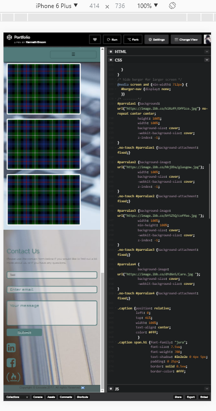
I’m from Greece Hm, i don’t have an iOS device to test it unfortunately, I can only test with the responsive feature of the dev tools. Can you upload a screenshot so I can get an idea of the issue? Because it seems to be different from what I’m getting.
Yeah I am not able to reproduce the issue on my browsers :-/ The elements hiding behind other elements is definitely an issue of max-height and height . I’m not sure about the form though. There is an error in your #parallax4 media query, max-height is undefined. Maybe that’s messing Safari up?
Unfortunately I can only come up with a few suggestions since I can’t test it myself. Let’s hope someone else jumps in and saves the day.
@TheGallery is right about the fixed heights. I don’t have an iOS device to test it either, but try changing height:100vh; to min-height:100vh; at line 180 of your CSS to see it that helps.
Yeah, I know, there is a lot there, but I’ve had to put a lot in there just to make things work on iOs. It doesn’t like the full page images apparently. All the extra doesn’t affect desktop, but it does on iOs. The media queries for parallax are absolutely necessary to iOs unfortunately.
Amazingly strange is correct. It doesn’t make sense.
Ah, well. I did some research and yeah, it seems like this is an issue with iOS and the vh unit. Most people seems to fix it by assigning the correct value of the vh in pixels instead. Or by not using vh at all.
What if you do this:
html {height: 100%;
      -webkit-overflow-scrolling: touch;}
body {-webkit-overflow-scrolling: touch;
      height:100%; } /* changed to height instead of min-height */
Tried it. Every other page is fine, but the bottom page - even more is cut off. I’m going to try host it outside Codepen just to see if it’s an issue with it being in codepen, 'cause it should work looking at the code. Thanks for your help. I’ll probably not be able to post a result until tomorrow.
@noyb
It seems as though its an issue within codepen. I hosted it directly and its all showing on iOs as it should do, so no cutting the page short. It took me long enough to get to this point, but thanks for your everyone’s help in the process of elimination.


 No I’m not Greek. I just like the word and its meaning.
 Hm, i don’t have an iOS device to test it unfortunately, I can only test with the responsive feature of the dev tools. Can you upload a screenshot so I can get an idea of the issue? Because it seems to be different from what I’m getting.