Let me know what you think about my Tribute page project

Hi there,

I’ve finished working on my tribute page project. And I like the way it looks. I decided not to follow the FCC’s User Stories cause when I started working on the project the idea was to make something a bit different. I’m sure the code is not ideal but this is only the beginning of my path so further it will be better :slight_smile:

I also tried to make it responsive and from my side it looks well on iPhones, iPads, MacBooks screen resolutions.

Here is the link:

Share your impressions and suggestions and also visual bugs :slight_smile:

Thank you!

Hello!

Your website looks great. The choice of colors works well and the information is neatly organized.

It’s quite responsive. However, on chrome dev tools there is some side scroll that appears at 768px.

Awesome work.

1 Like

Thank you for the feedback, unfortunately I was not able to find the side scroll at 768px. Are you talking about heigh or width?

I agree with @mwa_fcc it looks really good. Congrats!

I see some minor things that I see such as the transition in the background images are sharp, could be blended together? But for a FCC project, this is amazing compared to what I did.

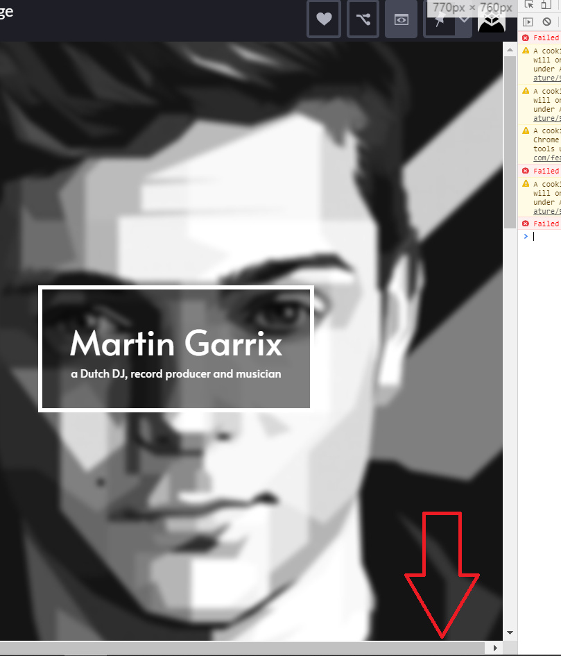
I also see the container break & get side scroll around 770px:

Sorry, yes at 770px. Same as @pjonp

Now I got you. Unfortunately, I’m not able to reproduce this on my Mac.

I will deal with it later when I have access to my Windows PC.

Thank you @pjonp and @mwa_fcc :slight_smile:

Very artsy I like it, very much suited for an entertainer.

Thanks a lot! :slight_smile:

I’m not aware now how to do that but as soon as I get more experience I hope I will be back to this project and fix it.

hi there,

pretty late reply, but I have found out a workaround for that issue

I’ve just used this CSS snippet:

body {
  overflow-x: hidden;
}

it seems to me a good solution, since without it the page looks still good :slight_smile: