Hey guys and gals, here is my shot at a Wiki Viewer. Any feedback is appreciated. Anyone have a good source they have gone to in order to get a better foundation for getting API calls down?
3 Likes
It’s pretty cool @ballermjc ! Good job. I’ve written down some notes for you for improvement.
I like the background image colours. However, I find the colours overall, such as on the buttons, text etc, not blend well with each other. But the result box blends well though ! Just not the h3 style in there.
I found one bug. Whenever I try to type “Free code camp”, it gives me no results. Whenever you search for free code camp on wikipedia, it should give you something about Auschwitz 
I couldn’t find the reason for it, but I think it might have something to do with the api call. Maybe there is a better one out there, I don’t know. You can always steal the one from the sample project.
And one final note. You could play around with bootstrap’s CSS to make your site responsive to mobile phones/tablets. It’s a good habit to make all your projects responsive. Here is how it looks like in iPhone 6.
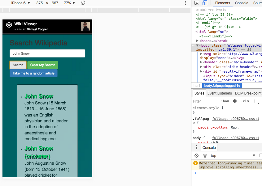
Maybe you could make the result box fill the width to make it more mobile friendly and adjust the buttons. I suggest you change the margin settings on the result class from margin: 30px to margin-top: 30px, and wrap another div around the result box with bootstrap elements, for example
<div class="container"> <div class="row"> <div class="col-md-10 col-md-offset-1 col-xs-12"> <ul class="searchlist"><h3>Results</h3> </ul> </div> </div> </div>
So whenever your you are viewing your page in a average size computer screen/tablets, your div has a little bit offset (can interpret it as margins), but when you view in your phone, the div flips into filling the container it is nested in. You can read more about it and learn about the 12 system in bootstrap’s documents
If you don’t know how to view your site in a virtual display in Google Chrome, you can do it by going into developer mode, and click that picture of tablet/phone, you can see it on my screenshot.
Keep up the good work 
1 Like
Looks like you already got some good feedback but I few things I might add: try to start using more relative units (em/rem) so that way your positions are more relative and less absolute. Here’s a great video all about the different units in css: https://www.youtube.com/watch?v=qrduUUdxBSY. I’d also say make the links open in a new tab by setting the target to _blank. Other than that great job on the core functionality!
1 Like