Original portfolio page: CodePen: FCC Personal Portfolio Webpage: Yossi Fisch - old
Based on the feedback below, I wrote a new (hopefully better) portfolio page: CodePen: FCC Personal Portfolio Webpage: Yossi Fisch
Original portfolio page: CodePen: FCC Personal Portfolio Webpage: Yossi Fisch - old
Based on the feedback below, I wrote a new (hopefully better) portfolio page: CodePen: FCC Personal Portfolio Webpage: Yossi Fisch
I really like the parallax effect; it scrolls very smoothly.
One of the main principles of web design is making your pages “sticky”, meaning that they make people want to hang out and spend more time on your site, consuming your content. I have to say that’s not the case with your site, at least for me.
The colour scheme is the first thing. These loud, fluorescent colours are jarring and make me want to get out of there a quickly as possible. It’s called a “home” page for a reason. If your home (walls, ceilings, floors, windows) were these colours, would your friends and family want to hang out there? Would your clients? Would they feel welcomed and warm?
Now let’s extend that metaphor a little further and think of all those sharp geometric shapes in the background as your furniture. Does the furniture look soft and comfortable or does it look like it would stab me if I sat on it?
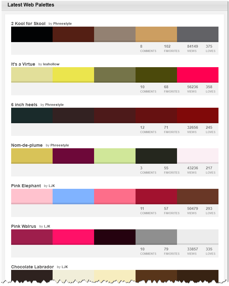
Here are some popular web palettes from this site:
Note that most are warm, muted colours.Even the palettes that have a pop of bright or fluorescent colour (like “It’s a Virtue”) balance it out with softer colours.
Since this is your portfolio page, it’s basically your office, the place where clients come to stay a while and learn about your skills and experience. Would you decorate your office this way?
My recommendation would be to move from jarring colours and sharp shapes/angles to warmer colours and soft, welcoming patterns, or no patterns at all would be even better, in my opinion.
Notwithstanding the constructive comments above, the layout is great and it’s responsive to different screen sizes, which is super important in today’s mobile-first world.
i have no idea what the test suites are about, but i get this message in firefox as an alert
when i open this link…
Test suites are currently optimized for Chrome. There are known issues that we are trying to work through to make these suites fully cross-browser compatible, but it is a work in progress. For the best user experience, please use Chrome until these issues are resolved. Thanks and Happy Coding!
caused by this header file…?
<script src="https://gitcdn.link/repo/freeCodeCamp/testable-projects-fcc/master/build/bundle.js"></script>
besides that, it’s very nice and colorful 
@yoizfefisch Great work!  I think @JaceyBennett’s comments are helpful, even if a little harsh. Some people might like your design and color choice and feel comfortable and at home with them. Others might not. Design and colors are the most difficult part of web development for me, so far anyway.
@JaceyBennett, can you explain how you’d take one of those color palettes and translate it into colors for a page? Take this Giant Goldfish color palette for example, would #69D2E7 be the primary background with #A7DBD8 as the primary text color? Do you have any resources that show how to use color palettes in relation to web design?
@yoizfefisch, I also like the parallax (did you make those backgrounds yourself?) and smooth scrolling. I only have one additional thought you may want to consider, as all of the CSS and HTML pass the accessibility and validation tests:
Nav Menu on Mobile Viewports: You may want to change the way the nav items are displayed on mobile layouts, both portrait and landscape (Source):
Other than that, your code is solid and I think you’ve done well in finishing the Responsive Web Design certificate for the beta curriculum! 
@Xiija That’s the test suite being used by the fCC beta curriculum. That message is supposed to be there. I think that message applies more for later projects since I haven’t had any issues with the responsive web design project tests in Firefox.
When all the colours are the same size in the palette, I guess it’s up to you on how to use them. I prefer when they’re laid out more like this:

The more space given a colour in the palette indicates that the colour should be used more liberally on your site.
There are so many ways to use all of the colours in a palette: background, links, hover over links, clicked links, text, navbar. These types of palettes are to give you an idea of what colours go well together and may be popular among designers.
Ultimately, you may show a palette to a client and they’ll tell you what colour goes with what element.
@JaceyBennett Thanks for your in-depth constructive comment  , your metaphor makes a lot of sense. In fact, I usually start out my projects with very dull colors (like shades of brown, because it’s my favorite color) but then I go out looking for matching color paletes and I end up with something very different from what I had in mind. I then look for background images and usually have to adjust my colors accordingly. If that’s not enough, trying to make it accessible usually ends up sharpening the colors even more.
@camper The background images are from Pixabay.
Regarding the mobile viewports, I believe there is a limit to how well you can solve responsive web design without JavaScript. I came to this conclusion after resaerching solutions for many of the problems I tried to solve in this project. If you want to have a fixed navigation that always fits inside the viewport and doesn’t cut off the menu items, you are left with few JS-free options and it will probably involve lots of media queries that will need to be changed based on the text in the menu, probably not a good idea. I did make a slight change though to improve the nav menu on a landscape view.
Anyways, I think I am going to redo this project and try to incorporate better visual design, more content and even beter responsiveness. Thanks all for the feedback!
I really like it.
Sew suggestions:
section)please be honest: is this your first rodeo with web development? This is too neat for a first timer. How do you come up with all these colors and design. You are either very good at designing or just very creative and use what is already there to work for you. I have some amazing designs in my head that i just cant put to paper
Hi everyone, I hope you are still following this forum and will be so kind and review my updated portfolio page (see first post).
I like that one a lot more. Nice work!
how did you do the different background that changes every time you scroll. You are really good at this stuff.
background-attachment: fixed;