I’m “late” in getting this out here. I was getting tired of creating pages so I started on the JavaScript lessons. Needed a break from that so went to work on my Tech Doc page. (Keeping me balanced)
I’m not sure why the one test fails. I have two navbars. I hide one while the other displays. The test is failing for the one navbar. I’ll investigate further but I’m not too terribly worried about it right now.
Not sure if I’m a fan of the smooth scrolling on a page this size. Whatcha think? Keep it or do away with it?
This is really well done. The code is extremely well written and is appropriately commented making it very easy to read. The design of the page is flawless with a decent font and is responsive. the hamburger menu was a nice addition. I still cant figure out why that one test failed but your a tags in your nav have the class of nav-links so it should be good enough
I like the style you went for, but you need to separate your nav bar from the documentation area. I suggest adding a gap and a background color, with a box-shadow. For example, my technical documentation page:
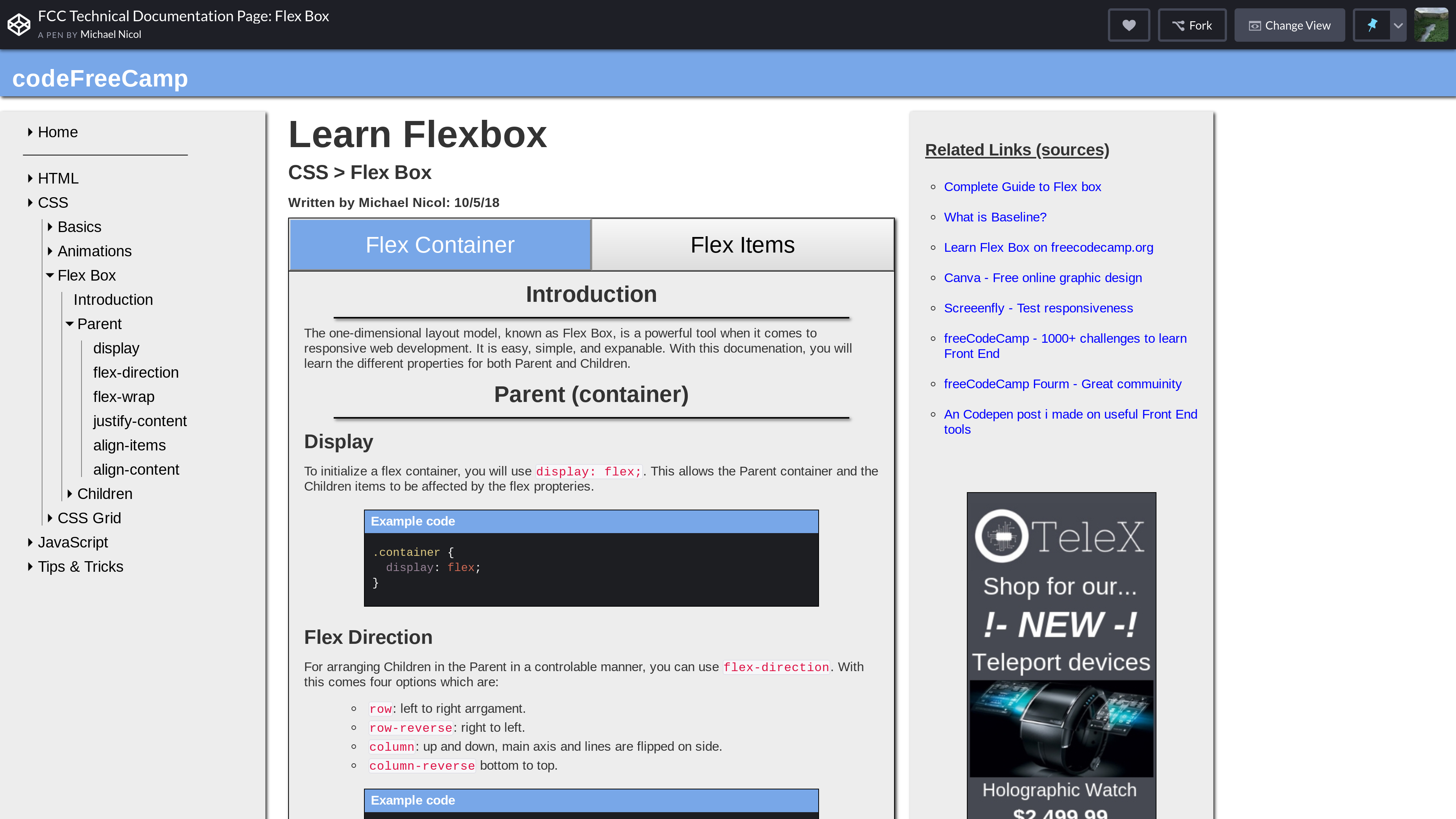
Note - On smaller screens, the navbar will change. Make sure on dev screen (inspect), you hit Ctrl+Shift+M to Toggle Device Toolbar. Then change the pixels at the top to 1920 x 1080p.
Change fCC in your title to FCC. People often use small issues like these to judge your page and or you, as it is a representation of your attention to detail.
The “Important” red text boxes are hard to read and can strain the user’s eyes. Change them to something that is a little easier to read.
Notes
Please hit the reply button or I do not get notified.
@michaelnicol, thanks for the feedback. Let me respond;
The navbar is separated from the doc area by a vertical bar. I want the page to look like a documentation page so I purposely avoided changing the background color and definitely avoided adding a box-shadow.
On smaller screens my navbar does change. From the vertical to a horizontal collapsed bar at the top.
My using fCC is not a typo. It’s meant to mirror freeCodeCamp’s camel-case logo. Attention to detail.
Since I ironically used bootstrap to do the styling I tried to mirror their utility class color. Though with theirs it’s white font on the red background. I thought that was a little harder to read. I’ll look into toning down the red a little more.
Kind of responding to myself. I removed the scroll-behavior: smooth; action. It didn’t look right with all the scrolling if one was going far down. I think I like it better that it “jumps”.