by Zeeshaan Maudarbocus
What is CSS Flexbox?
As per the MDN web docs:
“CSS Flexible Box Layout is a module of CSS that defines a CSS box model optimized for user interface design, and the layout of items in one dimension. In the flex layout model, the children of a flex container can be laid out in any direction, and can “flex” their sizes, either growing to fill unused space or shrinking to avoid overflowing the parent. Both horizontal and vertical alignment of the children can be easily manipulated.”
So to summarize, it is a layout module that makes things easier to align and distribute space among items in a container.
Let’s have a quick look at a few examples of what can be done with just a minimum of 1–2 lines of codes using CSS flexbox:
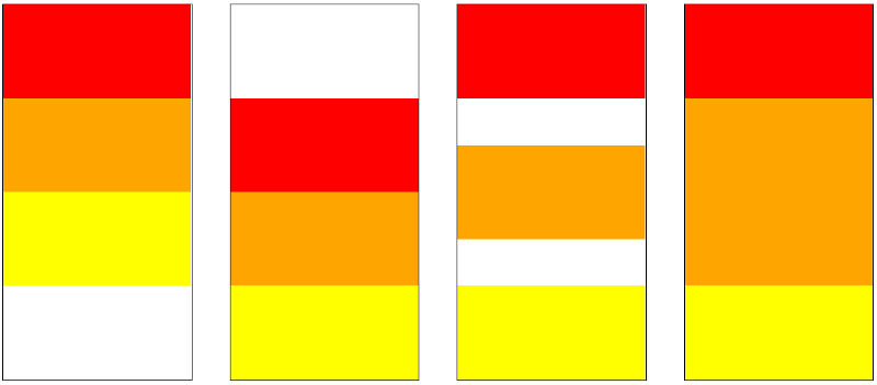
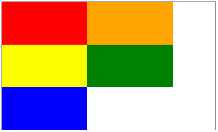
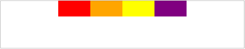
Horizontal alignment layout:
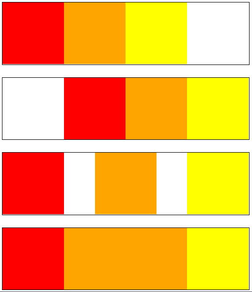
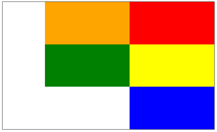
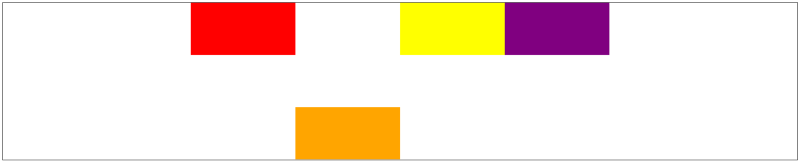
Vertical alignment layout:

It’s pretty cool given that just one or two lines of CSS were required to manipulate the layout inside each container.
The Basics
Flexbox properties can be categorized into 2 main types:
- Container properties (flex-direction, flex-wrap, justify-content, align-items, align-content)
- Flex Item properties (order, flex, flex-grow, flex-shrink, align-self)
Display: flex
The first property is not specific to flexbox. That property is display which we set to the value: flex . This is set on the container which contains the items we want to manipulate.
Let’s add some visuals to understand how it works:
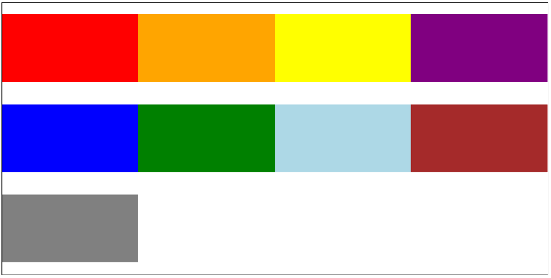
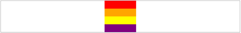
If we initially have a container, with 3 boxes ( div ) inside of it. This is how they will look like:
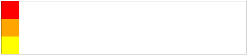
Now let’s add flex to the container:

display: flex;Just one line of CSS has changed the layout from a vertical direction to a horizontal one.
Important Terminologies around Flexbox
These terminologies will be used throughout this guide.
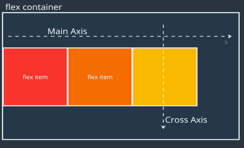
- Flex Container: This refers to the container that has
display: flex;set to it. - Flex Item: These are the individual children inside of the Flex Container
- Main-axis: By default is set from left to right.
- Cross-axis: By default is set from top to bottom.
As soon as display: flex is set on a container, these imaginary axes are going to work together to determine how the flex items inside of the flex container should move around and behave. These two axes change directions, whenever we change certain flexbox properties which are discussed below.
Flex-direction
This property determines the direction of the imaginary axes. The axes, in turn, determines how the items in the flex container should be placed. It takes the following 4 values:
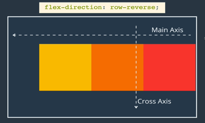
rowis the default value of the main axis which points from left to right. The cross-axis remains from top to bottom.row-reversereverses the direction of the row from right to left. Again, the cross-axis is left unaffected.
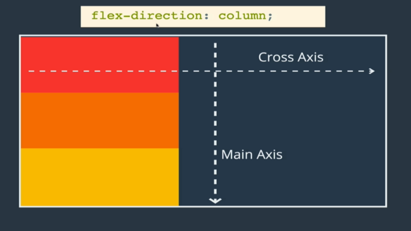
3. column changes the main-axis from the horizontal axis to the vertical axis. Meaning that the main-axis is now flowing from top to bottom while the cross-axis now flows from left to right.
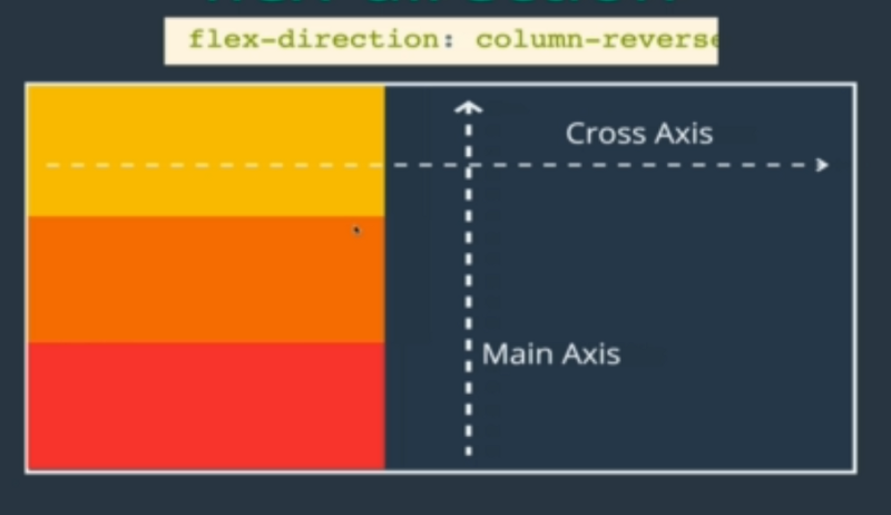
4. column-reverse is similar to the column value with the only difference being that the main-axis now flows from bottom to top.
Flex-wrap
The flex-container by default does not allow for items to take up several lines in a row. Instead, all of the items will be squished to fit into one row, that is, it does not allow for wrapping into several lines.
flex-wrap: no-wrapis the default.
2. flex-wrap: wrap . By changing that property to wrap, we can now ensure that each flex-item will keep their respective sizes. If they cannot fit on one line, they will wrap into a next row or column depending on the flex-direction.
If the flex-direction has been set to row-reverse, then the items will go onto the next row starting from the right to the left.
3. wrap-reverse on the other hand will wrap the next row of flex items above the initial one, still from left to right.
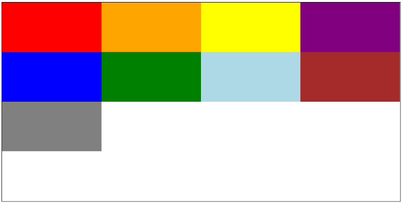
Justify-content
This property is used very often. Its purpose is to distribute space between flex-items in a flex-container along the main axis. Its default value is set to flex-start .


Remember: If flex-direction has been set to column, then the main-axis would now flow from top to bottom. Meaning that justify-content would now be distributing the items in a vertical fashion.
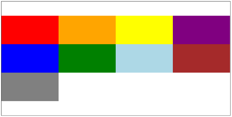
Align-items
This property is just as popular as justify-content and is used regularly with flexbox. It does the same thing as justify-content with the only difference being that it works along the cross-axis. The default value for align-items is stretch.
Remember: If flex-direction has been set to column, then the cross-axis would now flow from left to right. Meaning that align-items would now be distributing the items in a horizontal fashion.
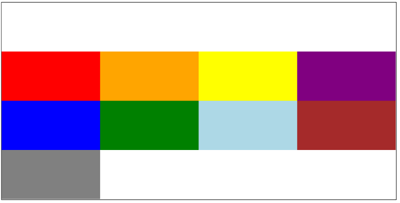
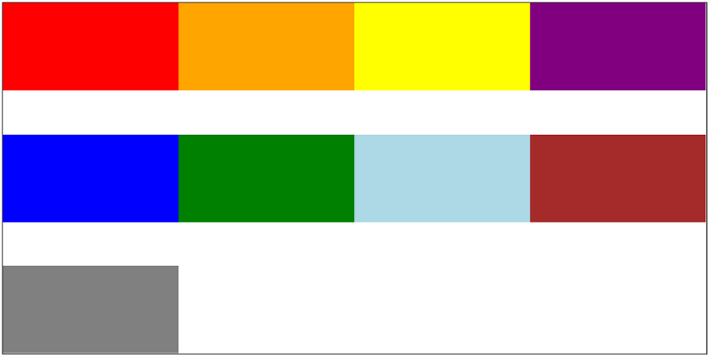
Align-content
This property is similar to and can be easily confused with align-items . The purpose of this property is to determine how space between rows in a flex-container should be distributed along the cross-axis.
While align-items targets space between flex-items, align-content targets rows between the items. The default value for align-content is stretch.
Flex Item Properties
Time to move on to the second type of flexbox properties which allows us to target the individual items inside of a flex container.
Align-self
This property allows you to align an individual flex item along the cross-axis. It overrides the alignment set to the container through align-items.
It also takes the same properties as align-items (see above).
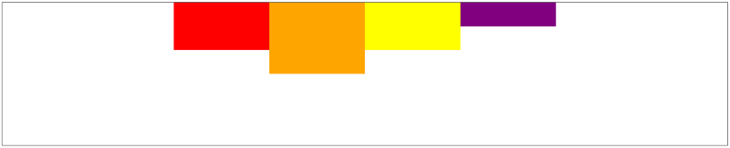
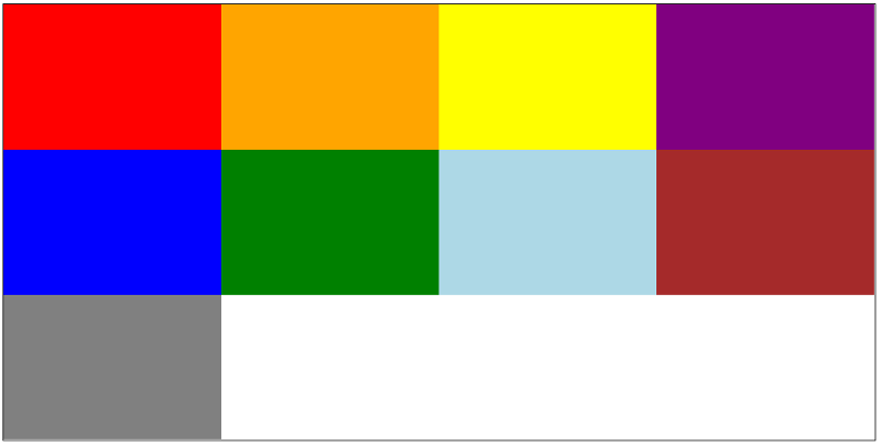
Order
This property allows us to re-order the positions of individual flex-items inside of their flex-container. By default, all items have a value of 0 assigned to them.
By assigning a value lower (-ve) or bigger (+ve) through order on the individual items, that specific item will move to be positioned according to their values.
The order will follow the most logical convention, that is -ve, 0, +ve. The lowest number will go to the far left and the biggest number to the far right, assuming that everything else is set as default. If there are items which haven’t been assigned any new value, they remain as 0.
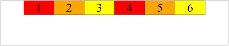
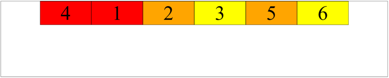
Note: The boxes, 1, 2, 5 and 6 in the example above are all still at the default value of 0. To clarify, the six boxes above have the following values: -1, 0, 0, 0, 0, 1.
If you want to place a box in front of box number 4, then you need to set your targeted box at an order of -2 or lower.
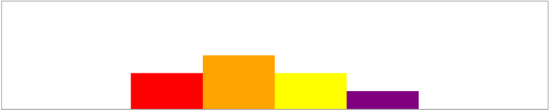
Flex-basis, Flex-grow, and Flex-Shrink
So far, all of the flex-items were equal in size. Let’s now look at how we can make a specific flex-item take up more space inside of a flex-container as compared to the other items inside of the same container.
Flex-basis
This property specifies the ideal size of a flex item before it is placed into a flex container. It works similarly to width when working with rows. It works like height when working with columns. So if we are working with columns, and an item has been given both height and flex-basis, the flex-basis will take priority as it is the ideal height that a flex-item will take if there is enough space available.
That being said, if there is not enough space, and no height or width assigned to the items. The items will take the max-height or max-width available in the container.


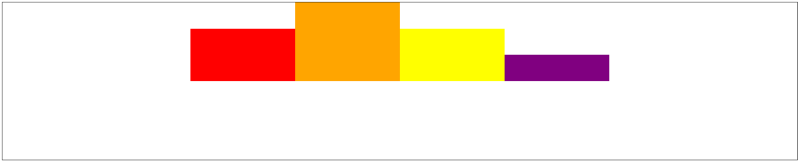
Flex-grow
This property determines how the flex-items can grow in order to fill in the unused space in a flex-container.
If we assign a flex-grow: 1 to all boxes, they will all take the remaining space evenly which is also its default value. The number can be anything, as long as they are all the same number.
If we give flex-grow: 1 to one item and give a second one a flex-grow: 2 , then the second item will take two times as much unused space as compared to the first one.
This applies to both rows and columns.


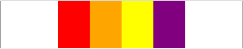
Flex-shrink
This property determines how the flex-items can shrink whenever there is not enough space in a flex-container.
The flex-shrink: 1 is the default value, meaning that all items will shrink at the same rate by default.
Note: flex-shrink: 0; means that this specific item should never shrink.
flex-shrink: 2; means that this specific item should shrink faster than the other ones at flex-shrink: 1;


Flex
This is the shorthand version for flex-grow, flex-shrink and flex-basis in that particular order.
If you need to use all of the three above, you could simply use something like this:
flex: 0 2 200px; where 0 refers to the flex-grow, 2 refers to flex-shrink and 200px refers to flex basis respectively.
Congratulations!
That’s it! These are the key ingredients to becoming a flex master. And like for every other thing in life and in code, practice makes perfect. I highly recommend putting this guide into practice to get a practical understanding. One example could be to start with something small like a simple navigation bar.
You can also check out the link to my Codepen collection on flex-box which I used to create those flexboxes in the images above and tweak them to see how they change.
Thank you for reading this guide on flexbox. I hope that it was helpful and informative. If you have any questions or want to share your thoughts on this topic, please feel free to reach out through the comments section or by email at maudarbocus.zeeshaan@gmail.com
If you found this read valuable, please show this article some love, by leaving some claps behind, so that other developers can find it too.
ZeeshaanMaudar - Overview
Code for fun Code for a change Code for social good - ZeeshaanMaudargithub.com