

These days, responsive web design is something we all take for granted. When we visit a website, we expect it to work and look good on all our devices, no matter what the screen size is.
But it took us a long time to get to this point, and developers came up with a number of techniques to adapt sites to different screen sizes before settling on responsive web design.
In this article, we'll take a look at the early web, different ways developers would adapt a site to different screen sizes, and modern responsive design.
The first website
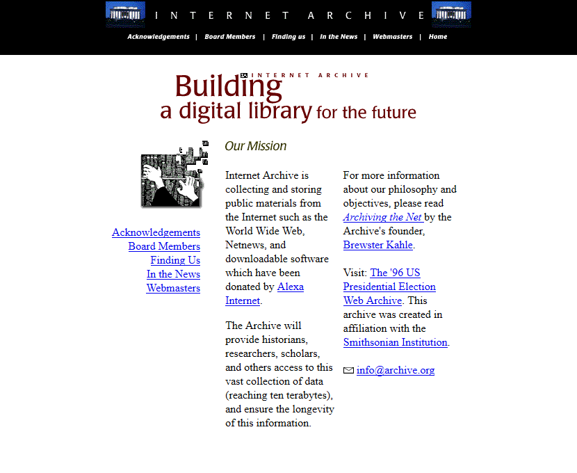
On August 6, 1991, the first website ever came online. The site was created by Tim Berners-Lee, and detailed the World Wide Web (W3) project. It originally ran off of a NeXT computer at CERN, the European Organization for Nuclear Research.
Though the original site went offline, CERN launched a project in 2013 to "preserve some of the digital assets that are associated with the birth of the web." Everything from the original machine names, IP addresses, and URL of the first website was restored to the best of their ability.
While the original 1991 version of the website was lost, they were able to restore a version from 1992. If you'd like to check out yourself, it now lives at http://info.cern.ch/hypertext/WWW/TheProject.html.
Early web design
The web changed rapidly since Berners-Lee's first website went online. Every year, thousands of websites were launched, and new design techniques developed as rapidly as web technology itself.
In the early 90s, web design was very simple. Most websites used simple header, paragraph, and early list tags like <dl>, <dt>, and <dd> tags to organize information.

More complex sites had to use tables to control the layout of the page, and create things like navigation and sidebars that are common today.
Though methods of styling websites existed in some form or another, Håkon Wium Lie first proposed CSS in 1994 while working at CERN. Then in 1996, the World Wide Web Consortium (W3C), also founded by Berners-Lee, released the first formal specification for Cascading Style Sheets, level 1 (CSS1).
With CSS and other technologies like JavaScript and Flash, web developers could get more creative and playful with their designs.
By the late 90s to early 2000s, patterns in web design and user experience had emerged, and websites started to look like the ones we use today:

Early responsive design methods
With the wider adoption of CSS, developers had to spend a lot more time on things like layout, design, and typography. But one thing they didn't have to worry much about was adapting to different screen sizes. At the time, most people's monitors were either 640x480, 800x600, or 1024×768.
Still, developers found a few different ways to work with these monitor or browser window sizes, which eventually lead to responsive web design as we know it today. Let's take a look at a few of them.
Liquid layouts
According to MDN, the two main layout options developers had early on were either fixed-width, where content was set to an exact, to-the-pixel width, or liquid, where content was sized using percentages.
MDN has some good examples of both fixed-width and liquid layouts.
Liquid layouts, first coined and popularized by Glenn Davis, were revolutionary at the time, and can be considered one of the first major methods of responsive web design.
While fixed-width layouts might break if your monitor wasn't the same resolution as the one the site was designed on, liquid layouts were much more flexible, and could adapt to different monitor resolutions or browser sizes.
But it wasn't perfect. On liquid layout sites, content could overflow and text could break on smaller screens, and on larger screens there could be a lot of unnecessary white space.
Resolution dependent layouts
In 2004, Cameron Adams wrote a blog post where he detailed a method of using JavaScript to swap out different stylesheets based on the size of the browser window.
This technique came to be known as resolution dependent layouts, named after Adams' blog post. Even though it was a bit of extra work for developers at the time, it allowed more fine-grained control over the layout of the site, and functioned as an early version of CSS breakpoints before those were a thing.

The downside of this method was that developers had to create different stylesheets for each target resolution, and ensure that the styling and JavaScript worked across all major browsers.
There were a whole lot of browsers at the time, and sometimes they handled HTML, CSS, and JavaScript differently. In fact, that's one of the major reasons that jQuery first became so popular at the time – it abstracted a lot of the browser differences away so you only had to write your code once.
Mobile subdomains
All this was happening right around the time that more mobile devices were going online. Nokia, Blackberry, and eventually, the iPhone, came with their own browsers. And suddenly developers had to come up with different ways to tailor the online experience to different screen sizes.
One clever way that developers came up with to handle all these new devices was to create a version of a site just for mobile and make it available on a subdomain.
Mobile subdomains, sometimes called m-dots or m subdomains, are just that – a mobile specific version of a site that's hosted on a subdomain, typically m.
For example, the desktop version of Facebook is at facebook.com, or more specifically, at the www subdomain, www.facebook.com:

But the mobile version of Facebook is at m.facebook.com:

If you sign in to both applications and look at them side-by-side, they look pretty similar. But under the hood, they're really two separate applications – the mobile version is quite a bit lighter, and is optimized to work on smaller screens and on most mobile browsers.
Mobile subdomains are still around today, and there are some definite advantages to this approach. With a separate version of a site on a mobile subdomain, developers can ensure the site loads quickly, and uses less mobile data.
Also, having a mobile subdomain allows developers to really tailor the SEO (search engine optimization) to mobile devices, and drive more traffic to the mobile version of the site.
But there are some definite downsides as well. Going with mobile subdomains means that developers have to maintain two, sometimes very different, websites instead of just one.
And mobile subdomains can sometimes be frustrating. I'm sure many of you know the pain of trying to visit the desktop version of a site only to get redirected to the mobile version.
Not only that, but developers have to figure out which devices to redirect, and under what conditions.
Traditionally this was done by checking the user agent of the visitor's browser, but with the number of devices coming out at the time, it was a constant moving target. Eventually developers started checking the width of the browser window with JavaScript and redirecting based on that.
Now you might be thinking, that sounds a lot like responsive web design today. And it's true – in many ways, modern responsive web design is a, well, response, to past techniques. It takes a lot of the good ideas that developers came up with and builds on top of them.
Responsive web design
By the late 2000s, designing a site to work on different screen sizes was quickly becoming the norm. But to do this, developers had to come up with a lot of tricks.
Even for simple layouts, developers had to use things like the max-width: 100% trick for flexible images, and float with clearfixes to keep things from breaking.
Then in 2010, a developer named Ethan Marcotte published an article in A List Apart where he outlined a new way of thinking about flexible web design. In the article, Marcotte listed three important components for creating a responsive website: fluid grids, flexible images, and media queries.
Beyond outlining the major components of responsive web design, Marcotte is also credited for coining the term itself, which was named after the title of the 2010 article.
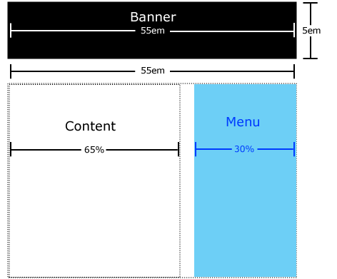
Fluid grids
Fluid grids are the idea that a website should adopt a different number of flexible columns that grow or shrink depending on the current screen size. On mobile devices, there should be one or two flexible columns of content, and on desktops there can be more:


You can read more of Marcott's thoughts on fluid grids in this earlier article.
Flexible images
Flexible images are the idea that images should grow or shrink along with the fluid grid they're in:


A common way to do this is with the max-width trick mentioned above.
If you have an image in a container, it could overflow, especially if the container is responsive. For example, if you have the following, the image could overflow like this:
<style>
  .container {
    width: 250px;
    outline: solid;
    text-align: center;
  }
</style>
<body>
  <div class="container">
    <img src="./images/kelly-sikkema-v9FQR4tbIq8-unsplash.jpg" />
    <p>Example image</p>
  </div>
</body>

But if you set its max-width to 100%, the image will not overflow:
<style>
  .container {
    width: 250px;
    outline: solid;
    text-align: center;
  }

  .my-image {
    max-width: 100%;
  }
</style>
<body>
  <div class="container">
    <img
      class="my-image"
      src="./images/kelly-sikkema-v9FQR4tbIq8-unsplash.jpg"
    />
    <p>Example image</p>
  </div>
</body>

And will even resize with the parent container:
<style>
  .container {
    width: 600px;
    outline: solid;
    text-align: center;
  }

  .my-image {
    max-width: 100%;
  }
</style>
<body>
  <div class="container">
    <img
      class="my-image"
      src="./images/kelly-sikkema-v9FQR4tbIq8-unsplash.jpg"
    />
    <p>Example image</p>
  </div>
</body>

Media queries
Media queries refer to CSS media queries that were available in 2010, but not widely adopted until its official release as a W3 Recommendation in 2012.
A media query is just a CSS rule that gets triggered based on options like the media type (screen, print, etc.) and media features (width, height, and so on):
@media screen and (min-width: 500px) {
  background-color: red;
}
Even though they were a bit simpler back then, media queries allowed developers to implement breakpoints, which are still used in responsive web design today.
A breakpoint is just when a website changes layouts or other styles based on the device or browser window's width. For example, here's the full code for the snippet above:
<!DOCTYPE html>
<html lang="en">
  <head>
    <meta charset="UTF-8" />
    <meta http-equiv="X-UA-Compatible" content="IE=edge" />
    <meta name="viewport" content="width=device-width, initial-scale=1.0" />
  </head>
  <style>
    .container {
      width: 250px;
      outline: solid;
      text-align: center;
    }

    .my-image {
      max-width: 100%;
    }

    @media screen and (max-width: 500px) {
      .container {
        background-color: red;
      }
    }
  </style>
  <body>
    <div class="container">
      <img
        class="my-image"
        src="./images/kelly-sikkema-v9FQR4tbIq8-unsplash.jpg"
      />
      <p>Example image</p>
    </div>
  </body>
</html>
Note that it's important to use a viewport meta tag for media queries to work the way you expect. This works in most cases:
<meta name="viewport" content="width=device-width, initial-scale=1.0" />With the media query above, here's what the container looks like when the resolution is 500px wide or below:

And here's what it looks like when the resolution is 501px or greater:

Mobile-first vs Desktop-first
More recently, there are two main approaches to responsive web design: mobile-first or desktop-first. Both are totally valid options, and each has its pros and cons.
If you're designing a website from scratch, many developers today feel that mobile-first is the way to go – mobile designs tend to be single column, and are much easier.
If you want to go the mobile-first route, you would write your styles normally, then create breakpoints like the one above with min-width once you start creating the tablet and desktop layouts.
But maybe you're working on an older site that was designed with desktops in mind, and need to adapt it to smaller mobile devices. In this case you'd use media queries with max-width to target those lower resolutions.
You can read more about mobile-first and desktop-first design philosophies in this article.
In closing
That's it! Now you know a bit about the history of responsive web design, and all the fits and starts that developers went through before everything we have today.
If you'd like to take a deep dive into responsive web design, Flexbox, and other modern techniques, check out this 4 hour tutorial on our YouTube channel:
And if you'd like to learn about CSS Grid, the new way to create complex, flexible layouts, check out one of our written tutorials here.
What's your history with responsive web design? Did I miss something? Let me know over on Twitter.