
With a myriad of visualization tools available, it is hard to find the right one for MongoDB data which has out-of-the-box functionality.
Today, I want to tell you about my experience in exploring such visualization tools.
My goal was to analyze a dataset from a MongoDB database. I wanted to work out a workflow for data analysis which combines database management analysis, data aggregation and data visualization.
Here are the tools I’ve chosen:
- Compass is a GUI application for in-depth analysis and visualization of MongoDB data and a collections’ schema. It provides a real-time view of your data. The intuitive interface helped me to focus on the meaning of data.
- Flexmonster Pivot Table is a tool for advanced web reporting and analysis. While Compass is a stand-alone application, I’ve discovered that Flexmonster is integrated directly into the web project. I’ve managed to embed it into my Angular 4 application and used it for data analysis.
The first part of the visualization process is to set up a connection to a MongoDB database with Compass. Then you can explore what functionalities Compass offers and what analysis you can conduct using this tool.
The second part is dedicated to further MongoDB data analysis. We will load data into a pivot table and explore the possibilities this offers.
As a data source for my research, I’ve chosen a dataset on 120 years of Olympic history and results.
This dataset has a typical JSON structure which is different from the format required by MongoDB. To import this into MongoDB, I’ve executed the following command in the CLI:
mongoimport - db <db-name> - collection athletes - type json - file athletes.json
 - jsonArray
Understanding the Data with Compass
At first, I’ll mention some database management features.
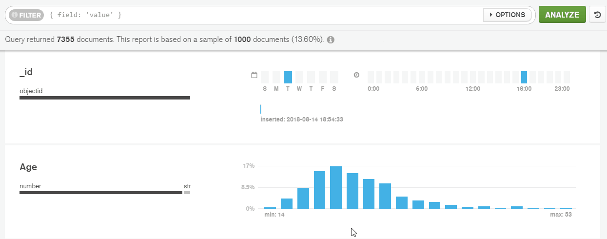
Compass is able to generate histograms to represent the data frequency. This helped me to analyze the presence of documents, data types and the distribution of values for specific fields within the collection.
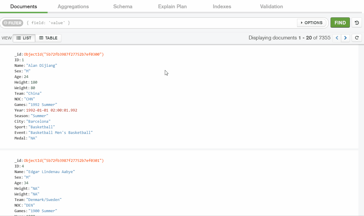
First of all, I connected to the MongoDB instance running on localhost using the Compass application.
On the main page of the “athletes” collection, I’ve checked the information about the collection, edited the data in an interactive mode and tried out simple and complex queries.
A schema visualization tool helped me understand my data.
Here I’ve checked the statistics on fields’ data types: the percentage of data types used for this field in all the documents within the collection.
I’ve identified that I have mixed data types for some fields. In my example, I have a numerical type for ‘Height’ in 80% of documents, but a string type appears in 20% of cases.
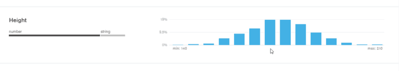
For me, that meant that there is a gap in my dataset. The height is stored differently between athletes.
Aggregation with Compass
What features make MongoDB and Compass so popular among data analysts who often work with semi-structured and unstructured data?
MongoDB is useful for real-time analytics because it supports aggregation pipelines. These can include sorting and filtering operations, and grouping the data.
While Compass supports real-time query building for aggregation.
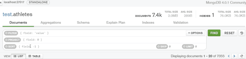
To focus on specific portions of the data, I’ve filtered the documents by the ‘Age’ field.
To show only those athletes under 22 years old, I’ve selected the necessary area on the histogram to construct a query on ‘Age’ field. As a result, the matching documents have been returned.
In the same way, I’ve filtered by the range of values. Then I’ve sorted the data by ‘Age’ in ascending order:
But to build stages in the aggregation pipeline and group the data, I needed to use my knowledge of MongoDB query language. It was easier to do in the pivot table.
Analyzing the Data with Flexmonster Pivot Table
In my web projects, I use Angular. So, I followed an Angular tutorial to embed the pivot table. To get the data from my database I’ve used this tutorial.
I’ve connected to MongoDB from my application and retrieved the data about athletes. The data was compressed and then passed to the pivot table for visualization.
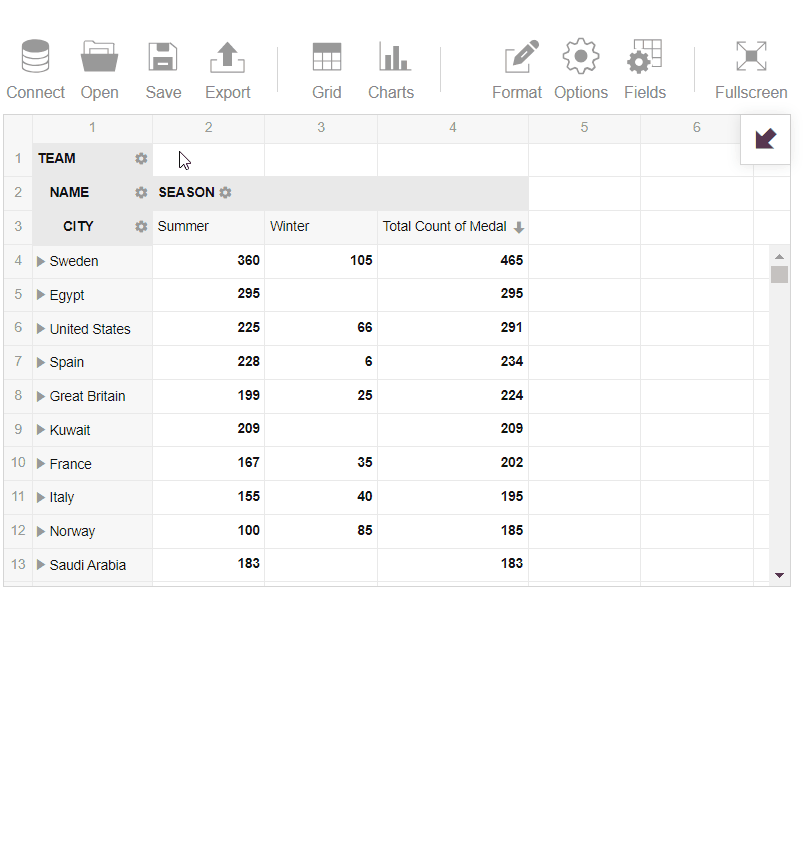
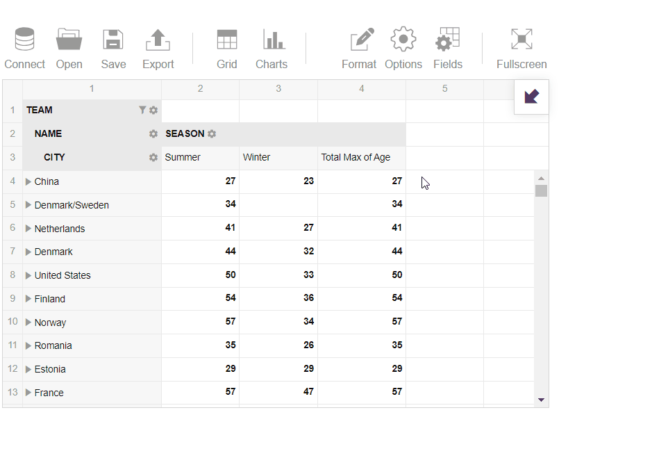
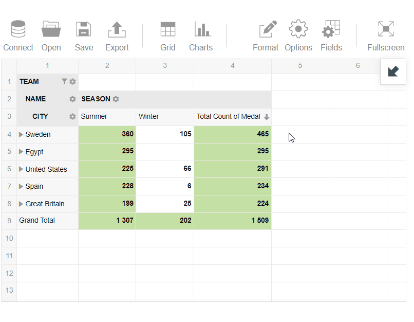
After loading the sample data about athletes into the pivot table, I wanted to analyze the minimum and maximum age among the athletes. Additionally, I wanted to define the best teams in history based on their total medals quantity.
To start the data analysis, I selected fields to columns and rows.
To work with the ‘Medal’ field, I’ve selected it to measures and achieved the following results:
- Filtered the records by value to display the top 5 teams with the highest quantity of medals
- Applied conditional formatting for my report to highlight teams which have more than 185 medals.
3. Next, I’ve selected ‘Age’ and analyzed the maximum age among the athletes:
4. Then I’ve switched to the pivot charts and analyzed the data in a more visual manner to learn about the best teams in the summer season:
Conclusion
So, today I’ve shared my experience of using Compass and Flexmonster Pivot Table. To my mind, both tools are able to help in making a creative visual story and analyze the data in a smart way.
I do hope you’ve found reading about my experience useful and now you are on the right path to successful MongoDB data analysis.
I will be happy to hear any feedback on this overview. Please, give your opinion in the comments. What tools for MongoDB data visualization could you recommend? Do they handle and process your data well?