
In this tutorial, we will see how to build an Order Book web application, that we'll use to display real-time cryptocurrency info.
We will use React with Typescript for creating the UI, Redux for managing the application state, and styled-components for applying the styling. And last, but not least, we'll use WebSockets for fetching the data feeds.
GitHub Repo
💡 If you want to skip the reading, here 💁 is the GitHub repository with a detailed README 🙌, and here you can see the live demo.
What is an Order Book?
An Order Book is an application that usually displays some kind of information related to buying and selling stuff.
💡 The most common use case is showing data for various assets, such as stocks, bonds, currencies, and even cryptocurrencies.
Why Would I Need an Order Book?
In practice, Order Books are used by traders to watch the fluctuations of the bidding price and the asking price of certain products – currencies, stocks, and so on.
This is happening real time, so the changes can be very rapid. Here is where WebSockets will come in handy, as you will see later.
In the past, people did something similar on paper, but the ‘real-time' part was impossible, of course.
A regular Order Book usually has two sides: buying (or bidding), shown in green on the left side and selling (or asking), red, on the right.
The Plan for our Order Book App
Our Order Book app will consist of five parts:
- order book main view
- grouping select box
- Toggle Feed button
- Kill Feed button
- Status Message.
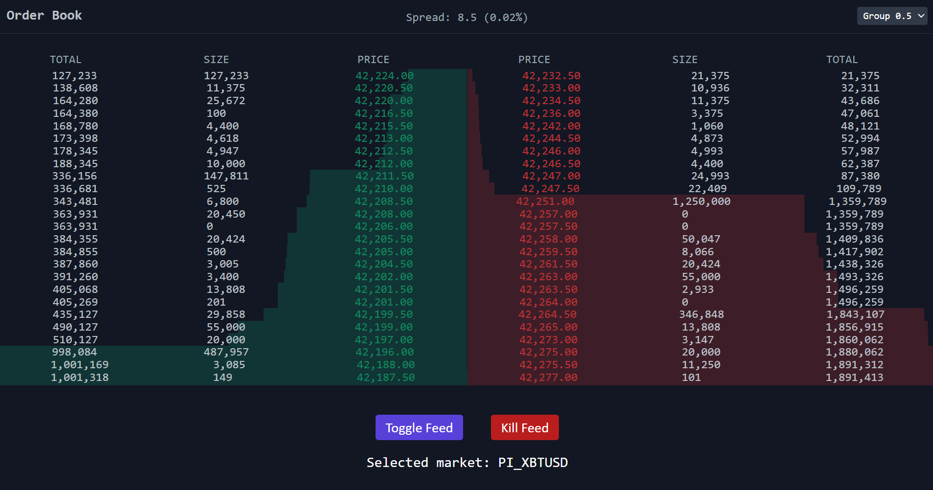
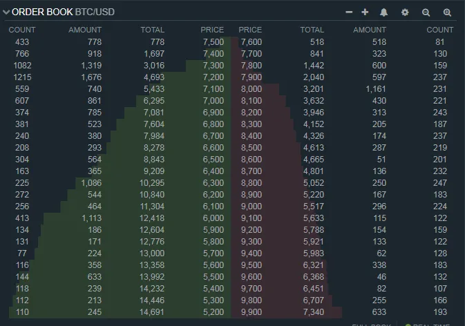
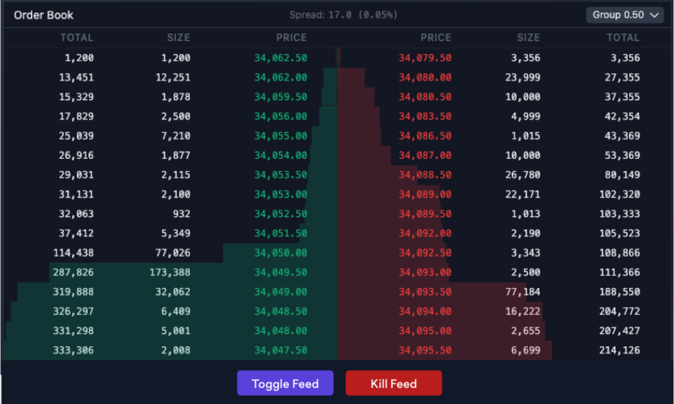
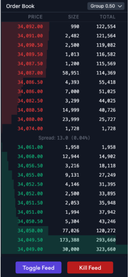
The app design will look as shown below. Note that the Status Message component, that you will see in the my implementation, is missing on these screenshots:
Application Features
Order book
The order book has two sides: the buy side and the sell side.
Both sides contain information about the number of orders opened at each price level.
Each level displays:
- Price: this is what defines the level. As orders must be placed at a price that is a multiple of the selected market's tick size (0.5), each level will be an increment of 0.5 (as long as there is an order open at that level).
- Size: the total quantity of contracts derived from open orders that have been placed at this level.
- Total: the summed amount of contracts derived from open orders that reside in the book at this level and above. To calculate the total of a given level we take the size of the current level and sum the sizes leading to this price level in the order book. The total is also used to calculate the depth visualizer (colored bars behind the levels). The depth of each level is calculated by taking that level's total as a percentage of the highest total in the book.
Grouping Select Box
By default the orders are grouped by the selected market's ticket size (0.5).
Possible toggling of the grouping is between 0.5, 1, 2.5 for XBTUSD market and 0.05, 0.1 and 0.25 for ETHUSD market.
To group levels, we combine the levels rounded down to the nearest group size – for example, if we change our grouping from 0.5 to 1 then we would combine the data from prices 1000 and 1000.5 and display it under a single level in the order book with the price 1000.
Toggle Feed Button
This button toggles the selected market between PI_XBTUSD and PI_ETHUSD. These are the two markets we will support -> Bitcoin/USD and Ethereum/USD.
It supports dynamic grouping logic and handles groupings for XBT (0.5, 1, 2.5) and groupings for ETH (0.05, 0.1, 0.25).
Kill Feed Button
Clicking this button stops the feed.
Then clicking this button a second time renews the feed.
Status Message
This message will show the currently selected market. It will also show a message saying the feed is killed.
Tech Stack for our App
Here is a list of the main technologies we will be using:
- React with TypeScript (
yarn create react-app my-app --template typescript) — a UI library we will use for building our application’s user interfaces. - Redux — a state management library we will use for managing our application’s state.
- WebSockets — The
WebSocketobject provides the API for creating and managing a WebSocket connection to a server, as well as for sending and receiving data on the connection. We will use it to implement the logic for consuming the live feeds as well as to be able to stop and renew. - styled-components — a CSS-in-JS library that lets you define the CSS styles of your components using ES6 template literals. We will use it to add styles to our app and make the look and feel beautiful. It utilizes tagged template literals to style your components and removes the mapping between components and styles. This means that when you’re defining your styles, you’re actually creating a normal React component that has your styles attached to it.
- react-testing-library — The
React Testing Libraryis a very light-weight solution for testing React components. We will use it for testing the UI components of our app. - Jest - a JavaScript Testing Framework that has become the de facto standard when we talk about testing React applications. We will use it to write some unit tests that will cover the reducer functions we have in our app.
How to Build the App
From this point onward I will try to guide you through the process I followed when building this.
💡 I must say that what I am showing you here is just a way of creating such an app – but it's not the way in any regard. Probably folks with more experience in crypto would do it better.
Project Structure
The project structure is pretty straightforward. We are using React and styled-components, which makes this way of structuring very convenient.
Let's see first what it looks like and then I will explain the what and the why.

As you can see on the image above, I have organized most of the components in folders. Each folder contains an index.tsx file, a styles.tsx and a .test.tsx files.
index.tsx – contains the code responsible for the component logic.
styles.tsx – contains the code responsible for styling the component. Here is where styled-components shines.
.text.tsx – these contain the component unit tests.
Let me give you a short summary of the idea behind each of the components in the components folder. Starting top to bottom:
Button renders a button with a given background color and title. It's used for the two buttons in the footer, Toggle Feed and Kill Feed / Renew Feed.
DepthVisualizer is the component responsible for drawing the red and the green backgrounds you are seeing behind the numbers. It does this by rendering a row (an HTML div element) with given width, position being left (Bids) or right (Asks).
Footer – well, there's not much to say here, it contains the two buttons used in the app.
GroupingSelectBox renders the select box we use to change the grouping value, using setGrouping reducer to amend the application state when grouping is being changed.
Header renders the title of the application as well as the GroupingSelectBox component.
Loader renders loading animation implemented by leveraging SVG.
Order Book contains the core logic of the app. Separated components are located in sub-folders, and the Redux state management logic is here also.
Spread renders the spread value, displayed in the middle of the header (in desktop view). The component itself contains short methods for calculating the amount itself and the percentage value.
StatusMessage is a small component used to display status messages. It basically shows which market is currently being displayed and whether the feed is killed.
Rendering Performance
Here is a good moment to talk about rendering performance and inline styling a bit.
Rendering is the process of React asking your components to describe what they want their section of the UI to look like based on the current combination of props and state.
This process is triggered by a change of the state in your component. This change could be caused by some of the props being changed or by some internal logic of the component.
The point here is that when re-rendering happens unnecessarily, it reduces the performance of our app. This is exactly what happened to me when I introduced the initial implementation of the DepthVisualizer component. It was using styled-components, that is JavaScript, for the drawing part.
In order to solve this, I have changed the component to use inline styles, that is pure CSS, instead of a CSS in JS approach. In other words, my bottleneck was using JavaScript animations, which is a famous reason for reduced performance.
Here is how it looks like now:
const DepthVisualizer: FunctionComponent<DepthVisualizerProps> = ({windowWidth, depth, orderType }) => {
  return <div style={{
    backgroundColor: `${orderType === OrderType.BIDS ? DepthVisualizerColors.BIDS : DepthVisualizerColors.ASKS}`,
    height: "1.250em",
    width: `${depth}%`,
    position: "relative",
    top: 21,
    left: `${orderType === OrderType.BIDS && windowWidth > MOBILE_WIDTH ? `${100 - depth}%` : 0}`,
    marginTop: -24,
    zIndex: 1,
  }} />;
};

export default DepthVisualizer;
Inline styling is when you write your CSS along with your markup, as values for the style attribute. This is something that is NOT considered a good practice, but as you can see here, there are cases when it's necessary to use it.
💡 Usually you would extract your CSS code into a separate file.
Footer a simple dummy component used to render the two buttons in the footer of the app.
Dummy components, also known as stateless or representational ones, are components that don't hold state and are usually used just to visualize data in some way. This data is being passed via the props. For example the isFeedKilled flag in the component above.
If such a component needs to execute some kind of interaction, it usually does this by accepting (again via the props, for example toggleFeedCallback) callback functions that can be executed when that interaction happens. For example clicking a button.
On the opposite side we could have smart or state-full components. They are the ones that are connected to the app state and can manipulate it directly. Usually they are the ones that read the data from the state and pass it to the stateless components via their props.
GroupingSelectBox contains the Select element you can use to switch between the groupings.
Header is the header part of the app. It takes care of setting properly the layout consisting of the title 'Order Book' on the left and the select box on the right.
Loader is used as an indicator for when the data has not yet been loaded. It leverages a SVG animation I have found online.
Order Book is where the real thing is happening. This one consists of a few smaller components:
- TableContainer – used for styling the views for both the Odds and Bets sides.
- TitleRow – this is the component responsible for displaying the titles of the columns: prize, size, and total, respectively.
How to Build the UI with React and styled-components
When we talk about component-based structure, such as the one React provides us, the styled-components library is likely one of the first choices you might make when styling is needed.
Like Josh Comeau says in his detailed article:
💡 It's a wonderful tool. In many ways, it's changed how I think about CSS architecture, and has helped me keep my codebase clean and modular, just like React!
As the name of the lib hints, we could easily style our components by using the CSS-in-JS pattern. Here is an example of how I used it to write the styles for my Button component:
import styled from "styled-components";

interface ContainerProps {
  backgroundColor: string;
}

export const Container = styled.button<ContainerProps>`
  padding: .3em .7em;
  margin: 1em;
  border-radius: 4px;
  border: none;
  color: white;
  background: ${props => props.backgroundColor};
  font-family: "Calibri", sans-serif;
  font-size: 1.2em;

  &:hover {
    cursor: pointer;
    opacity: .8;
  }
`
Notice how I am using an interface in my styles file, and also the background property being passed as an argument via props. This is part of the CSS-in-JS story.
The possibility to use CSS code in JavaScript or (as someone might say) vice versa comes very handy. For example, when we need a component to look differently depending on something, we can pass through its props a parameter to define this.
As every style is actually a component, this way of writing styles feels a lot like writing React components. I mean, in the end, everything is components, right?
Responsiveness and Page Visibility Detection
While working on this app, I read in several places that, for applications which support rapid updates, is a good practice to implement some kind of mechanism for pausing the whole thing when it is not being used by the user. For example when the user minimizes the browser window or just opens another tab.
Since our Order book is consuming a lot of new chunks of data every second via WSS, I decided to implement such a mechanism as well.
What this does is:
- it shows a loader when the data is not there yet
- it changes the meta title to signify that the app is in
pausedmode - it unpauses the work once the app window is on focus

You may see the whole implementation here.
The essential part is in the useEffect hook, which is triggered only once when the application renders for first time.
In there we take advantage of the Page Visibility API by attaching the necessary listeners. And then, in the handlers, we simply execute the logic we want.
Window Size Detection
In almost every app that has some level of responsiveness, you need some logic for detecting the changes in the window size and taking some actions accordingly.
In other words, you need to know when your app is being viewed in certain screen size, so you can arrange your components and adjust your styles so that everything looks nice and in place.
This is especially valid for mobile friendly applications, where responsiveness is essential.
Our implementation of the window size change detection is based on the innerWidtgh property of the browser window object and onresize event that is being triggered when it gets resized.
I am attaching a listener for this event in a useEffect hook in App.tsx file. And then, every time the window size changes, I am setting the new width to a state variable via setWindowWidth hook.
const [windowWidth, setWindowWidth] = useState(0);
...
...

// Window width detection
useEffect(() => {
  window.onresize = () => {
    setWindowWidth(window.innerWidth);
  }
  setWindowWidth(() => window.innerWidth);
}, []);
Then propagate this variable down through all interested components and use it accordingly. For example here is how I use it in Order Book/index.tsx in order to know when and where to render the TitleRow component.
{windowWidth > MOBILE_WIDTH && <TitleRow windowWidth={windowWidth} reversedFieldsOrder={false} />}


Note that it appears on different position depending on that whether you are seeing the app on desktop or mobile.
You may take a look at the component itself and see similar approach of using the window width there.
State Management with Redux
As you probably guessed already, I used Redux for managing the state of the app.
The main logic behind that is concentrated in the orderbookSlice reducer. In the following few lines I will walk you through it and see how and why I built it that way.
First we define the interface and the initial state of our order book data. The initial state contains the default values we need to have in place when starting the app.
export interface OrderbookState {
  market: string;
  rawBids: number[][];
  bids: number[][];
  maxTotalBids: number;
  rawAsks: number[][];
  asks: number[][];
  maxTotalAsks: number;
  groupingSize: number;
}

const initialState: OrderbookState = {
  market: 'PI_XBTUSD', // PI_ETHUSD
  rawBids: [],
  bids: [],
  maxTotalBids: 0,
  rawAsks: [],
  asks: [],
  maxTotalAsks: 0,
  groupingSize: 0.5
};
Then there are a few short, self-explanatory methods helping to manipulate the levels data:
const removePriceLevel = (price: number, levels: number[][]): number[][] => levels.filter(level => level[0] !== price);

const updatePriceLevel = (updatedLevel: number[], levels: number[][]): number[][] => {
  return levels.map(level => {
    if (level[0] === updatedLevel[0]) {
      level = updatedLevel;
    }
    return level;
  });
};

const levelExists = (deltaLevelPrice: number, currentLevels: number[][]): boolean => currentLevels.some(level => level[0] === deltaLevelPrice);

const addPriceLevel = (deltaLevel: number[], levels: number[][]): number[][] => {
  return [ ...levels, deltaLevel ];
};
Then the real magic is happening. If the size returned by a delta is 0 then that price level should be removed from the order book. Otherwise you can safely overwrite the state of that price level with new data returned by that delta.
/** The orders returned by the feed are in the format
 of [price, size][].
 * @param currentLevels Existing price levels - `bids` or `asks`
 * @param orders Update of a price level
 */
const applyDeltas = (currentLevels: number[][], orders: number[][]): number[][] => {
  let updatedLevels: number[][] = currentLevels;

  orders.forEach((deltaLevel) => {
    const deltaLevelPrice = deltaLevel[0];
    const deltaLevelSize = deltaLevel[1];

    // If new size is zero - delete the price level
    if (deltaLevelSize === 0 && updatedLevels.length > ORDERBOOK_LEVELS) {
      updatedLevels = removePriceLevel(deltaLevelPrice, updatedLevels);
    } else {
      // If the price level exists and the size is not zero, update it
      if (levelExists(deltaLevelPrice, currentLevels)) {
        updatedLevels = updatePriceLevel(deltaLevel, updatedLevels);
      } else {
        // If the price level doesn't exist in the orderbook and there are less than 25 levels, add it
        if (updatedLevels.length < ORDERBOOK_LEVELS) {
          updatedLevels = addPriceLevel(deltaLevel, updatedLevels);
        }
      }
    }
  });

  return updatedLevels;
}
What follows after these are few helper methods. Let me say a few words about each of them now:
- addTotalSums – with the help of this method, we iterate through the orders data, bids or asks, and calculate for each of them the total sum. The total sum value is then used for making the background visualizations.
- addDepths – we use this method to calculate the so-called depth for each order. These values will be used later by the depth meter component to display the red and green rows in the background.
- getMaxTotalSum – this one returns the max value of all total sums.
Everything below is what we use for creating the application state. As per the Redux Toolkit documentation, it’s using createSliceAPI to create the slice.

Creating a slice requires a string name to identify the slice, an initial state value, and one or more reducer functions to define how the state can be updated.
Once a slice is created, we can export the generated Redux action creators and the reducer function for the whole slice.
The last few lines consist of the exports in question – action creators, state slices selectors and the main reducer.
export const { addBids, addAsks, addExistingState, setGrouping, clearOrdersState } = orderbookSlice.actions;
export const selectBids = (state: RootState): number[][] => state.orderbook.bids;
export const selectAsks = (state: RootState): number[][] => state.orderbook.asks;
export const selectGrouping = (state: RootState): number => state.orderbook.groupingSize;
export const selectMarket = (state: RootState): string => state.orderbook.market;
export default orderbookSlice.reducer;
With all that, our state manipulation logic is complete. 🎉
Now it’s time to take a look at the protocol we used in our app to take advantage of all these rapid changes in the data we consume.
Websocket Protocol (WSS)
As you may have noticed, we're using the Web Socket communication protocol for fetching data into our application. We also use its features, as you will see in a moment, to accomplish other things (such as toggling the feeds and subscribe/unsubscribe from the data channel).
Here is how I used it.
Instead of trying to rely on manual implementation, I used the react-use-websocket package. It gives you all you need when you want to leverage WSS in a React app. If you want to go into details about this, you may take a look at their documentation.
A Few Words About My Implementation
What we need fist is the endpoint URL where the data feeds are coming from. I am sure there are multiple options out there when we talk about cryptocurrencies. In our app I used the one provided by www.cryptofacilities.com/.
const WSS_FEED_URL: string = 'wss://www.cryptofacilities.com/ws/v1';
Then the only thing we need to do to start consuming the data is to put the useWebSocket hook to work. As you may have guessed already, this hook is provided by the package mentioned above.
import useWebSocket from ["react-use-websocket"](<https://github.com/robtaussig/react-use-websocket>);

...
...
...

const { sendJsonMessage, getWebSocket } = useWebSocket(WSS_FEED_URL, {
    onOpen: () => console.log('WebSocket connection opened.'),
    onClose: () => console.log('WebSocket connection closed.'),
    shouldReconnect: (closeEvent) => true,
    onMessage: (event: WebSocketEventMap['message']) =>  processMessages(event)
  });
We pass the endpoint as the first argument and a few callback functions after that. These help us perform certain actions when one of the following happens:
onOpen– what to do when WebSocket connection is established.onClose– what to do when WebSocket connection is terminated.shouldReconnect– this is just a flag, saying if we want automatic reconnect when the connection drops for some reason.onMessage– this is the main event that brings us the chunks with the data (I callprocessMessagemethod every time when that happens. This means that every time when a new chunk of data is received, we process it and display it respectively).
Down below is the method in question. It simply does two things:
- Either calls a method called
process(No pun intended 😄) – this method is called every time new data for bids or asks is received and it processes it accordingly. - Dispatches an event that is using one of the reducer functions we have seen earlier. This function practically creates the initial state of our application.
In order to decide whether we are adding data to the current state or we should initialize it, we check for a property called numLevels. This is something that comes from the API, the very first time we establish the WebSocket connection.

The rest of the code you see in this file is mostly for preparing and rendering the results on the screen.
The most interesting part would be the method buildPriceLevels that is used for both halves – bids and asks. It sorts the data, makes the necessary calculations, and passes it to the relevant components for visualizing it. Those are DepthVisualizer and PriceLevelRow I mentioned earlier in this article.
Grouping
The grouping is an important part of how the order book works, as it defines by what ticket size the orders are grouped.
In our application, I have implemented a toggling functionality per each market, that allows grouping it as follows:
- Between 0.5, 1, 2.5 for XBTUSD market.

- Between 0.05, 0.1 and 0.25 for ETHUSD market.

There is a short gist I created when trying to figure out how to implement the grouping logic. You may find it here.
Also, aside from that gist, while developing this I have performed more than a few experiments out of the project itself. And just because these are just local files on my computer, I will publish them here for those of you who are even more curious.
It’s a small side npm project that has only one dependency. Here is the package.json file:
{
  "name": "grouping",
  "version": "1.0.0",
  "main": "index.js",
  "license": "MIT",
  "dependencies": {
    "lodash.groupby": "^4.6.0"
  }
}
And here is the code itself:
const bids = [
    [
        50163,
        110
    ],
    [
        50162,
        13140
    ],
    [
        50158,
        3763
    ],
    [
        50156,
        1570
    ],
    [
        50155,
        21997
    ],
    [
        50152.5,
        450
    ],
    [
        50151,
        4669
    ],
    [
        50150.5,
        10329
    ],
    [
        50150,
        2500
    ],
    [
        50149.5,
        450
    ],
    [
        50149,
        4022
    ],
    [
        50148,
        20000
    ],
    [
        50147,
        5166
    ],
    [
        50146.5,
        5274
    ],
    [
        50145,
        174609
    ],
    [
        50143,
        20000
    ],
    [
        50141,
        28000
    ],
    [
        50140.5,
        5000
    ],
    [
        50138,
        6000
    ],
    [
        50132.5,
        4529
    ],
    [
        50132,
        4755
    ],
    [
        50131,
        12483
    ],
    [
        50128.5,
        61115
    ],
    [
        50128,
        23064
    ],
    [
        50125.5,
        181363
    ]
]

/* function roundDownNearest(num, acc) {
    if (acc < 0) {
        return Math.floor(num * acc) / acc;
    } else {
        return Math.floor(num / acc) * acc;
    }
} */

/* function groupByTicketSize(ticketSize, levels) {
    const result = levels.map((element, idx) => {
        const nextLevel = levels[idx + 1];

        if (nextLevel) {
            const currentPrice = element[0];
            const currentSize = element[1];
            const nextPrice = nextLevel[0];
            const nextSize = nextLevel[1];
            console.log("current level: ", element)
            console.log("next level: ", nextLevel)

            element[0] = roundDownNearest(currentPrice, ticketSize);

            if (currentPrice - nextPrice < ticketSize) {
                element[1] = currentSize + nextSize;
            }
            console.log("==================================> Result: ", element)

            return element;
        }

    }).filter(Boolean);


    console.log("============================================================");
    console.log(result)
} */

const test = [
    [1004.5, 1],
    [1001.5, 1],
    [1001,   1],
    [1000.5, 1],
    [1000,   1],
    [999.5,  1],
    [999,    1],
    [990,    1],
    [988,    1]
]

function groupByTicketSize(ticketSize, levels) {
    const result = [];

    for (let i = 0; i < levels.length; i++) {
        console.log(levels[i])
        const prevLevel = levels[i-1]
        const level1 = levels[i]
        const level2 = levels[i+1]

        if (prevLevel && level1 && level1[0] - ticketSize === prevLevel) return

        if (level2 && level1[0] - level2[0] < ticketSize) {
            const newLevel = [level2[0], level1[1] + level2[1]];
            console.log("newLevel", newLevel)
            result.push(newLevel);
        } else {
            result.push(level1)
        }
    }

    console.log("============================================================");
    console.log(result)
}

// groupByTicketSize(1, bids);
groupByTicketSize(1, test);
How to Perform Unit Tests on the App
For performing unit testing I used the react-testing-library.
The main idea behind it that the developer should write tests only for what the user will see and interact with. There is no much point of testing implementation details.
💡 Imagine, just to give you an example, that you have implemented a list component that is just displaying lines of textual data. Say something like a todo list.
Then imagine that this data is coming from an API call in the shape of array. A data structure that you could easily iterate through via various methods – some sort of a loop cycle, such as for() or while(). Or you could use another more functional approach, say .map() method.
Now ask yourself – for the end user, the one that will just see the listed text data, does your implementation matter? As long as everything works as expected and in a good, performant way, the answer is ‘no, it does not’.
This is what your tests should reflect.
In the context of our Order Book application, each test file is located in the same directory as the implementation file. Most of the tests are short and self-explanatory, due to the fact that these are testing mostly rendering logic and only the happy path.
For example let’s take a look at the button component tests below:
import React from 'react';
import { render, screen } from '@testing-library/react';
import Button from './index';

test('renders button with title', () => {
  render(<Button backgroundColor={'red'} callback={jest.fn} title={'Toggle'} />);
  const btnElement = screen.getByText(/Toggle/i);
  expect(btnElement).toBeInTheDocument();
});
It just verifies that the component is rendered properly and it displays what we expect the user to see. Which is the title Toggle in this case.
For testing the reducers I have used Jest, as this is the only not visual part that we'll cover. These tests are also pretty simple and self-explanatory. I use them for testing whether the initial application state is in place and to see that adding price levels to that state works correctly.
How to Deploy the App to Vercel
Finally – deployment time. 🎉
After finishing the development and testing our application, let’s put it live.
I used the Vercel platform for this purpose. They offer a pretty rich and easy to use interface as well as integrations for all famous source control platforms out there – including, of course, GitHub (where our application repo lives).
Assuming you have a GitHub account, what you need to do if you want to deploy it on your own is to login with it here.

Click on the +New Project button in the top right corner. Then import your Git repository using the provided options in the screen that opens. Here is how mine looks:
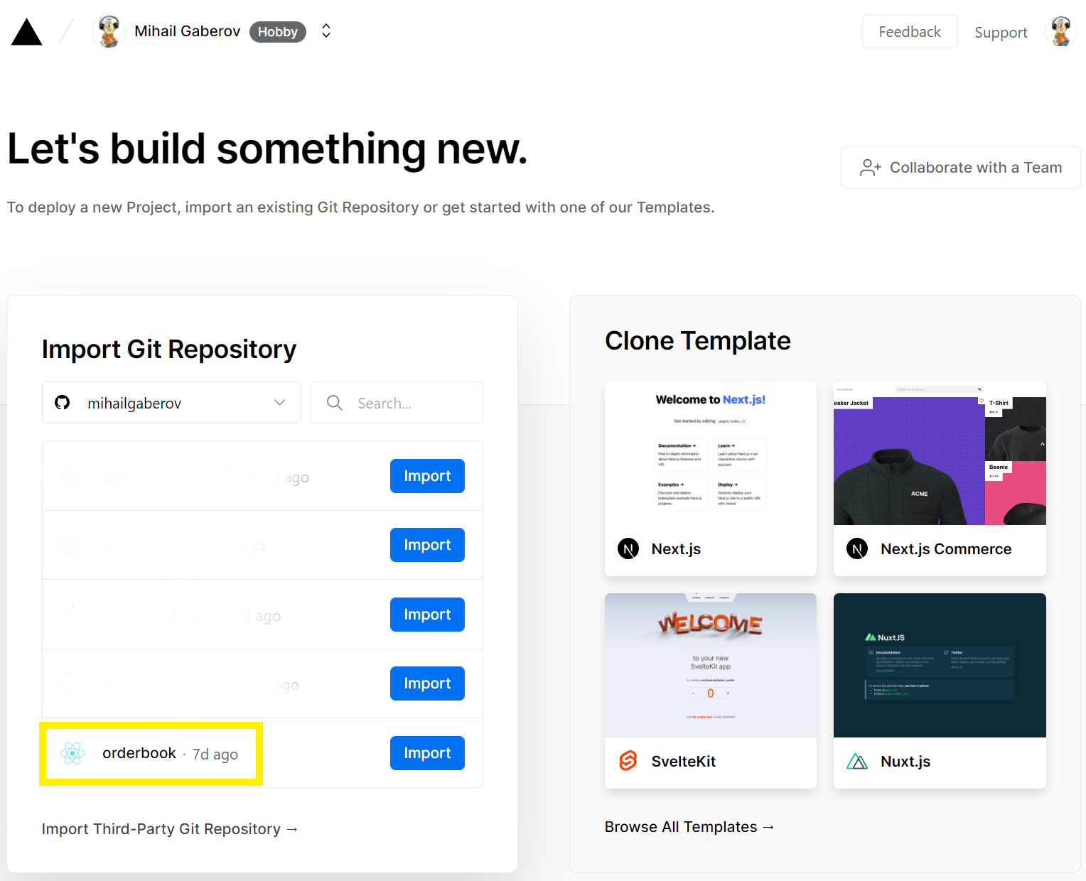
After importing the project, you will be able to do the actual deploy. When finished, Vercel will generate URLs for you to access your newly deployed app.

And I think you will receive an email letting you know if your deployment was successful. That email also contains these URLs.

Congratulations! 👏🏻
You now have your own Order Book application up and running online.
How to Add a Build Badge on GitHub
This is not order book related, but I decided to share it with you here anyway. It’s about those small details that make the big picture somehow more complete and attractive.
Maybe some of you have wondered how can you get one of these so called badges?

Here is the answer: https://shields.io/.
You go to the Other section and find the GitHub Deployments option.

Then click on it and follow the instructions.
There is one more thing you need to do in order to have this fully functioning. You go to your GitHub repository → Actions tab and create new workflow file. You may just go ahead and copy the content of mine from here. Name it main.yml.
What this will do is run the jobs defined in that file. In our case this is just the build job which is basically spinning a new build and running the tests.
After completing this, you just need add the following lines to your README file:
<!-- prettier-ignore-start -->
[](<https://github.com/mihailgaberov/orderbook/actions/workflows/main.yml>)
[![Build Status][build-badge]][build]
[build-badge]: <https://img.shields.io/github/deployments/mihailgaberov/orderbook/production?label=vercel&logoColor=vercel>
[build]: <https://github.com/mihailgaberov/orderbook/deployments>
<!-- prettier-ignore-end -->
💡 Don’t forget to put your own details in the URLs, that is your GitHub username and the name of your repository.
After pushing these changes you should see the badges displayed on your README: 🥳.

Wrapping Up
If you are reading this from the beginning, I will name you a champion. 🍾
It has been a long trip, but hopefully interesting and fun to walk along with me!
Now it’s time to summarize what we have done here and try to extract some useful insights which will help us in our future development challenges.
I will layout below my opinion of what was the most challenging in building this application. And I will be even more eager to find out what is yours.
Rendering Performance
This really bit me in the beginning, when I was building the UI and was trying to implement the drawing of the price level rows.
I mentioned earlier how I have managed to solve it and I think this is going to be something I will remember for sure.
Grouping Functionality
Implementing this was also kind of challenging because there were several factors I had to take into account. Because of the market we are in and the range I had to do the calculations in.
It took me a while to polish it (remember the side mini project and the gist I shared in the previous sections) and I still think it could be improved even more. Try switching between the markets and the grouping values multiple times and observe the results.
Space for Improvement
One thing already mentioned is for sure the grouping. Which should also improve the visualizing of the red and green parts – they (almost) always should form a not ideal triangle.
If we try to look at the bigger picture, this order book application can be a part of a dashboard screen filled with other widgets as well, and they all can interact between them.
For example, changing the grouping of the order book to reflect on changing the views in the other widgets as well – say showing a market chart like this one below:

I am not even mentioning adding new markets as an improvement, as it’s kinda clear. But this should be taken into account when building the functionality for the current markets, as to do it in a way that will be easily extendable. So that adding a new market to the order book be a trivial and quick task to do.
I think that's all from me.
Thanks for reading! 🙏
References
Here are few links you might find useful to read:
The styled-components Happy Path
Blogged Answers: A (Mostly) Complete Guide to React Rendering Behavior