

按钮是前端开发里的一个常见元素,在给按钮添加样式时有一些窍门,我收集了美化按钮的一些方法,当然你可以按需组合使用。首先安利一个创建渐变的小工具。
一个简单的 “Get Started” 按钮
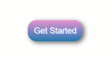
.btn {
  background: #eb94d0;
  /* 创建渐变 */
  background-image: -webkit-linear-gradient(top, #eb94d0, #2079b0);
  background-image: -moz-linear-gradient(top, #eb94d0, #2079b0);
  background-image: -ms-linear-gradient(top, #eb94d0, #2079b0);
  background-image: -o-linear-gradient(top, #eb94d0, #2079b0);
  background-image: linear-gradient(to bottom, #eb94d0, #2079b0);
  /* 给按钮添加圆角 */
  -webkit-border-radius: 28;
  -moz-border-radius: 28;
  border-radius: 28px;
  text-shadow: 3px 2px 1px #9daef5;
  -webkit-box-shadow: 6px 5px 24px #666666;
  -moz-box-shadow: 6px 5px 24px #666666;
  box-shadow: 6px 5px 24px #666666;
  font-family: Arial;
  color: #fafafa;
  font-size: 27px;
  padding: 19px;
  text-decoration: none;
}
/* 悬停样式 */
.btn:hover {
  background: #2079b0;
  background-image: -webkit-linear-gradient(top, #2079b0, #eb94d0);
  background-image: -moz-linear-gradient(top, #2079b0, #eb94d0);
  background-image: -ms-linear-gradient(top, #2079b0, #eb94d0);
  background-image: -o-linear-gradient(top, #2079b0, #eb94d0);
  background-image: linear-gradient(to bottom, #2079b0, #eb94d0);
  text-decoration: none;
}
透明背景色
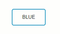
.btn {
      /* 文字颜色 */
      color: #0099CC;
      /* 清除背景色 */
      background: transparent;
      /* 边框样式、颜色、宽度 */
      border: 2px solid #0099CC;
      /* 给边框添加圆角 */
      border-radius: 6px;
      /* 字母转大写 */
      border: none;
      color: white;
      padding: 16px 32px;
      text-align: center;
      display: inline-block;
      font-size: 16px;
      margin: 4px 2px;
      -webkit-transition-duration: 0.4s; /* Safari */
      transition-duration: 0.4s;
      cursor: pointer;
      text-decoration: none;
      text-transform: uppercase;
}
.btn1 {
      background-color: white;
      color: black;
      border: 2px solid #008CBA;
}
/* 悬停样式 */
.btn1:hover {
      background-color: #008CBA;
      color: white;
}
应用 CSS Entities
这里是 CSS entities 的详细介绍。
也可以使用 HTML entities,但是只支持部分功能。
.button {
  display: inline-block;
  border-radius: 4px;
  background-color: #f4511e;
  border: none;
  color: #FFFFFF;
  text-align: center;
  font-size: 28px;
  padding: 20px;
  width: 200px;
  transition: all 0.5s;
  cursor: pointer;
  margin: 5px;
}
.button span {
  cursor: pointer;
  display: inline-block;
  position: relative;
  transition: 0.5s;
}
.button span:after {
content: '\00bb';  /* CSS Entities. 如果用的是 HTML Entities, 请改成 →*/
position: absolute;
  opacity: 0;
  top: 0;
  right: -20px;
  transition: 0.5s;
}
.button:hover span {
  padding-right: 25px;
}
.button:hover span:after {
  opacity: 1;
  right: 0;
}
添加点击动画
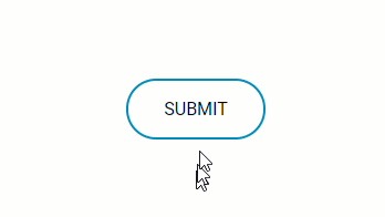
CSS: (SCSS)
$gray: #bbbbbb;
* {
  font-family: 'Roboto', sans-serif;
}
.container {
  position: absolute;
  top:50%;
  left:50%;
  margin-left: -65px;
  margin-top: -20px;
  width: 130px;
  height: 40px;
  text-align: center;
}
.btn {
      color: #0099CC; /* 文字颜色 */
      background: transparent; /* 清除背景色 */
      border: 2px solid #0099CC; /* 边框样式、颜色、宽度 */
      border-radius: 70px; /* 给边框添加圆角 */
      text-decoration: none;
      text-transform: uppercase; /* 字母转大写 */
      border: none;
      color: white;
      padding: 16px 32px;
      text-align: center;
      text-decoration: none;
      display: inline-block;
      font-size: 16px;
      margin: 4px 2px;
      -webkit-transition-duration: 0.4s; /* 兼容 Safari */
      transition-duration: 0.4s;
      cursor: pointer;
}
.btn1 {
      background-color: white;
      color: black;
      border: 2px solid #008CBA;
}
 .btn1:hover {
      background-color: #008CBA;
      color: white;
 }
b {
  outline:none;
  height: 40px;
  text-align: center;
  width: 130px;
  border-radius:100px;
  background: #fff;
  border: 2px solid #008CBA;
  color: #008CBA;
  letter-spacing:1px;
  text-shadow:0;
  font:{
    size:12px;
    weight:bold;
  }
  cursor: pointer;
  transition: all 0.25s ease;
&:active {
    letter-spacing: 2px ;
  }
  &:after {
    content:"";
  }
}
.onclic {
  width: 10px !important;
  height: 70px !important;
  border-radius: 50% !important;
  border-color:$gray;
  border-width:4px;
  font-size:0;
  border-left-color: #008CBA;
  animation: rotating 2s 0.25s linear infinite;
  &:hover {
    color: dodgerblue;
    background: white;
  }
}
.validate {
  content:"";
  font-size:16px;
  color: black;
  background: dodgerblue;
  border-radius: 50px;
  &:after {
    font-family:'FontAwesome';
    content:" done \f00c";
  }
}
@keyframes rotating {
  from {
    transform: rotate(0deg);
  }
  to {
    transform: rotate(360deg);
  }
}
Javascript: (JQuery)
$(function() {
  $("#button").click(function() {
    $("#button").addClass("onclic", 250, validate);
  });
function validate() {
    setTimeout(function() {
      $("#button").removeClass("onclic");
      $("#button").addClass("validate", 450, callback);
    }, 2250);
  }
  function callback() {
    setTimeout(function() {
      $("#button").removeClass("validate");
    }, 1250);
  }
});
图片按钮
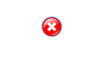

.btn {
 background: #92c7eb;
 background-image: url(“http://res.freestockphotos.biz/pictures/15/15107-illustration-of-a-red-close-button-pv.png");
 background-size: cover;
 background-position: center;
 display: inline-block;
 border: none;
 padding: 20px;
 width: 70px;
 border-radius: 900px;
 height: 70px;
 transition: all 0.5s;
 cursor: pointer;
}
.btn:hover
{
 width: 75px;
 height: 75px;
}
Icons 按钮
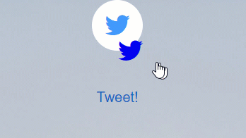
index.html:
<div class="main"><button class="button" style="vertical-align:middle"><a href="#" class="icon-button twitter"><i class="icon-twitter"></i><span></span></button></a>
<div class="text"><strong>TWEET!</strong></div>
</div>Style.css:
button{
  border: none;
  border-radius: 50px;
}
html,
body {
  font-size: 20px;
  min-height: 100%;
  overflow: hidden;
  font-family: "Helvetica Neue", Helvetica, sans-serif;
  text-align: center;
}
.text {
  padding-top: 50px;
  font-family: "Helvetica Neue", Helvetica, 'Lucida Sans Unicode', Geneva, Verdana, sans-serif;
}
.text:hover
{
  cursor: pointer;
  color: #1565C0;
}
.main {
  padding: 0px 0px 0px 0px;
  margin: 0;
  background-image: url("https://someimg");
  text-align: center;
  background-size: 100% !important;
  background-repeat: no-repeat;
  width: 900px;
  height: 700px;
}
.icon-button {
  background-color: white;
  border-radius: 3.6rem;
  cursor: pointer;
  display: inline-block;
  font-size: 2rem;
  height: 3.6rem;
  line-height: 3.6rem;
  margin: 0 5px;
  position: relative;
  text-align: center;
  -webkit-user-select: none;
  -moz-user-select: none;
  -ms-user-select: none;
  user-select: none;
  width: 3.6rem;
}
.icon-button span {
  border-radius: 0;
  display: block;
  height: 0;
  left: 50%;
  margin: 0;
  position: absolute;
  top: 50%;
  -webkit-transition: all 0.3s;
  -moz-transition: all 0.3s;
  -o-transition: all 0.3s;
  transition: all 0.3s;
  width: 0;
}
.icon-button:hover span {
  width: 3.6rem;
  height: 3.6rem;
  border-radius: 3.6rem;
  margin: -1.8rem;
}
.twitter span {
  background-color: #4099ff;
}
/* Icons */
.icon-button i {
  background: none;
  color: white;
  height: 3.6rem;
  left: 0;
  line-height: 3.6rem;
  position: absolute;
  top: 0;
  -webkit-transition: all 0.3s;
  -moz-transition: all 0.3s;
  -o-transition: all 0.3s;
  transition: all 0.3s;
  width: 3.6rem;
  z-index: 10;
}
.icon-button .icon-twitter {
  color: #4099ff;
}
.icon-button:hover .icon-twitter {
  color: white;
}
总结
在这个教程里,我们学习了通过 CSS 和一点 JavaScript(如果需要点击后的效果)来美化 CSS 按钮。也可以使用 CSS3ButtonGenerator 来生成一个简单的按钮。有问题欢迎留言。
原文链接:A quick guide to styling buttons using CSS,作者:Ashwini Sheshagiri