
By Ashwini Sheshagiri
Buttons have become an inevitable part of front end development. Thus, it is important to keep in mind a few things before you start styling buttons. I have gathered some of the ways of styling buttons using CSS.
A simple “Get Started” button
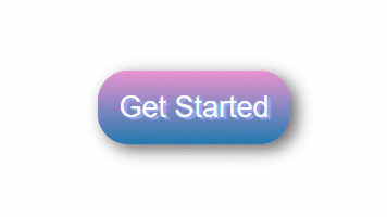
First, create the button class itself:
.btn {
    background: #eb94d0;
Then create the gradients:
background-image: -webkit-linear-gradient(top, #eb94d0, #2079b0); background-image: -moz-linear-gradient(top, #eb94d0, #2079b0); background-image: -ms-linear-gradient(top, #eb94d0, #2079b0); background-image: -o-linear-gradient(top, #eb94d0, #2079b0); background-image: linear-gradient(to bottom, #eb94d0, #2079b0);
Then give the curved edge for the button
-webkit-border-radius: 28;  -moz-border-radius: 28;  border-radius: 28px;
text-shadow: 3px 2px 1px #9daef5;  -webkit-box-shadow: 6px 5px 24px #666666;  -moz-box-shadow: 6px 5px 24px #666666;  box-shadow: 6px 5px 24px #666666;
font-family: Arial;  color: #fafafa;  font-size: 27px;  padding: 19px;  text-decoration: none;}
How to Trigger a button on-hover event
.btn:hover {
  background: #2079b0;
  background-image: -webkit-linear-gradient(top, #2079b0, #eb94d0);
  background-image: -moz-linear-gradient(top, #2079b0, #eb94d0);
  background-image: -ms-linear-gradient(top, #2079b0, #eb94d0);
  background-image: -o-linear-gradient(top, #2079b0, #eb94d0);
  background-image: linear-gradient(to bottom, #2079b0, #eb94d0);
  text-decoration: none;
}
How to Add a Transparent Background to a CSS Button
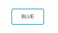
Create the button class:
.btn {
/ Text color /
color: #0099CC;
/ Remove background color /
background: transparent;
/ Border thickness, line style, and color /
border: 2px solid #0099CC;
/ Adds curve to border corners /
border-radius: 6px;
/ Make letters uppercase /
      border: none;
      color: white;
      padding: 16px 32px;
      text-align: center;
      display: inline-block;
      font-size: 16px;
      margin: 4px 2px;
      -webkit-transition-duration: 0.4s;
      /* Safari */
      transition-duration: 0.4s;
      cursor: pointer;
      text-decoration: none;
      text-transform: uppercase;
}
.btn1 {
      background-color: white;
      color: black;
      border: 2px solid #008CBA;
}
/button on hover/
.btn1:hover { background-color: #008CBA; color: white; }
Button with CSS Entities
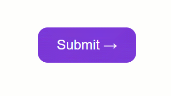
.button { display: inline-block; border-radius: 4px; background-color: #f4511e; border: none; color: #FFFFFF; text-align: center; font-size: 28px; padding: 20px; width: 200px; transition: all 0.5s; cursor: pointer; margin: 5px;}
.button span { cursor: pointer; display: inline-block; position: relative; transition: 0.5s;}
.button span:after {
content: '\00bb';  /* CSS Entities. To use HTML Entities, use →*/
position: absolute;  opacity: 0;  top: 0;  right: -20px;  transition: 0.5s;}
.button:hover span {  padding-right: 25px;}
.button:hover span:after {  opacity: 1;  right: 0;}
Button with click animation
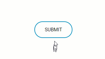
Full CSS: (SCSS)
$gray: #bbbbbb;
* {  font-family: 'Roboto', sans-serif;}

.container {  position: absolute;
    top:50%;
    left:50%;
    margin-left: -65px;
    margin-top: -20px;
    width: 130px;
    height: 40px;
    text-align: center;
}

.btn {
    color: #0099CC;
    /* Text color */
    background: transparent; /* Remove background color */
    border: 2px solid #0099CC; /* Border thickness, line style, and color */
    border-radius: 70px; /* Adds curve to border corners */
    text-decoration: none;
    text-transform: uppercase; /* Make letters uppercase */
    border: none;
    color: white;
    padding: 16px 32px;
    text-align: center;
    text-decoration: none;
    display: inline-block;
    font-size: 16px;
    margin: 4px 2px;
    -webkit-transition-duration: 0.4s; /* Safari */
    transition-duration: 0.4s;
    cursor: pointer;}.btn1 {
    background-color: white;
    color: black;
    border: 2px solid #008CBA;} .btn1:hover {
    background-color: #008CBA;
    color: white;
}


&:active {    letter-spacing: 2px ;
    }  &:after {
    content:"";  }}.onclic {
    width: 10px !important;
    height: 70px !important;
    border-radius: 50% !important;
    border-color:$gray;
    border-width:4px;
    font-size:0;
    border-left-color: #008CBA;
    animation: rotating 2s 0.25s linear infinite;
    &:hover {    color: dodgerblue;    background: white;  }}.validate {  content:"";
    font-size:16px;
    color: black;
    background: dodgerblue;
    border-radius: 50px;
    &:after {    font-family:'FontAwesome';    content:" done \f00c";  }
}


b {  outline:none;
    height: 40px;
    text-align: center;
    width: 130px;
    border-radius:100px;
    background: #fff;
    border: 2px solid #008CBA;
    color: #008CBA;
    letter-spacing:1px;
    text-shadow:0;
    font:{    size:12px;    weight:bold;  }
    cursor: pointer;
    transition: all 0.25s ease;
    @keyframes rotating {  from {    transform: rotate(0deg);  }  to {    transform: rotate(360deg);  }
}
Javascript: (JQuery)
$(function() { $("#button").click(function() { $("#button").addClass("onclic", 250, validate); });
function validate() { setTimeout(function() { $("#button").removeClass("onclic"); $("#button").addClass("validate", 450, callback); }, 2250); } function callback() { setTimeout(function() { $("#button").removeClass("validate"); }, 1250); }});
Button with an image
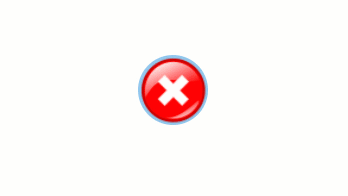
.btn {

 background: #92c7eb; background-image: url(“http://res.freestockphotos.biz/pictures/15/15107-illustration-of-a-red-close-button-pv.png"); background-size: cover; background-position: center; display: inline-block; border: none; padding: 20px; width: 70px; border-radius: 900px; height: 70px; transition: all 0.5s; cursor: pointer;}.btn:hover{ width: 75px; height: 75px;}
Button with icons
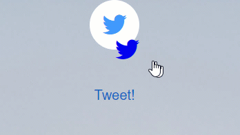
index.html:
<div class="main"><button class="button" style="vertical-align:middle"><a href="#" class="icon-button twitter"><i class="icon-twitter"></i><span></span></button></a> <div class="text"><strong>TWEET!</strong></div></div>
style.css:
button{  border: none;  border-radius: 50px;}html,body {  font-size: 20px;  min-height: 100%;  overflow: hidden;  font-family: "Helvetica Neue", Helvetica, sans-serif;    text-align: center;}.text {  padding-top: 50px;  font-family: "Helvetica Neue", Helvetica, 'Lucida Sans Unicode', Geneva, Verdana, sans-serif;

}.text:hover{  cursor: pointer;  color: #1565C0;}.main {  padding: 0px 0px 0px 0px;  margin: 0;  background-image: url("https://someimg");  text-align: center;  background-size: 100% !important;  background-repeat: no-repeat;  width: 900px;  height: 700px;  }

.icon-button {  background-color: white;  border-radius: 3.6rem;  cursor: pointer;  display: inline-block;  font-size: 2rem;  height: 3.6rem;  line-height: 3.6rem;  margin: 0 5px;  position: relative;  text-align: center;  -webkit-user-select: none;  -moz-user-select: none;  -ms-user-select: none;  user-select: none;  width: 3.6rem;}

.icon-button span {  border-radius: 0;  display: block;  height: 0;  left: 50%;  margin: 0;  position: absolute;  top: 50%;  -webkit-transition: all 0.3s;  -moz-transition: all 0.3s;  -o-transition: all 0.3s;  transition: all 0.3s;  width: 0;}.icon-button:hover span {  width: 3.6rem;  height: 3.6rem;  border-radius: 3.6rem;  margin: -1.8rem;}.twitter span {  background-color: #4099ff;}

/* Icons */.icon-button i {  background: none;  color: white;  height: 3.6rem;  left: 0;  line-height: 3.6rem;  position: absolute;  top: 0;  -webkit-transition: all 0.3s;  -moz-transition: all 0.3s;  -o-transition: all 0.3s;  transition: all 0.3s;  width: 3.6rem;  z-index: 10;}.icon-button .icon-twitter {  color: #4099ff;}

.icon-button:hover .icon-twitter {  color: white;}
Conclusion
In this tutorial, you’ve learned how to customize buttons using CSS and a bit of Javascript if you need the “after click” function. You can also use CSS3ButtonGenerator to generate simple buttons. Feel free to ping me if you have any questions.