

原文:How to Create a Portfolio Website Using HTML, CSS, JavaScript, and Bootstrap 5,作者:Sampurna Chapagain
如果你是 Web 开发人员或 Web 设计师,那么拥有一个作品集网站对你来说至关重要。你可以在上面展示自己的信息,并且运用你的相关技能和经验展示你的最佳作品。
在这篇文章中,我们将讨论创建作品集网站的一些好处。然后,我将向你展示如何使用 HTML、CSS、JavaScript 和 Bootstrap5 为自己创建一个漂亮的响应式作品集网站。
目录
- 拥有作品集网站的好处
- Bootstrap 是什么
- 文件夹结构
- 如何给你的作品集添加导航菜单
- 如何给作品集添加主视觉
- 如何创建关于部分
- 如何创建服务部分
- 如何在页面滚动上向导航栏添加深色背景颜色
- 如何创建作品集部分
- 如何创建联系部分
- 如何创建页脚部分
- 最后润色
- 总结
拥有作品集网站的好处
拥有一个作品集网站有几个好处,包括:
- 它提供了一个平台来展示你的相关技能和经验
- 它显示了你的个性
- 它让招聘经理找到你,而不是你联系他们
- 人们可以在 Google 等搜索引擎中搜索到你
Bootstrap 是什么
Bootstrap 是一个流行的前端 CSS 框架,用于开发响应式和移动端友好的网站。 Bootstrap 的最新版本是第 5 版。你可以在此处找到 Bootstrap5 的官方文档。
文件夹结构
我们现在将开始创建作品集网站。
首先,让我们创建文件夹结构。你可以在 GitHub 上获取项目启动文件。此外,你可以访问此处查看该项目的 demo。
文件夹结构由 index.html、style.css 和 script.js 文件和一个 images 文件夹组成。我们将在 style.css 文件中编写所有 CSS,在 script.js 文件中编写 JavaScript。
在 index.html 文件中,你可以看到带有 Bootstrap CDN 的 HTML 样板代码、font awesome 套件以及指向外部样式表和 JavaScript 的链接。
这里,script.js 文件是在加载完所有 HTML 代码后加载的。
如何给你的作品集添加导航菜单
现在,在我们的项目中添加一个导航菜单。它将帮助访问者找到他们正在寻找的相关信息。
我们将在 nav 元素中使用 Bootstrap 的 fixed-top 类来将导航栏保持在页面顶部。 navbar 也有一个 navbar-brand 类,我们将人名作为品牌保存。
<nav class="navbar navbar-expand-lg fixed-top navbarScroll">
        <div class="container">
            <a class="navbar-brand" href="#">Brad</a>
            <button class="navbar-toggler" type="button" data-bs-toggle="collapse" data-bs-target="#navbarSupportedContent" aria-controls="navbarSupportedContent" aria-expanded="false" aria-label="Toggle navigation">
                <span class="navbar-toggler-icon"></span>
            </button>
            <div class="collapse navbar-collapse" id="navbarSupportedContent">
                <ul class="navbar-nav ms-auto">
                    <li class="nav-item active">
                        <a class="nav-link" href="#home">Home</a>
                    </li>
                    <li class="nav-item">
                        <a class="nav-link" href="#about">About</a>
                    </li>
                    <li class="nav-item">
                        <a class="nav-link" href="#services">Services</a>
                    </li>
                    <li class="nav-item">
                        <a class="nav-link" href="#portfolio">Portfolio</a>
                    </li>
                    <li class="nav-item">
                        <a class="nav-link" href="#contact">Contact</a>
                    </li>
                </ul>

            </div>
        </div>
    </nav>
导航栏具有以下功能:
- 它有六个链接:home(主页)、about(关于)、services(服务)、portfolio(作品集)、contact(联系)和 footer(页脚)
- 它有一个透明的背景,稍后我们将在页面滚动时添加深色背景
- 它可以在较小的设备上滚动
你可以在此处找到有关 Bootstrap5 导航栏功能的更多详细信息。
但是,导航栏在滚动时出现问题。它在整个页面中完全透明,这会导致可读性问题。我们将在完成 services 部分后解决此问题,以便你正确地理解该问题。
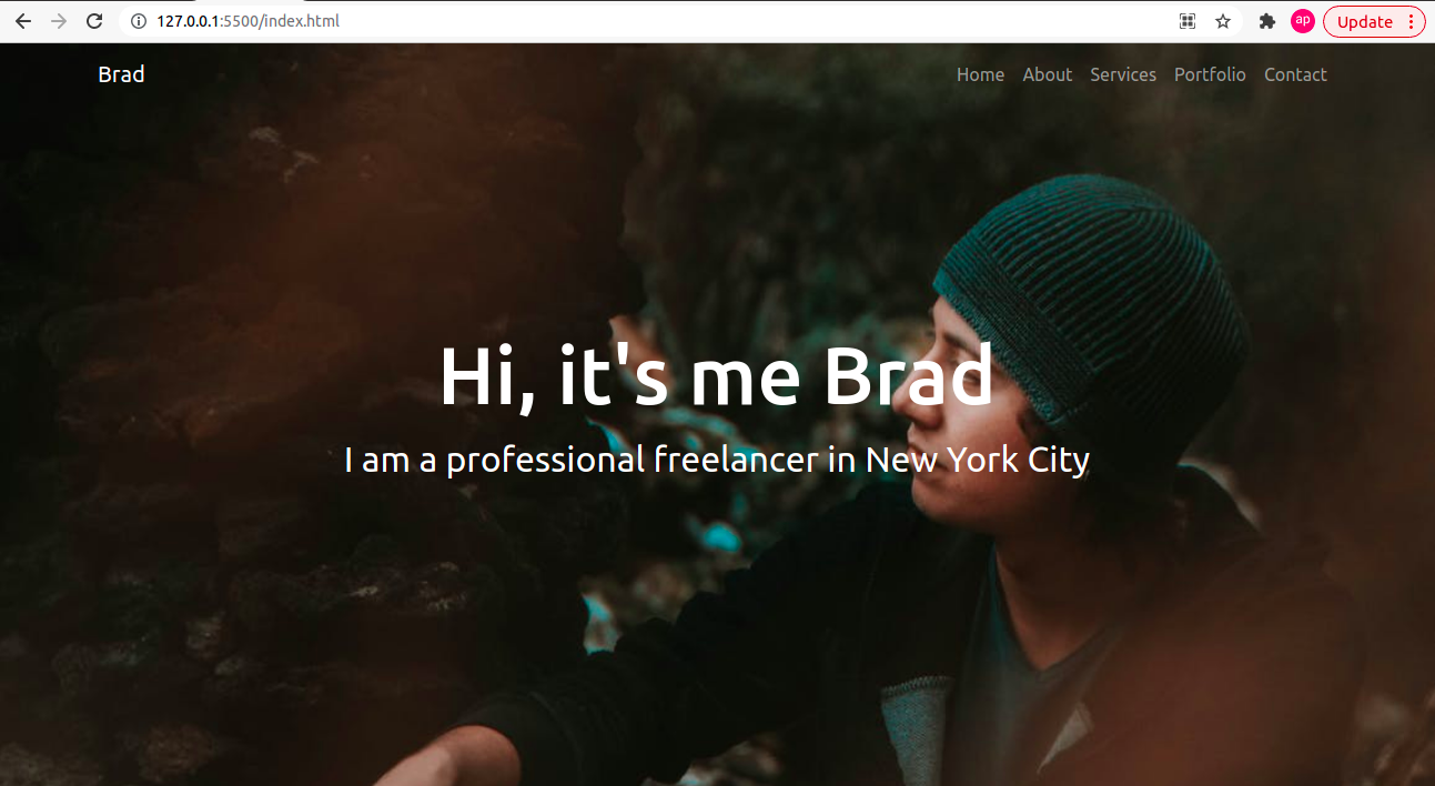
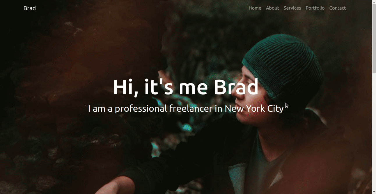
如何给作品集添加主视觉(Hero Header)
现在,我们将在中心添加一个带有一些文本的主视觉。主视觉是一个网页设计术语,指的是显示公司或个人主要目标的高质量全幅图像、具有代表性的图像或其他引人注目的元素。它有助于吸引用户访问你的网站。
 <!-- main banner -->
    <section class="bgimage" id="home">
        <div class="container-fluid">
            <div class="row">
            <div class="col-lg-12 col-md-12 col-sm-12 col-xs-12 hero-text">
                <h2 class="hero_title">Hi, it's me Brad</h2>
                <p class="hero_desc">I am a professional freelancer in New York City</p>
            </div>
            </div>
        </div>
    </section>
另外,让我们在 style.css 文件中添加上述代码的 CSS:
/* hero background image */
.bgimage {
    height:100vh;
    background: url('images/heroImage.jpeg');
    background-size:cover;
    position:relative;
}
/* text css above hero image*/
.hero_title {
    font-size: 4.5rem;
}
.hero_desc {
    font-size: 2rem;
}
.hero-text {
    text-align: center;
    position: absolute;
    top: 50%;
    left: 50%;
    transform: translate(-50%, -50%);
    color: white;
}
在这里我们可以看到该部分有一个名为 bgimage 的 id,它负责以全宽显示主视觉图像。它还借助上述 CSS 在图像上方的中心显示一些文本。
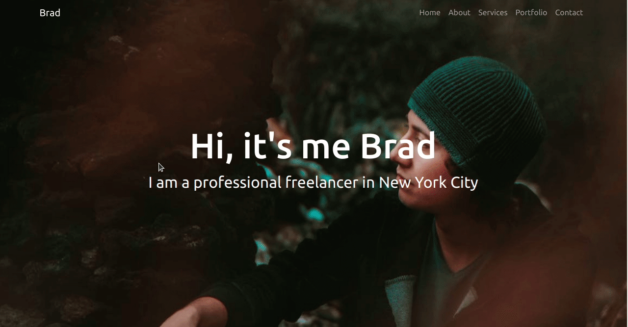
这是该网站到目前为止的导航栏和主视觉部分的外观:
如何创建关于部分
关于页面包含有关你和你的背景的重要信息。你的作品集网站的访问者可以通过你在此页面中提供的信息了解你。
我们将在行的左侧添加一个图像,在右侧我们将在本节中添加快速介绍。让我们使用下面的代码来演示它:
<!-- about section-->
    <section id="about">
        <div class="container mt-4 pt-4">
            <h1 class="text-center">About Me</h1>
            <div class="row mt-4">
                <div class="col-lg-4">
                    <img src="images/about.jpeg" class= "imageAboutPage" alt="">
                </div>

                <div class="col-lg-8">
                    <p> Lorem Ipsum has been the industry's standard dummy text ever since the 1500s, when an unknown printer took a galley of type and scrambled it to make a type specimen book. It has survived not only five centuries, but also the leap into electronic typesetting, remaining essentially unchanged

                    </p>
                    <div class="row mt-3">
                        <div class="col-md-6">
                            <ul>
                                <li>Name: David Parker</li>
                                <li>Age: 28</li>
                                <li>Occupation: Web Developer</li>

                            </ul>
                        </div>
                    </div>
                    <div class="row mt-3">
                        <p> Lorem Ipsum has been the industry's standard dummy text ever since the 1500s, when an unknown printer took a galley of type and scrambled it to make a type specimen book. It has survived not only five centuries, but also the leap into electronic typesetting, remaining essentially unchanged.
                            Lorem Ipsum has been the industry's standard dummy text ever since the 1500s, when an unknown printer took a galley of type and scrambled it to make a type specimen book. It has survived not only five centuries, but also the leap into electronic typesetting, remaining essentially unchanged.
                        </p>
                    </div>
                </div>
            </div>
    </section>
让我们为左侧图像添加一些 CSS:
/* about section image css */
.imageAboutPage {
    width: 100%;
}
这将创建一个关于部分。你可以根据你的用例修改内容。我们添加了名为 mt-4 和 pt-4 的类以及容器类,它将顶部 margin 和顶部 padding 设置为 1.5 rem。
该行有两列。一个有 col-lg-4 类用于显示图像,它将占据左列,有 4 部分网格用于大屏幕。
下一列有一个 col-lg-8 类,它将占据右列,并带有 8 部分网格,用于更大的屏幕。
对于中小屏幕,它们会相互重叠,我们可以在下面的 GIF 文件中看到:
如何创建服务部分
本部分有助于将网站访问者转化为潜在客户。你在这里展示自己可提供哪些特定的细分的服务。
让我们为此部分添加代码,并在下面进行描述:
<!-- services section-->
<section id="services">
<div class="container">
<h1 class="text-center">Services</h1>
<div class="row">
<div class="col-lg-4 mt-4">
<div class="card servicesText">
<div class="card-body">
<i class="fas servicesIcon fa-clock"></i>
<h4 class="card-title mt-3">Website Development</h4>
<p class="card-text mt-3">Some quick example text to build on the card title and make up the bulk of the card's content.
Some quick example text to build on the card title and make up the bulk of the card's content.
</p>
</div>
</div>
</div>
<div class="col-lg-4 mt-4">
<div class="card servicesText">
<div class="card-body">
<i class='fas servicesIcon fa-layer-group'></i>
<h4 class="card-title mt-3">Website Design</h4>
<p class="card-text mt-3">Some quick example text to build on the card title and make up the bulk of the card's content.
Some quick example text to build on the card title and make up the bulk of the card's content.
</p>
</div>
</div>
</div>
<div class="col-lg-4 mt-4">
<div class="card servicesText">
<div class="card-body">
<i class='far servicesIcon fa-check-circle'></i>
<h4 class="card-title mt-3">Website Deployment</h4>
<p class="card-text mt-3">Some quick example text to build on the card title and make up the bulk of the card's content.
Some quick example text to build on the card title and make up the bulk of the card's content.
</p>
</div>
</div>
</div>
</div>
<div class="row">
<div class="col-lg-4 mt-4">
<div class="card servicesText">
<div class="card-body">
<i class='fas servicesIcon fa-search'></i>
<h4 class="card-title mt-3">SEO</h4>
<p class="card-text mt-3">Some quick example text to build on the card title and make up the bulk of the card's content.
Some quick example text to build on the card title and make up the bulk of the card's content.
</p>
</div>
</div>
</div>
<div class="col-lg-4 mt-4">
<div class="card servicesText">
<div class="card-body">
<i class='fas servicesIcon fa-shield-alt'></i>
<h4 class="card-title mt-3">DevOps</h4>
<p class="card-text mt-3">Some quick example text to build on the card title and make up the bulk of the card's content.
Some quick example text to build on the card title and make up the bulk of the card's content.
</p>
</div>
</div>
</div>
<div class="col-lg-4 mt-4">
<div class="card servicesText">
<div class="card-body">
<i class='fas servicesIcon fa-wrench'></i>
<h4 class="card-title mt-3">QA</h4>
<p class="card-text mt-3">Some quick example text to build on the card title and make up the bulk of the card's content.
Some quick example text to build on the card title and make up the bulk of the card's content.
</p>
</div>
</div>
</div>
</div>
</div>
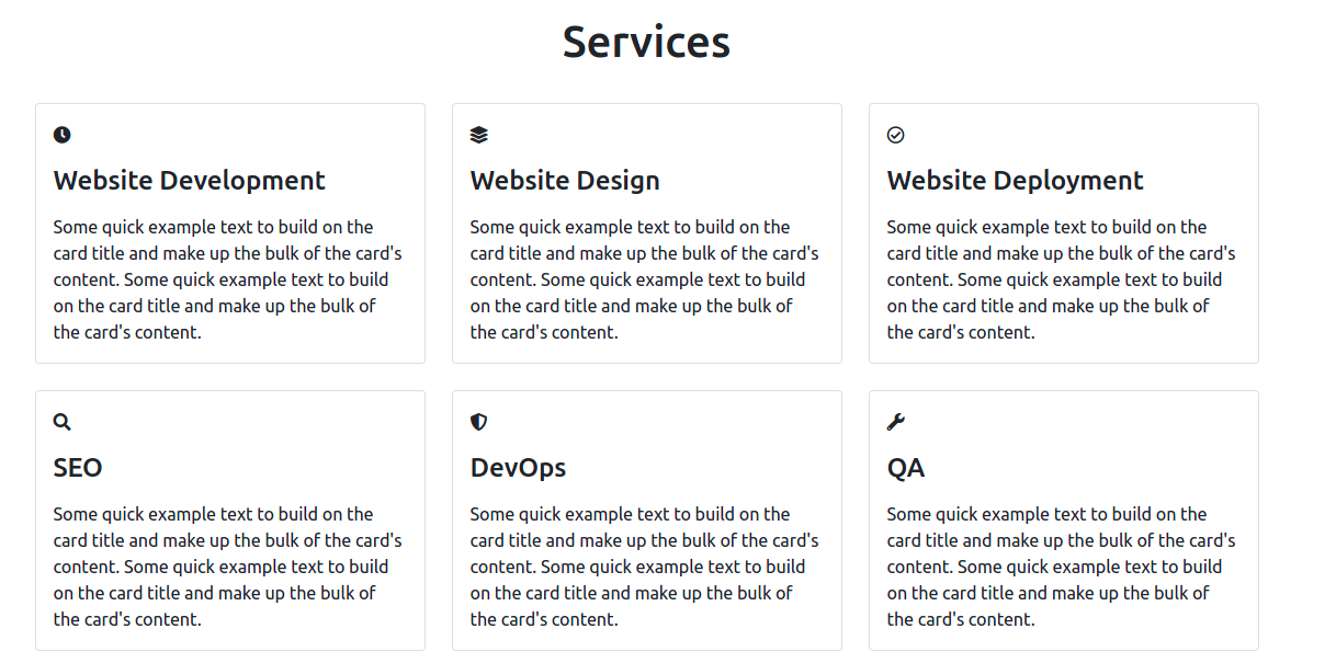
</section>由于该网站面向 Web 开发人员和设计人员,因此我列出了 Web 开发人员或设计人员可能提供的一些服务。
我们使用 Bootstrap 卡片来显示服务。我们的服务部分有 2 行和 3 列。对于宽度大于等于 992px 的大屏,三张卡片连续显示。对于宽度小于 992px 的屏幕,一行中只会显示一张卡片。
你可以在此处找到有关 Bootstrap 断点的更多信息。
此外,每张卡片中都添加了字体以使它们看起来更好。
如果没有 CSS,服务部分将如下所示:
所以,让我们添加一些 CSS 来增加字体图标的字体大小和卡片高度,并在用户将鼠标悬停在卡片上时添加一些额外的颜色。
/* services section css */
.servicesText.card {
    height: 280px;
    cursor: pointer;
  }
.servicesIcon {
    font-size: 36px;
    text-align: center;
    width: 100%;
}
.card-title {
    text-align: center;
}
.card:hover .servicesIcon {
    color: #008000;
}
.servicesText:hover {
    border: 1px solid #008000;
}
这就是我们的服务部分现在的样子:
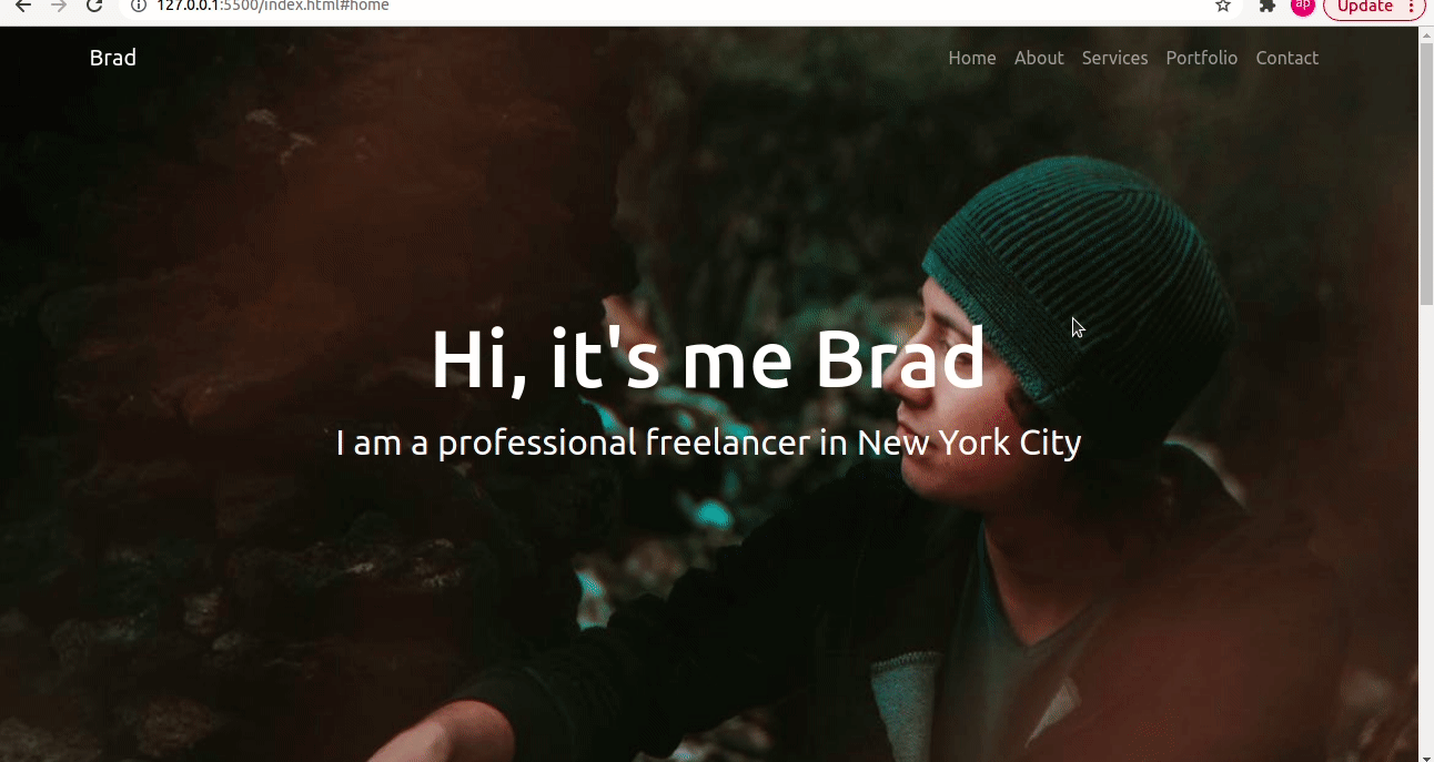
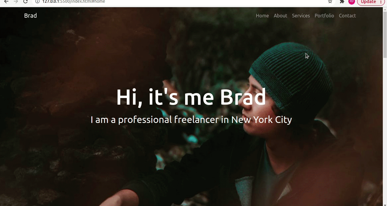
如何在页面滚动上向导航栏添加深色背景颜色
如果你查看上面的 GIF,你会发现导航栏在整个页面中都是透明的,这会导致可读性问题。所以让我们努力解决这个问题。
我们将编写一些 JavaScript 和 CSS 来解决这个问题。我们将添加一个 navbarDark 类,以便在页面滚动时为导航栏显示深色背景色。
为此,我们需要转到 script.js 文件并添加以下代码:
// add class navbarDark on navbar scroll
const header = document.querySelector('.navbar');

window.onscroll = function() {
    var top = window.scrollY;
    if(top >=100) {
        header.classList.add('navbarDark');
    }
    else {
        header.classList.remove('navbarDark');
    }
}
现在,让我们分解上面的代码:
- header 保存 nav 元素的值,querySelector 方法返回与 CSS 选择器匹配的第一个元素(在本例中为
.navbar)。 window.onscroll在滚动事件发生时触发。window.scrollY返回文档垂直滚动的像素数,并将其值分配给名为top的变量。- 如果
top的值大于等于100,则在 header 中添加一个navbarDark类。
让我们快速为 navbarDark 类添加 CSS。为此,请转到你的 style.css 文件并添加以下代码:
/* display background color black on navbar scroll */
.navbarScroll.navbarDark {
    background-color: black;
}
这是导航栏现在的样子:
如何创建作品集部分
这个部分包括你的最佳作品。人们可以看到你的能力,并且展示过去的出色工作肯定会吸引更多的潜在客户或招聘人员。因此,请仅在这个部分中添加你的最佳作品。
我们将使用 Bootstrap 卡片来展示作品集项目,将有 2 行,每行将有 3 列卡片。
这将是作品集部分的代码:
<!-- portfolio section-->
    <section id="portfolio">
        <div class="container mt-3">
            <h1 class="text-center">Portfolio</h1>
            <div class="row">
                <div class="col-lg-4 mt-4">
                    <div class="card">
                        <img class="card-img-top" src="images/portfolioImage1.jpg" alt="Card image" style="width:100%">
                        <div class="card-body">
                            <h4 class="card-title">YouTube Clone</h4>
                            <p class="card-text">Lorem Ipsum is simply dummy text of the printing and typesetting industry.</p>
                            <div class="text-center">
                                <a href="#" class="btn btn-success">Link</a>
                            </div>
                        </div>
                    </div>
                </div>

                <div class="col-lg-4 mt-4">
                    <div class="card portfolioContent">
                        <img class="card-img-top" src="images/portfolioImage4.jpg" alt="Card image" style="width:100%">
                        <div class="card-body">
                            <h4 class="card-title">Quiz App</h4>
                            <p class="card-text">Lorem Ipsum is simply dummy text of the printing and typesetting industry.</p>
                            <div class="text-center">
                                <a href="#" class="btn btn-success">Link</a>
                            </div>
                        </div>
                    </div>
                </div>

                <div class="col-lg-4 mt-4">
                    <div class="card portfolioContent">
                        <img class="card-img-top" src="images/portfolioImage3.jpg" alt="Card image" style="width:100%">
                        <div class="card-body">
                            <h4 class="card-title">Product Landing Page</h4>
                            <p class="card-text">Lorem Ipsum is simply dummy text of the printing and typesetting industry.</p>
                            <div class="text-center">
                                <a href="#" class="btn btn-success">Link</a>
                            </div>
                        </div>
                    </div>
                </div>
            </div>
            <br>
            <div class="row">
                <div class="col-lg-4 mt-4">
                    <div class="card portfolioContent">
                        <img class="card-img-top" src="images/portfolioImage4.jpg" alt="Card image" style="width:100%">
                        <div class="card-body">
                            <h4 class="card-title">Messaging Service</h4>
                            <p class="card-text">Lorem Ipsum is simply dummy text of the printing and typesetting industry.</p>
                            <div class="text-center">
                                <a href="#" class="btn btn-success">Link</a>
                            </div>
                        </div>
                    </div>
                </div>

                <div class="col-lg-4 mt-4">
                    <div class="card portfolioContent">
                        <img class="card-img-top" src="images/portfolioImage1.jpg" alt="Card image" style="width:100%">
                        <div class="card-body">
                            <h4 class="card-title">Twitter Clone</h4>
                            <p class="card-text">Lorem Ipsum is simply dummy text of the printing and typesetting industry.</p>
                            <div class="text-center">
                                <a href="#" class="btn btn-success">Link</a>
                            </div>
                        </div>
                    </div>
                </div>

                <div class="col-lg-4 mt-4">
                    <div class="card portfolioContent">
                        <img class="card-img-top" src="images/portfolioImage4.jpg" alt="Card image" style="width:100%">
                        <div class="card-body">
                            <h4 class="card-title">Blog App</h4>
                            <p class="card-text">Lorem Ipsum is simply dummy text of the printing and typesetting industry.</p>
                            <div class="text-center">
                                <a href="#" class="btn btn-success">Link</a>
                            </div>
                        </div>
                    </div>
                </div>
            </div>
    </section>
每张卡片都有图片、标题、描述和项目链接。对于断点宽度大于等于 992px 的大屏幕,连续显示三张卡片,但对于宽度小于 992px 的屏幕,仅连续显示一张卡片。
下面的 GIF 显示了作品集部分现在的样子:
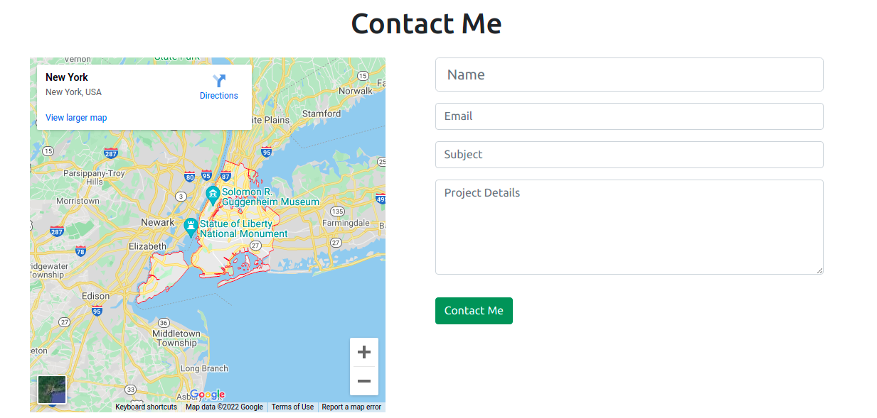
如何创建联系部分
你应该在此部分中包含你的联系信息,以便访问者在他们想雇用你时可以与你联系。
我们的联系部分将在单行中包含 2 列:用于位置的谷歌地图和联系表格。
要嵌入 Google 地图,你需要执行以下步骤:
- 访问 https://www.embed-map.com
- 输入你的位置
- 单击生成 HTML 代码按钮,该按钮将提供你的 Google 地图 HTML 代码
我们的代码将如下所示,其中包含联系表格:
<!-- contact section-->
    <section id="contact">
        <div class="container mt-3 contactContent">
            <h1 class="text-center">Contact Me</h1>

            <div class="row mt-4">
                <div class="col-lg-6">
                    <!-- to edit google map goto https://www.embed-map.com type your location, generate html code and copy the html  -->
                    <div style="max-width:100%;overflow:hidden;color:red;width:500px;height:500px;">
                        <div id="embedmap-canvas" style="height:100%; width:100%;max-width:100%;">
                            <iframe style="height:100%;width:100%;border:0;" frameborder="0" src="https://www.google.com/maps/embed/v1/place?q=new+york&key=AIzaSyBFw0Qbyq9zTFTd-tUY6dZWTgaQzuU17R8">
                            </iframe>
                        </div>
                        <a class="googlemaps-html" href="https://www.embed-map.com" id="get-data-forembedmap">https://www.embed-map.com</a>
                        <style>#embedmap-canvas img{max-width:none!important;background:none!important;font-size: inherit;font-weight:inherit;}
                        </style>
                    </div>
                </div>

                <div class="col-lg-6">
                    <!-- form fields -->
                    <form>
                        <input type="text" class="form-control form-control-lg" placeholder="Name">
                        <input type="email" class="form-control mt-3" placeholder="Email">
                        <input type="text" class="form-control mt-3" placeholder="Subject">
                        <div class="mb-3 mt-3">
                            <textarea class="form-control" rows="5" id="comment" name="text" placeholder="Project Details"></textarea>
                        </div>
                    </form>
                    <button type="button" class="btn btn-success mt-3">Contact Me</button>

                </div>

            </div>
        </div>
    </section>
第一列将显示谷歌地图,下一列将显示联系表。
该表单有四个不同的字段:姓名、电子邮件、主题和项目详细信息。表单本身不提交请求。你需要将其与任何后端语言连接起来。或者,你可以简单地使用 Netlify 表单或 Formspree 表单。
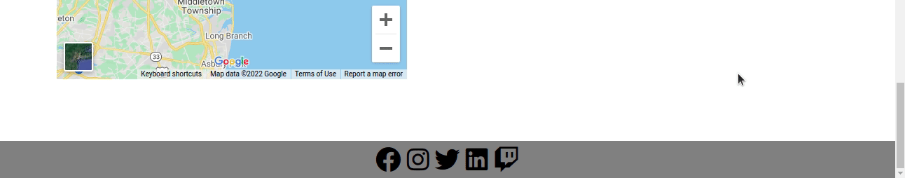
这是联系人部分的样子:
如何创建页脚部分
现在我们来到了这篇文章的最后一部分,即页脚部分。我们已经在 index.html 文件中添加了指向字体 awesome CDN 的链接。
在页脚中,我们将通过 font awesome 图标添加指向社交媒体的链接。
 <!-- footer section-->
    <footer id="footer">
        <div class="container-fluid">
            <!-- social media icons -->
            <div class="social-icons mt-4">
                <a href="https://www.facebook.com/" target="_blank"><i class="fab fa-facebook"></i></a>
                <a href="https://www.instagram.com/" target="_blank"><i class="fab fa-instagram"></i></a>
                <a href="https://www.twitter.com/" target="_blank"><i class="fab fa-twitter"></i></a>
                <a href="https://www.linkedin.com/" target="_blank"><i class="fab fa-linkedin"></i></a>
                <a href="https://www.twitch.tv/" target="_blank"><i class="fab fa-twitch"></i></a>
            </div>
        </div>
    </footer>
如果没有 CSS,我们的页脚将如下所示:

因此,让我们使用以下代码为页脚添加一些样式:
/* social media icons styling */
.social-icons {
    font-size: 36px;
    cursor: pointer;
}
.fa-facebook:hover,.fa-instagram:hover,.fa-twitter:hover,.fa-linkedin:hover, .fa-twitch:hover {
    color: #008000;
}
.fab {
    color: #000000;
}
/* footer styling */
#footer {
    background-color: #808080;
    text-align: center;
}
图标现在显示在中心,带有悬停效果,我们可以在下面的 GIF 文件中看到。
最后润色
为了在所有部分之间添加一些间距,让我们添加更多样式:
/* spacing on all sections */
#about, #services, #portfolio, #contact {
    margin-top: 4rem;
    padding-top: 4rem;
}
#contact {
    padding-bottom: 4rem;
}
现在我们已经完成了完整的作品集网站的制作。
你可以在这里找到这个项目的完整源代码。
总结
这就是如何使用 HTML、CSS、JavaScript 和 Bootstrap5 创建一个完整的响应式作品集网站。
在这篇文章中,我们看到了 Web 开发者和设计师创建一个作品集网站的一些好处。我们把整个网站分为不同的部分,并在创建过程中单独讨论了每一个部分。
你可以根据自己的使用情况来定制这个网站。
希望这篇文章对你有帮助,祝你编程愉快!
你可以在 Twitter 上关注我,了解有关 Web 开发的更多内容。