
By Sampurna Chapagain
If you are a web developer or a web designer, it is essential for you to have a portfolio website. It lets you provide information about yourself and showcase your best work with your relevant skills and experience.
In this blog post, I will discuss some of the benefits of creating a portfolio website. Then I'll show you how to create a beautiful responsive portfolio website for yourself using HTML, CSS, JavaScript and Bootstrap version 5.
Here's an interactive scrim about how to create a portfolio website using HTML, CSS, JS, and Bootstrap 5:
Table Of Contents
- Benefits of having a portfolio website
- What is Bootstrap?
- Folder Structure
- How to Add a Navigation Menu to Your Portfolio
- How to Add a Hero Header to the Portfolio
- How to Make the About Section
- How to Make the Services Section
- How to Add Dark Background Color to Navbar on Page Scroll
- How to Build the Portfolio Section
- How to Build the Contact Section
- How to Build the Footer Section
- Adding Final Touches
- Conclusion
Benefits of having a Portfolio Website
Having a portfolio website has several benefits, including:
- it provides a platform to showcase your relevant skills and experience
- it shows your personality
- it lets hiring managers find you instead of you reaching out to them
- you are easily searchable on search engines like Google
What is Bootstrap?
Bootstrap is a popular front-end CSS framework which is used to develop responsive and mobile friendly websites. The latest release of Bootstrap is version 5. You can find the official documentation of Bootstrap 5 here.
Folder Structure
We will now start working on creating the portfolio website.
First, let's create the folder structure. You can get the project starter files on GitHub. Also, you can visit here to see the live demo of this project.
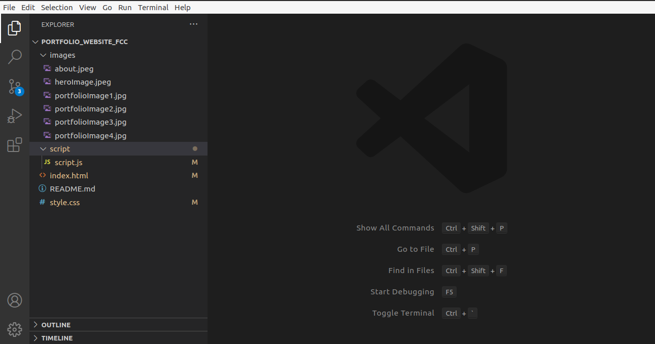 Project Folder Structure
The folder structure consists of index.html, style.css, and script.js files and an images folder. We'll write all CSS in the style.css file and the JavaScript in the script.js file .
In the index.html file, you can see the HTML boilerplate code with the Bootstrap CDN, font awesome kit, and a link to the external style sheet and JavaScript.
Here, the script.js file is loaded after loading all the HTML code.
How to Add a Navigation Menu to Your Portfolio
Now, let's work on adding a navigation menu in our project. It will help visitors find the relevant info they're looking for.
We will use Bootstrap's fixed-top class in nav element to keep the navbar at the top of the page. The navbar also has a navbar-brand class where we keep the name of the person as a brand.
<nav class="navbar navbar-expand-lg fixed-top navbarScroll">
        <div class="container">
            <a class="navbar-brand" href="#">Brad</a>
            <button class="navbar-toggler" type="button" data-bs-toggle="collapse" data-bs-target="#navbarSupportedContent" aria-controls="navbarSupportedContent" aria-expanded="false" aria-label="Toggle navigation">
                <span class="navbar-toggler-icon"></span>
            </button>
            <div class="collapse navbar-collapse" id="navbarSupportedContent">
                <ul class="navbar-nav ms-auto">
                    <li class="nav-item active">
                        <a class="nav-link" href="#home">Home</a>
                    </li>
                    <li class="nav-item">
                        <a class="nav-link" href="#about">About</a>
                    </li>
                    <li class="nav-item">
                        <a class="nav-link" href="#services">Services</a>
                    </li>
                    <li class="nav-item">
                        <a class="nav-link" href="#portfolio">Portfolio</a>
                    </li>
                    <li class="nav-item">
                        <a class="nav-link" href="#contact">Contact</a>
                    </li>
                </ul>

            </div>
        </div>
    </nav>
The navbar has the following features:
- It has six links: home, about, services, portfolio, contact, and footer
- It has a transparent background. We will add a dark background on page scrolling later.
- It toggles on smaller devices
You can find more details regarding Bootstrap 5 navbar features here.
However, the navbar has a problem while scrolling. It's fully transparent throughout the page which causes readability issues. We will fix this issue after we complete the Services section to make you understand the issue properly.
How to Add a Hero Header to the Portfolio
Now, we will be adding a hero image with some text in the center. A hero image is a web design term which refers to a high quality full width image that displays the company or individual's main goals, a representative image, photo, or other eye-catching elements. It helps attract users to your site.
 <!-- main banner -->
    <section class="bgimage" id="home">
        <div class="container-fluid">
            <div class="row">
            <div class="col-lg-12 col-md-12 col-sm-12 col-xs-12 hero-text">
                <h2 class="hero_title">Hi, it's me Brad</h2>
                <p class="hero_desc">I am a professional freelancer in New York City</p>
            </div>
            </div>
        </div>
    </section>
Also, let's add the CSS for the above code in the style.css file:
/* hero background image */
.bgimage {
    height:100vh;
    background: url('images/heroImage.jpeg');
    background-size:cover;
    position:relative;
}
/* text css above hero image*/
.hero_title {
    font-size: 4.5rem;
}
.hero_desc {
    font-size: 2rem;
}
.hero-text {
    text-align: center;
    position: absolute;
    top: 50%;
    left: 50%;
    transform: translate(-50%, -50%);
    color: white;
}
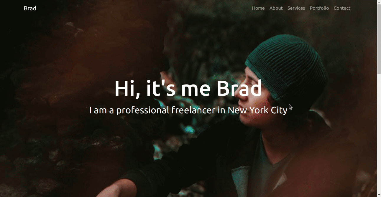
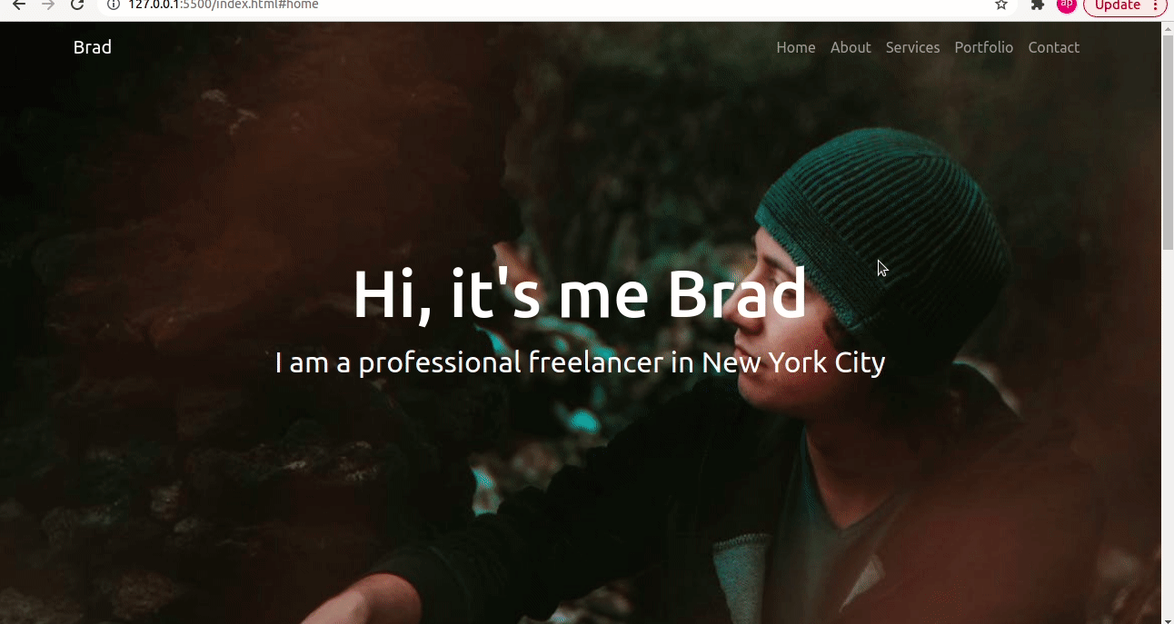
Here we can see that the section has an id named bgimage which is responsible for displaying the background hero image with full width. It also displays some text in the center above the background image with the help of the above CSS.
This is how the site looks so far with the navbar and the hero section:
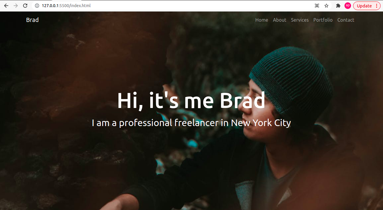 Hero Image with Navbar
How to Make the About Section
The About page contains important information about you and your background. Visitors to your portfolio site can get to know you through the information you provide in this page.
We will be adding an image to the left side of the row, and on the right side we will add our quick introduction in this section. Let's demonstrate it using the code below:
<!-- about section-->
    <section id="about">
        <div class="container mt-4 pt-4">
            <h1 class="text-center">About Me</h1>
            <div class="row mt-4">
                <div class="col-lg-4">
                    <img src="images/about.jpeg" class= "imageAboutPage" alt="">
                </div>

                <div class="col-lg-8">
                    <p> Lorem Ipsum has been the industry's standard dummy text ever since the 1500s, when an unknown printer took a galley of type and scrambled it to make a type specimen book. It has survived not only five centuries, but also the leap into electronic typesetting, remaining essentially unchanged

                    </p>
                    <div class="row mt-3">
                        <div class="col-md-6">
                            <ul>
                                <li>Name: David Parker</li>
                                <li>Age: 28</li>
                                <li>Occupation: Web Developer</li>

                            </ul>
                        </div>
                    </div>
                    <div class="row mt-3">
                        <p> Lorem Ipsum has been the industry's standard dummy text ever since the 1500s, when an unknown printer took a galley of type and scrambled it to make a type specimen book. It has survived not only five centuries, but also the leap into electronic typesetting, remaining essentially unchanged.
                            Lorem Ipsum has been the industry's standard dummy text ever since the 1500s, when an unknown printer took a galley of type and scrambled it to make a type specimen book. It has survived not only five centuries, but also the leap into electronic typesetting, remaining essentially unchanged.
                        </p>
                    </div>
                </div>
            </div>
    </section>
Let's add some CSS for the left side image:
/* about section image css */
.imageAboutPage {
    width: 100%;
}
This will create an about section. You can modify the content based on your use cases. We have added classes named mt-4 and pt-4 with container class which will set the margin top and padding top to 1.5 rem.
The row has two columns. One has the col-lg-4 class for displaying the image which will occupy the left column with a 4-part grid for large screens.
The next column is assigned a class of col-lg-8 which will occupy the right column with an 8-part grid for larger screens. For medium and small screens they will overlap with each other which we can see in the below GIF file:
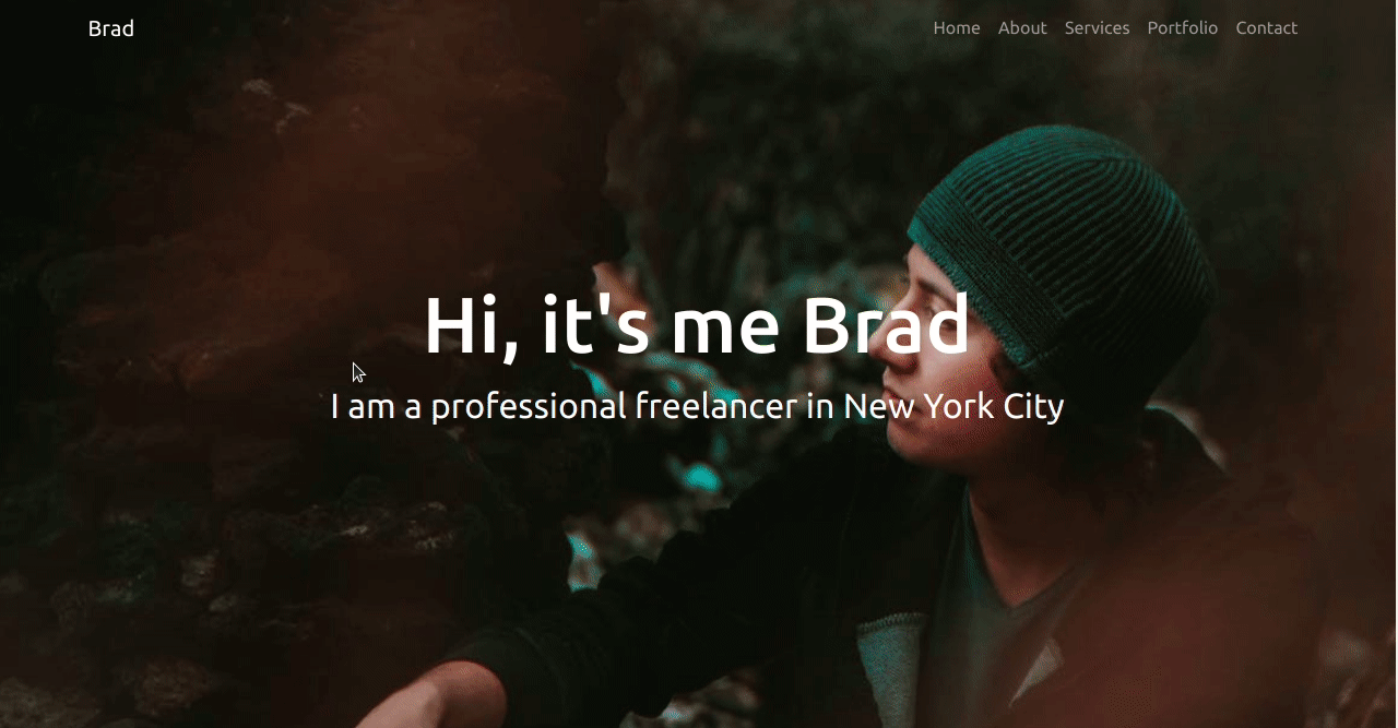 About Section
How to Make the Services Section
This section helps convert website visitors into potential clients. This is where you explain what specific services you offer, and where you niche down your offered services.
Let's add the code for this section and describe it below:
<!-- services section-->
    <section id="services">
        <div class="container">
            <h1 class="text-center">Services</h1>
            <div class="row">
                <div class="col-lg-4 mt-4">
                    <div class="card servicesText">
                        <div class="card-body">
                            <i class="fas servicesIcon fa-clock"></i>
                            <h4 class="card-title mt-3">Website Development</h4>
                            <p class="card-text mt-3">Some quick example text to build on the card title and make up the bulk of the card's content.
                                Some quick example text to build on the card title and make up the bulk of the card's content.
                            </p>
                        </div>
                    </div>
                </div>
                <div class="col-lg-4 mt-4">
                    <div class="card servicesText">
                        <div class="card-body">
                            <i class='fas servicesIcon fa-layer-group'></i>
                            <h4 class="card-title mt-3">Website Design</h4>
                            <p class="card-text mt-3">Some quick example text to build on the card title and make up the bulk of the card's content.
                                Some quick example text to build on the card title and make up the bulk of the card's content.
                            </p>
                        </div>
                    </div>
                </div>

                <div class="col-lg-4 mt-4">
                    <div class="card servicesText">
                        <div class="card-body">
                            <i class='far servicesIcon fa-check-circle'></i>
                            <h4 class="card-title mt-3">Website Deployment</h4>
                            <p class="card-text mt-3">Some quick example text to build on the card title and make up the bulk of the card's content.
                                Some quick example text to build on the card title and make up the bulk of the card's content.
                            </p>
                        </div>
                    </div>
                </div>
            </div>

            <div class="row">
                <div class="col-lg-4 mt-4">
                    <div class="card servicesText">
                        <div class="card-body">
                            <i class='fas servicesIcon fa-search'></i>
                            <h4 class="card-title mt-3">SEO</h4>
                            <p class="card-text mt-3">Some quick example text to build on the card title and make up the bulk of the card's content.
                                Some quick example text to build on the card title and make up the bulk of the card's content.
                            </p>
                        </div>
                    </div>
                </div>

                <div class="col-lg-4 mt-4">
                    <div class="card servicesText">
                        <div class="card-body">
                            <i class='fas servicesIcon fa-shield-alt'></i>
                            <h4 class="card-title mt-3">DevOps</h4>
                            <p class="card-text mt-3">Some quick example text to build on the card title and make up the bulk of the card's content.
                                Some quick example text to build on the card title and make up the bulk of the card's content.
                            </p>
                        </div>
                    </div>
                </div>

                <div class="col-lg-4 mt-4">
                    <div class="card servicesText">
                        <div class="card-body">
                            <i class='fas servicesIcon fa-wrench'></i>
                            <h4 class="card-title mt-3">QA</h4>
                            <p class="card-text mt-3">Some quick example text to build on the card title and make up the bulk of the card's content.
                                Some quick example text to build on the card title and make up the bulk of the card's content.
                            </p>
                        </div>
                    </div>
                </div>
            </div>
        </div>
    </section>
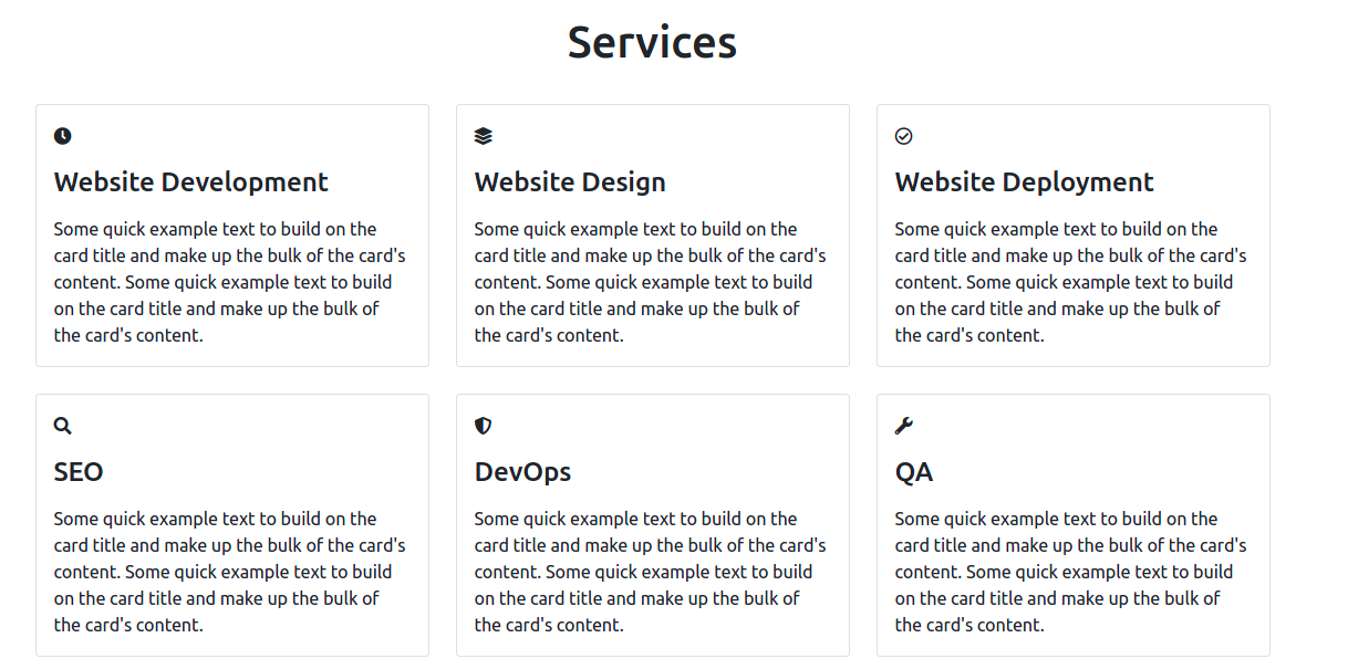
Since this website is targeted towards web developers and designers, I've included some of the services which a web developer or designer might offer.
We have used bootstrap cards to display services. Our services section has 2 rows and 3 columns each. For large screens with a width greater than or equal to 992px, three cards are displayed in a row. For screens less than 992px wide, only a single card is displayed in a row.
You can find more about bootstrap breakpoints here.
Also, there are fonts added in each card to make them look better.
Without CSS, the services section would look like this :
So, let's add some CSS to increase the font icon font size and card height and add some extra color when a user hovers over a card.
/* services section css */
.servicesText.card {
    height: 280px;
    cursor: pointer;
  }
.servicesIcon {
    font-size: 36px;
    text-align: center;
    width: 100%;
}
.card-title {
    text-align: center;
}
.card:hover .servicesIcon {
    color: #008000;
}
.servicesText:hover {
    border: 1px solid #008000;
}
This is how our services section looks now:
 Services
How to Add Dark Background Color to Navbar on Page Scroll
If you look into the above gif properly you will see that the navbar is transparent throughout the page which causes readability issues. So let's work on fixing this issue.
We will write some JavaScript and CSS in order to resolve this problem. We will add a navbarDark class in order to show a dark background color for the navbar on page scroll.
For that we need to go to the script.js file and add the following code:
// add class navbarDark on navbar scroll
const header = document.querySelector('.navbar');

window.onscroll = function() {
    var top = window.scrollY;
    if(top >=100) {
        header.classList.add('navbarDark');
    }
    else {
        header.classList.remove('navbarDark');
    }
}
Now, let's break down the above code:
- The header holds the value of the nav element since the querySelector method returns the first element that matches the CSS selector (which is
.navbarin this case). window.onscrollfires up when the scroll event happens.window.scrollYreturns the number of pixels that the document is scrolled vertically and its value is assigned to a variable namedtop.- If the value of
topis greater than or equal to 100, it adds a class ofnavbarDarkto the header.
Let's quickly add CSS for the navbarDark class. For that, go to your style.css file and add the following code:
/* display background color black on navbar scroll */
.navbarScroll.navbarDark {
    background-color: black;
}
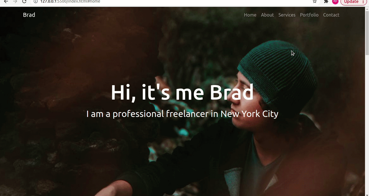
This is how the navbar will look now:
 Dark background color on Navbar on page scroll
How to Build the Portfolio Section
This section includes your best work. People can see what you are capable of doing, and showcasing strong past work will definitely attract more potential clients or recruiters. So only add your best work in this section.
We will use Bootstrap cards to display the portfolio projects. There will be 2 rows and each row will have 3 columns of cards.
This will be the code for portfolio section:
<!-- portfolio section-->
    <section id="portfolio">
        <div class="container mt-3">
            <h1 class="text-center">Portfolio</h1>
            <div class="row">
                <div class="col-lg-4 mt-4">
                    <div class="card">
                        <img class="card-img-top" src="images/portfolioImage1.jpg" alt="Card image" style="width:100%">
                        <div class="card-body">
                            <h4 class="card-title">YouTube Clone</h4>
                            <p class="card-text">Lorem Ipsum is simply dummy text of the printing and typesetting industry.</p>
                            <div class="text-center">
                                <a href="#" class="btn btn-success">Link</a>
                            </div>
                        </div>
                    </div>
                </div>

                <div class="col-lg-4 mt-4">
                    <div class="card portfolioContent">
                        <img class="card-img-top" src="images/portfolioImage4.jpg" alt="Card image" style="width:100%">
                        <div class="card-body">
                            <h4 class="card-title">Quiz App</h4>
                            <p class="card-text">Lorem Ipsum is simply dummy text of the printing and typesetting industry.</p>
                            <div class="text-center">
                                <a href="#" class="btn btn-success">Link</a>
                            </div>
                        </div>
                    </div>
                </div>

                <div class="col-lg-4 mt-4">
                    <div class="card portfolioContent">
                        <img class="card-img-top" src="images/portfolioImage3.jpg" alt="Card image" style="width:100%">
                        <div class="card-body">
                            <h4 class="card-title">Product Landing Page</h4>
                            <p class="card-text">Lorem Ipsum is simply dummy text of the printing and typesetting industry.</p>
                            <div class="text-center">
                                <a href="#" class="btn btn-success">Link</a>
                            </div>
                        </div>
                    </div>
                </div>
            </div>
            <br>
            <div class="row">
                <div class="col-lg-4 mt-4">
                    <div class="card portfolioContent">
                        <img class="card-img-top" src="images/portfolioImage4.jpg" alt="Card image" style="width:100%">
                        <div class="card-body">
                            <h4 class="card-title">Messaging Service</h4>
                            <p class="card-text">Lorem Ipsum is simply dummy text of the printing and typesetting industry.</p>
                            <div class="text-center">
                                <a href="#" class="btn btn-success">Link</a>
                            </div>
                        </div>
                    </div>
                </div>

                <div class="col-lg-4 mt-4">
                    <div class="card portfolioContent">
                        <img class="card-img-top" src="images/portfolioImage1.jpg" alt="Card image" style="width:100%">
                        <div class="card-body">
                            <h4 class="card-title">Twitter Clone</h4>
                            <p class="card-text">Lorem Ipsum is simply dummy text of the printing and typesetting industry.</p>
                            <div class="text-center">
                                <a href="#" class="btn btn-success">Link</a>
                            </div>
                        </div>
                    </div>
                </div>

                <div class="col-lg-4 mt-4">
                    <div class="card portfolioContent">
                        <img class="card-img-top" src="images/portfolioImage4.jpg" alt="Card image" style="width:100%">
                        <div class="card-body">
                            <h4 class="card-title">Blog App</h4>
                            <p class="card-text">Lorem Ipsum is simply dummy text of the printing and typesetting industry.</p>
                            <div class="text-center">
                                <a href="#" class="btn btn-success">Link</a>
                            </div>
                        </div>
                    </div>
                </div>
            </div>
    </section>
Each card has an image, title, description, and link to the projects. Three cards are displayed in a row for large screens which have breakpoints of ≥ 992px wide, but for screens < 992px wide only a single card is displayed in a row.
The GIF below shows how the portfolio section looks now:
 Portfolio
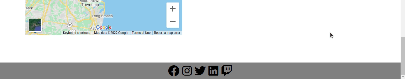
How to Build the Contact Section
You should include your contact information in this section so that visitors can contact you if they want to hire you.
Our contact section will include 2 columns in a single row: Google maps for location and a contact form.
In order to embed the Google map, you need to follow these steps:
- go to https://www.embed-map.com
- enter your location
- click on the Generate HTML Code button which will provide your Google Map HTML Code
Our code will look like this with the contact form included:
<!-- contact section-->
    <section id="contact">
        <div class="container mt-3 contactContent">
            <h1 class="text-center">Contact Me</h1>

            <div class="row mt-4">
                <div class="col-lg-6">
                    <!-- to edit google map goto https://www.embed-map.com type your location, generate html code and copy the html  -->
                    <div style="max-width:100%;overflow:hidden;color:red;width:500px;height:500px;">
                        <div id="embedmap-canvas" style="height:100%; width:100%;max-width:100%;">
                            <iframe style="height:100%;width:100%;border:0;" frameborder="0" src="https://www.google.com/maps/embed/v1/place?q=new+york&key=AIzaSyBFw0Qbyq9zTFTd-tUY6dZWTgaQzuU17R8">
                            </iframe>
                        </div>
                        <a class="googlemaps-html" href="https://www.embed-map.com" id="get-data-forembedmap">https://www.embed-map.com</a>
                        <style>#embedmap-canvas img{max-width:none!important;background:none!important;font-size: inherit;font-weight:inherit;}
                        </style>
                    </div>
                </div>

                <div class="col-lg-6">
                    <!-- form fields -->
                    <form>
                        <input type="text" class="form-control form-control-lg" placeholder="Name">
                        <input type="email" class="form-control mt-3" placeholder="Email">
                        <input type="text" class="form-control mt-3" placeholder="Subject">
                        <div class="mb-3 mt-3">
                            <textarea class="form-control" rows="5" id="comment" name="text" placeholder="Project Details"></textarea>
                        </div>
                    </form>
                    <button type="button" class="btn btn-success mt-3">Contact Me</button>

                </div>

            </div>
        </div>
    </section>
The first column will display the Google map and the next one will display the contact form.
The form has four different form fields: name, email, subject and project details. The form doesn't submit the request itself. You will need to connect it with any back-end language. Or, you can simply use Netlify Form or Formspree form for this.
This is how the contact section will appear:
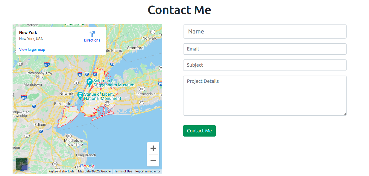 Contact Section
How to Build the Footer Section
Now we have come to the last section of this post, which is the footer section. We have already added a link to the font awesome CDN in the index.html file.
In the Footer, we will add links to our social media through font awesome icons.
 <!-- footer section-->
    <footer id="footer">
        <div class="container-fluid">
            <!-- social media icons -->
            <div class="social-icons mt-4">
                <a href="https://www.facebook.com/" target="_blank"><i class="fab fa-facebook"></i></a>
                <a href="https://www.instagram.com/" target="_blank"><i class="fab fa-instagram"></i></a>
                <a href="https://www.twitter.com/" target="_blank"><i class="fab fa-twitter"></i></a>
                <a href="https://www.linkedin.com/" target="_blank"><i class="fab fa-linkedin"></i></a>
                <a href="https://www.twitch.tv/" target="_blank"><i class="fab fa-twitch"></i></a>
            </div>
        </div>
    </footer>
Without the CSS, our footer will look like this:
 footer without styling
So let's add some styling to the footer with this code:
/* social media icons styling */
.social-icons {
    font-size: 36px;
    cursor: pointer;
}
.fa-facebook:hover,.fa-instagram:hover,.fa-twitter:hover,.fa-linkedin:hover, .fa-twitch:hover {
    color: #008000;
}
.fab {
    color: #000000;
}
/* footer styling */
#footer {
    background-color: #808080;
    text-align: center;
}
The icons are now displayed in the center with a hover effect which we can see in the below GIF file.
 Footer
Final Touches
In order to add some spacing between all the sections, let's add some more styling:
/* spacing on all sections */
#about, #services, #portfolio, #contact {
    margin-top: 4rem;
    padding-top: 4rem;
}
#contact {
    padding-bottom: 4rem;
}
Now we're done making our complete portfolio website.
You can find the full source code of this project here.
Conclusion
This is how you can create a complete responsive portfolio website using HTML, CSS, JavaScript, and Bootstrap 5 .
In this blog post we saw some of the benefits of creating a portfolio website for web developers and designers. We divided the whole website into different sections and discussed each one individually as we built it.
You can customize this website based on your own use cases.
I hope you found this post useful.
Happy Coding!
You can find me on Twitter for daily content regarding Web development.