

In this tutorial, I'll teach you how to use the react-data-table-component library in your React projects. You'll learn how to render a table that has features such as pagination, searching/filtering, and sorting.
I'll walk you through each step, from setting up a React and TypeScript project with Vite to using the react-data-table-component library to render a table.
To follow along with this tutorial, there are a few prerequisites:
- A basic understanding of React and TypeScript
- Basic knowledge of Bootstrap, which we'll use for styling
- For Windows OS users, know how to use the PowerShell terminal (as you'll need an interactive terminal to create the project with Vite)
- Node v20.11.1 installed
- npm v10.2.4 installed
- A code editor such as Visual Studio Code (VS Code) or Atom
Let's start creating the project!
What will we build
By the end of this tutorial, you will have built a table that displays a person's ID, name, height, and eye color.
The table will also have a search bar where users can search for a person based on the value of any of the four properties mentioned above.
Each row in the table will be selectable and each column will be sortable when the column header is clicked by a user.
1. Create a React and TypeScript Project
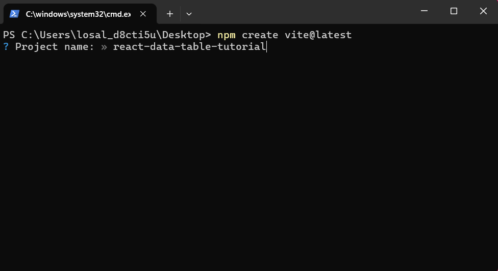
In the command line, create the project with the command below:
npm create vite@latestName the project react-data-table-tutorial .
Navigate to React with the up and down keys to select React. Choose React as the library you're going to use.
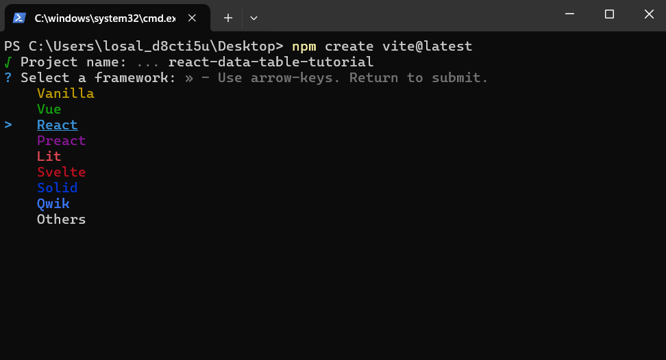
Similar to the step above, navigate to TypeScript and choose it as the language to use.
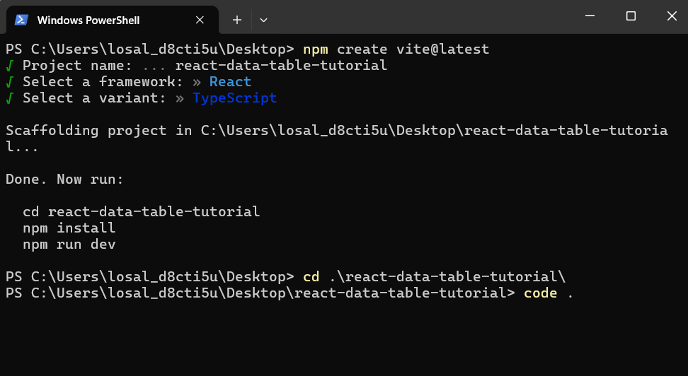
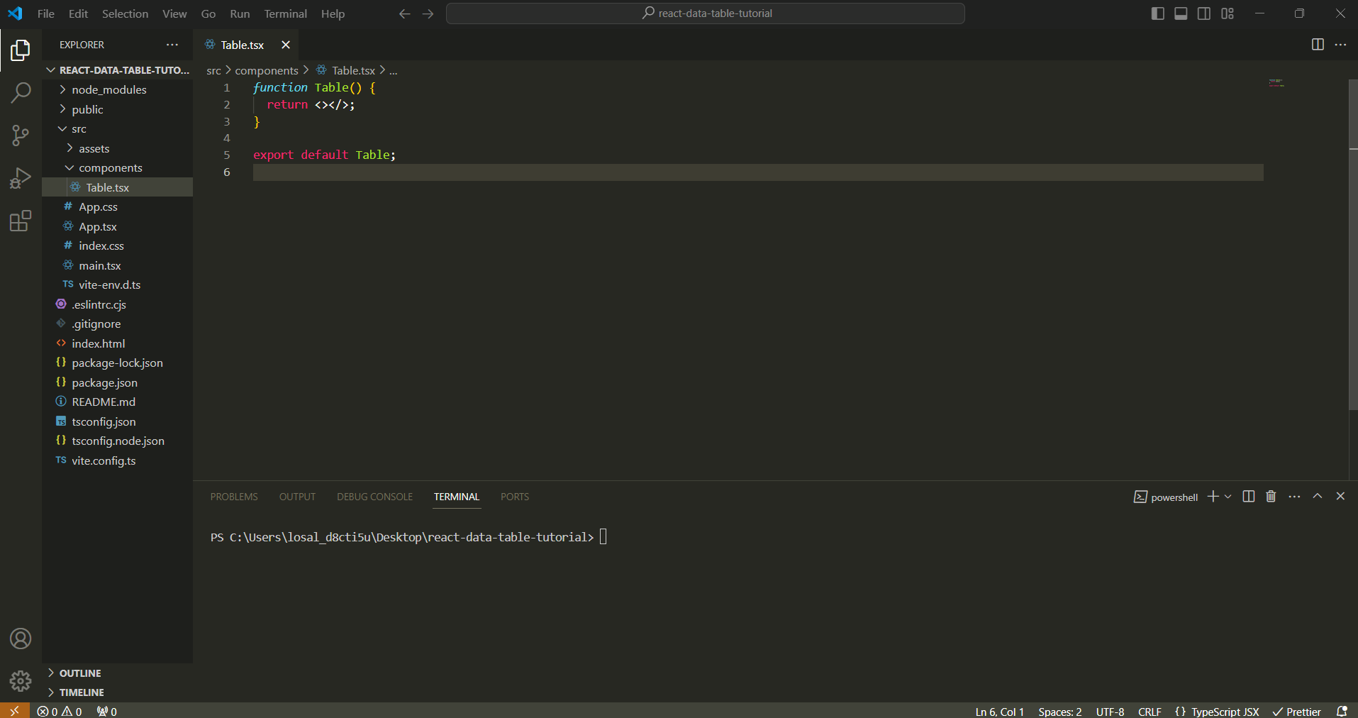
The next step is to change directories into the project's folder. Once you've done that, open the project in your code editor as seen in Figure 1.2 below. I'll be using the VS Code editor in this tutorial.
2. Remove the Default Code Set by React
This step is just to remove any default code and stylings in the files found in the src folder.
First, remove all default styling in the App.css file and replace it with the stylings below.
body {
    background-color: white;
    padding: 160px 500px;
}Then remove the following from the App.tsx file:
- the imported statements of the
useStatehook,reactLogo, and theviteLogo. - The destructured array and
useStatehook for the count variable andsetCountfunction. - The returned JSX wrapped within the fragment of the
Appcomponent.
The App component should look like the code-block below after all of those changes:
import './App.css';

function App(){
	return <></>;
}

export default App;3. Install the Libraries We'll Need
In the project, you will need to install a few libraries:
- styled-components v3.23+
- react-data-table-component v16.8.0+
- Bootstrap v5.3.3
You will need to install the styled-components library to use with the react-data-table-component library.
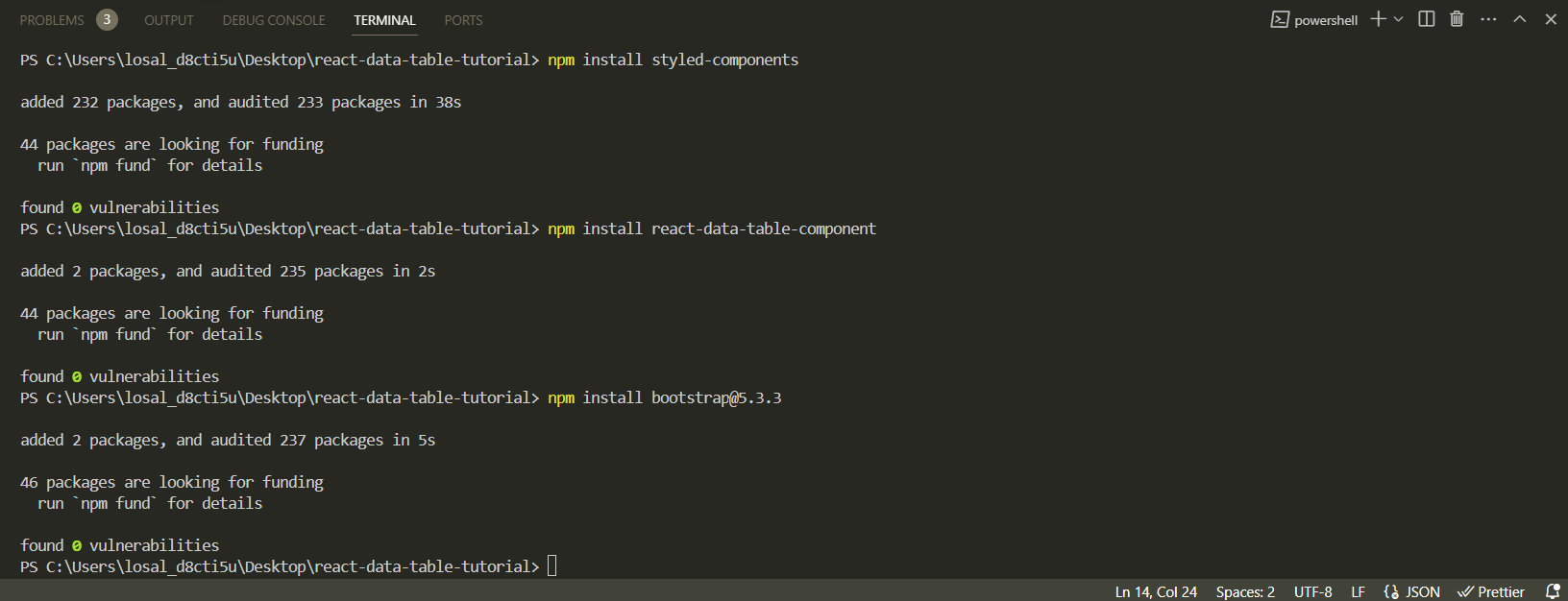
In the command line, install all of these by using the commands below:
npm install styled-components
npm install react-data-table-components
npm install bootstrap@5.3.3
The installed libraries are listed under dependencies in the package.json file.
{
   // rest of the code in the file
    "dependencies": {
        "boostrap": "^5.3.3",
        "react": "^18.2.0",
        "react-data-table-component": "^7.6.2",
        "react-dom": "^18.2.0",
        "styled-components": "^6.1.8",
    }
    // rest of the code in the file
}4. Import Bootstrap in the App Component
In the App.tsx file, import the Bootstrap library at the top of the file.
This will allow us to use Bootstrap stylings throughout the project.
import "./App.css";
import "bootstrap/dist/js/bootstrap.bundle.min.js";

function App(){
   return <></>;
}

export default App;5. Create a Table Component
In the src folder, create a sub-directory and name it components. By convention, this is to hold all of the components of the project.
In the components folder, create a file called Table.tsx. This is for our Table component.
Create a function component called Table.
6. Import the react-data-table-component Library to Start Using it
Import the react-data-table-component library into the Table component.
import DataTable from "react-data-table-component";

function Table(){
	return <></>;
}

export default Table;7. Create the Table in the Table Component
Create a <div> container within the fragment and add Bootstrap styling of container and my-5 to place the table in the center of the page.
Add the DataTable component as the child of the <div> container.
import DataTable from 'react-data-table-component';

function Table(){
	return (
    	<>
        	<div className="container my-5">
            	<DataTable />
            </div>
        </>
    );
}DataTable component as a child of the div container.Pass the columns and rows of the table as props to the DataTable component.
The column headers of the table are objects that will be stored in an array. The rows of the table will also be stored in a similar way. The array of objects for both will have these structures:
const columns = [
    {
        name: "ID",
        selector: row => row.id
    },
    {
        name: "Full Name",
        selector: row => row.fullName
    },
    {
        name: "Height",
        selector: row => row.height
    },
    {
        name: "Weight",
        selector: row => row.weight
    },
];
const rows = [
    {
    	id: 1,
        fullName: "John Doe",
        height: "1.75m",
        weight: "89kg",
    },
    {
    	id: 2,
        fullName: "Jane Doe",
        height: "1.64m",
        weight: "55kg",
    },
    {
    	id: 3,
        fullName: "Sheera Maine",
        height: "1.69m",
        weight: "74kg",
    },
];
These constants are then passed into the DataTable component as such:
<DataTable columns={columns} data={rows} />Create a columns constant that is an array of objects that has four columns headers for personID, fullName, height, and eyeColor.
Create a rows constant that is an array of objects that has 15 objects which is equivalent to data for 15 people.
Pass the two constants into their respective props in the DataTable component as seen in the next code-block.
function Table(){
	const columns = [
    	{
            name: "ID",
            selector: (row) => row.personID,
        },
        {
            name: "Full Name",
            selector: (row) => row.fullName,
        },
        {
            name: "Height",
            selector: (row) => row.height,
        },
        {
            name: "eyeColor",
            selector: (row) => row.eyeColor,
        },
    ];

    const rows = [
    	{
           personID: 1,
           fullName: "Kate Shein",
           height: "1.79m",
           eyeColor: "blue",
        },
        //....remaining objects for the 2nd to 14th person
        {
           personID: 15,
           fullName: "Isabella Thompson",
           height: "1.79m",
           eyeColor: "blue",
        },
    ];
}columns and rows constants & passing them as props to the DataTable component in the Table componentYou will also add the fixedHeader prop to the DataTable component to keep the column header fixed when a user scrolls down the table that has more than 10 records.
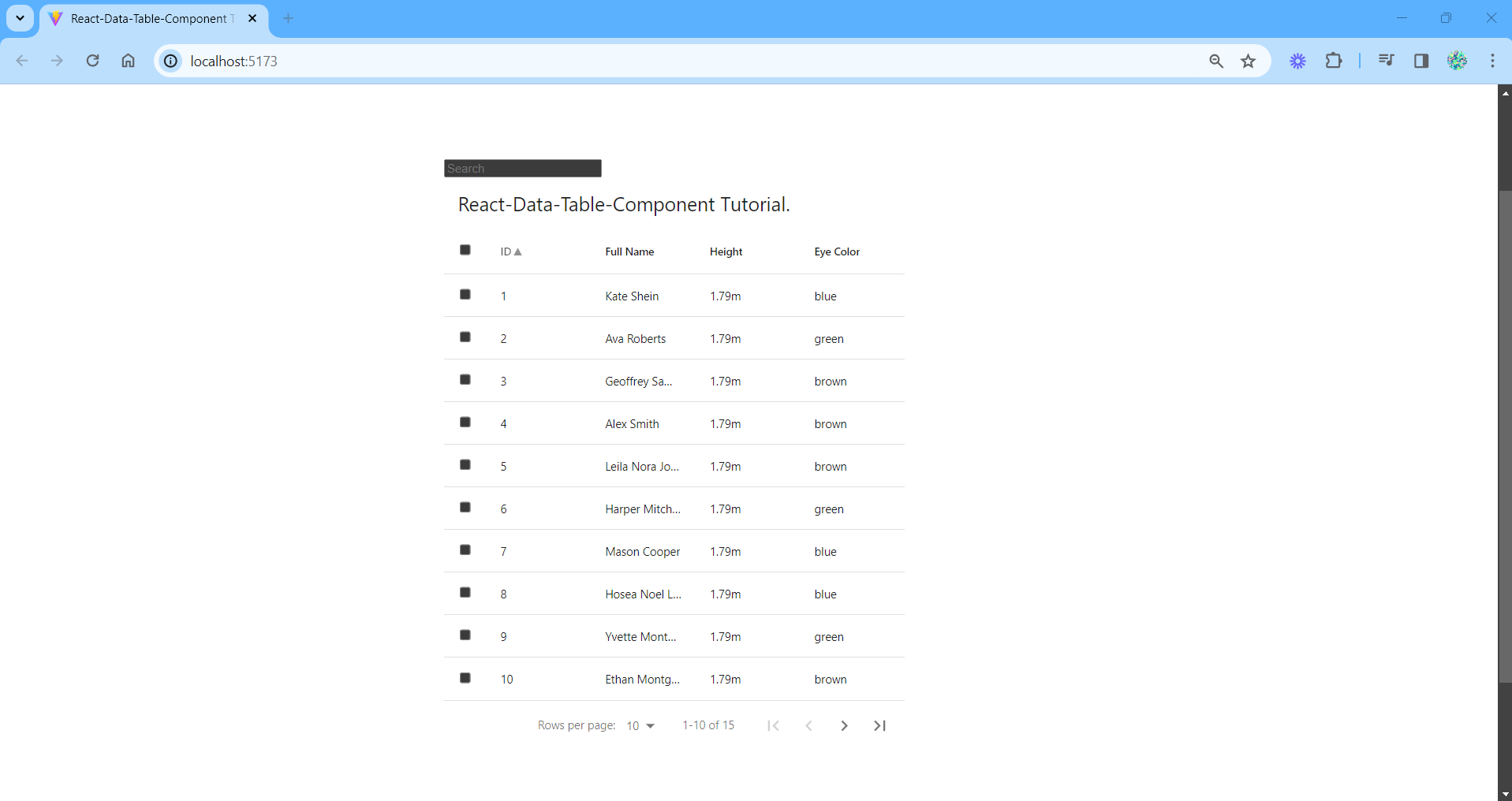
Give the table a title by passing the title prop to the component and its value is whatever you would like to call your table.
<div class="container">
    <DataTable
        columns={columns}
        data={rows}
        fixedHeader
        title="React-Data-Table-Component Tutorial."
     />
</div>
DataTable component.Back in the App component, import the Table component and place it within the fragment.
import "./App.css";
import "bootstrap/dist/js/bootstrap.bundle.min.js";
import Table from "./components/Table";

function App(){
    return (
    	<>
           <Table />
        </>
    );
}

export default App;Table component and returning it in the App component.8. Add Pagination and Sorting, and Make Each Row Selectable
Pagination and selectableRows
Add the pagination and selectableRows props to the DataTable component.
By default, the first page has the first 10 records. If there needs to be API calls from the server side for custom pagination, then you can use the paginationServer property along with the paginationTotalRows, onChangeRowsPerPage and onChangePage properties which work in conjunction with a few other things.
But for now, let's stick with the pagination property.
//...rest of the code in the function component
<div className="container d-flex justify-content-center my-5">
   <DataTable
    	columns={columns}
        data={rows}
        fixedHeader
        title="React-Data-Table-Component Tutorial"
        pagination
        selectableRows
    />
</div>
//...rest of the code in the function componentpagination and selectableRows properties in the DataTable component.Sorting
In the DataTable component, add the sortable property to each object in the columns constant. Give it a boolean value of true so that sorting is applied to each column when a user clicks on the column headers.
//...rest of the code in the function component
const columns = [
    {
        name: 'ID',
        selector: (row) => row.personID,
        sortable: true,
    },
    {
        name: 'Full Name',
        selector: (row) => row.fullName,
        sortable: true,
    },
    {
        name: 'Height',
        selector: (row) => row.height,
        sortable: true,
    },
    {
        name: 'Eye Color',
        selector: (row) => row.eyeColor,
        sortable: true,
    },
];
//...rest of the code in the function component
sortable property to each column header & setting it to true.9. Add Searching and Filtering
Add a <div> container above the DataTable component in the returned JSX. Also add the bootstrap input-group class to the <div>.
The child element of this new container will be the <input /> of type search and we'll use Bootstraps' stylings for it. Use the code below:
<input
    type="search"
    className="form-control-sm border ps-3"
    placeholder="Search"
/>An optional step is to add a search icon or use Bootstraps' default styling for a search bar. However, we'll leave it out for now so we can focus solely on the searching functionality.
Now, let's import the useState hook into the Table.tsx file.
Use the hook and pass in the rows constant as the default value of our state variable. Within the destructured array will be our state variable called data and the setter function called setData.
const [data, setData] = useState(rows);
Create a function called handleSearch that will be called when the onChange event listener is used on the search bar.
Pass in the event object, e, as its argument. Using type annotation, set the type of the event object to React.ChangeEvent<HTMLInputElement>.
const handleSearch = (e: React.ChangeEvent<HTMLInputElement>) => {
   // the rest of the code will be defined in here
};Declare 5 variables of Boolean type as seen below:
const handleSearch = (e: React.ChangeEvent<HTMLInputElement>) => {
   let searchValue: Boolean;
   let personIDValue: Boolean;
   let fullNameValue: Boolean;
   let heightValue: Boolean;
   let eyeColorValue: Boolean;
};
Declare a new local constant called newRows. In this constant, filter out and return the rows/data in the rows constant where the search input's value is the same as the value of the rows' fullName or height or eyeColor property.
const newRows = rows.filter((row) => {
      personIDValue = row.personID
        .toString()
        .toLowerCase()
        .includes(e.target.value.toLowerCase());
      fullNameValue = row.fullName
        .toLowerCase()
        .includes(e.target.value.toLowerCase());
      heightValue = row.height
        .toLowerCase()
        .includes(e.target.value.toLowerCase());
      eyeColorValue = row.eyeColor
        .toLowerCase()
        .includes(e.target.value.toLowerCase());

      if (personIDValue) {
        searchValue = personIDValue;
      } else if (fullNameValue) {
        searchValue = fullNameValue;
      } else if (heightValue) {
        searchValue = heightValue;
      } else {
        searchValue = eyeColorValue;
      }

      return searchValue;
});Pass newRows into the setter function, setData.
setData(newRows);setData.// definition of the columns constant
// definition of the rows constant
const [data, setData] = useState(rows);
// Handle Search
const handleSearch = (e: React.ChangeEvent<HTMLInputElement>) => {
let searchValue: Boolean;
let personIDValue: Boolean;
let fullNameValue: Boolean;
let heightValue: Boolean;
let eyeColorValue: Boolean;
const newRows = rows.filter((row) => {
personIDValue = row.personID
.toString()
.toLowerCase()
.includes(e.target.value.toLowerCase());
fullNameValue = row.fullName
.toLowerCase()
.includes(e.target.value.toLowerCase());
heightValue = row.height
.toLowerCase()
.includes(e.target.value.toLowerCase());
eyeColorValue = row.eyeColor
.toLowerCase()
.includes(e.target.value.toLowerCase());
if (personIDValue) {
searchValue = personIDValue;
} else if (fullNameValue) {
searchValue = fullNameValue;
} else if (heightValue) {
searchValue = heightValue;
} else {
searchValue = eyeColorValue;
}
return searchValue;
});
setData(newRows);
};
handleSearch function.Next step is to pass (not call the function) the handleSearch function into the onChange event listener.
<input
   type="search"
   className="form-control-sm border ps-3"
   placeholder="Search"
   onChange={handleSearch}
/>handleSearch function into onChange.The value of the data property in the DataTable component will now be the state variable, data instead of rows that was initially passed in.
<DataTable
    columns={columns}
    data={data}
    fixedHeader
    title="React-Data-Table-Component Tutorial."
    pagination
    selectableRows
/>DataTable component.10. View the Table
Run the project in the command line and view the table in a browser:
npm run devThe table should look something like this:
You can read through the documentation for react-data-table-component as it has more in-depth coverage of the library's usage that goes beyond the scope of this article.
Don't fret if there's a difference in your table from the expected result. The source code in this repository will guide you.
Happy coding and may your code run smoothly!