

If you have some text inside a div, and nothing else, the div's height will match the text height. Suppose, though, you have some text and an image. Your text will be aligned at the bottom of the div, which is usually not what you want.
In this article, you'll learn a couple of ways to vertically center your text inside such a div or other element.
How to Center Text using Line Height
This approach is limited, but can be useful if you have your element set to a fixed height using the height property.
The line-height property determines the height of the box that the browser renders text into. By default, this is set to a value slightly larger than 1 to provide comfortable spacing between lines of text.
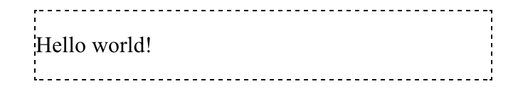
If you set the element's height and line-height to the same value, the text will be vertically centered:
.my-element {
  height: 3rem;
  line-height: 3rem;
}
 Vertically centered text using line-height
There is an important caveat to this approach, though. This only works if your text can fit on one line.
If the text does wrap, you'll see the first line vertically centered. Because you set the line-height to be the same as the element's height, the wrapped line of text now overflows the element.
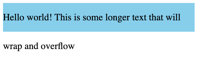 Wrapped text overflowing the container
If this sounds too rigid, read on. Next, you'll see how you can use Flexbox to vertically center your text, along with any other content inside the element.
How to Center Text using Flexbox
A better, more general-purpose solution, is to use a Flexbox layout with align-items set to center.
An element using Flexbox (the flex container) lays out elements (flex items) either in a row or column. A Flexbox layout has two imaginary lines running through it. The first is the main axis, along which items will be placed. For a row flexbox, the main axis is the horizontal axis.
The cross axis runs perpendicular to the main axis. You can use the cross axis to define the vertical alignment of elements inside the flex container.
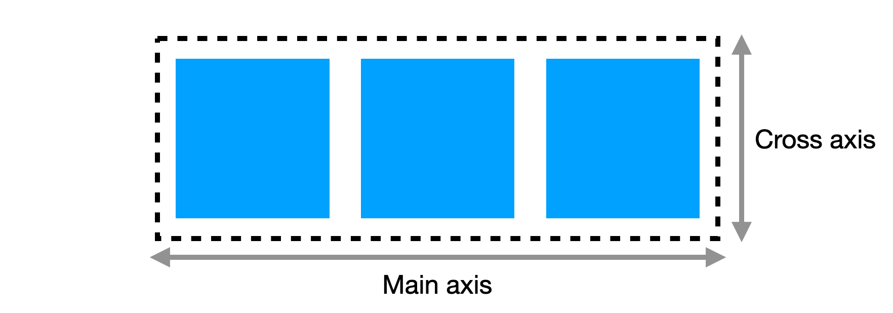 The main and cross axis in a horizontal Flexbox layout
Here's the CSS you'll need to apply a Flexbox layout and vertically center the text:
.my-element {
    /* Use a flexbox layout */
    display: flex;

    /* Make a horizontal flexbox (the default) */
    flex-direction: row;

    /* The important part: vertically center the items */
    align-items: center;
}
This creates a horizontal Flexbox layout (the flex-direction: row is not strictly required, as it's the default). The align-items property determines the alignment of items along the cross, or vertical, axis. There are a few different values you can use, but here you can use center to vertically center the text.
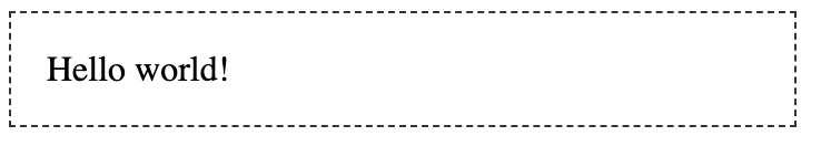 The text with align-items: center
This works nicely, and it even handles multiple lines of wrapped text. If you have other content inside the element, such as an image, everything will be aligned vertically.
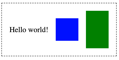 The text is aligned vertically with other content
How to Center Text Using CSS Grid
You can also center your content vertically using CSS Grid.
For a single div containing the text to center, you can turn it into a grid layout with one row and one column.
.my-element {
    display: grid;
    align-items: center;
}
In a grid layout, the align-items property specifies the alignment of the content within the cell, along the column (vertical) axis. This vertically aligns your text within the div element.
 Text vertically centered using a 1x1 grid layout
If the element containing your text is already part of a grid layout, you can either apply align-items: center to the entire grid, or if you just want to control the vertical alignment of that one grid cell, you can use align-self: center.
Conclusion
Now you know how to vertically center text. Next time you see a tweet about centering a div, you can reply with your newfound CSS knowledge!