
Writing CSS is often painful for a lot of developers, because many of us lose our curiosity very early in the learning journey. For instance, as soon as we learn basic CSS selectors, we settle into a pattern of using only those, thinking they're all we need. But what if there’s more?
In this article, you'll learn about some essential advanced CSS selectors and combinators like child and sibling combinators , pseudo-classes, structural pseudo-classes, pseudo-elements and attribute selectors by building an Interactive FAQ section. If you'd like to move ahead to see what we'll build, check it out.
Table of Contents:
- What are Advanced CSS selectors?
- Why You Should Use Advanced CSS selectors
- How to Build an Interactive FAQ section
- Full Project Code
- Conclusion
What are Advanced CSS Selectors?
At its core, CSS is about selecting elements from the DOM (Document Object Model) to apply styles to them.
While basic selectors like class, ID, and element selectors get much of the day-to-day work done, advanced CSS selectors offer a deeper level of specificity and control. They enable you to target exactly the elements you wish to style, based on attributes, states, and their relationships to each other.
For instance, you can dress up links that have been visited (:visited), style the first paragraph within an article (article p:first-of-type), or target empty elements (:empty), all of which save you from littering your HTML code with extra classes or IDs ultimately leading to cleaner and more efficient code.
Why You Should Use Advanced CSS Selectors
Here are three of many reasons to consider giving advanced CSS selectors a chance:
- Interactive Styling: With pseudo-classes like
:hoverand:focus, you can create interactive elements that respond to user actions, directly within CSS. This is a win-win, because it minimizes the need for JavaScript for visual effects and so keeps your scripts lean and still boosts user experience and interactivity. - Accessibility and SEO: Using advanced selectors can help keep HTML semantic, as styles are applied based on the natural structure of your document and attributes of elements. This makes your code easier to read and maintain but most importantly improves accessibility and SEO.
- Future Relevance: As web standards evolve, so does CSS. This means by adopting advanced selectors today, you're aligning your stylesheets with the future of web development. This ensures that your designs remain resilient and adaptable, no matter what changes come to the web .
How to Build an Interactive FAQ Section
To learn advanced CSS selectors, we’ll build an interactive FAQ section to reveal answers to questions when clicked. We'll also implement different styles for the FAQs based on their state or content.
This practical approach will solidify your understanding as you see their application in real-world scenarios.
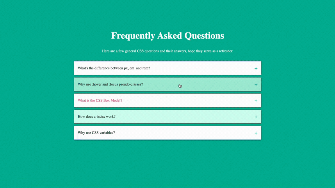 A GIF showing the FAQ section we'll build in this article
Check it out on CodePen here.
Prerequisites
- Basic knowledge of HTML and CSS
- An IDE
- A web browser
HTML Code
The HTML structure for our project consists of a series of FAQ items, each contained within a div and featuring a clickable question (label or button) that controls the visibility of the answer (div). Each FAQ item has a checkbox input to manage its open/close state, using CSS to visually toggle the answer visibility without JavaScript.
<body>
  <section class="faq-section">
  <div class="container">
    <div class="faq-heading">
      <h1>Frequently Asked Questions</h1>
    <p>Here are a few general CSS questions and their answers, hope they serve as a refresher.</p>
    </div>
    <div class="faq-container">
      <!-- FAQ Item 1 -->
      <div class="faq-item">
        <input type="checkbox" id="faq1" class="faq-toggle" hidden>
        <label for="faq1" class="faq-question">What's the difference between px, em, and rem?</label>
        <div class="faq-answer">
          <p>px is a fixed size, em changes size based on the parent element's font size, and rem is always relative to the document's root font size, making layouts more flexible.</p>
        </div>
      </div>
      <!-- FAQ Item 2 -->
      <div class="faq-item">
        <input type="checkbox" id="faq2" class="faq-toggle" hidden>
        <label for="faq2" class="faq-question">Why use :hover and :focus pseudo-classes?</label>
        <div class="faq-answer">
          <p>They let you style elements when users interact with them, like changing a button's color when hovered over, making websites more interactive.</p>
        </div>
      </div>
    </div>
  </div>
</section>
</body>
Starting Basic CSS Code
The code below applies basic styling to our HTML code above. This is provided so that you can focus on learning how advanced CSS selectors work.
body {
  background-color: #00ad8f;
}

.faq-section {
  margin-top: 5em;
}

.faq-section h1 {
  font-size: 2.5em;
}

.faq-heading {
  text-align: center;
  margin-bottom: 2em;
  color: #fff;
}

.container {
  max-width: 800px;
  margin: auto;
  padding: 1em;
}

.faq-item {
  background-color: #fff;
  border-radius: 0.3em;
  border: 1px solid #333;
  margin-bottom: 0.5em;
}

.faq-toggle {
  display: none; /* Hide checkbox */
}

.faq-question {
  background-color: #efefef;
  padding: 1em;
  margin: 0;
  display: flex;
  justify-content: space-between;
  align-items: center;
  cursor: pointer;
  border: none;
  position: relative; /* Necessary for positioning ::before content */
}

.faq-answer {
  max-height: 0;
  overflow: hidden;
  border-top: 1px solid #333;
  transition: transform 0.3s ease, padding 0.3s ease;
  padding: 0 1em;
}
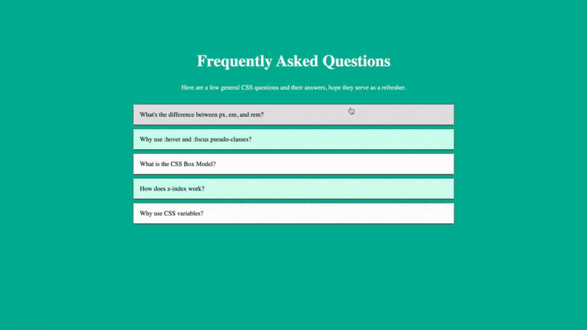
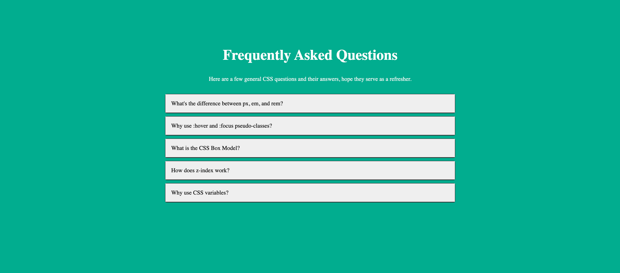 A screenshot of our FAQ section before adding advanced CSS selectors
Child and Sibling Combinators (+ , ~, >):
The child and sibling combinators, though not as popular as id and class selectors, are powerful for styling elements in relation to each other.
The child combinator (>) is essential for targeting direct children of an element, such as styling menu items in a navigation bar without affecting nested drop-downs.
Meanwhile, the adjacent sibling selector (+) targets only the sibling that immediately follows an element for tasks like making the first paragraph after a heading stand out
And the general sibling selector (~) targets any sibling that follows an element, like highlighting list items following a checked checkbox.
In our project, as seen in the code below, when a question is clicked (that is, its associated checkbox is checked), the adjacent sibling selector (+) shows a "-" symbol to indicate an open state, meaning an FAQ is opened. Also, it controls the max-height of the answer to reveal it smoothly.
.faq-toggle:checked + .faq-question::after {
  content: '-'; /* Changes the plus to a minus on the FAQ question when the toggle is checked */
}

.faq-toggle:checked + .faq-question + .faq-answer {
  max-height: 1000px; /* Reveals the answer when the toggle is checked */
}
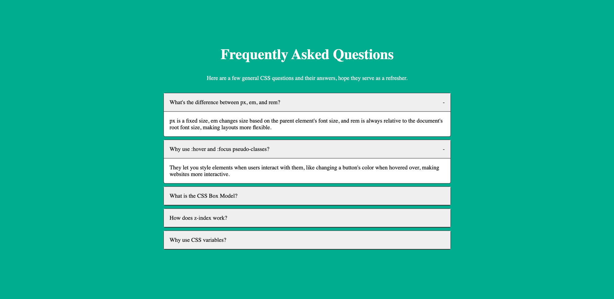 A screenshot of our FAQ section adding the - symbol on open questions
Pseudo-Classes (:nth-child(), :nth-of-type(), :not(), :focus, :hover):
Pseudo-classes allow styling of elements based on their state or characteristics without changing the HTML structure.
They're great for interactive elements, like changing the background color of buttons on hover using :hover and :nth-of-type() to highlight every third image in a gallery for a patterned effect. Or styling every other row in a table to improve readability with :nth-child()and:not()to apply styles to all buttons except the disabled ones.
In our project, as seen in the code below, we use the :nth-of-type() pseudo-class to differentiate between odd and even questions by assigning them different background colors, and :hover to improve interactivity, making the FAQ section easier to navigate visually.
.faq-item:nth-of-type(odd) .faq-question{
 background-color: #fff; /* For odd items */
}

.faq-item:nth-of-type(even) .faq-question{
 background-color: #caffee; /* For even items */
}

.faq-item:nth-of-type(odd) .faq-question:hover {
  background-color: #dfdfdf;
}

.faq-item:nth-of-type(even) .faq-question:hover {
  background-color: #9debd2;
}
 A GIF showing different hover colors for odd and even FAQ questions
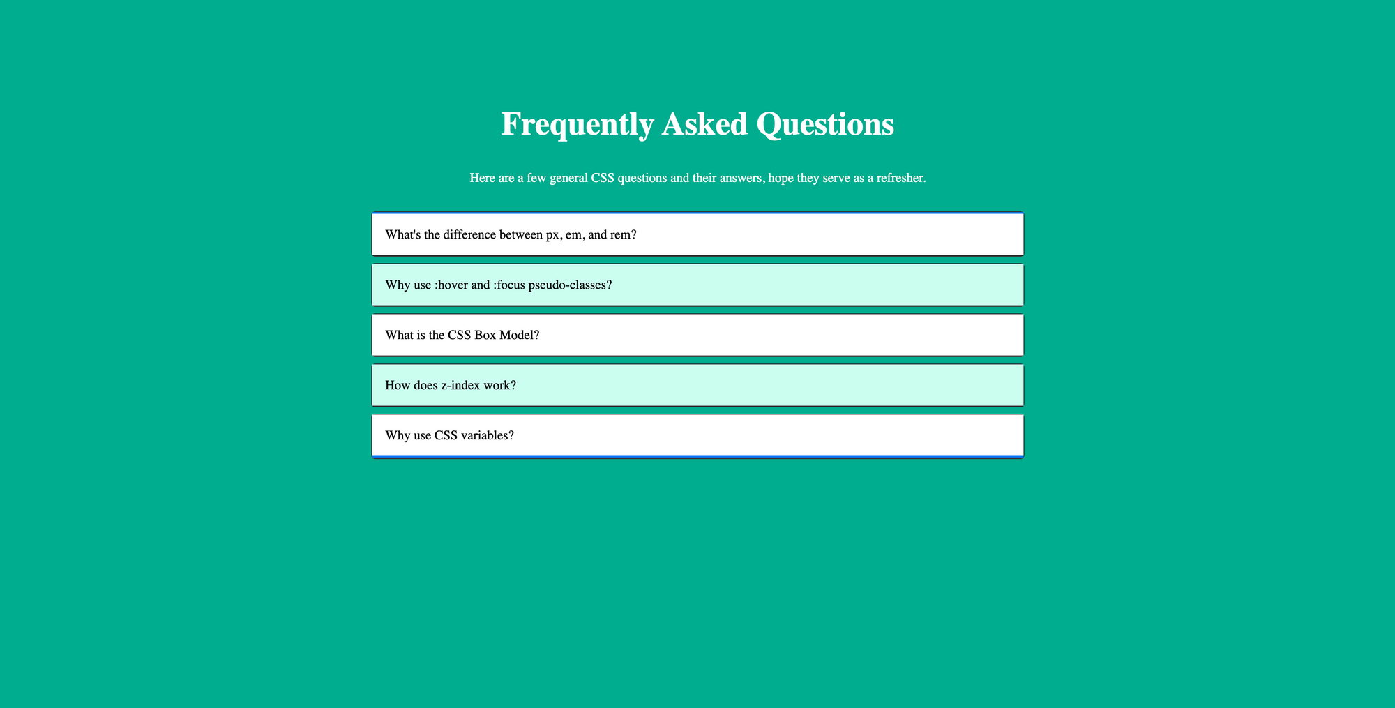
Structural Pseudo-Classes (:first-child, :last-child, :empty, :only-child):
Structural pseudo-classes shine when it comes to styling elements based on their position within their parent container. This is why they help with tasks like highlighting the first or last item in a list with :first-child to draw attention or :last-child for adding a special border for emphasis.
They also excel in scenarios where the document structure influences style, such as using :empty to hide or differently style empty divs for layout consistency, or :only-child to center content within a div for a clean look.
.faq-item:first-of-type .faq-question {
  border-top: 2px solid #007BFF;
}

.faq-item:last-of-type .faq-question {
  border-bottom: 2px solid #007BFF;
}
In our project and in the code above, the :first-of-type and :last-of-type selectors are used to visually distinguish the first and last FAQ items by adding a top and bottom border, respectively.
 A screenshot of our FAQ section with blue borders
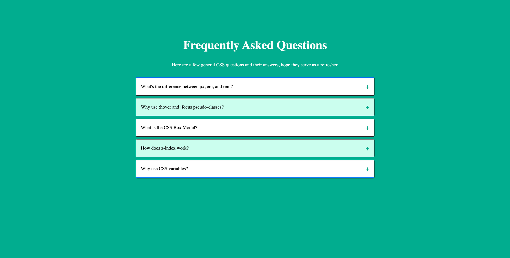
Pseudo-Elements (::before, ::after, ::first-letter, ::first-line):
Pseudo-elements have the ability to create virtual elements that can be styled separately. They allow us to style specific parts of an element, such as adding content before or after an element's content, or styling the first letter or line of text.
You can also use ::before and ::after to add decorative quotes around block quotes without altering the HTML, or ::first-letter to enlarge the first letter of each article similar to what’s done in magazines. Finally, ::first-line changes the color of the first line of a paragraph to grab attention.
/* ::after used to display "+" symbol */
.faq-question::after {
  content: '+';
  color: #00ad8f;
  font-size: 1.4em;
}
In our project and in the code above, the ::after pseudo-element adds a "+" sign to each question in their default states. This complements the "-" symbol we added above on opened questions. Together, these provide visual cues to the user about the state of the FAQ item.
 A screenshot of our FAQ section adding the + symbol on closed questions
Attribute Selectors ( [attr^="value"], [attr$="value"], [attr*="value"]):
Attribute selectors provide a way to style elements based on the presence, absence, or value of attributes. They're the go-to for styling elements with specific data attributes, like differentiating external links with [attr^="value"] by targeting URLs that begin with "http" or using [attr$="value"] to apply icons to download links.
All these emphasize the role of attribute selectors in crafting precise and condition-based styles, offering a high level of specificity and flexibility.
.faq-item[data-category^="important"] .faq-question {
  color: #E91E63;
}
In our project and in the code above, we use an attribute selector [attr^="value"] to apply a distinct style (red) to questions marked with a data-category as important. This makes them stand out in the FAQ section.
 A screenshot of our FAQ section with the important question differently colored
Full Project Code
Here's the HTML Code:
<body>
  <section class="faq-section">
  <div class="container">
    <div class="faq-heading">
      <h1>Frequently Asked Questions</h1>
    <p>Here are a few general CSS questions and their answers, hope they serve as a refresher.</p>
    </div>
    <div class="faq-container">
      <!-- FAQ Item 1 -->
      <div class="faq-item">
        <input type="checkbox" id="faq1" class="faq-toggle" hidden>
        <label for="faq1" class="faq-question">What's the difference between px, em, and rem?</label>
        <div class="faq-answer">
          <p>px is a fixed size, em changes size based on the parent element's font size, and rem is always relative to the document's root font size, making layouts more flexible.</p>
        </div>
      </div>
      <!-- FAQ Item 2 -->
      <div class="faq-item">
        <input type="checkbox" id="faq2" class="faq-toggle" hidden>
        <label for="faq2" class="faq-question">Why use :hover and :focus pseudo-classes?</label>
        <div class="faq-answer">
          <p>They let you style elements when users interact with them, like changing a button's color when hovered over, making websites more interactive.</p>
        </div>
      </div>
      <!-- FAQ Item 3 -->
      <div class="faq-item" data-category="important">
        <input type="checkbox" id="faq3" class="faq-toggle" hidden>
        <label for="faq3" class="faq-question">What is the CSS Box Model?</label>
        <div class="faq-answer">
          <p>It's a concept that includes margins, borders, padding, and the actual content area, helping you control spacing and layout around elements.</p>
        </div>
      </div>
      <!-- FAQ Item 4 -->
      <div class="faq-item">
        <input type="checkbox" id="faq4" class="faq-toggle" hidden>
        <label for="faq4" class="faq-question">How does z-index work?</label>
        <div class="faq-answer">
          <p>z-index decides which elements appear on top of others on the page. Higher values are closer to the front, useful for overlays or dropdown menus.</p>
        </div>
      </div>
      <!-- FAQ Item 5 -->
      <div class="faq-item">
        <input type="checkbox" id="faq5" class="faq-toggle" hidden>
        <label for="faq5" class="faq-question">Why use CSS variables?</label>
        <div class="faq-answer">
          <p>They make it easy to update values like colors or fonts across your site by changing them in one place, keeping your styles consistent and easier to manage.</p>
        </div>
      </div>
    </div>
  </div>
</section>

</body>
Here's the CSS code:
body {
  background-color: #00ad8f;
}

.faq-section {
  margin-top: 5em;
}

.faq-section h1 {
  font-size: 2.5em;
}

.faq-heading {
  text-align: center;
  margin-bottom: 2em;
  color: #fff;
}

.container {
  max-width: 800px;
  margin: auto;
  padding: 1em;
}

.faq-item {
  background-color: #fff;
  border-radius: 0.3em;
  border: 1px solid #333;
  margin-bottom: 0.5em;
}

.faq-toggle {
  display: none; /* Hide checkbox */
}

.faq-question {
  background-color: #efefef;
  padding: 1em;
  margin: 0;
  display: flex;
  justify-content: space-between;
  align-items: center;
  cursor: pointer;
  border: none;
  position: relative; /* Necessary for positioning ::before content */
}

.faq-answer {
  max-height: 0;
  overflow: hidden;
  border-top: 1px solid #333;
  transition: transform 0.3s ease, padding 0.3s ease;
  padding: 0 1em;
}

.faq-toggle:checked + .faq-question::after {
  content: '-'; /* Changes the plus to a minus on the FAQ question when the toggle is checked */
}

.faq-toggle:checked + .faq-question + .faq-answer {
  max-height: 1000px; /* Reveals the answer when the toggle is checked */
}

 /* nth-of-type for styling odd and even .faq-question differently */
.faq-item:nth-of-type(odd) .faq-question{
 background-color: #fff; /* For odd items */
}

.faq-item:nth-of-type(even) .faq-question{
 background-color: #caffee; /* For even items */
}

.faq-item:nth-of-type(odd) .faq-question:hover {
  background-color: #dfdfdf; /* Lightens the question's background on hover for visual feedback */
}

.faq-item:nth-of-type(even) .faq-question:hover {
  background-color: #9debd2; /* Lightens the question's background on hover for visual feedback */
}

/* First-of-type and last-of-type to style the first and last item uniquely */
.faq-item:first-of-type .faq-question {
  border-top: 2px solid #007BFF;
}

.faq-item:last-of-type .faq-question {
  border-bottom: 2px solid #007BFF;
}

/* ::after used to display "+" symbol */
.faq-question::after {
  content: '+';
  color: #00ad8f;
  font-size: 1.4em;
}

.faq-item[data-category^="important"] .faq-question {
  color: #E91E63; /* Styles important questions differently */
}
Conclusion
We've just taken a dive into the world of advanced CSS selectors by building an interactive FAQ section. These advanced selectors allow you to write less code while doing more, keeping your HTML clean and your styles sharp.
As we wrap up, I hope the next time you're faced with a decision on how to approach styling a complex layout or interactive element, you'll remember the power and flexibility that these advanced CSS selectors offer and choose to try them out.