By Christian Sepulveda
Animations delight users. And you’d think, by the sheer volume of articles, that React Hooks delight developers. But for me, fatigue was starting to creep into my opinions on Hooks.
But serendipity saved me. I found an example that was a good match for React Hooks, rather than just “the new way.” As you may have guessed by this article’s title, that example was an animation.
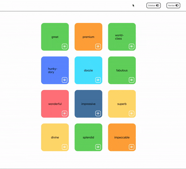
I was working on a React application with cards in a grid. When an item was removed, I wanted to animate its exit, like this.
 my goal
Unfortunately, there are nuances to making this work. And my solution led me to a good use of React Hooks.
What are We Going to Do?
- start with a baseline example application
- incrementally animate the disappearing of elements, highlighting some challenges
- once we achieve the desired animation, we’ll refactor a reusable animation component
- we’ll use this component to animate a sidebar and a navbar
- and …. (you need to read / jump to the end)
For the impatient, here is the GitHub repo for the code in this project. There are tags for each step. (See README for links and descriptions for each tag.)
Baseline
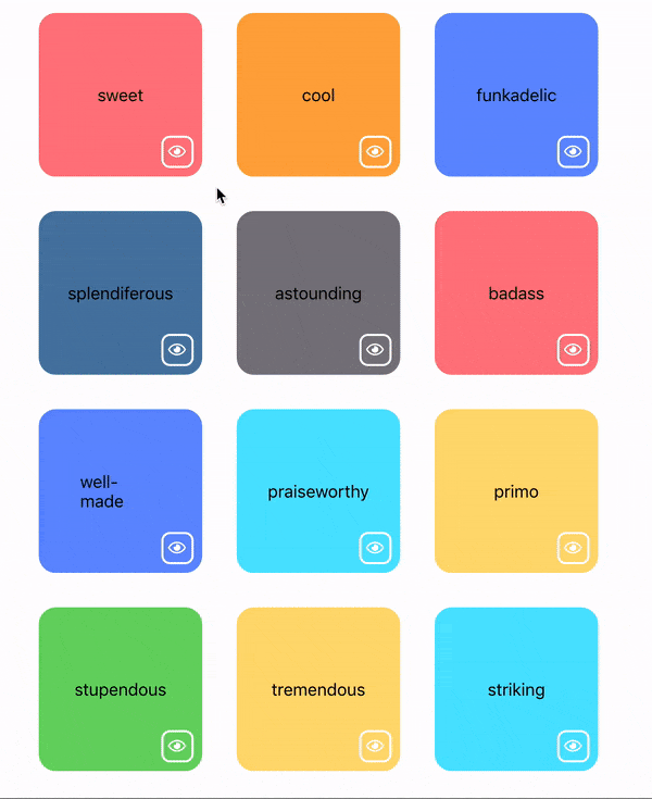
I’ve created a simple application, using create-react-app. It has a grid of simple cards. You can hide individual cards.
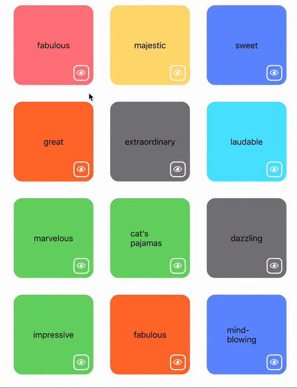 no animation — items disappear to fast
The code for this is basic and the results are uninteresting. When a user clicks the eye icon button, we change the item’s display property.
function Box({ word }) {
  const color = colors[Math.floor(Math.random() * 9)];
  const [visible, setVisible] = useState(true);
  function hideMe() {
    setVisible(false);
  }
  let style = { borderColor: color, backgroundColor: color };
  if (!visible) style.display = "none";
  return (
    <div className="box" style={style}>
      {" "}
      <div className="center">{word}</div>{" "}
      <button className="button bottom-corner" onClick={hideMe}>
        {" "}
        <i className="center far fa-eye fa-lg" />{" "}
      </button>{" "}
    </div>
  );
}
(Yes I am using hooks above, but this is not the interesting use of hooks.)
Adding Animation
Rather than build my own animation library, I looked for an animation library like animate.css. react-animated-css is nice library that provides a wrapper around animate.css.
npm install --save react-animated-css
add animate.css to index.html
<link rel="stylesheet" href="https://cdnjs.cloudflare.com/ajax/libs/animate.css/3.7.2/animate.css" />
In the Box component above, we change it’s rendering to
return (
  <Animated animationIn="zoomIn" animationOut="zoomOut" isVisible={visible}>
    <div className="box" style={style}>
      <div className="center">{word}</div>
      <button className="button bottom-corner" onClick={hideMe}>
        <i className="center far fa-eye fa-lg" />
      </button>
    </div>
  </Animated>
);
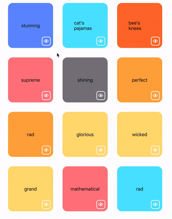
Not quite what we want
But animate.css animates opacity and other CSS properties; you can’t do a CSS transition on the display property. So an invisible object remains and it takes up space in the document flow.
If you google a bit, you’ll find some solutions that suggest using a timer to set display: none at the end of the animation.
So we can add that,
function Box({ word }) {
  const color = colors[Math.floor(Math.random() * 9)];
  const [visible, setVisible] = useState(true);
  const [fading, setFading] = useState(false);

  function hideMe() {
    setFading(true);
    setTimeout(() => setVisible(false), 650);
  }

  let style = { borderColor: color, backgroundColor: color };

  return (
    <Animated
      animationIn="zoomIn"
      animationOut="zoomOut"
      isVisible={!fading}
      style={visible ? null : { display: "none" }}
    >
      <div className="box" style={style}>
        <div className="center">{word}</div>
        <button className="button bottom-corner" onClick={hideMe}>
          <i className="center far fa-eye fa-lg" />
        </button>
      </div>
    </Animated>
  );
}
(Note: The default animation duration is 1000ms. I use 650ms for the timeout, to minimize a stutter/pause before setting the display property. This is a matter of preference.)
And that will give us the desired effect.
 Yay!
Yay!
Creating a Reusable Component
We could stop here, but there are two issues (for me):
- I don’t want to copy/paste the
Animatedblock, styles and functions to recreate this effect - The
Boxcomponent is mixing different kinds of logic, i.e. violating Separation of Concerns. Specifically, theBox's essential function is to render a card with its content. But the animation details are mixed in.
Class Component
We can create a traditional React class component to manage the state of animation: toggle visibility and set the timeout for the display CSS property.
class AnimatedVisibility extends Component {
  constructor(props) {
    super(props);
    this.state = { noDisplay: false, visible: this.props.visible };
  }

  componentWillReceiveProps(nextProps, nextContext) {
    if (!nextProps.visible) {
      this.setState({ visible: false });
      setTimeout(() => this.setState({ noDisplay: true }), 650);
    }
  }

  render() {
    return (
      <Animated
        animationIn="zoomIn"
        animationOut="zoomOut"
        isVisible={this.state.visible}
        style={this.state.noDisplay ? { display: "none" } : null}
      >
        {this.props.children}
      </Animated>
    );
  }
}
and then use it
function Box({ word }) {
  const color = colors[Math.floor(Math.random() * 9)];
  const [visible, setVisible] = useState(true);

  function hideMe() {
    setVisible(false);
  }

  let style = { borderColor: color, backgroundColor: color };

  return (
    <AnimatedVisibility visible={visible}>
      <div className="box" style={style}>
        <div className="center">{word}</div>
        <button className="button bottom-corner" onClick={hideMe}>
          <i className="center far fa-eye fa-lg" />
        </button>
      </div>
    </AnimatedVisibility>
  );
}
This does create a reusable component, but it is a bit complicated. We can do better.
React Hooks and useEffect
React Hooks are a new feature in React 16.8. They offer a simpler approach to lifecycle and state management in React components.
The useEffect hook provides an elegant replacement to our use of componentWillReceiveProps. The code is simpler and we can use a functional component again.
function AnimatedVisibility({ visible, children }) {
  const [noDisplay, setNoDisplay] = useState(!visible);
  useEffect(() => {
    if (!visible) setTimeout(() => setNoDisplay(true), 650);
    else setNoDisplay(false);
  }, [visible]);

  const style = noDisplay ? { display: "none" } : null;
  return (
    <Animated
      animationIn="zoomIn"
      animationOut="zoomOut"
      isVisible={visible}
      style={style}
    >
      {children}
    </Animated>
  );
}
There are some subtleties with the useEffect hook. It’s primarily for side effects: changing state, calling asynchronous functions, etc. In our case, it sets the internal noDisplay boolean based on the previous value of visible.
By adding visible to the dependencies array for useEffect, our useEffect hook will only be called when the value of visible changes.
I think useEffect is a much better solution than the class component clutter. ?
Reusing the Component: Sidebars and Navbars
Everyone loves a sidebars and navbars. So let’s add one of each.
function ToggleButton({ label, isOpen, onClick }) {
  const icon = isOpen ? (
    <i className="fas fa-toggle-off fa-lg" />
  ) : (
    <i className="fas fa-toggle-on fa-lg" />
  );
  return (
    <button className="toggle" onClick={onClick}>
      {label} {icon}
    </button>
  );
}

function Navbar({ open }) {
  return (
    <AnimatedVisibility
      visible={open}
      animationIn="slideInDown"
      animationOut="slideOutUp"
      animationInDuration={300}
      animationOutDuration={600}
    >
      <nav className="bar nav">
        <li>Item 1</li>
        <li>Item 2</li>
        <li>Item 3</li>
      </nav>
    </AnimatedVisibility>
  );
}

function Sidebar({ open }) {
  return (
    <AnimatedVisibility
      visible={open}
      animationIn="slideInLeft"
      animationOut="slideOutLeft"
      animationInDuration={500}
      animationOutDuration={600}
      className="on-top"
    >
      <div className="sidebar">
        <ul>
          <li>Item 1</li>
          <li>Item 2</li>
          <li>Item 3</li>
        </ul>
      </div>
    </AnimatedVisibility>
  );
}

function App() {
  const [navIsOpen, setNavOpen] = useState(false);
  const [sidebarIsOpen, setSidebarOpen] = useState(false);

  function toggleNav() {
    setNavOpen(!navIsOpen);
  }

  function toggleSidebar() {
    setSidebarOpen(!sidebarIsOpen);
  }

  return (
    <Fragment>
      <main className="main">
        <header className="bar header">
          <ToggleButton
            label="Sidebar"
            isOpen={sidebarIsOpen}
            onClick={toggleSidebar}
          />
          <ToggleButton label="Navbar" isOpen={navIsOpen} onClick={toggleNav} />
        </header>
        <Navbar open={navIsOpen} />
        <Boxes />
      </main>
      <Sidebar open={sidebarIsOpen} />
    </Fragment>
  );
}
 reuse achieved
But We’re Not Done…
We could stop here. But as with my earlier comments about Separation of Concerns, I’d prefer to avoid mixing the AnimatedVisibility component in the render method of the Box, Sidebar nor Navbar. (It is also a small amount of duplication.)
We can create an HOC. (In fact, I wrote an article about animations and HOCs, How to Build Animated Microinteractions in React.) But HOCs usually involve class components, because of the state management.
But with React Hooks, we can just compose the HOC (functional programming approach).
function AnimatedVisibility({
  visible,
  children,
  animationOutDuration,
  disappearOffset,
  ...rest
})
// ... same as before
}


function makeAnimated(
  Component,
  animationIn,
  animationOut,
  animationInDuration,
  animationOutDuration,
  disappearOffset
) {
  return function({ open, className, ...props }) {
    return (
      <AnimatedVisibility
        visible={open}
        animationIn={animationIn}
        animationOut={animationOut}
        animationInDuration={animationInDuration}
        animationOutDuration={animationOutDuration}
        disappearOffset={disappearOffset}
        className={className}
      >
        <Component {...props} />
      </AnimatedVisibility>
    );
  };
}

export function makeAnimationSlideLeft(Component) {
  return makeAnimated(Component, "slideInLeft", "slideOutLeft", 400, 500, 200);
}

export function makeAnimationSlideUpDown(Component) {
  return makeAnimated(Component, "slideInDown", "slideOutUp", 400, 500, 200);
}

export default AnimatedVisibility
and then use these function-based HOCs in App.js
function Navbar() {
  return (
    <nav className="bar nav">
      <li>Item 1</li>
      <li>Item 2</li>
      <li>Item 3</li>
    </nav>
  );
}

function Sidebar() {
  return (
    <div className="sidebar">
      <ul>
        <li>Item 1</li>
        <li>Item 2</li>
        <li>Item 3</li>
      </ul>
    </div>
  );
}

const AnimatedSidebar = makeAnimationSlideLeft(Sidebar);
const AnimatedNavbar = makeAnimationSlideUpDown(Navbar);

function App() {
  const [navIsOpen, setNavOpen] = useState(false);
  const [sidebarIsOpen, setSidebarOpen] = useState(false);

  function toggleNav() {
    setNavOpen(!navIsOpen);
  }

  function toggleSidebar() {
    setSidebarOpen(!sidebarIsOpen);
  }

  return (
    <Fragment>
      <main className="main">
        <header className="bar header">
          <ToggleButton
            label="Sidebar"
            isOpen={sidebarIsOpen}
            onClick={toggleSidebar}
          />
          <ToggleButton label="Navbar" isOpen={navIsOpen} onClick={toggleNav} />
        </header>
          <AnimatedNavbar open={navIsOpen} />
        <Boxes />
      </main>
      <AnimatedSidebar open={sidebarIsOpen} className="on-top"/>
    </Fragment>
  );
}
At the risk of promoting my own work, I much prefer the clean resulting code.
Here is a sandbox of the final result.
Now What?
For simple animations, the approach I describe works well. For more complex cases, I would use libraries like react-motion.
But separate from animations, React Hooks provide opportunities create readable and simple code. However, there is an adjustment in thinking. Hooks like useEffect are not a straight replacement for all lifecycle methods. You’ll need to study and experiment.
I suggest looking at sites like useHooks.com and libraries like react-use, a collection of hooks for a variety of use cases.