Bootstrap is a popular front-end framework for web development. It contains pre-built components and design elements to style HTML content. Modern browsers such as Chrome, Firefox, Opera, Safari, and Internet Explorer support Bootstrap.
Bootstrap includes a responsive grid system for varying layouts. It is a great starting point for building a mobile friendly website. It also includes optional JavaScript functionality like collapsible content, carousels, and modals.
Version History
Twitter originally developed the Bootstrap framework as an internal tool. They released it as an open source project in August of 2011.
Bootstrap 2 was released in January 2012. One of the primary features was the introduction of the 12 column responsive grid system. Bootstrap 3 appeared in August of 2013, switching to a flat design and a mobile-first approach. Bootstrap 4 is available in beta as of August 2017, and now includes Sass and Flexbox.
Bootstrap 4 was in development for two years before releasing some beta versions during 2017, while the first stable release was out in January 2018. Some notable changes include:
- Moved from Less to Sass;
- Moved to Flexbox and improved grid system;
- Added cards (replacing wells, thumbnails, and panels);
- And much more!
At the time of writing, Bootstrap’s latest release is 4.1.3. If you would like to keep up with any news of announcements, follow them here.
Installation
There are two main options to add Bootstrap to your web project. You can link to publicly available sources, or download the framework directly.
Linking To Another Source
You can add Bootstrap CSS by using a <link> element inside the <head> of your webpage that references a Content Delivery Network (CDN):
<link rel="stylesheet" href="https://stackpath.bootstrapcdn.com/bootstrap/4.1.3/css/bootstrap.min.css" integrity="sha384-MCw98/SFnGE8fJT3GXwEOngsV7Zt27NXFoaoApmYm81iuXoPkFOJwJ8ERdknLPMO" crossorigin="anonymous">
Adding the JavaScript elements of Bootstrap is similar with <script> elements usually placed at the bottom of your ‘’ tag. You may need to include some dependencies first. Pay special attention to the order listed:
<script src="https://code.jquery.com/jquery-3.3.1.slim.min.js" integrity="sha384-q8i/X+965DzO0rT7abK41JStQIAqVgRVzpbzo5smXKp4YfRvH+8abtTE1Pi6jizo" crossorigin="anonymous"></script>
<script src="https://cdnjs.cloudflare.com/ajax/libs/popper.js/1.14.3/umd/popper.min.js" integrity="sha384-ZMP7rVo3mIykV+2+9J3UJ46jBk0WLaUAdn689aCwoqbBJiSnjAK/l8WvCWPIPm49" crossorigin="anonymous"></script>
<script src="https://stackpath.bootstrapcdn.com/bootstrap/4.1.3/js/bootstrap.min.js" integrity="sha384-ChfqqxuZUCnJSK3+MXmPNIyE6ZbWh2IMqE241rYiqJxyMiZ6OW/JmZQ5stwEULTy" crossorigin="anonymous"></script>
Note: These are only examples and may change without notice. Please refer to a CDN for current links to include in your project.
Download/Install
You can download and install the Bootstrap source files with Bower, Composer, Meteor, or npm. This allows greater control and the option to include or exclude modules as needed.
npm install bootstrap
gem 'bootstrap', '~> 4.1.3'
_Note: These are only examples and may change without notice. Please refer to the Bootstrap website for the most up-to-date links.
The Bootstrap Grid System
The grid system is a mobile-first flexbox system for quickly building layouts of all shapes and sizes suitable on all devices. It’s based on a 12 column layout and has multiple tiers, one for each media query range.
Bootstrap comes with predefined grid classes for your use in markup. See more details and examples at https://getbootstrap.com/docs/4.1/layout/grid/
Boostrap Features
- Bootstrap 3 supports the latest versions of the Google Chrome, Firefox, Internet Explorer, Opera, and Safari (except on Windows). It additionally supports back to IE8 and the latest Firefox Extended Support Release (ESR).[12]
- Since 2.0, Bootstrap supports responsive web design. This means the layout of web pages adjusts dynamically, taking into account the characteristics of the device used (desktop, tablet, mobile phone).
- Starting with version 3.0, Bootstrap adopted a mobile-first design philosophy, emphasizing responsive design by default.
- Version 4.0 added Sass and Flexbox support
More Information:
Bootstrap has thorough documentation with many examples and an HTML template for getting started (this template only has script included; it does not contain a set up of the grid system if that’s what you’re looking for).
In addition, you can find both free and paid themes that build on the Bootstrap framework to provide a more customized and stylish look.
Bootstrap Resources:
Showcase of sites built using Bootstrap
HTML linter for projects using Bootstrap
Design elements and code snippets for Bootstrap
Code, theme, and add-on resources for Bootstrap
Getting started with Bootstrap tutorial
Using Bootstrap makes it easy to design a fully responsive website and is a framework worth learning.
What is a responsive website?
A responsive website is a website that resizes and rearranges that items on the page depending on the size of your browser. With a responsive website, if you resize your browser, you can see the changes occur in real time. Bootstrap makes your website responsive for you.
How to add Bootstrap to your page
Adding bootstrap to your page is a fast process, just add the following to the <head> tags in your code.
<link rel="stylesheet" href="https://stackpath.bootstrapcdn.com/bootstrap/4.1.3/css/bootstrap.min.css" integrity="sha384-MCw98/SFnGE8fJT3GXwEOngsV7Zt27NXFoaoApmYm81iuXoPkFOJwJ8ERdknLPMO" crossorigin="anonymous">
You will also need to add the following between the body tags in your code. With bootstrap you’ll be using <div> tags. When using many of Bootstrap’s features, each tag will have its own unique set of classes applied that allows the tag to perform its task. Other sections of this Bootstrap guide will show more examples of how Bootstrap uses <div> tags. (<div> tags are not exclusive to Bootstrap, however Bootstrap makes use of them.).
Below is the code that would add to the body tags in your code to finish getting started. Keep in mind that while this creates the container, the page will still remain blank until you add content to the container.
<div class="alert alert-success" role="alert">
    <strong>Congratulations!</strong>
    <p>Bootstrap is now working on this page</p>
</div>
Templates
Templates are prebuilt toolkits that make spinning up a new web page a breeze. If you have a general idea of your desired layout, or if you want to browse through a library of common layout templates for ideas, Bootstrap templates take much of the tediousness and frustrations away form the initial build process. This assistance helps you to focus on the finer details of the project instead of wondering why CSS is not cooperating.
Getting Started
- Bootstrap's official webpage offers “Themes” instead of templates. Themes are just fully built out starter projects, while a template describes just a prebuilt HTML frame. Themes cost money and perhaps help out the novice developer, while many templates are open source and only provide the preliminary layout elements needed.
- Below is a list of layout templates, made specifically for for Bootstrap. Have Fun!
Template Links
Navigation Bar
The Bootstrap framework provides you with a feature call navigation bars. In short a navigation bar (also referred to as navbars) is a header at the top of the page to display navigational information.
How To Use
To use Bootstrap Navigation Bars, you add a <nav> element to the top inside the <body> element of your webpage. There are various styles you can add to customize the display of your navbars.
Code Example
This is the code needed to make a basic navbar.
<nav class="navbar navbar-default">
  <div class="container-fluid">
    <div class="navbar-header">
      <a class="navbar-brand" href="#">Site Name</a>
    </div>
    <ul class="nav navbar-nav">
      <li class="active"><a href="#">Home</a></li>
      <li><a href="#">Page 1</a></li>
      <li><a href="#">Page 2</a></li>
      <li><a href="#">Page 3</a></li>
    </ul>
  </div>
</nav>
Navbar Styles
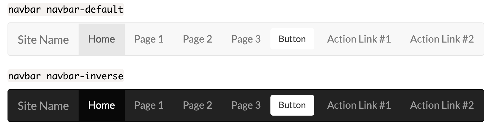
Bootstrap provides a set of classes in the Bootstrap framework to style your navbars. These classes are as follows:
navbar navbar-defaultThis is the default style for your navbars.navbar navbar-inverseThis is similar to the default style except the colors are inverted.
Adding drop-down menus to the navbar
You can include a drop down menu inside a navbar. This feature requires you to include Bootstrap’s javascript file for it to work.
<li class="dropdown">
  <a class="dropdown-toggle" data-toggle="dropdown" href="#">Drop down
    <span class="caret"></span>
  </a>
<ul class="dropdown-menu">
    <li><a href="#">Item 1</a></li>
    <li><a href="#">Item 2</a></li>
    <li><a href="#">Item 3</a></li>
  </ul>
</li>
Adding buttons to the navbar
You can add buttons on the navbar. The existing Bootstrap Button classes work, however you’ll need to include the class navbar-btn to the end of the class list.
<button class="btn navbar-btn">Button</button>
Adding forms to the navbar
You can also add forms to the navbar. This could be used for tasks such as a search field, quick login field, etc.
<form class="navbar-form navbar-right">
  <div class="form-group">
      <input type="text" class="form-control" placeholder="Search">
  </div>
  <button type="submit" class="btn btn-default">Search</button>
</form>
Aligning elements to the right on the navbar
In some cases you might want to align elements in a navbar to the right (for example a login or sign-up button.). To do this you’ll need to use the navbar-right class.
<nav class="navbar navbar-default">
  <div class="container-fluid">
    <div class="navbar-header">
      <a class="navbar-brand" href="#">Site Name</a>
    </div>
    <ul class="nav navbar-nav">
      <li class="active"><a href="#">Home</a></li>
      <li><a href="#">Page 1</a></li>
      <li><a href="#">Page 2</a></li>
      <li><a href="#">Page 3</a></li>
    </ul>
    <ul class="nav navbar-nav navbar-right">
      <li><a href="#">Action Link #1</a></li>
      <li><a href="#">Action Link #2</a></li>
    </ul>
  </div>
</nav>
Displaying the navbar independent of scrolling
In some cases you might want to keep the navbar at the top or bottom of the screen regardless of scrolling. You will need to add either the navbar-fixed-top or navbar-fixed-bottom class to the <nav> element.
<nav class="navbar navbar-default navbar-fixed-top">
  <div class="container-fluid">
    <div class="navbar-header">
      <a class="navbar-brand" href="#">Site Name</a>
    </div>
    <ul class="nav navbar-nav">
      <li class="active"><a href="#">Home</a></li>
      <li><a href="#">Page 1</a></li>
      <li><a href="#">Page 2</a></li>
      <li><a href="#">Page 3</a></li>
    </ul>
  </div>
</nav>
Collapsing the navbar
On a small screen (such as a phone or tablet) the navbar is going to take up too much space. Luckily the option to collapse the navbar exists. You can accomplish this using the following example.
<nav class="navbar navbar-default">
  <div class="container-fluid">
    <div class="navbar-header">
      <a class="navbar-brand" href="#">Site Name</a>
    </div>
    <ul class="nav navbar-nav">
      <li class="active"><a href="#">Home</a></li>
      <li><a href="#">Page 1</a></li>
      <li><a href="#">Page 2</a></li>
      <li><a href="#">Page 3</a></li>
    </ul>
  </div>
</nav>
Navbar Examples