

When you're building a webpage, sometimes you might want images or other elements to go beyond the boundaries of a container. So in this tutorial, I'll show you a couple ways you can accomplish this.
To illustrate a situation when you might find this useful, let's say we are given a webpage that looks like this:
 A webpage whose contents span 100% of the window's width
As you will probably agree, that's not very pleasant to read. One of the things you can do is set a max-width on the container – in this case it's the article element so that it's "contained" in a more pleasing way:
article {
  max-width: 60ch; /* no more than 60 characters per line in this container */
}
 Use max-width property to constrain the width of a container
That's better, but it's off to the left. So now, let's place our article text and image at the center of the page by setting margin: 0 auto on the container:
article {
  max-width: 60ch;
  margin: 0 auto; /* center this container */
}
 Center our article with margin: 0 auto
Much better now, right? To further optimize readability, we can tweak the font's size and line height as I have done in the playground below:
Now, notice the width of the image: It has been constrained by the width of the container. What if you want the image (or any other element) to span the entire page (that is, full-bleed), like this?
 Example of a full-bleed layout
Or what if you just want the image to "break out" to have any width that is wider than its container, like this?
 An element breaking out to have a width wider than that of the container
Currently, as far as I know, there are two main ways to accomplish this:
- You can either do a manual horizontal offset via negative
margin-leftandtranslateXto shift the image to the left, or - You can use CSS Grid.
But to my mind, the first solution is hacky, and the second solution is heavy-handed.
In this article, I'll cover some simpler ways to do this.
Setting the Stage
First of all, let's free up all the child elements inside the container. Instead of setting a width on the container, we set it to its child elements:
/* Instead of doing this
article {
  max-width: 60ch;
  margin: 0 auto;
}
*/

/* we set width on its direct child elements */
article > * {
  max-width: 60ch; /* childs' width can't go wider than 60ch */
  margin: 0 auto; /* center them */
}
Before:
 All children can't grow beyond the confines of their container
After:
 Now each child has plenty of space to grow horizontally if it chooses to
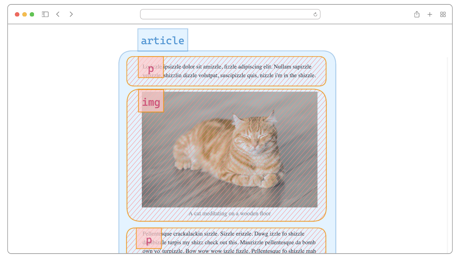
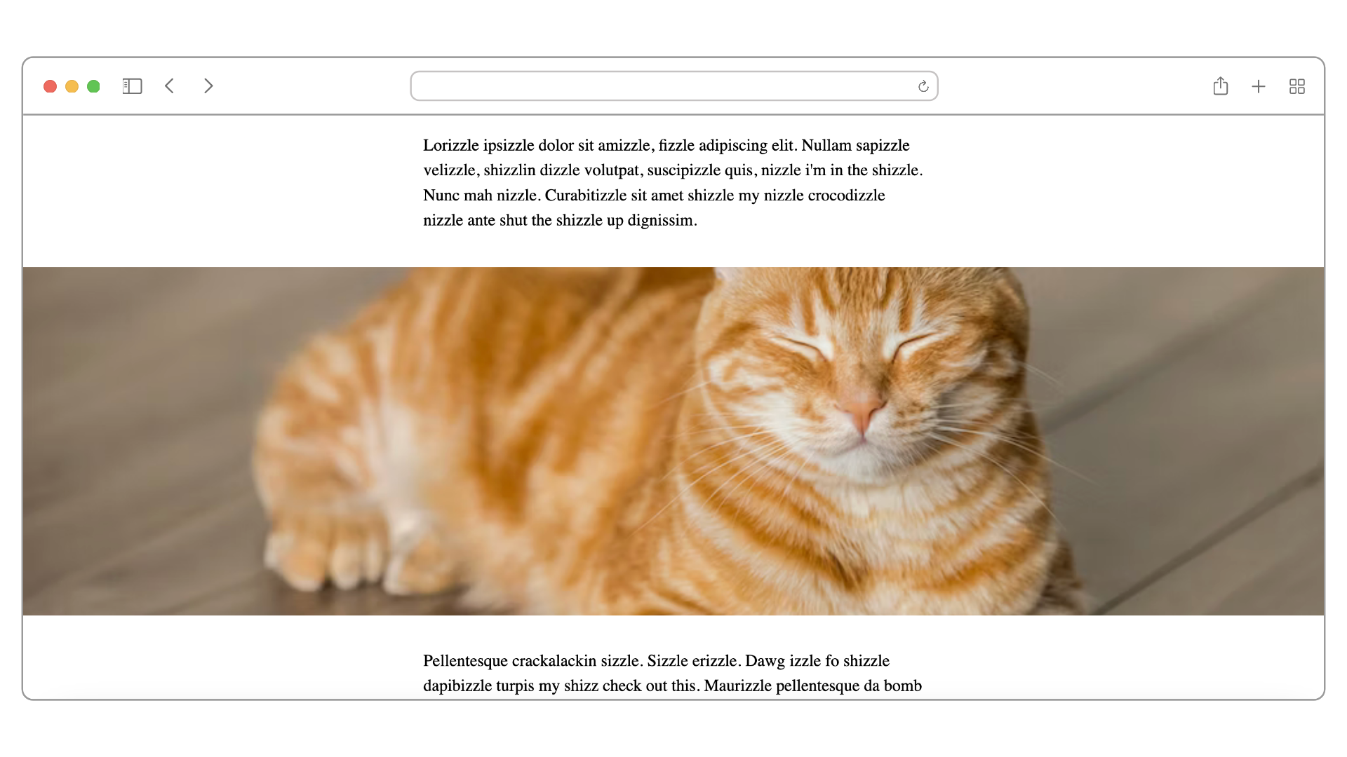
The article container is no longer limited to a specific width. It now spans the entire width of the window. This has allowed any child element to grow sideways until the boundary of the window.
For example, we can choose to specifically let the image to grow to our heart's content:
 The
The img element growing wider than the p elements
This is exactly what we are going to learn how to do next.
How to Break Out Childless Elements
Breaking out at its simplest form is when the elements we want to break out are childless. For example, say we want to break out the img element below:
<article>
  <p>Texts</p>
  <img />
  <p>Texts</p>
</article>
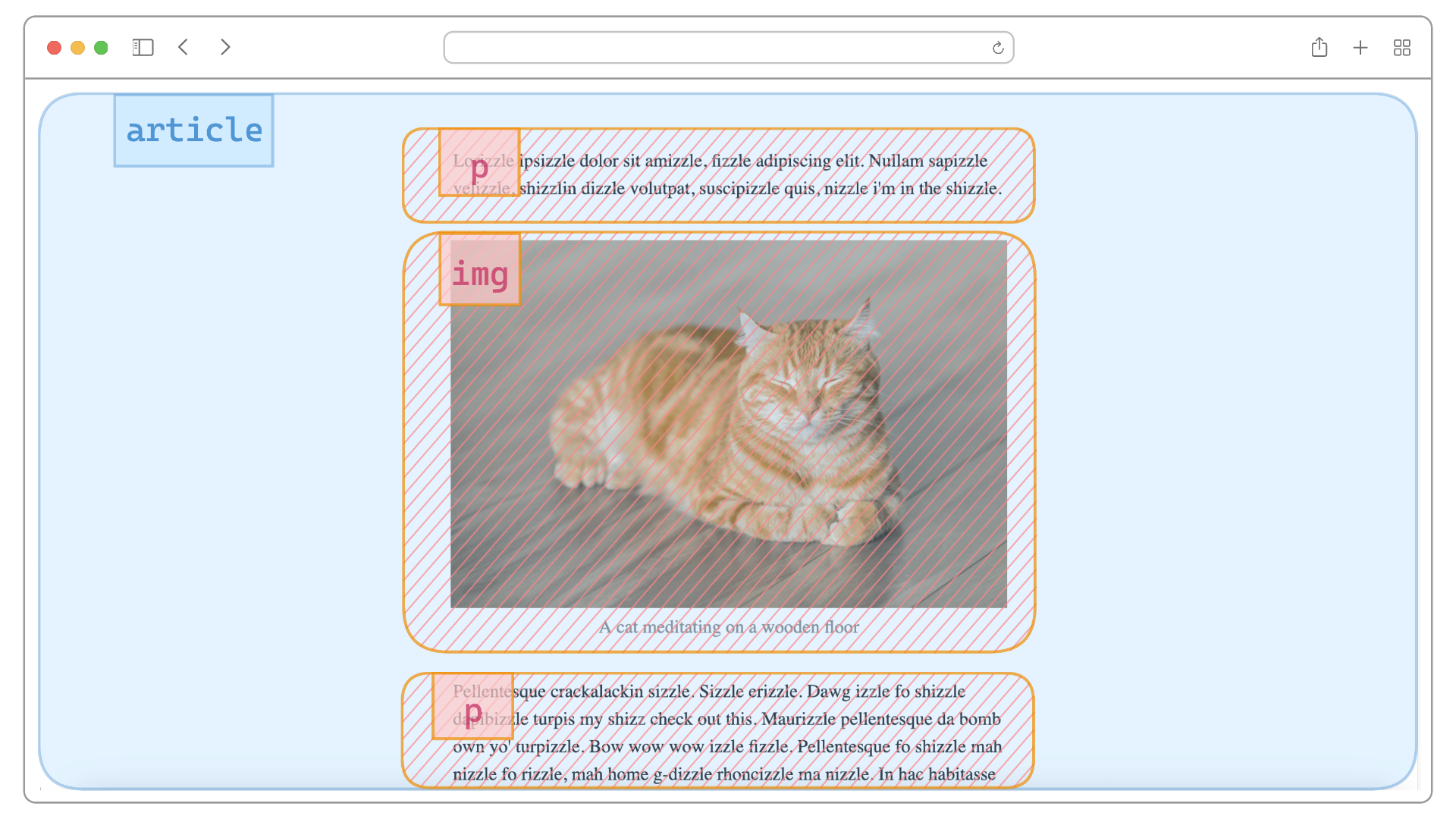
And let's make it full-bleed. To do that, we will apply 3 properties on the img:
**display: block**– Because a)imgis inline by default, and b)margin: 0 autoonly works on block elements.**width: 100%**– To have it fully fill the width of its container which isarticlethat already fills the window.**max-width: 100%**– To override themax-width: 60chand also to stop it from expanding beyond the available horizontal space of its container.
img {
  display: block;
  width: 100%;
  max-width: 100%;
}
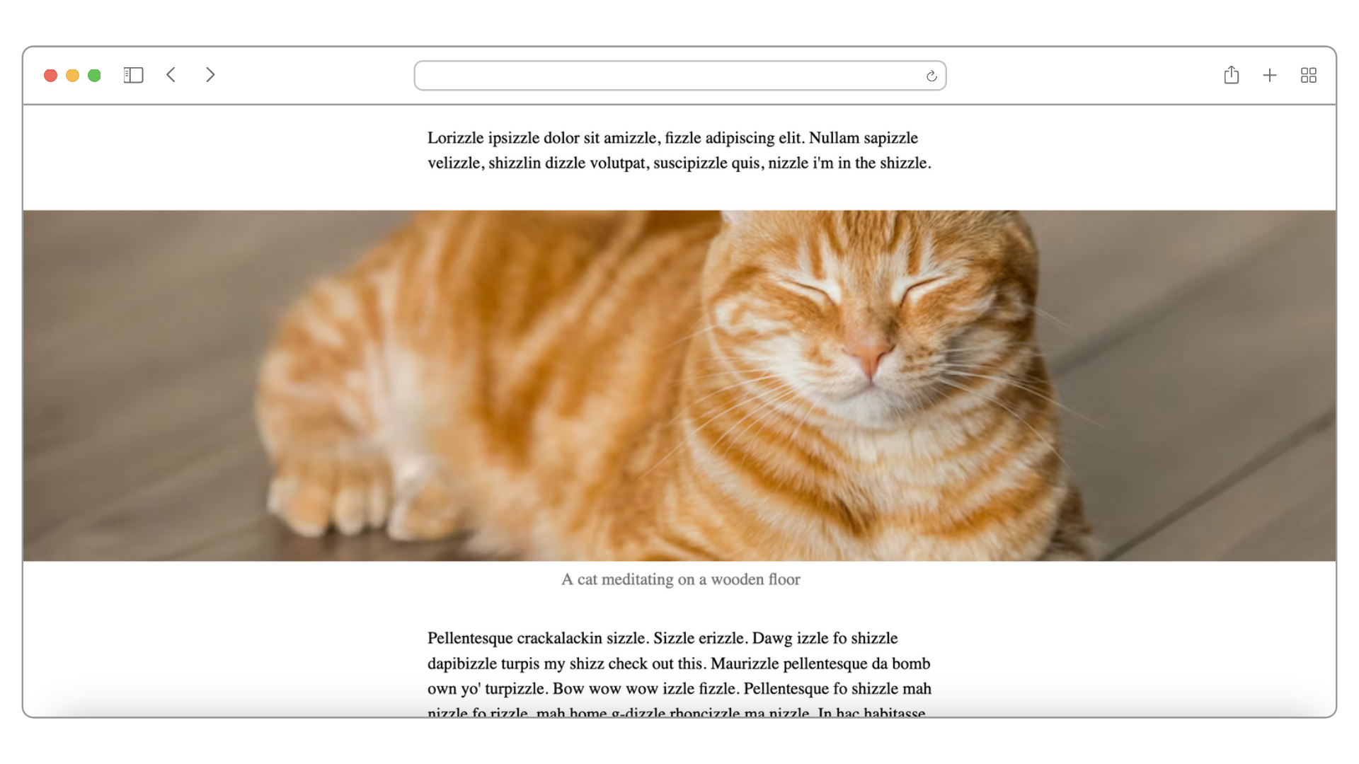
And it works:
 Full-bleed layout
Following up on the previous playground:
So far so good.
How to Break Out Elements that Have Children
Now, what if your image is wrapped in a figure, like this:
<figure>
  <img width="900px" src="" alt="" />
  <figcaption></figcaption>
</figure>
And the image has its width set or even just uses its intrinsic width? How will we break it out while centering it?
Without leveraging CSS Flexbox, to make the image full-bleed as before, first we need to set the figure to max-width: 100% so that it can fill the entire horizontal space of article. Next, we need to make sure our img is applied with display: block and margin: 0 auto in order to stay centered.
Compare this to if we were to use CSS Flexbox. Apply a CSS class that contains 3 Flexbox properties to figure alone and we are done:
.break-out {
  display: flex;
  flex-direction: column;
  align-items: center;
}
**display: flex**– Setfigureas a Flex container from which we can choose to arrange its content – in this case they would be theimgandfigcaption– either horizontally (row) or vertically (column) along the main axis.**flex-direction: column**– For our use case, we choose to arrange the content vertically.**align-items: center**– Lastly, we choose to always center the content along the cross axis. If main axis is going vertically inflex-direction: column, its cross axis would be going horizontally. So this property allowsimgandfigcaptionto always be centered horizontally relative tofigurewhich is now spanning 100% of the screen.
Finally, we just apply the class to the figure element:
<figure class="break-out">
  <img width="900px" src="" alt="" />
  <figcaption></figcaption>
</figure>
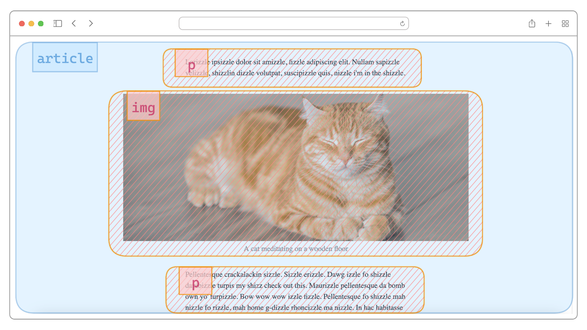
Now whatever the width of the img may be, it will be centered even until it's full-bleed:
Benefits of These Methods
The methods I have demonstrated here have the following benefits:
- Principle of Least Power: CSS Flexbox is a less powerful solution than CSS Grid.
- No complicated calculation: We let the browser center our image within the available space.
- Responsive: No re-calculation needed on our part when the browser resizes.
The second-order benefits are:
- For users: optimal performance – less code shipped and less expensive code to run. Happy browser, happy users.
- For developers: simpler and less code to maintain, which means less valuable cognitive resources spent.
Background
I found this method when I was building Zuunote. It's a Markdown-based note-taking web app in which images can be resized.
The tricky thing is, in Markdown, image syntax is parsed as an inline element. So, when users do create inline images when writing in a paragraph, this method enables them to resize between inline and full-bleed.
This is how I achieved it. Similar to what we just discussed, I wrapped the img element in a span to retain the inline characters:
<span>
  <img src="" alt="" />
</span>
Then I applied our Flexbox properties on the span when the user has resized beyond the boundary of the paragraphs:
<span class="break-out">
  <img src="" alt="" />
</span>
And the browser will keep the image centered without any expensive hand-holding on my part.
Here is the result:
One gesture covers a spectrum of resizing intentions – I think that's pretty neat :)
Thank you for reading!