
By Shubham Khatri
We often work with web applications that need to fetch large amounts of data from a server through APIs and render it on the screen.
For example, in a Social media application we fetch and render users' posts and comments. In an HR dashboard we display information about candidates who applied for a job. And in an Email Client we show the a user's emails.
Rendering all the data at once on the screen can cause your webpage to slow down considerably because of the large number of DOM elements present in the webpage.
If we want to optimize on performance we can adopt various techniques to render data in a more efficient manner. Some of these methods include infinite scroll with virtualization and pagination.
Pagination works well when you know the size of the data in advance, and you don't make frequent additions or deletions to the data-set.
For instance in a social media website where new posts are published every few milliseconds, pagination wouldn't be an ideal solution. But it would work well for an HR dashboard where candidate applications are displayed and need to be filtered or sorted as well.
In this post, we will focus on pagination and we'll build a custom controlled component that handles page buttons based on the current page and total data count.
We will also write a custom React hook that gives us a range of numbers to be rendered by the pagination component. We can use this hook independently as well when we want to render a pagination component with different styles or in a different design.
Below is a demo of what we will be building in this tutorial:
How to Set Up the Project
If you are familiar with setting up a React project, you can skip this section.
In order to set up our React Project, we will use the create-react-app command line package. You can install the package globally using npm install -g create-react-app or yarn add global create-react-app.
Run create-react-app from the command line to create a new project like this:
npx create-react-app react-pagination
Next we need to install our dependencies. We will just be using a simple additional dependency called classnames which provides flexibility when handling multiple classNames conditionally.
To install it run npm install classnames or yarn add classnames .
Now, we can run our project using the below command:
yarn start
How to Define the Interface
Now that we have our project running, we'll dive straight into our Pagination component.
Let's first look at what values we need as props to our Pagination component:
- totalCount: represents the total count of data available from the source.
- currentPage: represents the current active page. We'll use a 1-based index instead of a traditional 0-based index for our
currentPagevalue. - pageSize: represents the maximum data that is visible in a single page.
- onPageChange: callback function invoked with the updated page value when the page is changed.
- siblingCount (optional): represents the min number of page buttons to be shown on each side of the current page button. Defaults to 1.
 Illustration of different values siblingCount
- className (optional): className to be added to the top level container.
From the pagination component we'll invoke the usePagination hook which will take in the following parameters to compute the page ranges: totalCount , currentPage , pageSize , siblingCount .
How to Implement the usePagination Hook
Below are the few things we need to keep in mind while implementing the usePagination hook:
- Our pagination hook must return the range of numbers to be displayed in our pagination component as an array.
- The computation logic needs to re-run when either
currentPage,pageSize,siblingCount, ortotalCountchanges. - The total number of items returned by the hook should remain constant. This will avoid resizing our pagination component if the length of the range array changes while the user is interacting with the component.
Keeping the above things in mind let's create a file called usePagination.js in our project src folder and start with the implementation.
Our code skeleton will be as follows:
export const usePagination = ({
  totalCount,
  pageSize,
  siblingCount = 1,
  currentPage
}) => {
  const paginationRange = useMemo(() => {
     // Our implementation logic will go here

  }, [totalCount, pageSize, siblingCount, currentPage]);

  return paginationRange;
};
If we look at the above code, we are using the useMemo hook to compute our core logic. The useMemo callback will run when any value in its dependency array changes.
Also we are setting the defaultValue of our siblingCount prop to be 1 as it is an optional prop.
Before we go ahead and implement the code logic, let's understand the different behaviors of the Pagination component. The below image contains the possible states of a pagination component:
 Different states of a Pagination Component
Note that there are four possible states for a pagination component. We'll go over them one by one.
- Total page count is less than the page pills we want to show. In such a case we just return the range from
1 to totalPageCount. - Total page count is greater than the page pills but only the right DOTS are visible.
- Total page count is greater than the page pills but only the left DOTS are visible.
- Total page count is greater than the page pills and both the left and the right DOTS are visible.
As a first step, we shall go about calculating the total pages from totalCount and pageSize as follows:
const totalPageCount = Math.ceil(totalCount / pageSize);
Notice that we are using Math.ceil to round of the number to the next higher integer value. This ensures that we are reserving an extra page for the remaining data.
Next, we'll go ahead and implement a custom range function which takes in a start and end value and returns an array with elements from start to end:
const range = (start, end) => {
  let length = end - start + 1;
  /*
      Create an array of certain length and set the elements within it from
    start value to end value.
  */
  return Array.from({ length }, (_, idx) => idx + start);
};
Finally, we'll implement the core logic by keeping the above cases in mind.
export const usePagination = ({
  totalCount,
  pageSize,
  siblingCount = 1,
  currentPage
}) => {
  const paginationRange = useMemo(() => {
    const totalPageCount = Math.ceil(totalCount / pageSize);

    // Pages count is determined as siblingCount + firstPage + lastPage + currentPage + 2*DOTS
    const totalPageNumbers = siblingCount + 5;

    /*
      Case 1:
      If the number of pages is less than the page numbers we want to show in our
      paginationComponent, we return the range [1..totalPageCount]
    */
    if (totalPageNumbers >= totalPageCount) {
      return range(1, totalPageCount);
    }

    /*
        Calculate left and right sibling index and make sure they are within range 1 and totalPageCount
    */
    const leftSiblingIndex = Math.max(currentPage - siblingCount, 1);
    const rightSiblingIndex = Math.min(
      currentPage + siblingCount,
      totalPageCount
    );

    /*
      We do not show dots just when there is just one page number to be inserted between the extremes of sibling and the page limits i.e 1 and totalPageCount. Hence we are using leftSiblingIndex > 2 and rightSiblingIndex < totalPageCount - 2
    */
    const shouldShowLeftDots = leftSiblingIndex > 2;
    const shouldShowRightDots = rightSiblingIndex < totalPageCount - 2;

    const firstPageIndex = 1;
    const lastPageIndex = totalPageCount;

    /*
        Case 2: No left dots to show, but rights dots to be shown
    */
    if (!shouldShowLeftDots && shouldShowRightDots) {
      let leftItemCount = 3 + 2 * siblingCount;
      let leftRange = range(1, leftItemCount);

      return [...leftRange, DOTS, totalPageCount];
    }

    /*
        Case 3: No right dots to show, but left dots to be shown
    */
    if (shouldShowLeftDots && !shouldShowRightDots) {

      let rightItemCount = 3 + 2 * siblingCount;
      let rightRange = range(
        totalPageCount - rightItemCount + 1,
        totalPageCount
      );
      return [firstPageIndex, DOTS, ...rightRange];
    }

    /*
        Case 4: Both left and right dots to be shown
    */
    if (shouldShowLeftDots && shouldShowRightDots) {
      let middleRange = range(leftSiblingIndex, rightSiblingIndex);
      return [firstPageIndex, DOTS, ...middleRange, DOTS, lastPageIndex];
    }
  }, [totalCount, pageSize, siblingCount, currentPage]);

  return paginationRange;
};
The idea of the implementation is that we identify the range of numbers we want to show in our pagination component and then join them together with the separators or DOTS when we return the final range.
For the first scenario where our totalPageCount is less than the total number of pills we calculated based on the other params, we just return a range of numbers 1..totalPageCount .
For the other scenarios, we go about identifying whether we need DOTS on the left or right side of the currentPage by calculating the left and right indices after including the sibling pills to the currentPage and then make our decisions.
Once we know where we want to show the DOTS, the rest of the calculations are quite straightforward.
How to Implement the Pagination Component
As I mentioned earlier, we'll be using the usePagination hook in our pagination component and we'll map over the returned range to render them.
We create a Pagination.js file in our src folder and implement the code logic as follows:
import React from 'react';
import classnames from 'classnames';
import { usePagination, DOTS } from './usePagination';
import './pagination.scss';
const Pagination = props => {
const {
onPageChange,
totalCount,
siblingCount = 1,
currentPage,
pageSize,
className
} = props;
const paginationRange = usePagination({
currentPage,
totalCount,
siblingCount,
pageSize
});
// If there are less than 2 times in pagination range we shall not render the component
if (currentPage === 0 || paginationRange.length < 2) {
return null;
}
const onNext = () => {
onPageChange(currentPage + 1);
};
const onPrevious = () => {
onPageChange(currentPage - 1);
};
let lastPage = paginationRange[paginationRange.length - 1];
return (
<ul
className={classnames('pagination-container', { [className]: className })}
>
{/* Left navigation arrow */}
<li
className={classnames('pagination-item', {
disabled: currentPage === 1
})}
onClick={onPrevious}
>
<div className="arrow left" />
</li>
{paginationRange.map(pageNumber => {
// If the pageItem is a DOT, render the DOTS unicode character
if (pageNumber === DOTS) {
return <li className="pagination-item dots">…</li>;
}
// Render our Page Pills
return (
<li
className={classnames('pagination-item', {
selected: pageNumber === currentPage
})}
onClick={() => onPageChange(pageNumber)}
>
{pageNumber}
</li>
);
})}
{/* Right Navigation arrow */}
<li
className={classnames('pagination-item', {
disabled: currentPage === lastPage
})}
onClick={onNext}
>
<div className="arrow right" />
</li>
</ul>
);
};
export default Pagination;
We do not render a Pagination component if there are fewer than two pages (and then we return null) .
We render the Pagination component as a list with left and right arrows which handle the previous and next actions the user makes. In between the arrows, we map over the paginationRange and render the page numbers as pagination-items. If the page item is a DOT we render a unicode character for it.
As a special handling we add a disabled class to the left/right arrow if the currentPage is the first or the last page, respectively. We disable the pointer-events and update the styles of the arrow icons through CSS if the icon needs to be disabled.
We also add click event handlers to the page pills which will invoke the onPageChanged callback function with the updated value of currentPage.
Our CSS file will contain the following styles:
.pagination-container {
  display: flex;
  list-style-type: none;

  .pagination-item {
    padding: 0 12px;
    height: 32px;
    text-align: center;
    margin: auto 4px;
    color: rgba(0, 0, 0, 0.87);
    display: flex;
    box-sizing: border-box;
    align-items: center;
    letter-spacing: 0.01071em;
    border-radius: 16px;
    line-height: 1.43;
    font-size: 13px;
    min-width: 32px;

    &.dots:hover {
      background-color: transparent;
      cursor: default;
    }
    &:hover {
      background-color: rgba(0, 0, 0, 0.04);
      cursor: pointer;
    }

    &.selected {
      background-color: rgba(0, 0, 0, 0.08);
    }

    .arrow {
      &::before {
        position: relative;
        /* top: 3pt; Uncomment this to lower the icons as requested in comments*/
        content: '';
        /* By using an em scale, the arrows will size with the font */
        display: inline-block;
        width: 0.4em;
        height: 0.4em;
        border-right: 0.12em solid rgba(0, 0, 0, 0.87);
        border-top: 0.12em solid rgba(0, 0, 0, 0.87);
      }

      &.left {
        transform: rotate(-135deg) translate(-50%);
      }

      &.right {
        transform: rotate(45deg);
      }
    }

    &.disabled {
      pointer-events: none;

      .arrow::before {
        border-right: 0.12em solid rgba(0, 0, 0, 0.43);
        border-top: 0.12em solid rgba(0, 0, 0, 0.43);
      }

      &:hover {
        background-color: transparent;
        cursor: default;
      }
    }
  }
}
And that's it!
Our generic pagination implementation is ready and we can use it anywhere in our codebase.
How to Use the Custom Pagination Component
As a last step, let's incorporate this component in a small example.
For the scope of this article, we shall render static data in the form of a table. So let's go ahead and do that first:
import React from 'react';
import data from './data/mock-data.json';

export default function App() {
  return (
    <>
      <table>
        <thead>
          <tr>
            <th>ID</th>
            <th>FIRST NAME</th>
            <th>LAST NAME</th>
            <th>EMAIL</th>
            <th>PHONE</th>
          </tr>
        </thead>
        <tbody>
          {data.map(item => {
            return (
              <tr>
                <td>{item.id}</td>
                <td>{item.first_name}</td>
                <td>{item.last_name}</td>
                <td>{item.email}</td>
                <td>{item.phone}</td>
              </tr>
            );
          })}
        </tbody>
      </table>
    </>
  );
}
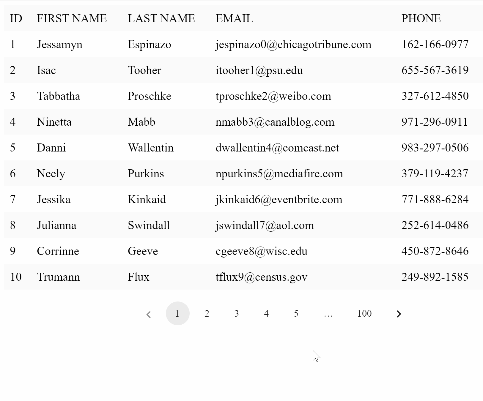
At this point our UI looks as follows:
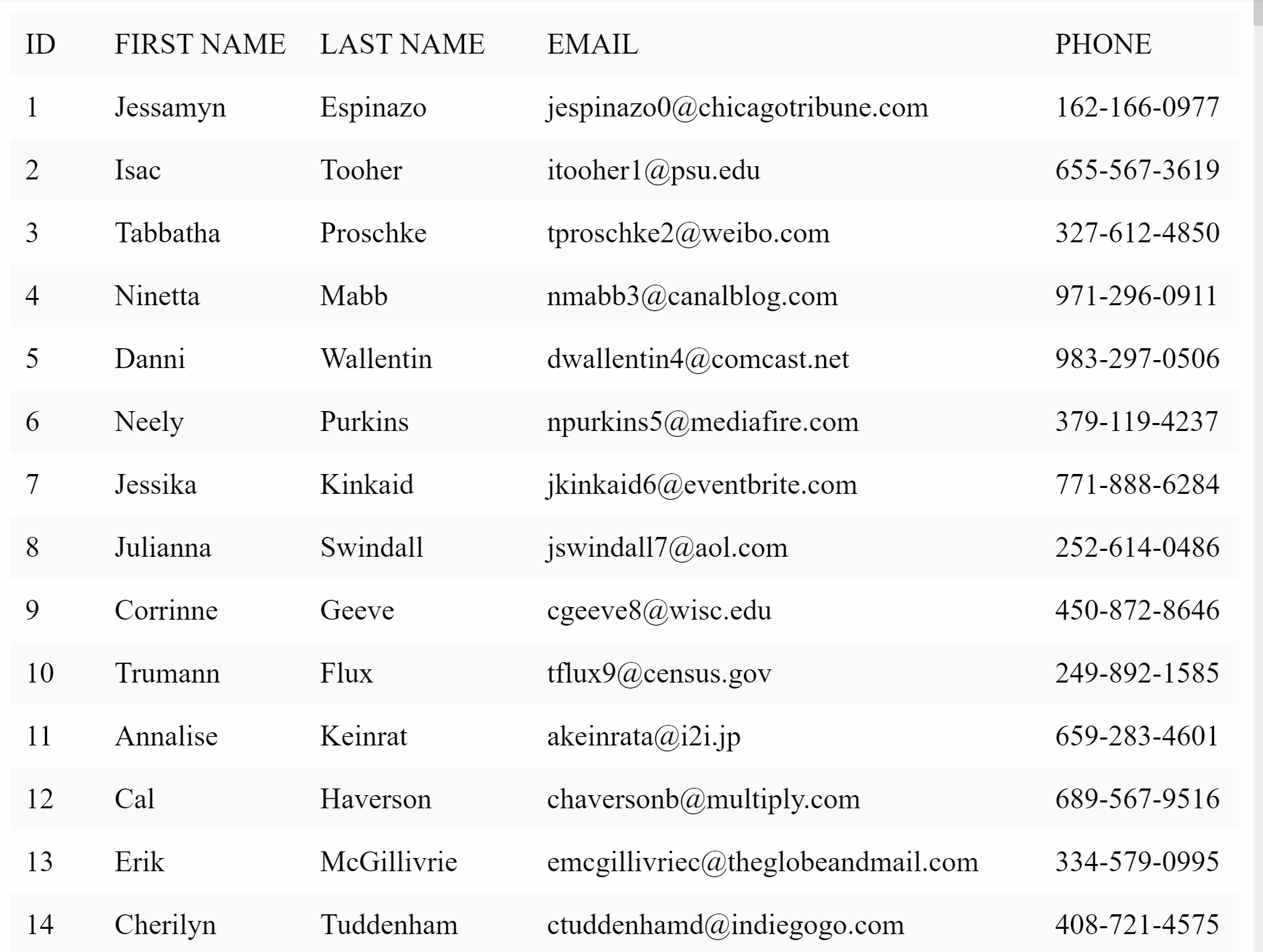
Now to incorporate the Pagination component, we need two things.
- First, we maintain a
currentPagestate. - Second, we calculate the data to be rendered for a given page and just map and render it.
For the purposes of this demo, we'll keep the PageSize constant and set its value to 10 we can also provide a selector for the user to select the desired pageSize .
Once we have made changes, we can go ahead and render our Pagination component with the appropriate props.
With these changes in mind, our final code will be as follows:
import React, { useState, useMemo } from 'react';
import Pagination from '../Pagination';
import data from './data/mock-data.json';
import './style.scss';

let PageSize = 10;

export default function App() {
  const [currentPage, setCurrentPage] = useState(1);

  const currentTableData = useMemo(() => {
    const firstPageIndex = (currentPage - 1) * PageSize;
    const lastPageIndex = firstPageIndex + PageSize;
    return data.slice(firstPageIndex, lastPageIndex);
  }, [currentPage]);

  return (
    <>
      <table>
        <thead>
          <tr>
            <th>ID</th>
            <th>FIRST NAME</th>
            <th>LAST NAME</th>
            <th>EMAIL</th>
            <th>PHONE</th>
          </tr>
        </thead>
        <tbody>
          {currentTableData.map(item => {
            return (
              <tr>
                <td>{item.id}</td>
                <td>{item.first_name}</td>
                <td>{item.last_name}</td>
                <td>{item.email}</td>
                <td>{item.phone}</td>
              </tr>
            );
          })}
        </tbody>
      </table>
      <Pagination
        className="pagination-bar"
        currentPage={currentPage}
        totalCount={data.length}
        pageSize={PageSize}
        onPageChange={page => setCurrentPage(page)}
      />
    </>
  );
}
Here is a live demo of this tutorial:
Conclusion
In this article, we create a custom React hook usePagination and used it within our Pagination component. We also implemented a short demo which used this component.
You can check out the full source code for this tutorial in this GitHub repository.
If you have any questions or suggestions regarding this article, please feel free to reach out to me on Twitter.
Thank you for reading.