
By Yazdun Fadali
Adding smooth and professional animations to your user interfaces can be a bit tricky. In this tutorial, I'll show you how to use Framer Motion in your React apps to create beautiful animations.
This guide is perfect if you're new to Framer Motion or just want to make your animations stand out. We'll walk through the steps together, making it easy to add those beautiful, professional touches to your projects. Let's get started!
What Are We Going to Build?
During this tutorial, I'll guide you step by step through implementing a complete animated sidebar component in React and Framer Motion.
You can also checkout this in-depth video tutorial I have created based on this article.
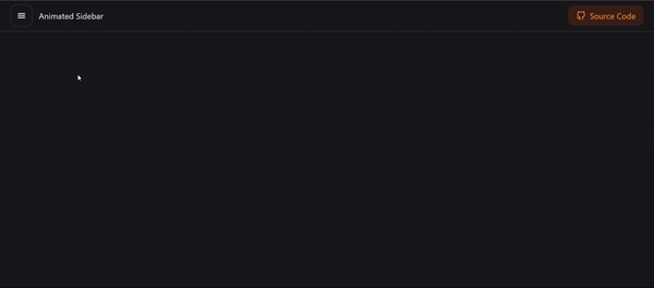
 Animated Sidebar component
Getting Started
To get started with this tutorial, I've prepared a boilerplate project for you which contains all the required dependencies, so you don't need to set up your project from scratch.
Simply clone the starter boilerplate from the GitHub repository and then follow along with the tutorial.
- Starter Boilerplate: View on GitHub
- Final Version: View on GitHub
What is Framer Motion?
Framer Motion is a simple yet powerful animation library for React. With Framer Motion, you can effortlessly add smooth and professional animations and interactions to your React projects.
Framer Motion allows you to create things like smoothly sliding buttons, fading in text, or even complex animations with just a few simple lines of code.
You might also find it interesting to know that Framer Motion is what powers Framer, a popular tool for professional web designers. So, it's trusted by the experts to create those cool animations you often see on really polished websites.
How to Create a Simple Navigation Bar in React
In this section, you'll be creating a straightforward navigation bar. Simply open the components/Navigation file and insert the following code:
//📁components/Navigation

import { Sidebar } from './Sidebar'
import { FiGithub } from 'react-icons/fi'

export const Navigation = () => {
  return (
    <nav className="flex items-center justify-between px-5 py-2 border-b-2 border-zinc-800">
      <div className="flex items-center gap-3">
        <Sidebar />
        <p>Animated Sidebar</p>
      </div>
      <a
        className="flex items-center gap-2 px-4 py-2 text-orange-400 bg-orange-700/20 rounded-xl"
        href=""
      >
        <FiGithub className="text-lg" />
        Source Code
      </a>
    </nav>
  )
}
This component renders a navigation bar on a web page. Within this navigation bar, there are two main sections. The first section includes the Sidebar component. The second section contains a link element styled like a button with an icon.
This code is essentially setting up a basic navigation interface with some predefined styles for a React application.
How to Create a Simple Sidebar Component in React
In this section, you'll be building a simple sidebar component in React. First of all, let's open up components/Sidebar and add the following code:
//📁components/Sidebar

export const Sidebar = () => {
  const [open, setOpen] = useState(false)
  const ref = useRef(null)
  useClickAway(ref, () => setOpen(false))
  const toggleSidebar = () => setOpen(prev => !prev)

  return (
    <>
      <button
        onClick={toggleSidebar}
        className="p-3 border-2 border-zinc-800 rounded-xl"
        aria-label="toggle sidebar"
      >
        <GiHamburgerMenu />
      </button>
      {open && (
        <>
          <div
            aria-hidden="true"
            className="fixed bottom-0 left-0 right-0 top-0 z-40 bg-[rgba(0,0,0,0.1)] backdrop-blur-sm"
          ></div>
          <div
            className="fixed top-0 bottom-0 left-0 z-50 w-full h-screen max-w-xs border-r-2 border-zinc-800 bg-zinc-900"
            ref={ref}
            aria-label="Sidebar"
          >
            <div className="flex items-center justify-between p-5 border-b-2 border-zinc-800">
              <span>Welcome</span>
              <button
                onClick={toggleSidebar}
                className="p-3 border-2 border-zinc-800 rounded-xl"
                aria-label="close sidebar"
              >
                <AiOutlineRollback />
              </button>
            </div>
            <ul>
              {items.map((item, idx) => {
                const { title, href, Icon } = item
                return (
                  <li key={title}>
                    <a
                      onClick={toggleSidebar}
                      href={href}
                      className="flex items-center justify-between gap-5 p-5 transition-all border-b-2 hover:bg-zinc-900 border-zinc-800"
                    >
                      <span>{title}</span>
                      <div>
                        <Icon className="text-2xl" />
                      </div>
                    </a>
                  </li>
                )
              })}
            </ul>
          </div>
        </>
      )}
    </>
  )
}

const items = [
  { title: 'Home', Icon: BiHomeSmile, href: '#' },
  { title: 'About', Icon: BiUser },
  { title: 'Contact', Icon: HiOutlineChatBubbleBottomCenterText, href: '#' },
  { title: 'Settings', Icon: FiSettings, href: '#' },
  { title: 'Shop', Icon: FiShoppingCart, href: '#' },
]
This component creates a collapsible sidebar navigation menu.
When the sidebar button is clicked, the sidebar either opens or closes. Inside the sidebar, there are menu items like Home , About, Contact, and so on represented by icons.
Clicking on any of these items will perform an action, like navigating to a different page.
The component also handles various interactions, such as clicking outside the sidebar to close it.
Overall, this component sets up a functional and interactive sidebar menu for a web application. Here is how your sidebar looks like so far:
 Sidebar Component
While this sidebar functions perfectly, you may notice that there are no animations present. Let's now integrate Framer Motion and incorporate some smooth animations into this sidebar.
How to Animate React Components with Framer Motion
Now that you have a functional sidebar, let's enhance it with some animations to add a bit of flair. Open up components/Sidebar and add the following code:
import { useRef, useState } from 'react'
import { GiHamburgerMenu } from 'react-icons/gi'
import { AnimatePresence, motion } from 'framer-motion'
import { useClickAway } from 'react-use'
import { AiOutlineRollback } from 'react-icons/ai'
import { BiHomeSmile, BiUser } from 'react-icons/bi'
import { HiOutlineChatBubbleBottomCenterText } from 'react-icons/hi2'
import { FiSettings, FiShoppingCart } from 'react-icons/fi'

export const Sidebar = () => {
  const [open, setOpen] = useState(false)
  const ref = useRef(null)
  useClickAway(ref, () => setOpen(false))
  const toggleSidebar = () => setOpen(prev => !prev)

  return (
    <>
      <button
        onClick={toggleSidebar}
        className="p-3 border-2 border-zinc-800 rounded-xl"
        aria-label="toggle sidebar"
      >
        <GiHamburgerMenu />
      </button>
      <AnimatePresence mode="wait" initial={false}>
        {open && (
          <>
            <motion.div
              {...framerSidebarBackground}
              aria-hidden="true"
              className="fixed bottom-0 left-0 right-0 top-0 z-40 bg-[rgba(0,0,0,0.1)] backdrop-blur-sm"
            ></motion.div>
            <motion.div
              {...framerSidebarPanel}
              className="fixed top-0 bottom-0 left-0 z-50 w-full h-screen max-w-xs border-r-2 border-zinc-800 bg-zinc-900"
              ref={ref}
              aria-label="Sidebar"
            >
              <div className="flex items-center justify-between p-5 border-b-2 border-zinc-800">
                <span>Welcome</span>
                <button
                  onClick={toggleSidebar}
                  className="p-3 border-2 border-zinc-800 rounded-xl"
                  aria-label="close sidebar"
                >
                  <AiOutlineRollback />
                </button>
              </div>
              <ul>
                {items.map((item, idx) => {
                  const { title, href, Icon } = item
                  return (
                    <li key={title}>
                      <a
                        onClick={toggleSidebar}
                        href={href}
                        className="flex items-center justify-between gap-5 p-5 transition-all border-b-2 hover:bg-zinc-900 border-zinc-800"
                      >
                        <motion.span {...framerText(idx)}>{title}</motion.span>
                        <motion.div {...framerIcon}>
                          <Icon className="text-2xl" />
                        </motion.div>
                      </a>
                    </li>
                  )
                })}
              </ul>
            </motion.div>
          </>
        )}
      </AnimatePresence>
    </>
  )
}

const items = [
  { title: 'Home', Icon: BiHomeSmile, href: '#' },
  { title: 'About', Icon: BiUser },
  { title: 'Contact', Icon: HiOutlineChatBubbleBottomCenterText, href: '#' },
  { title: 'Settings', Icon: FiSettings, href: '#' },
  { title: 'Shop', Icon: FiShoppingCart, href: '#' },
]

const framerSidebarBackground = {
  initial: { opacity: 0 },
  animate: { opacity: 1 },
  exit: { opacity: 0, transition: { delay: 0.2 } },
  transition: { duration: 0.3 },
}

const framerSidebarPanel = {
  initial: { x: '-100%' },
  animate: { x: 0 },
  exit: { x: '-100%' },
  transition: { duration: 0.3 },
}

const framerText = delay => {
  return {
    initial: { opacity: 0, x: -50 },
    animate: { opacity: 1, x: 0 },
    transition: {
      delay: 0.5 + delay / 10,
    },
  }
}

const framerIcon = {
  initial: { scale: 0 },
  animate: { scale: 1 },
  transition: {
    type: 'spring',
    stiffness: 260,
    damping: 20,
    delay: 1.5,
  },
}
Now let's go through the changes you've just added to your sidebar component:
motionfrom Framer Motion:motionis an element provided by the Framer Motion library. It's used to wrap other components or elements to enable animation effects. In this code, we've used it to animate different elements of the sidebar, such as background overlays and icons.AnimatePresencefrom Framer Motion:AnimatePresenceis a component from Framer Motion that helps us animate components when they are mounted or unmounted. It's used to wrap elements that may appear or disappear dynamically. In this code, we've used it to handle the animation when the sidebar opens or closes.- Animation Objects:
framerSidebarBackground– This object contains properties that define how the background overlay of the sidebar animates. It has three states: initial (when it's not visible), animate (when it's fully visible), and exit (when it's disappearing).opacityis used to control the transparency of the overlay.transitiondefines how the animation transitions between states, including the duration of the animation and a delay. framerSidebarPanel: This object defines the animation for the sidebar panel itself, controlling how it slides into view.xis used to set the horizontal position of the sidebar. Similar toframerSidebarBackground, it defines initial, animate, and exit states, as well as transition properties.framerTextandframerIcon: These objects define animations for the text and icons within the sidebar items. They control properties like opacity, position (x), and scale to create smooth transitions and effects.
These animation objects provide a structured way to define how different elements within the sidebar should animate when they appear or disappear. They use a combination of properties like opacity, position, and scale to animate your React components.
Final result
Congratulations! You've successfully brought life to your sidebar using React and Framer Motion. 🎉
Conclusion
In this tutorial you learned how to create a fully animated sidebar using Framer Motion.
With this new skill, you're now equipped to add smooth, professional animations to your React applications.
The possibilities for creating impressive and intricate animations using Framer Motion are endless.
Don't hesitate to showcase your projects on Twitter with me – I'd love to see your creative ideas come to life!