
HTML forms consist of a body of text boxes, buttons, dropdowns and other selection widgets. Web developers use these elements to receive users' information on a website.
If you've ever searched on Google, signed up or logged into a website, made a payment, or responded to a questionnaire, you have interacted with a web form.
When building for the web, you must ensure that your application is accessible to all users. This includes those who require assistive technologies such as screen readers to navigate a website.
HTML5 has semantic form elements which are the best way to achieve this. Thankfully, the benefits are beyond accessibility:
- They make it easier to develop because they come with some free functionality, and is generally easier to understand.
- Better on mobile — semantic HTML is easier to make responsive for different screen sizes. Its file are generally lighter than non-semantic spaghetti code.
- Good for SEO — your web page will have a higher chance of being found by customers because search engines prioritize keywords inside headings, links, and so on over those in non-semantic
<div>s etc.
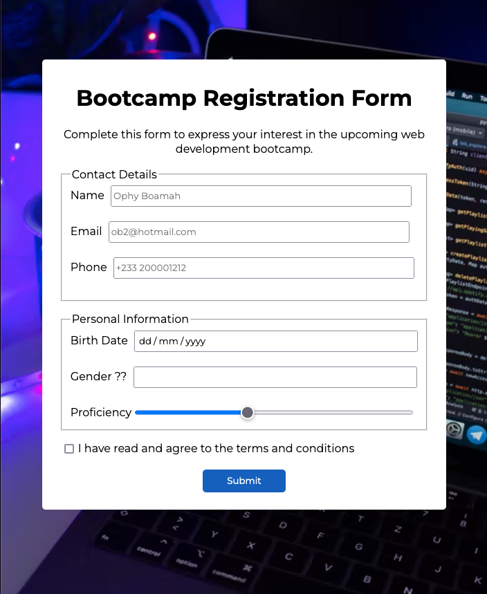
In this article, we’re going to discuss the latest elements and attributes in HTML5 forms that you can use to build and validate the simple yet modern form you see here:
You can see the source code here.
How to Use New HTML5 Form Elements
Over the years, web forms have gone through various changes until the arrival of HTML5.
With the introduction of new and improved HTML5 elements and their attributes, anyone can learn to build beautiful, functional, and accessible forms.
Out of the numerous form elements, some of the most essential include:
Form Outline – How to Use Fieldset, Legend, and Label Tags
You use the <fieldset> tag to group related elements (controls and labels) in a web form by drawing a box around them. It usually contains elements like legend, label and inputs.
You use the <legend> tag to define captions for fieldset elements. This way it can also be used as a way to group elements. And the <label> tag gives a definition to several elements.
You should always link the <label> tag to an <input> element because:
- A user can focus on the input by clicking the label
- When the input is focused, screen readers read out the label to help differently-abled users.
- For checkboxes, especially on mobile, users who aren't able to easily click on smaller items can click on the label to toggle the checkbox on.
<fieldset class="first-section">
      <legend>Contact Details</legend>
      <label for="name">Name</label>
      <input type="text" id="name" name="name" autofocus placeholder="Ophy Boamah" autocomplete="on" required> <br><br>
      <label for="email">Email</label>
      <input type="email" id="email" placeholder="ob2@hotmail.com"> <br><br>
      <label for="tel">Phone</label>
      <input type="tel" id="tel" placeholder="+233 200001212"> <br><br>
</fieldset>
In the code above, we're using the fieldset tag to create an initial group tagged "first-section". The legend tag contains text that provides a description for the group of elements. Finally, the label tag identifies each of the inputs and their purpose.
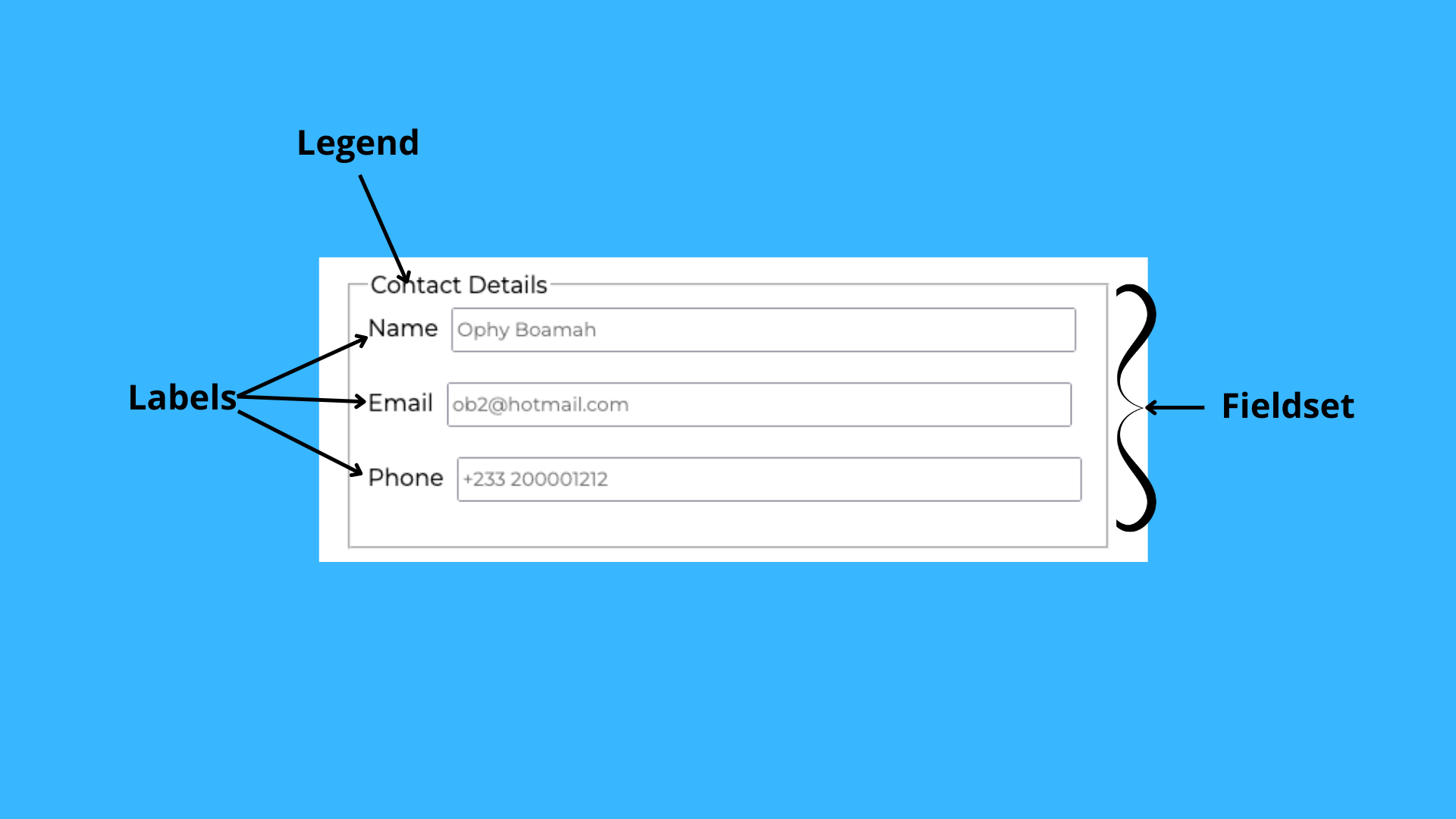 Fieldset, Legend, and Label
How to Use Placeholder Text
You use placeholder text within input fields, and it's only removed when the input field is focused or filled.
Usually, placeholder text has a lighter font color compared to the color of the input labels and values. You'll mostly use placeholders to give a user further insights as to what to fill out in a form. Here's an example:
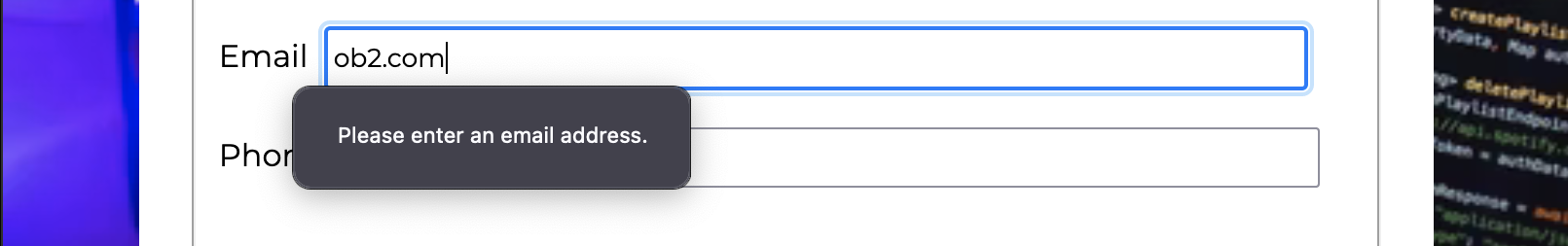
<input type="email" id="email" placeholder="ob2@hotmail.com">
The type="email" attribute ensures that the input doesn't accept any other value than emails. The id attribute links the input element to its label to allow for association and focusing. The "ob2@hotmail.com" gives the user a hint of the kind of value the input expects.
 Email input placeholder
How to Use Focus
Initially, users had to click within the first input box in a form in order to start filling it out. But HTML5 lets web developers place emphasis on the inputs users should interact with first.
Autofocus is an attribute that you can add on an <input> or <textarea> element for this purpose. It's an important accessibility feature too because it makes life easier for people who use screen readers, for example.
Here's an example of how to use autofocus:
<input autofocus type="text" id="name" name="name" autofocus placeholder="Ophy Boamah" required>
As seen in the code above, you can put the autofocus attribute anywhere within the input tag. It's often followed or surrounded by the other generic attributes like name, id, and so on.
 Input focus
How to Use New HTML5 Inputs
It's probably safe to say that <input> is the most popular attribute of a web form. Actually, everything in a form is an input because it requires some form of data from users. You use this attribute the most to receive text, numbers and emails, and so on.
Various elements are differentiated using the value of the type attribute in inputs. Below are three new and useful examples:
How to Use the Search Element
You use the search element to let users enter queries when they need to search for something. It is very similar to text inputs.
The main thing that differentiates them would be in the styling as accessing the input using the type input[type=search] tends to be super handy as compared to giving a text input a class.
<input type="search" id="email" placeholder="ob2@hotmail.com">
On certain browsers like Chrome, once you start typing, an 'x' icon is placed at the end of the input field. Clicking on this icon clears the value typed into the input and using the esc key on your keyboard gives the same result.
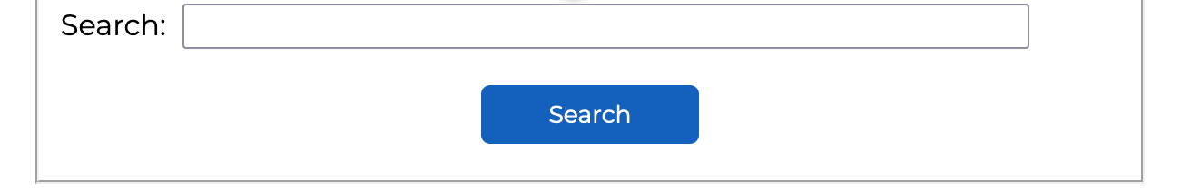 Search input
How to Use the Hidden Element
Web developers use hidden elements to render an input's content hidden and inaccessible to a user interacting with a form. This input type doesn't exactly render visually. Its content is not seen by the user but upon submitting the form, its sent to the server.
<input type="hidden" id="indexNumber" name="indexNumber" value="00202010">
How to Use the Progress Element
This is an element you can use to indicate the progress of a task. The max attribute is used to indicate the total value of the progress bar. The value attribute essentially shows the percentage of the task that's been completed by coloring in the bar to that extent. The id attribute, as always, is used to link to the the label.
 <label for="days">Proficiency:</label>
<progress id="days" value="27" max="100"> 27% </progress>
Unlike the input with the type range, the progress element does not allow users to make changes. Instead, it communicates in a read-only style.
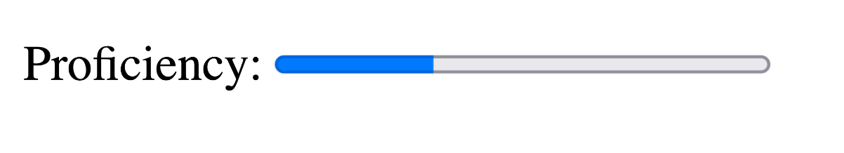 Progress bar
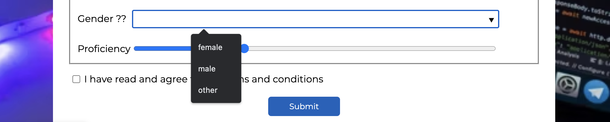
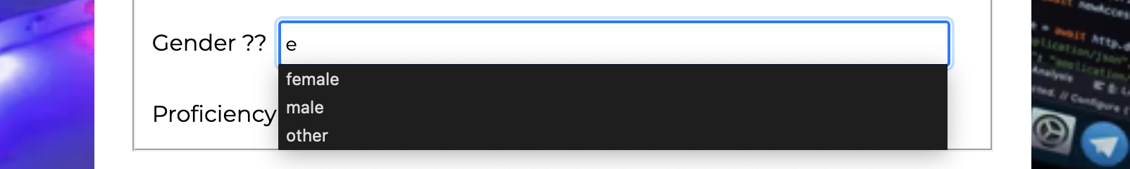
How to Use the Data List Element
The data list element specifies a list of pre-defined options for an element. It's often used to offer autocomplete features for a list of items. This is because once you start typing, you get a preview of the list of options available.
As shown below, in order to link an <input> tag with a <datalist>, you have to ensure the value of the 'list' attribute is the same as the 'id' on the datalist.
<label for="gender">Gender ??</label>
      <input list="genders" name="gender" id="gender">
      <datalist id="genders">
        <option value="female">
        <option value="male">
        <option value="other">
      </datalist>
This input is rendered differently on the various browsers:
Chrome: Once you hover on the input, there's a dropdown icon added at the end of the input. When you click within the input or on the label, the values of the various options are also shown in a dropdown.
Firefox: In order to see the option values, the user has to enter a part of the text and the options will be displayed in sort of an autocomplete style.
 Data list
What is Form Validation?
Building the form is the first step in this process. As a developer, you have to always make sure that your users are providing accurate responses. This is necessary because you shouldn't assume that users will do the right thing.
This is the concept of validation in forms – preventing mistakes or catching them as soon as they happen.
Types of Form Validation
There are two popular types of validating a web form. They are:
Client-side Validation
Client-side validation can be linked to the 'preventing mistakes' part of validation. It involves strategies such as doing certain checks in the browser before submitting the form.
Methods of client-side validation include adding error popups and not letting a user proceed until they fill in the correct info.
Server-side Validation
Server-side validation can be linked to the 'catching mistakes' part of validation.
Unlike the client-side, this type doesn't check for errors while users are still on the form. Instead it checks when the form data is sent to your web server.
In this case, you'd show an error page as feedback to indicate the presence of errors.
Popular Client-side Validation Methods
Basic Client-side Validation
Some examples of basic client-side validation include "This field is required", "Enter a valid email", and "Password should be at least 8 characters long".
These are just a few of the many error messages thrown at users when they don't enter data in the format a form expects.
The most commonly used of these attributes include:
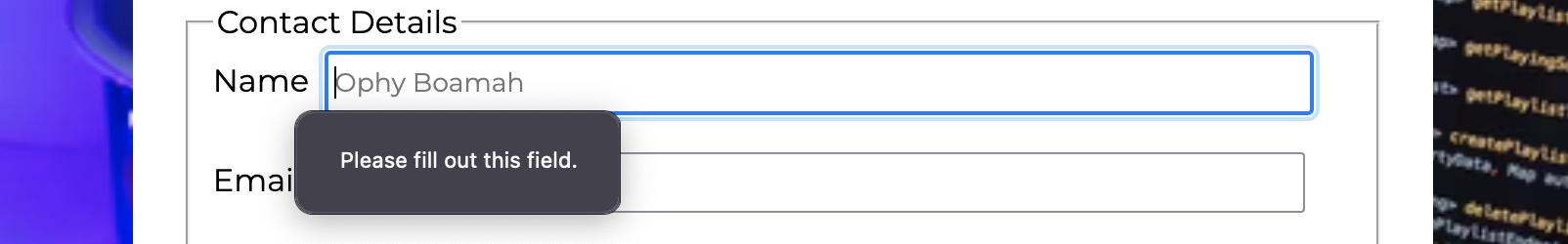
- Required: Specifies input fields that need to be filled in before submitting the form.
- Minlength and Maxlength: Specify a string's minimum and maximum length expected.
- Min and Max: Specify the minimum and maximum values of numbers.
- Type: Specifies what kind of data is needed for specific input fields, for example date, number, name, email, and so on.
The Constraint Validation API
As the name suggests, the Constraint Validation API is a Web API that offers validating features to web forms. You can use its new properties and methods to modify a form input's validity.
Developers can now easily give custom functionality and error messages. Basically, this API allows you to detect errors and display a custom message based on the type of error.
You can create custom validation and error messages with the setCustomValidity method as well as the validationMessage property.
Other Helpful Elements to Know
| Element | Description |
|---|---|
autocomplete |
You can use autocomplete to recall recently typed values in a given input. Besides sensitive data and one-time PINs, it's a time-saving feature. You can turn on its value to recommend it for a particular input field or vice versa. |
autocorrect |
Use these attributes to control automatic correction and capitalization features on some mobile devices (namely, the version of Safari that runs on iPads and iPhones) |
spellcheck |
You can set this attribute to true to indicate that the user should check the spelling of some text, especially strings typed in an input. The only issue that comes from this is that not all text that is typed in the input is supposed to make sense as actual words. |
Putting it All Together
Here's the outcome of putting the various elements you've learned about in this article together:
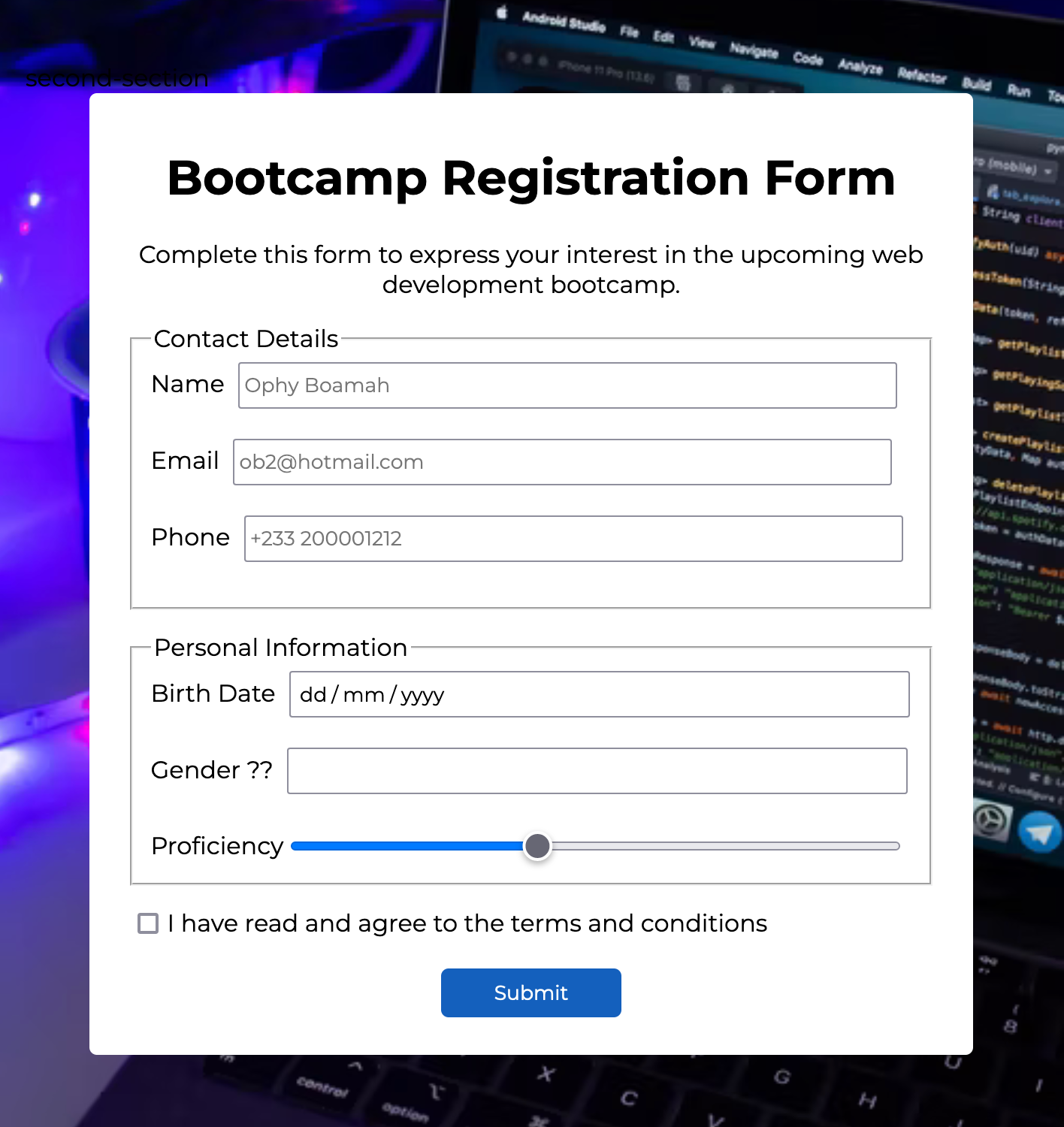
Here's the code for that:
<!DOCTYPE html>
<html lang="en">
<head>
  <meta charset="UTF-8">
  <meta http-equiv="X-UA-Compatible" content="IE=edge">
  <meta name="viewport" content="width=device-width, initial-scale=1.0">
  <title>Bootcamp Registration</title>
  <link rel="preconnect" href="https://fonts.googleapis.com">
<link rel="preconnect" href="https://fonts.googleapis.com">
<link rel="preconnect" href="https://fonts.gstatic.com" crossorigin>
<link href="https://fonts.googleapis.com/css2?family=Montserrat:wght@400;600;700&display=swap" rel="stylesheet">
</head>
<body>
  <div class="form">
    <h1>Bootcamp Registration Form</h1>
  <p>Complete this form to express your interest in the upcoming web development bootcamp.</p>
  <form>
<!-- Contact Details -->
    <fieldset class="first-section">
      <legend>Contact Details</legend>
      <label for="name">Name</label>
      <input autofocus type="text" id="name" name="name" autofocus placeholder="Ophy Boamah" autocomplete="on" required> <br><br>
      <label for="email">Email</label>
      <input type="email" id="email" placeholder="ob2@hotmail.com"> <br><br>
      <label for="tel">Phone</label>
      <input type="tel" id="tel" placeholder="+233 200001212"> <br><br>
    </fieldset>
    <!-- Personal Information -->
    <fieldset class="second-section">
      <legend>Personal Information</legend>
      <label for="dob">Birth Date</label>
      <input type="date" id="dob"> <br><br>
        <label for="gender">Gender ??</label>
      <input list="genders" name="gender" id="gender">
      <datalist id="genders">
        <option value="female">
        <option value="male">
        <option value="other">
      </datalist><br><br>
     <div class="proficiency">
        <label for="profeciency">Proficiency</label>
      <input type="range" value="4" max="10" id="profeciency" name="profeciency">
     </div>

    </fieldset>
     <!-- Preferred Language -->
     <div class="terms">
        <input type="checkbox" id="scales" name="scales" class="checkbox">
      <label for="scales">I have read and agree to the terms and conditions</label>
     </div>
    <button>Submit</button>
  </form>
  </div>
</body>
</html>
* {
  font-family: 'Montserrat', sans-serif;
}

body {
  height: 80vh;
  margin-top: 5rem;
  background-image: url("https://images.unsplash.com/photo-1595675024853-0f3ec9098ac7?ixlib=rb-1.2.1&ixid=MnwxMjA3fDB8MHxzZWFyY2h8Nnx8Y29kaW5nJTIwYm9vdGNhbXB8ZW58MHx8MHx8&auto=format&fit=crop&w=500&q=60");
  background-repeat: no-repeat;
  background-position: center;
  background-size: cover;
  padding: 10px;
}

.form {
  background-color: #fff;
  border-radius: 5px;
  padding: 15px 25px;
  width: 80%;
  margin: 0 auto;
}

.checkbox {
  width: 20px !important;
}

.first-section input {
  width: 85%;
  height: 25px;
  margin-left: 5px;
}

.second-section input{
  width: 80%;
  height: 25px;
  margin-left: 5px;
}

.form h1, p {
  text-align: center;
}
button {
  border: none;
  color: white;
  background: #1560BD;
  padding: 8px 25px;
  border-radius: 5px;
  display: block;
  margin: 20px auto 10px auto;
  width: 120px;
}

.second-section {
  margin-top: 15px;
}

.proficiency {
  display: flex;
  align-items: center;
}

.terms {
  margin-top: 15px;
  display: flex;
  align-items: center;
}
Conclusion
The new HTML5 form elements and attributes make it easy to access certain essential functionalities. Especially those that were otherwise only possible with CSS or many lines of JavaScript.
It's now easier than ever to create web forms that are both modern and functional with only HTML. Most importantly, it brings peace of mind to web developers. Because you know that you can easily create forms that will be uniform across the various browsers.
Thanks for reading 👋🏾. I hope you found this helpful.