
When you think of marquees, you often envision the vibrant lights and spinning displays at amusement parks, bringing back fond memories of your childhood.
Similarly in web applications, marquees inject a lively visual sense by effortlessly grabbing attention and infusing your online projects with dynamism.
Join me as we explore how to build an engaging marquee component in React.
This step-by-step guide targets everyone regardless of skill level, we aim to make your experience with React both enjoyable and useful.
What We'll Cover:
- Understanding Marquee Components
- Benefits of Marquees
- Planning and Designing the Marquee Component
- How to Implement the Marquee Component
- How to Enhance the Marquee Component
- Best Practices and Tips for Marquee Component Development
- Conclusion
Prerequisites
- Fundamentals of HTML and CSS
- Fundamentals of ES6 JavaScript and React
Understanding Marquee Components
A marquee represents a continuous section of text or visual content (such as pictures) that scrolls automatically in a horizontal direction.
Although the official HTML Marquee element is obsolete and its use is heavily discouraged, the concept of scrolling, endless elements to add zest to a webpage is still very much in use, and can be found on numerous modern websites.
This effect is realized through CSS animations, offering a more efficient, fluid, and lightweight animation outcome.
A visual example of a marquee component from Webflow is shown below.
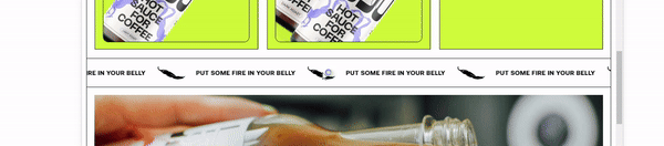 Webflow Example
Benefits of Marquees
They have a bunch of usefulness such as:
- Attention-grabbing: Marquees are excellent for drawing attention to specific content on a webpage. Whether it's a special offer, announcement, or featured content, a moving marquee naturally catches the eye.
- Visual Appeal: Adding a touch of motion to your website enhances its visual appeal. Marquees can bring life to a page, making it more dynamic and engaging for users.
- Highlighting Important Information: When you want to emphasize critical information like breaking news, upcoming events, or urgent messages, a marquee is an effective way to ensure that users don't miss out.
- Event Promotion: They are particularly useful for promoting events or time-sensitive activities. Their scrolling nature allows you to display event details, dates, and highlights space-efficiently.
- Ticker-Style Updates: For displaying real-time updates, such as stock prices, news headlines, or social media feeds, marquees provide a ticker-style format that keeps information continuously flowing for users.
- Interactive Banners: They can serve as interactive banners, allowing users to click on specific items as they scroll by. This can be a creative way to lead users to different sections or pages of your website.
- Dynamic Product Showcases: E-commerce websites can benefit from marquees by showcasing new products or featured items in a visually engaging way, encouraging users to explore the offerings.
- Call-to-Action Emphasis: If you have specific call-to-action messages, using them can give prominence and ensure that they don't go unnoticed.
- Breaking Monotony: In long pages or static content, a well-designed marquee can break the monotony and add an element of surprise, making the user experience more interesting.
- Versatility: They are versatile and can be customized to suit various styles and themes, making them a flexible tool for web designers seeking to create unique and memorable user interfaces.
Planning and Designing the Marquee Component
Before you start coding, it's important to plan and design your component and consider factors such as:
- Define Content: Clearly outline the content you want to display in the component. This could include text, images, or a combination of both.
- Scroll Speed: Determine the desired scrolling speed to be used. Consider the optimal pace for readability and visual appeal.
- Visual Design: Sketch or visualize how you want it to look. Decide on colors, fonts, and any additional styling to align with your overall design scheme.
- Behavior at Scroll End: Consider its behavior when it reaches the end of its scroll position. Decide whether it should loop continuously, bounce back and forth, or have a specific end-state.
- User Interaction: If applicable, plan for any user interaction. This could include pausing on hover or allowing users to click on items within the marquee.
- Responsive Design: Ensure that your component is designed to be responsive, adapting seamlessly to different screen sizes and devices.
- Testing Considerations: Anticipate potential challenges or adjustments needed during the testing phase. Plan for how it will behave on various browsers and devices.
- Accessibility: Keep accessibility in mind, ensuring that users with different disabilities can still access and understand the content within it.
How to Implement the Marquee Component
To implement the component, start by creating a React environment with Vite.
npm create vite@latest
After which you navigate to your project directory, install the necessary packages and start up the dev server.
 Setting up dev server
Next, create the elements for the JSX mockup for your component.
export default function App() {
  return (
    <div className=" main__container">
      <h1>My Marquee</h1>
      <section className=" ">
        <h2>Default Behaviour</h2>

        <div className="marquee">
          <ul className="marquee__content">
            <div className=" marquee__item">
              <img src={AndroidLogo} alt="" />
            </div>
            <div className=" marquee__item">
              <img src={BehanceLogo} alt="" />
            </div>
            <div className=" marquee__item">
              <img src={GoogleLogo} alt="" />
            </div>
            <div className=" marquee__item">
              <img src={InstagramLogo} alt="" />
            </div>
            <div className=" marquee__item">
              <img src={PaypalLogo} alt="" />
            </div>
            <div className=" marquee__item">
              <img src={SpotifyLogo} alt="" />
            </div>
          </ul>

          <ul aria-hidden="true" className="marquee__content">
            <div className=" marquee__item">
              <img src={AndroidLogo} alt="" />
            </div>
            <div className=" marquee__item">
              <img src={BehanceLogo} alt="" />
            </div>
            <div className=" marquee__item">
              <img src={GoogleLogo} alt="" />
            </div>
            <div className=" marquee__item">
              <img src={InstagramLogo} alt="" />
            </div>
            <div className=" marquee__item">
              <img src={PaypalLogo} alt="" />
            </div>
            <div className=" marquee__item">
              <img src={SpotifyLogo} alt="" />
            </div>
          </ul>
        </div>
      </section>
    </div>
  );
}
This includes a header for the component, the behavior of the component and the data in the component to be animated.
It is important to duplicate the data in the component as it would be used to achieve the duplicate effect. However, we’re hiding the second list initially using the aria-hidden='true' property.
To make it more visually appealing, add these styles.
body {
  font-family: system-ui, -apple-system, BlinkMacSystemFont, "Segoe UI", Roboto,
    Oxygen, Ubuntu, Cantarell, "Open Sans", "Helvetica Neue", sans-serif;
  padding: 2rem;
  width: 100%;
  min-height: 100vh;
  font-size: 1rem;
  line-height: 1.5;
}

* { box-sizing: border-box; }

h1 {
  font-size: 2rem;
  font-weight: 600;
  line-height: 1.2;
  margin-block: 2rem 1rem;
  text-align: center;
}

h2 {
  font-size: 1.25rem;
  font-weight: 600;
}

section { margin-block: 3rem; }

.main__container {
  max-width: 1000px;
  margin-inline: auto;
  background: rgb(124, 145, 175);
  padding: 3rem;
}

/* Marquee styles */
.marquee {
  --gap: 1rem;
  position: relative;
  display: flex;
  overflow: hidden;
  user-select: none;
  gap: var(--gap);
  border: 2px dashed lightgray;
}

.marquee__content {
  flex-shrink: 0;
  display: flex;
  justify-content: space-around;
  gap: var(--gap);
  min-width: 100%;
}

.marquee__content img {
  max-width: 2rem;
  width: 100%;
  object-fit: contain;
}

.marquee__content > * {
  flex: 0 0 auto;
  color: white;
  background: #e8daef;
  margin: 2px;
  padding: 1rem 2rem;
  border-radius: 0.25rem;
  text-align: center;
}

.marquee__item {
  display: flex;
  justify-content: center;
  align-items: center;
}

ul { padding-left: 0; }
At the moment, your component should look like this;
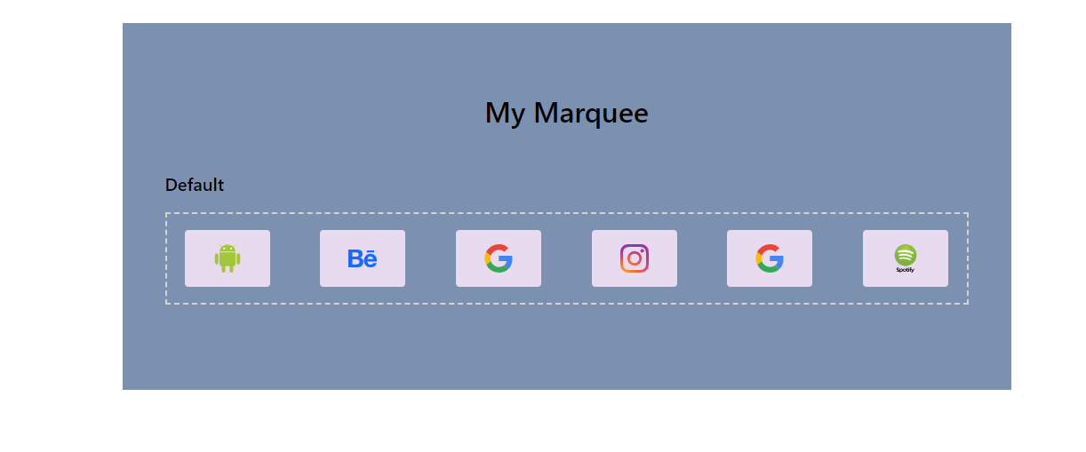 UI after applying styles
To animate this component, start by defining custom CSS keyframes.
@keyframes scroll {
  from { transform: translateX(0); }
  to { transform: translateX(calc(-100% - var(--gap))); }
}
Note: The gap used is the same gap between the marquee items.
Then, assign those keyframes to a class.
/* Enable animation */
.enable-animation .marquee__content {
  animation: scroll 10s linear infinite;
}
Finally, add that class to your section element.
<section className="enable-animation">
And with that, your component should already be animating.
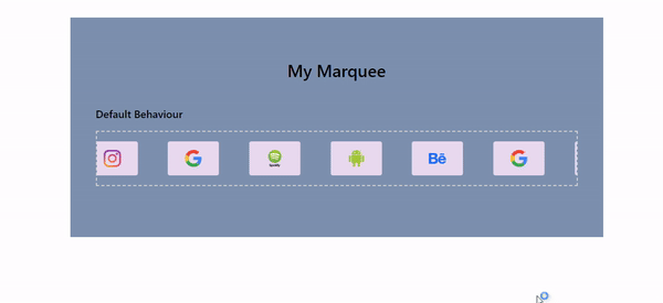 Animated marquee
How to Enhance the Marquee Component
This component goes beyond the regular infinite animations (as shown above), it often possess some extra functionalities such as:
- Pause on Hover: While using a marquee can be beneficial to show a bunch of content more dynamically, the speed of the animation or the position of the information relevant to the user might cause issues, especially for slow readers.
To fix this, you can implement a pause functionality to halt it when the user hovers over it. Just add the CSS code below.
/* Pause on hover */
.marquee:hover .marquee__content {
  animation-play-state: paused;
}
And with that, it pauses on hover.
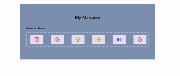 Animated marquee that pauses on hover
- Reverse on Double Tap: In the case where a user has passed important information and wants to see it without waiting for the looping animation to bring it back, it’s important to provide a means to achieve that.
By double tapping on the component, the animation plays in the opposite direction, showing the information the user just passed. This feature not only promotes accessibility but also gives your web pages a snappy feel, as it provides a quicker way to get information.
To implement this, start by creating a reverse animation state.
const [reverseAnimation, setReverseAnimation] = useState(false);
The create a function to flip the state of the animation.
const handleDoubleClick = () => {
    setReverseAnimation((prev) => !prev);
  };
After that, create the CSS class rule to reverse the animation.
/* Reverse animation */
.marquee--reverse .marquee__content {
  animation-direction: reverse !important;
}
Then attach the handler function to the component.
<div className="marquee" onDoubleClick={handleDoubleClick}>
      <ul className="marquee__content">
        <div className=" marquee__item">
          <img src={AndroidLogo} alt="" />
        </div>
        <div className=" marquee__item">
          <img src={BehanceLogo} alt="" />
        </div>
        <div className=" marquee__item">
          <img src={GoogleLogo} alt="" />
        </div>
        <div className=" marquee__item">
          <img src={InstagramLogo} alt="" />
        </div>
        <div className=" marquee__item">
          <img src={PaypalLogo} alt="" />
        </div>
        <div className=" marquee__item">
          <img src={SpotifyLogo} alt="" />
        </div>
      </ul>

      <ul aria-hidden="true" className="marquee__content">
        <div className=" marquee__item">
          <img src={AndroidLogo} alt="" />
        </div>
        <div className=" marquee__item">
          <img src={BehanceLogo} alt="" />
        </div>
        <div className=" marquee__item">
          <img src={GoogleLogo} alt="" />
        </div>
        <div className=" marquee__item">
          <img src={InstagramLogo} alt="" />
        </div>
        <div className=" marquee__item">
          <img src={PaypalLogo} alt="" />
        </div>
        <div className=" marquee__item">
          <img src={SpotifyLogo} alt="" />
        </div>
      </ul>
</div>
Finally, conditionally add the reverse class to the component which reverses the animation on double click.
 <div className={`marquee ${reverseAnimation && "marquee--reverse"}`}
      onDoubleClick={handleDoubleClick}>
Double-clicking the component now gives;
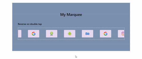 Animated marquee that reverses on double click
- Pause/Play on Space Bar Click: Another functionality that can be added to improve UX, especially for keyboard users is to pause or play it on press of the spacebar. This mimics the functionality of how videos work on the web and would help improve accessibility for users.
To implement this, start by creating a state to store the current paused state of the animation.
const [isAnimationPaused, setIsAnimationPaused] = useState(false);
Then create the CSS rule for the paused state.
/* Pause animation */
.marquee--paused .marquee__content {
  animation-play-state: paused !important;
}
After that, create an effect that updates the isAnimationPaused state each time the space bar is pressed.
 useEffect(() => {
    const handleKeyPress = (event) => {
      if (event.code === "Space") {

        setIsAnimationPaused((prev) => !prev);
      }
    };
    document.addEventListener("keydown", handleKeyPress);

   // Clean-up function when component unmounts
    return () => {
      document.removeEventListener("keydown", handleKeyPress);
    };
  }, []);
This way, the state toggles between true and false based on user presses.
Finally, dynamically add the paused class to your component.
<div className={`marquee ${reverseAnimation && "marquee--reverse"} ${
       isAnimationPaused && "marquee--paused"}`} onDoubleClick={handleDoubleClick}>
And with that, your component pauses and replays each time you press the space bar.
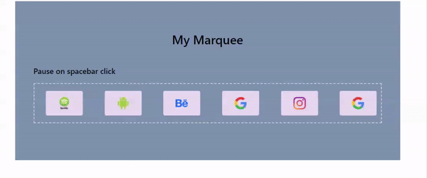 Animated marquee that can be paused with space bar
Best Practices and Tips for Marquee Component Development
Some of the best practices to consider when building this component includes:
- Lazy Loading Images: In the case where your marquee has a lot of high-quality images which could be large, it is essential to optimize them before building the component.
Lazy loading defers the browser from downloading the images until they are needed (required to be shown in the viewport), cutting down on overall page load time.
To achieve this, add loading='lazy' property to your images.
<ul className="marquee__content">
    <div className=" marquee__item">
      <img src={AndroidLogo} alt="" loading="lazy" />
    </div>
    <div className=" marquee__item">
      <img src={BehanceLogo} alt="" loading="lazy" />
    </div>
    <div className=" marquee__item">
      <img src={GoogleLogo} alt="" loading="lazy" />
    </div>
    <div className=" marquee__item">
      <img src={InstagramLogo} alt="" loading="lazy" />
    </div>
    <div className=" marquee__item">
      <img src={PaypalLogo} alt="" loading="lazy" />
    </div>
    <div className=" marquee__item">
      <img src={SpotifyLogo} alt="" loading="lazy" />
    </div>
  </ul>

  <ul aria-hidden="true" className="marquee__content">
    <div className=" marquee__item">
      <img src={AndroidLogo} alt="" loading="lazy" />
    </div>
    <div className=" marquee__item">
      <img src={BehanceLogo} alt="" loading="lazy" />
    </div>
    <div className=" marquee__item">
      <img src={GoogleLogo} alt="" loading="lazy" />
    </div>
    <div className=" marquee__item">
      <img src={InstagramLogo} alt="" loading="lazy" />
    </div>
    <div className=" marquee__item">
      <img src={PaypalLogo} alt="" loading="lazy" />
    </div>
    <div className=" marquee__item">
      <img src={SpotifyLogo} alt="" loading="lazy" />
    </div>
</ul>
- Mindful Animation Speed: When implementing the animation, it's crucial to strike a careful balance in terms of speed. The animation pace should be visually appealing, capturing the user's attention without sacrificing readability or causing discomfort.
This involves thoughtful consideration of how quickly the content scrolls across the screen.
By paying attention to animation speed and finding the right balance, you enhance the overall user experience, making it an effective and enjoyable element on your website. - Think of Users with Motion Sensitivity: Inclusive design means taking into account the needs and preferences of different users, including those with motion sensitivity. Certain users may prefer less movement due to conditions such as vestibular disorders or simply for personal comfort.
To support these users, you can use theprefers-reduced-motionmedia query in your component.
/* Pause animation when reduced-motion is set */
@media (prefers-reduced-motion: reduce) {
  .marquee__content {
    animation-play-state: paused !important;
  }
}
- Proper Documentation: Provide clear documentation on how users can use your component effectively so that they won't struggle to use it or don’t miss out on the all the features it has. Consider using labels around the component or a pop-up to convey short instructions on its use.
Conclusion
Your guide to React Marquee Components is complete! From planning to execution, you've dived into creating dynamic scrolling elements for your web projects.
Remember, this component is more than motion—it's an interactive story. Whether sharing crucial info, promoting events, or injecting dynamism, your marquee is a versatile addition to your toolkit.
But this journey is just the beginning. Adjust speeds, consider sensitivities, and adopt best practices to refine your marquee. Let creativity flow, and may your scrolling stories leave a lasting impact.
Prioritize user experience, experiment with enhancements, and let your development shine in the web landscape. Happy scrolling!
Contact Information
Want to connect or contact me? Feel free to hit me up on the following:
- Twitter: @jajadavid8
- LinkedIn: David Jaja
- Email: Jajadavidjid@gmail.com