
By Ogundiran Ayobami
In this tutorial we will build a YouTube clone step by step. You'll learn how to create layouts and add content to those layouts.
If you have been struggling to build a real website with HTML & CSS, this is the article for you. Because I am about to teach you to do it step by step to reduce your struggle.
We'll discuss how to make the layout of the YouTube clone with HTML and CSS and you'll learn how to make a two-column layout.
Just wait: If you're a total beginner and you don't even understand the difference between HTML and CSS, you can check out the video below to learn everything you need to get started...
It's important to break things into smaller pieces to make our projects easier to build. So, we have to break this YouTube clone into smaller units that we'll be building step by step.
YouTube Clone Breakdown
In the YouTube clone we'll be building, the website has about 6 units:
The Header contains three sections (left, center and right). The left section contains the logo and menu, the center contains the search box and an icon, and the right contains navigation icons. The icons are based on similar elements, which means that we design an icon element and then copy, paste, and edit it to create the others.
The Main body contains two sections (sidebar and content). The navigation links in the sidebar are also similar, so they are just one thing. The same thing happens to the videos in the content section.
So, our YouTube clone has a header, main, sidebar, content, video-card, navigation link and navigation icon as the major units. That is the breakdown of the units of the web page we want to create.
YouTube Clone Layout
The first thing we have to do is create the layout structure of the YouTube clone with HTML. We'll do that with the below code:
<html lang="en">
  <head>
    <meta charset="UTF-8" />
    <meta http-equiv="X-UA-Compatible" content="IE=edge" />
    <meta name="viewport" content="width=device-width, initial-scale=1.0" />
    <!-- Material Icons -->
    <link href="https://fonts.googleapis.com/icon?family=Material+Icons" rel="stylesheet" />
    <!-- CSS File -->
    <link rel="stylesheet" href="styles/index.css" />
    <title>Youtube Clone with HTML & CSS</title>
  </head>
  <body>
      <header class="header">.</header>
      <main>
          <div class="side-bar">.</div>
          <div class="content">.</div>
      </main>
  <!-- Main Body Ends -->
</body>
</html>
In this tutorial, I assume you have an understanding of how to use HTML meta tags and how to link a CSS file. If you don’t, you can learn more about them in the video I added above. But you don’t need to understand them for what we are learning in this lesson, so keep on reading.
We have a header tag to create the header section of the YouTube clone. We'll add the YouTube logo, search box, and other navigation icons to the header later.
There is also the main section that contains the side-bar and content. The side-bar will contain some navigation links while the content will contain videos. So, that is it for the structure with just HTML.
Wait! Our code doesn't look too beautiful after running. Well, we'll fix that with CSS. So let’s add CSS to it to really create a YouTube layout.
CSS for the YouTube Clone
Step 1: Use the @import in CSS
@import url('https://fonts.googleapis.com/css2?family=Roboto:wght@300;400;700&display=swap');
Let’s start with “import url(‘path’)...What does it do? We use it to link to the Google font called Roboto so that we can use it as the font of our website.
Step 2: Reset HTML default styles
* {
  margin: 0;
  padding: 0;
  box-sizing: border-box;
}
The asterisk * is a CSS selector that selects all HTML tags on our page. We set their margin and padding to 0. We then set their box-sizing to border-box. Why do we do that?
We want width or height, border, margin, and padding to add up to be the total length. This is what I mean: in CSS, if a box has width of 100px and padding of 10px, the width of the box will now be 110px
But we don't want that – we want everything to be 100px. Width should still be 100px including the margin of 10px instead of making it 110px. That is what box-sizing: border-box does.
Note: when you're using it, you will start to better understand how it works – but for now, I just wanted to give some insight a beginner can quickly relate to.
Step 3: Set the font-family
body {
  font-family: 'Roboto', sans-serif;
}
We select the body tag and set its font-family to Roboto and use sans-serif as a fall-back in case Roboto is not available.
Step 4: Style the header
/* header section*/
.header {
    display: flex;
    justify-content: space-between;
    align-items: center;
    height: 60px;
    padding: 15px;
  }
The .header class name is used to select (or connect to) the header section of our website so that we can add some styles to it.
We set its display property to flex to create a layout out of it, and then we can easily divide it into sections. We will divide it into sections later.
Justify-content: space-between means we want the contents in the header to have space between them once there are more than one.
Align-items: centre is used to move all the contents of the header to the centre-left of your screen. That is called vertical alignment. We finally set the height of the header to 60px and its padding to 15px.
Step 5: Set the height of the main section
main {
    height: calc(100vh - 70px);
    display: flex;
    background-color: #f9f9f9;
  }
We set the height of the main section to calc( 100vh - 70px)...What does it mean? V stands for a viewport, which is the visible part of a window’s screen without scrolling. “height” means vertical length, and we can also use “w” which means width - horizontal length.
In short, 100vh means the total height that is visible in a browser without scrolling. And we use calc ( 100vh - 70px) to run a calculation that subtract 70px from 100vh.
We set its display property to flex to create a layout out of it. Finally, we set its background colour to #f9f99f which is a kind of silver or ash.
Step 6: Hide the scrollbar
/* Sidebar */
.side-bar {
    height: 100%;
    width: 17%;
    background-color: white;
    overflow-y: hidden;
  }
The height of the .side-bar is set to 100% of its parent. That means it will have the same height as its parent. Its width is set to 17% of its parent and background colour set to white.
Hey! What is overflow-y: hidden? When Twitter loads 10 tweets at once, you can’t see everything at once and you have to scroll, right? In this case, we hide the scroll bar. Gracias!
Step 7: Add media queries for responsiveness
@media (max-width: 768px) {
    .side-bar {
      display: none;
    }
  }
We use this media query to make a website responsive on mobile, tablets, and desktop. When the YouTube clone is on a device whose screen is less than or equal to 768px (like mobile & tablet), the sidebar will disappear. Also, max-width: 768px means that a device’s screen can be less or equal to 768px.
Alright, we have built the layout of our YouTube clone. Below is the result…
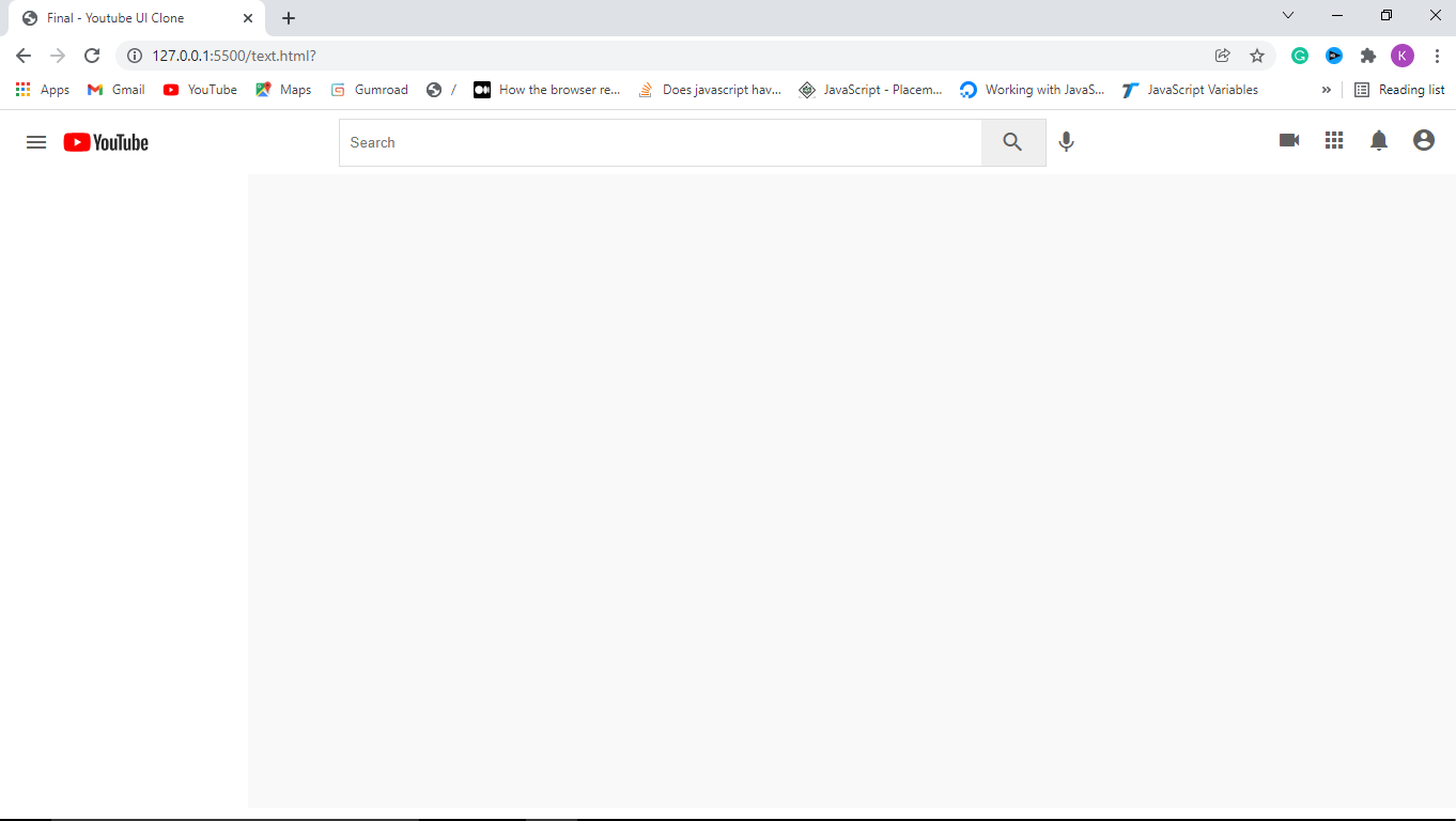
How to Add Content to the Header Section
In this part, we are going to discuss how to divide an element into sections and add content to the header section.
In short, we are dividing the header section of the YouTube clone into three sections: left, center, and right. And each of the sections contains some tags. Let's get started!
Step 1: Add children and grandchildren to the header
Here, we will simply add HTML tags to the header section of the YouTube Clone. We'll do just that with the code below:
<header>
 <div class="logo left">
   <i id="menu" class="material-icons">menu</i>
   <img src="https://www.freecodecamp.org/news/content/images/2022/01/yt-logo.png">
 </div>

 <div class="search center">
   <form action="">
     <input type="text" placeholder="Search" />
     <button><i class="material-icons">search</i></button>
   </form>
   <i class="material-icons mic">mic</i>
 </div>

 <div class="icons right">
   <i class="material-icons">videocam</i>
   <i class="material-icons">apps</i>
   <i class="material-icons">notifications</i>
   <i class="material-icons display-this">account_circle</i>
 </div>
</header>
After dividing the header into three sections by adding three separate blocks of code, it is time to use CSS to make it more beautiful. Let’s get started.
Step 2: Style the left section
.left {
  display: flex;
  align-items: center;
}

.left #menu {
  padding: 0 7px;
  cursor: pointer;
}
Don’t forget, we set the justify-content property of the header to space-between, which means there will be equal space between every tag in the header.
Now, we gave a class left because it should be to the left side. We set its display property to flex to create sections with the layout out of it. Its children are aligned to the left-center of the header. We also access the menu that is inside the left section with its id.
We set its padding top and bottom to 0 and its padding left and right to 7px. Its cursor property is set to the pointer so that when the mouse is on it, it will show a pointing finger.
Step 3: Style the center section and its form
.search {
  display: flex;
}

.search form {
  display: flex;
  border: 1px solid #ddd;
  height: 45px;
}
Hey! You should know what we do in the search class by now. :)
We set its display property to flex so that we can create a layout with its children. We do the same to the form which is inside of the search/center section.
Its border thickness is set to 1px, type to solid, and color to #ddd (something silver or ash).
Step 4: Style the input in the search form
.search input {
  width: 600px;
  padding:10px;
  border: 0;
  height: 100%;
  border-radius: 2px 0 0 2px
}

input:focus {
  outline: none;
  border: 1px solid #ddd;
}
We select the input which is inside the seach section with .search input. We set its border-radius to 2px top, 0 right, 0 bottom, and 2px left. Then, what is border-radius? It is the curved edges of an object with four angles.
Step 5: Style the search and mic icons/buttons
.search button {
  height: 100%;
  width: 60px;
  border: none;
}

.mic {
  margin-top: 10px;
}
The button inside the search section is also selected with the .search button. Its height is set to 100% of its parent. We don’t want it to have any border so we set its border to 0.
We access the microphone icon with its class name .mic and set its margin-top to 10px so that it will move down a bit.
Finally, let's style all the material-icons we have on the web page:
  .material-icons {
    color: rgb(100, 100, 100);
    padding: 0 7px;
    cursor: pointer;
  }
Hurry! We have added children and sections to the header of the YouTube clone. Check out the final result below:
How to Add Content to the Sidebar
In this part, we are going to discuss how to add navigation links to the YouTube clone. In short, we will add a bunch of links to the existing sidebar.
Step 1: Add children and grandchildren to the sidebar
We will add below HTML code to the sidebar:
<!-- <div class=”side-bar”> -->

   <div class="nav">
      <a class="nav-link active">
        <i class="material-icons">home</i>
        <span>Home</span>
      </a>
  </div>

<!-- </div> -->
Then, we need to first style the navbar, which is the wrapper for all the links:
.nav {
    width: 100%;
    display: flex;
    flex-direction: column;
    margin-bottom: 15px;
    margin-top: 15px;
  }
The only thing I will explain here is flex-direction. This determines whether we want the children to appear in a column (vertical) or row (horizontal). In this case we go with a horizontal display.
Then, let's style the nav-link above with CSS as shown below:
.nav-link {
    display: flex;
    align-items: center;
    padding: 12px 25px;
  }

 .nav-link span {
    margin-left: 15px;
  }

 .nav-link:hover {
    background: #e5e5e5;
    cursor: pointer;
  }

.active {
    background: #e5e5e5;
 }
Oops – there is nothing to explain here because I have explained many similar concepts already!
Okay, let’s talk about .home:hover. The styles in it will only be applied whenever we move our cursor over the home navigation link. That is it.
Hey…wait. We have many links in the sidebar, so how are we going to create that? Well, we just do what every developer loves - copy and paste and then edit it as in below:
<div class=”side-bar”>
<div class="nav">
   <a class="nav-link active">
      <i class="material-icons">home</i>
      <span>Home</span>
   </a>
   <a class="nav-link">
      <i class="material-icons">local_fire_department</i>
      <span>Trending</span>
   </a>
   <a class="nav-link">
      <i class="material-icons">subscriptions</i>
      <span>Subscriptions</span>
   </a>
 </div>
 <hr>
</div>
After pasting three links, we want to make them into separate categories by using the
tag to create a line that separates them from the next category. Now, let’s style the hr tag.
hr {
    height: 1px;
    background-color: #e5e5e5;
    border: none;
  }
Then, we will add the remaining code after the hr tag as in below:
<!-- <div class="nav">
     hr -->
    <a class="nav-link">
       <i class="material-icons">library_add_check</i>
       <span>Library</span>
    </a>
    <a class="nav-link">
       <i class="material-icons">history</i>
       <span>History</span>
    </a>
    <a class="nav-link">
       <i class="material-icons">play_arrow</i>
       <span>Your Videos</span>
    </a>
    <a class="nav-link">
       <i class="material-icons">watch_later</i>
       <span>Watch Later</span>
    </a>
    <a class="nav-link">
       <i class="material-icons">thumb_up</i>
       <span>Liked Videos</span>
    </a>
<!-- </div> -->
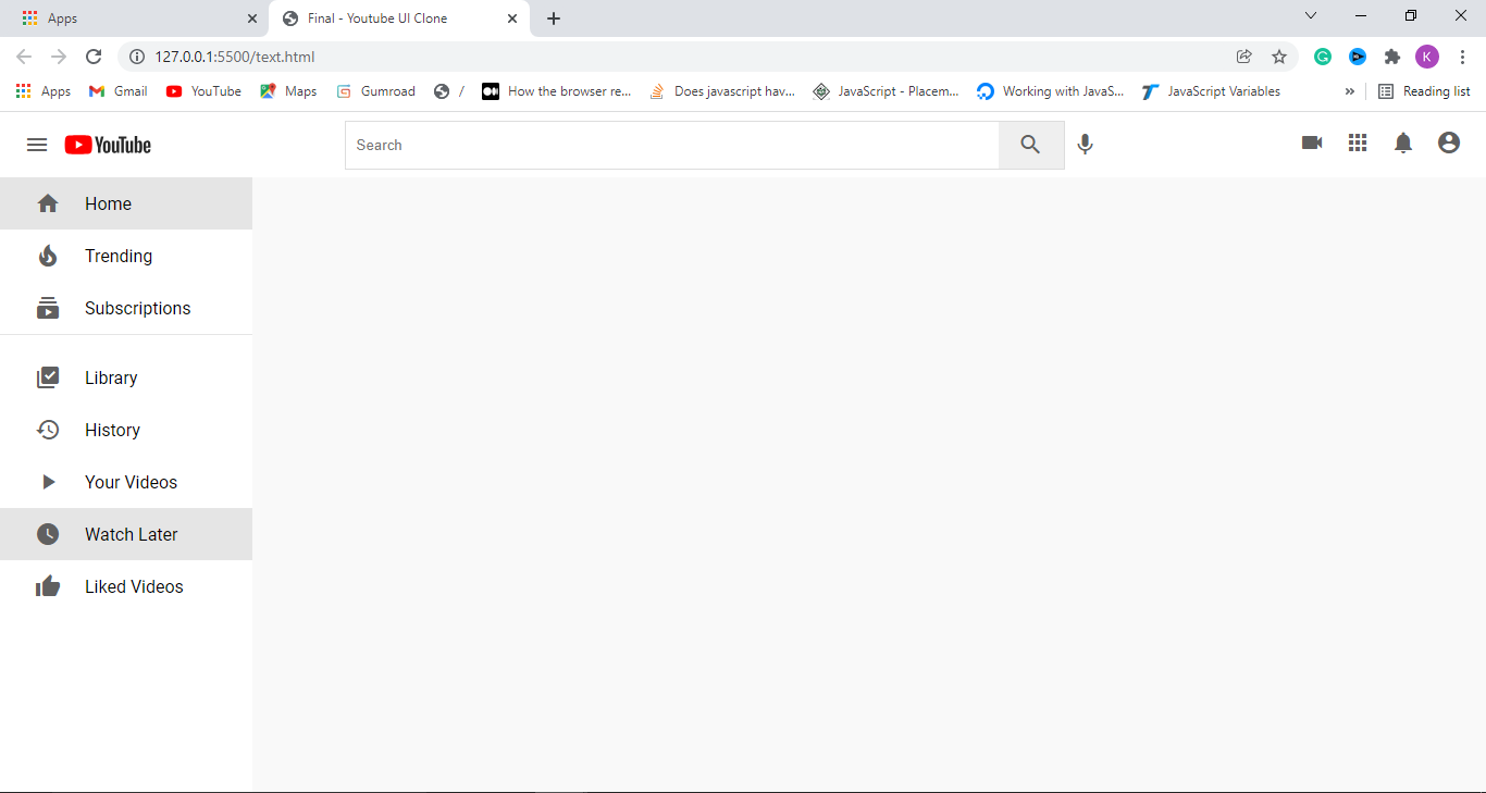
Wow, we are done with the sidebar of the YouTube clone and below is the result we get:
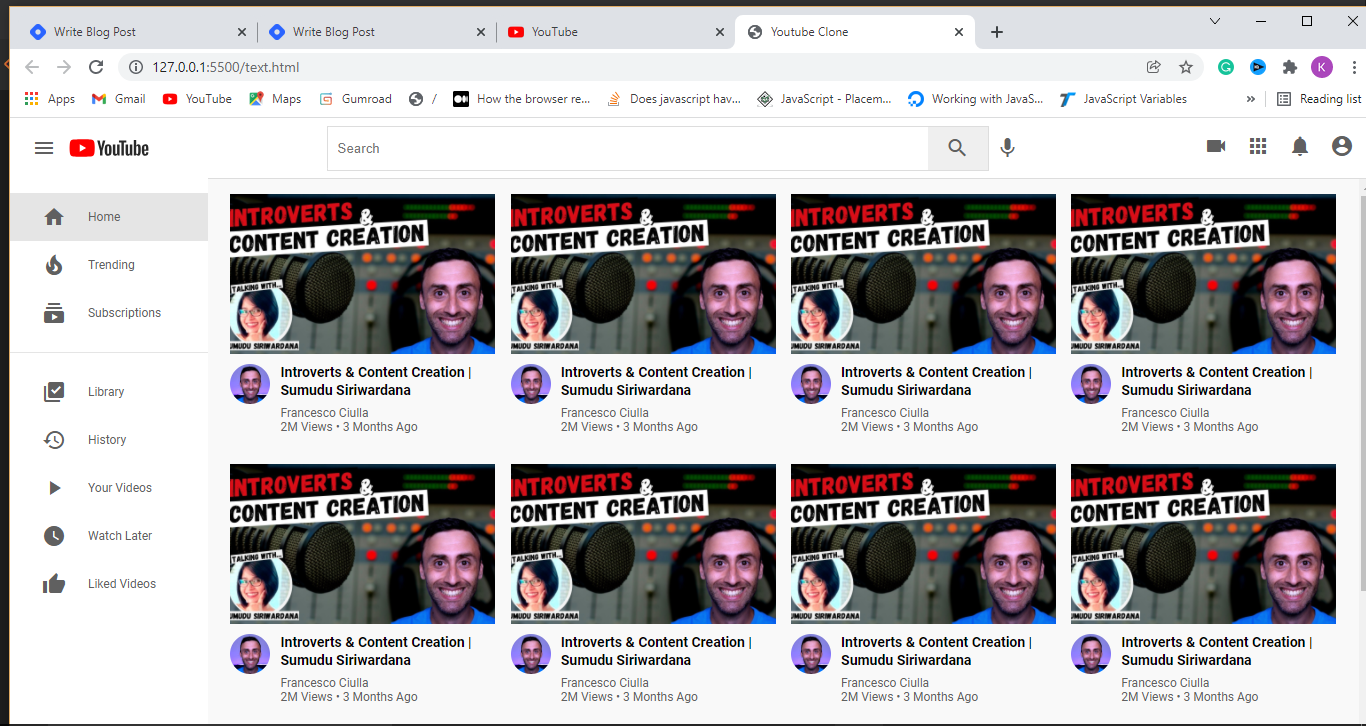
How to Add Videos to the Content Section
In this part of the YouTube Clone tutorial, we will add videos to the content area. You need to duplicate video (not videos) into many places to make it look like Youtube and you can edit them with unique Youtube video information if it's available.
<div class="videos">
  <!-- a video starts -->
    <div class="video">
       <div class="thumbnail">
          <img src="https://img.youtube.com/vi/zUwB_imVjmg/maxresdefault.jpg" alt="" />
        </div>

          <div class="details">
             <div class="author">
                <img src="https://yt3.ggpht.com/bpzY-S4DYlbTeOpY5hIA7qz_hcbMkgvLAugtwKBGTTImNnWAGudX0y53bo_fJZ0auypxrWkUiw=s88-c-k-c0x00ffffff-no-rj" alt="" />
             </div>
             <div class="title">
                <h3>
                    Introverts & Content Creation | Sumudu Siriwardana
                 </h3>
                 <a href="">
                        Francesco Ciulla
                  </a>
                  <span> 2M Views • 3 Months Ago </span>
             </div>
           </div>

         </div>
   <!-- a video Ends -->
 </div>
Now, let apply CSS to it.
.content {
  background-color: #f9f9f9;
  width: 100%;
  height: 100%;
  padding: 15px 15px;
  border-top: 1px solid #ddd;
  overflow-y: scroll;
}

.videos {
  display: flex;
  flex-direction: row;
  justify-content: space-around;
  flex-wrap: wrap;
}

.video {
  width: 270px;
  margin-bottom: 30px;
}
If you check the style for .videos, you will see flex-wrap. It is the only property I have not explained before, so let’s explain it.
When the screen can only take four items, for example, other items will be moved to another row. That is what “flex-wrap” does.
.thumbnail {
  width: 100%;
  height: 170px;
}

.thumbnail img {
  object-fit: cover;
  height: 94%;
  width: 100%;
}
.author img {
  object-fit: cover;
  border-radius: 50%;
  height: 40px;
  width: 40px;
  margin-right: 10px;
}
The only thing you may not understand above because we haven’t explained it before is object-fit: cover. Then how do we use it?
object-fit in this case is used to clip the image to its container so as to remove overflow (areas where the image is bigger than its container) in height and width:
.details {
  display: flex;
}

.title {
  display: flex;
  flex-direction: column;
}

.title h3 {
  color: rgb(3, 3, 3);
  line-height: 18px;
  font-size: 14px;
  margin-bottom: 6px;
}

.title a,
span {
  text-decoration: none;
  color: rgb(96, 96, 96);
  font-size: 12px;
}
In this case, we make a layout out of .details and because we don’t set its flex-direction to property, it will be set to row – which is its default value. You see that a layout is also made out of the title and set its children to appear in a column by setting flex-direction to column.
We select the h3 tag that is inside .title and we set its color to somewhat black…I will explain how to understand the color code later.
line-height is used to set the height of a line of text and in this case, we set it to 18px.
Finally we use .title a, span to select the anchor tag in .title. We also select all span tags on the page and set their text-decoration to none.
So what is text decoration? It has a design such as an underline that an anchor tag has, and we hide it in this case by setting it to none. We have added videos to the YouTube Clone and the final result is below:

How to Make the YouTube Clone Responsive
In this part of the tutorial, we are going to make the YouTube Clone we have built a bit responsive. How do we do it? Well, we will use CSS media queries. Now, let get started!
So, we will add the CSS code below to the CSS file of the YouTube Clone.
 @media (max-width: 768px) {
    .side-bar {
      display: none;
    }
    .search {
      display: none;
    }
}
@media (max-width: 768px) { } is used to set the device screen sizes that the code in the media query will apply to.
In this example, max-width: 768px means that the styles in the media query will be applied to any screen size that is equal to or less than 768px.
So, whenever the screen size in use is 768px or less, we will hide the sidebar and the search input by setting their display property to none.
  @media (max-width: 900px) {
    .search input {
      width: 25rem;
    }
  }
Finally, we make the the search input a bit smaller whenever the screen size of the device in use is less or equal to 900px.
That is it.
Hurraaaay...we're done in making the YouTube clone. Now go and build your own and don't forget to play with it.
Add or remove some things from the tutorial to be sure you trully understand what you're doing. Good luck!
One more thing
Ayobami Ogundiran loves writing history with software development and is currently helping those who are struggling to understand and build projects with HTML, CSS and JavaScript through You Too Can Code.
Join me via Telegram group or Discord group.