

Miro and Figma are online collaborative canvas type tools that became very popular during the pandemic.
Instead of sticking post it notes on a physical wall, you can now add virtual post its (and a dizzying array of other things) to a virtual canvas. This lets teams collaborate virtually in ways that feel familiar from the physical world.
Figma and Miro are large, mature products, and they bypass HTML and CSS entirely. They use technologies like WebAssembly, WebGL, C++ and similar, due to their extremely demanding performance requirements.
But we can create similar virtual canvas type features, without the complexity, using React, TypeScript, and a couple of packages. We are going to support one type of 'card', that will just contain simple text, to keep this guide concise, but it is easy to extend the solution to support more elaborate use cases.
The functionality we are going to implement is:
Dragging cards around the canvas
Adding new cards to the canvas
Panning and Zooming the canvas
This article is a step by step guide describing how to create these features, and there is companion code on GitHub with live demos.
Our scratch-built solution won't be as fast as Figma or Miro, but if you're needs are simpler, it'll probably be enough.
Project Overview
We'll use DndKit for dragging and dropping and D3 Zoom for panning and zooming. I found both of these tools to be a pleasure to work with.
The code is on GitHub, and there is a live demo so you can try it out.
There are only 4 components (App, Canvas, Draggable and Addable), and only about 250 lines of code.
This guide is aimed at intermediate level React / TypeScript developers. It will be much easier if you already understand components, hooks, how to think in React, state, mutable refs and things like that.
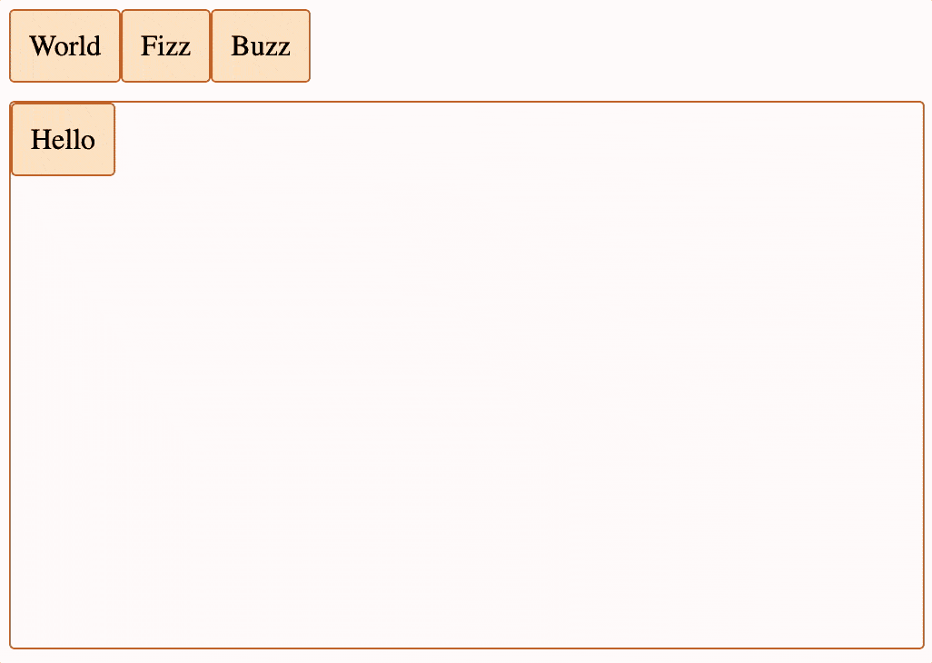
Screen grab showing final canvas solution
Alright, now to see how you can actually build this, let's dive in.
Step 1 – How to Drag the Cards Around the Canvas
To get started, we'll use DndKit to drag cards around a canvas. We'll install the tools we need to build the project, create a simple Card type, and create simple App, Canvas and Draggable components.
The App component stores the card state and renders the Canvas.
The Canvas component integrates with DndKit, updates the card state and renders the cards as Draggable components.
The Draggable component integrates with DndKit and uses CSS styling to position itself correctly on the canvas.
Here's a screen grab of what we'll be building in this part, and there is also a live demo you can try out for yourself:
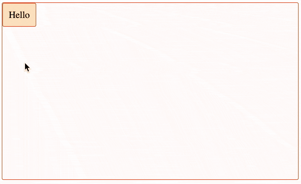
Screen grab showing part 1 of the canvas solution
Project Setup
We create a new project with Vite and install DndKit using the following commands:
npm create vite@latest figma-miro-canvas -- --template react-ts
npm install
npm install @dnd-kit/core
App.tsx
The App component stores the card state and renders the Canvas.
We add a Card type, in this demo cards will simply contain some text. UniqueIdentifier is from DndKit, and looks scary, but it's just a String | number. Coordinates also comes from DndKit and contains the x and y position.
export type Card = {
  id: UniqueIdentifier;
  coordinates: Coordinates;
  text: string;
};
We then need to create some cards, and pass them to the canvas.
export const App = () => {
  const [cards, setCards] = useState<Card[]>([
    { id: "Hello", coordinates: { x: 0, y: 0 }, text: "Hello" },
  ]);

  return (<Canvas cards={cards} />);
}
Canvas.tsx
The Canvas component integrates with DndKit, updates the card state and renders the cards as Draggable components.
It takes cards and setCards as props, as the state is stored higher up the tree in App. This isn't strictly necessary right now, but is useful in later steps.
type Props = {
  cards: Card[];
  setCards: (cards: Card[]) => void;
}
We add a function to call setCards with an update after a drag operation has completed. This simply adds the drag distance / delta to the x and y values for the card that was being dragged.
The DragEndEvent comes from DndKit, and includes the active item being dragged, so we can use that to work out which card to update.
const updateDraggedCardPosition = ({ delta, active }: DragEndEvent) => {
  if (!delta.x && !delta.y) return;

  setCards(
    cards.map((card) => {
      if (card.id === active.id) {
        return {
          ...card,
          coordinates: {
            x: card.coordinates.x + delta.x,
            y: card.coordinates.y + delta.y,
          },
        };
      }
      return card;
    })
  );
};
We add a div to represent the canvas, a DndContext (from DndKit), and render a Draggable for each card. We hook up our new function with the onDragEnd event from DndContext so that the card state is updated after a successful drag operation.
<div className="canvas">
  <DndContext onDragEnd={updateDraggedCardPosition}>
    {cards.map((card) => (
      <Draggable card={card} key={card.id} />
    ))}
  </DndContext>
</div>
Draggable.tsx
The Draggable component integrates with DndKit and uses CSS styling (position, top and left) to position itself correctly on the canvas.
useDraggable comes from DndKit, and we blindly pass the attributes, listeners, and setNodeRef that it returns to our div, which allows it to respond to onClick events and things like that.
We also use the transform from DndKit to apply CSS in order to render the card at a modified position when a drag is in progress. Slightly confusingly, the CSS property name is also called transform.
export const Draggable = ({ card }: { card: Card }) => {
  // hook up to DndKit
  const { attributes, listeners, setNodeRef, transform } = useDraggable({
    id: card.id,
  });

  return (
    <div
      className="card"
      style={{
        // position card on canvas
        position: "absolute",
        top: `${card.coordinates.y}px`,
        left: `${card.coordinates.x}px`,
        // temporary change to this position when dragging
        ...(transform
          ? {
              transform: `translate3d(${transform.x}px, ${transform.y}px, 0px)`,
            }
          : {}),
      }}
      ref={setNodeRef}
      {...listeners}
      {...attributes}
    >
      {card.text}
    </div>
  );
};
App.css
Finally we can add some CSS styling to make everything look vaguely acceptable. This isn't strictly necessary, but it does look a lot better, even with my limited design skills.
Step 2 – How to Add New Cards to the Canvas
In this step, we'll create a new Addable component, to represent cards that are not currently on the canvas, but can be dragged on to it.
We will update App to add a "tray" div to contain these new Addable cards. We will also add another DndContext (this new DndContext will handle the drag drop from the tray to the canvas, and the existing DndContext in Canvas handles dragging of cards around the canvas), and hook up to its events. This will let us update the state when the Addable cards are drag / dropped on to the canvas.
We will update Canvas to make it a DndKit drop target, so that the Addable cards can be dropped on to it.
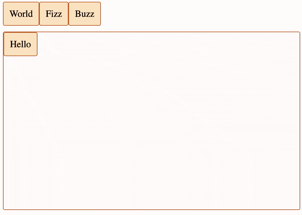
Here's the functionality we'll add in this section, and there is also a live demo you can try out for yourself:
App.tsx
The App component now needs a "tray" div to contain Addable cards.
It also needs another DndContext (this new DndContext will handle the drag drop from the tray to the canvas, and the existing DndContext in Canvas handles dragging of cards around the canvas). It needs to hook up to its events so that we can update the state when the Addable cards are drag / dropped on to the canvas.
We add a list of cards to appear on the tray:
const trayCards = [
  // the coordinates aren't used for the tray cards, we could create a new type without them
  { id: "World", coordinates: { x: 0, y: 0 }, text: "World" },
];
We add a function to work out the position on the canvas at the end of a drag drop operation. This has to know the initial position of the card, the drag distance / delta, and the top left position of the canvas. These details are all provided by the DndKit DragEndEvent.
const calculateCanvasPosition = (
  initialRect: ClientRect,
  over: Over,
  delta: Translate
): Coordinates => ({
  x: initialRect.left + delta.x - (over?.rect?.left ?? 0),
  y: initialRect.top + delta.y - (over?.rect?.top ?? 0),
});
We add state to store the tray card being dragged, along with a function to update the cards state after a drag / drop from the tray. The DragEndEvent comes from DndKit, and includes the active item being dragged, so we can use that to create a new card and add it to the cards array. We also make some checks to make sure that the "canvas" is the drop target, and that we have all the data we need.
const [draggedTrayCardId, setDraggedTrayCardId] = useState<UniqueIdentifier | null>(null);

const addDraggedTrayCardToCanvas = ({ over, active, delta }: DragEndEvent) => {
  setDraggedTrayCardId(null);

  if (over?.id !== "canvas") return;
  if (!active.rect.current.initial) return;

  setCards([
    ...cards,
    {
      id: active.id,
      coordinates: calculateCanvasPosition(
        active.rect.current.initial,
        over,
        delta
      ),
      text: active.id.toString(),
    },
  ]);
};
We add the new, additional, DndContext, a div to represent the tray, and a DragOverlay.
The DragOverlay component comes from DndKit, and we render the tray card being dragged inside it. It does the hard work of showing the tray card while it is being dragged. It is very convenient to use with Drag / Drop, but not as handy when just dragging, which is why we didn't use one earlier when dragging cards around the canvas.
<DndContext
  onDragStart={({ active }) => setDraggedTrayCardId(active.id)}
  onDragEnd={addDraggedTrayCardToCanvas}
>
  <div className="tray">
    {trayCards.map((trayCard) => {
      // this line removes the card from the tray if it's on the canvas
      if (cards.find((card) => card.id === trayCard.id)) return null;

      return <Addable card={trayCard} key={trayCard.id} />;
    })}
  </div>
  <Canvas cards={cards} setCards={setCards} />
  <DragOverlay>
    {/* this works because the id of the card is the same as the text in this example so we can just render the id inside a div. In more complex cases you would have a component to render the card, and use that here. */}
    <div className="trayOverlayCard">{draggedTrayCardId}</div>
  </DragOverlay>
</DndContext>
Addable.tsx
The Addable component integrates with DndKit, and is used to represent cards that are not currently on the canvas, but can be dragged on to it.
We hook up the component with DndKit and render the card text in a div. useDraggable comes from DndKit, and we blindly pass the attributes, listeners and setNodeRef that it returns on to our div. This allows it to respond to onClick events and things like that.
export const Addable = ({
   card
} : {
  card: Card;
}) => {
  const { attributes, listeners, setNodeRef } = useDraggable({
    card.id,
  });

  return (
    <div
      className="trayCard"
      ref={setNodeRef}
      {...listeners}
      {...attributes}>
      {card.text}
    </div>
  );
};
Canvas.tsx
Canvas now needs to integrate with DndKit to make it a drop target, so that the Addable cards can be dropped on to it.
We hook up the canvas as a drop target with DndKit. useDroppable comes from DndKit, and we just pass the ref on to our div. This is so that DndKit can identify it, and obtain its id when it is dragged over.
const { setNodeRef } = useDroppable({ id: "canvas" });
<div
  className="canvas"
  ref={setNodeRef}
  ...
>
  ...
</div>
Step 3 - How to Pan Around and Zoom In and Out from the Canvas
In this final step, we'll install d3-zoom, hook it up to the canvas, and then update some calculations and styles so that everything appears in the right place.
We will update App, to store the transform (the pan and zoom of the canvas) from d3-zoom, and update the style of the DragOverlay and calculateCanvasPosition to take account of the transform.
We will update Canvas to integrate with d3-zoom and to use CSS styling to take account of the transform.
We will update Draggable, using CSS styling to take account of the transform, both when stationary and whilst being dragged.
d3-zoom handles mouse and pointer events for pan and zoom automatically, so we don't need to add any code for that (but it's easy to do so if you want to add a "Zoom In" button or similar).
Here's what we'll build in this section, and there is also a live demo you can try out for yourself:

Before you continue on, make sure you've installed d3-zoom:
npm install d3-zoom
npm install --save-dev @types/d3-zoom
App.tsx
App now needs to store the transform (the pan and zoom of the canvas) from d3-zoom and update the style of the DragOverlay and calculateCanvasPosition to take account of the transform.
We store the current transform from d3-zoom. This represents both the pan (transform.x and transform.y) and the zoom (transform.k).
const [transform, setTransform] = useState(zoomIdentity);
We add CSS to the DragOverlay, so that cards dragged from the tray are the same size that they are on the canvas.
style={{
  transformOrigin: "top left",
  transform: `scale(${transform.k})`,
}}
We update the calculateCanvasPosition function as it now needs to account for the zoom of the canvas (transform.k) as well as the top left position.
const calculateCanvasPosition = (
  initialRect: ClientRect,
  over: Over,
  delta: Translate,
  transform: ZoomTransform
): Coordinates => ({
  x: (initialRect.left + delta.x - (over?.rect?.left ?? 0) - transform.x) / transform.k,
  y: (initialRect.top + delta.y - (over?.rect?.top ?? 0) - transform.y) / transform.k,
});
Canvas.tsx
Canvas now needs to integrate with d3-zoom and to use CSS styling to take account of the transform from d3-zoom.
We add props for transform and setTransform (we pass these down from App.tsx).
type Props = {
  cards: Card[];
  setCards: (cards: Card[]) => void;
  transform: ZoomTransform;
  setTransform(transform: ZoomTransform): void;
}
We hook up d3-zoom. Both DndKit and d3-zoom need a ref to the element, so we create canvasRef and updateAndForwardRef, which allows both of them to reference the same HTMLDivElement.
d3-zoom is a JavaScript library, rather than a React component, which is why we have to use the slightly esoteric code below, such as useMemo and useLayoutEffect (although you will see both of these in nearly any reasonably sized React codebase).
const canvasRef = useRef<HTMLDivElement | null>(null);

const updateAndForwardRef = (div: HTMLDivElement) => {
  canvasRef.current = div;
  setNodeRef(div);
};

// create the d3 zoom object, and useMemo to retain it for rerenders
const zoomBehavior = useMemo(() => zoom<HTMLDivElement, unknown>(), []);

// update the transform when d3 zoom notifies of a change.
const updateTransform = useCallback(
  ({ transform }: { transform: ZoomTransform }) => {
    setTransform(transform);
  },
  [setTransform]
);

useLayoutEffect(() => {
  if (!canvasRef.current) return;

  // get transform change notifications from d3 zoom
  zoomBehavior.on("zoom", updateTransform);

  // attach d3 zoom to the canvas div element, which will handle
  // mousewheel, gesture and drag events automatically for pan / zoom
  select<HTMLDivElement, unknown>(canvasRef.current).call(zoomBehavior);
  },
  [zoomBehavior, canvasRef, updateTransform]
 );
We add a wrapper / window around the canvas. The canvas div will now pan and zoom (so will move around the screen a lot), so we wrap it in another div with a fixed position and size and hide any overflow, so that we have a "window" showing the relevant part of the canvas.
We also add CSS styles to the canvas to account for the pan and zoom, use the new updateAndForwardRef function and move the ref from the canvas to the canvas window.
<div ref={updateAndForwardRef} className="canvasWindow">
  <div
    className="canvas"
    style={{
      // apply the transform from d3
      transformOrigin: "top left",
      transform: `translate3d(${transform.x}px, ${transform.y}px, ${transform.k}px)`,
      position: "relative",
      height: "300px",
    }}
  >
    ...
  </div>
</div>
Draggable.tsx
Draggable now needs different CSS styling to take account of the d3-zoom transform, both when stationary and whilst being dragged.
We add a prop for the d3-zoom transform, which we call canvasTransform, as we are already using a transform variable from DndKit.
type Props = {
  card: Card;
  canvasTransform: ZoomTransform;
}
We update the CSS to account for the canvas pan and zoom. We have to handle two cases, both when it is currently being dragged, and when it is not.
style={{
  position: "absolute",
  top: `${card.coordinates.y * canvasTransform.k}px`,
  left: `${card.coordinates.x * canvasTransform.k}px`,
  transformOrigin: "top left",
  ...(transform
    ? {
        // temporary change to this position when dragging
        transform: `translate3d(${transform.x}px, ${transform.y}px, 0px) scale(${canvasTransform.k})`,
      }
    : {
        // zoom to canvas zoom
        transform: `scale(${canvasTransform.k})`,
      }),
}}
We also stop the onPointerDown event bubbling up to the canvas, otherwise it would be handled by d3-zoom, and interpreted as a request to start dragging, which results in dragging the canvas and the card at the same time (an interesting but undesirable effect!)
onPointerDown={(e) => {
  listeners?.onPointerDown?.(e);
  e.preventDefault();
}}
Conclusion
There is some complexity to the various position / transform calculations, but it isn't too crazy, and there are only two dependencies to install.
There are only four components (App, Canvas, Draggable and Addable), and only about 250 lines of code for all of them, which seems like a very modest amount for all the functionality.
This demo is very simple, but it contains a lot of virtual canvas functionality, and it is easy to use this as a base and build something more elaborate on top.