
By Manu Arora
A while ago, I saw a post on Twitter that had some fancy beams of light emanating out from behind the main image. It looked like a meteor was blazing softly behind the card, and I thought it was a really cool UI component to have in a project.
Looking at that, I thought of creating a React component of my own that would do the same job – that is, adding this meteor glowing effect to the background of a card.
This would make the card stand out instantly and would be really useful if you wanted to highlight a specific card from your set of UI cards.
So that's what we're going to build in this tutorial.
Prerequisites
For creating this effect, we are going to use:
- Next.js for our framework (because we are going to create a component)
- TailwindCSS for styling
How to Setup the Project
To setup a project in Next.js and TailwindCSS, simply follow these steps:
First, head over to the terminal and enter the following command:
npx create-next-app@latest meteor-effect --typescript --eslint
Once you have Next.js installed, cd into the project like this:
cd meteor-effect
Then install TailwindCSS like this:
npm install -D tailwindcss postcss autoprefixer
npx tailwindcss init -p
Setup the tailwind.config.js file so that Tailwind knows where to find your styles:
tailwind.config.js

/** @type {import('tailwindcss').Config} */
module.exports = {
  content: [
    "./app/**/*.{js,ts,jsx,tsx,mdx}",
    "./pages/**/*.{js,ts,jsx,tsx,mdx}",
    "./components/**/*.{js,ts,jsx,tsx,mdx}",

    // Or if using `src` directory:
    "./src/**/*.{js,ts,jsx,tsx,mdx}",
  ],
  theme: {
    extend: {},
  },
  plugins: [],
}
Once you've setup the config file, add the base styles for Tailwind to the global stylesheet like this:
@tailwind base;
@tailwind components;
@tailwind utilities;
With these steps, you should be good to go.
What Are We Building?
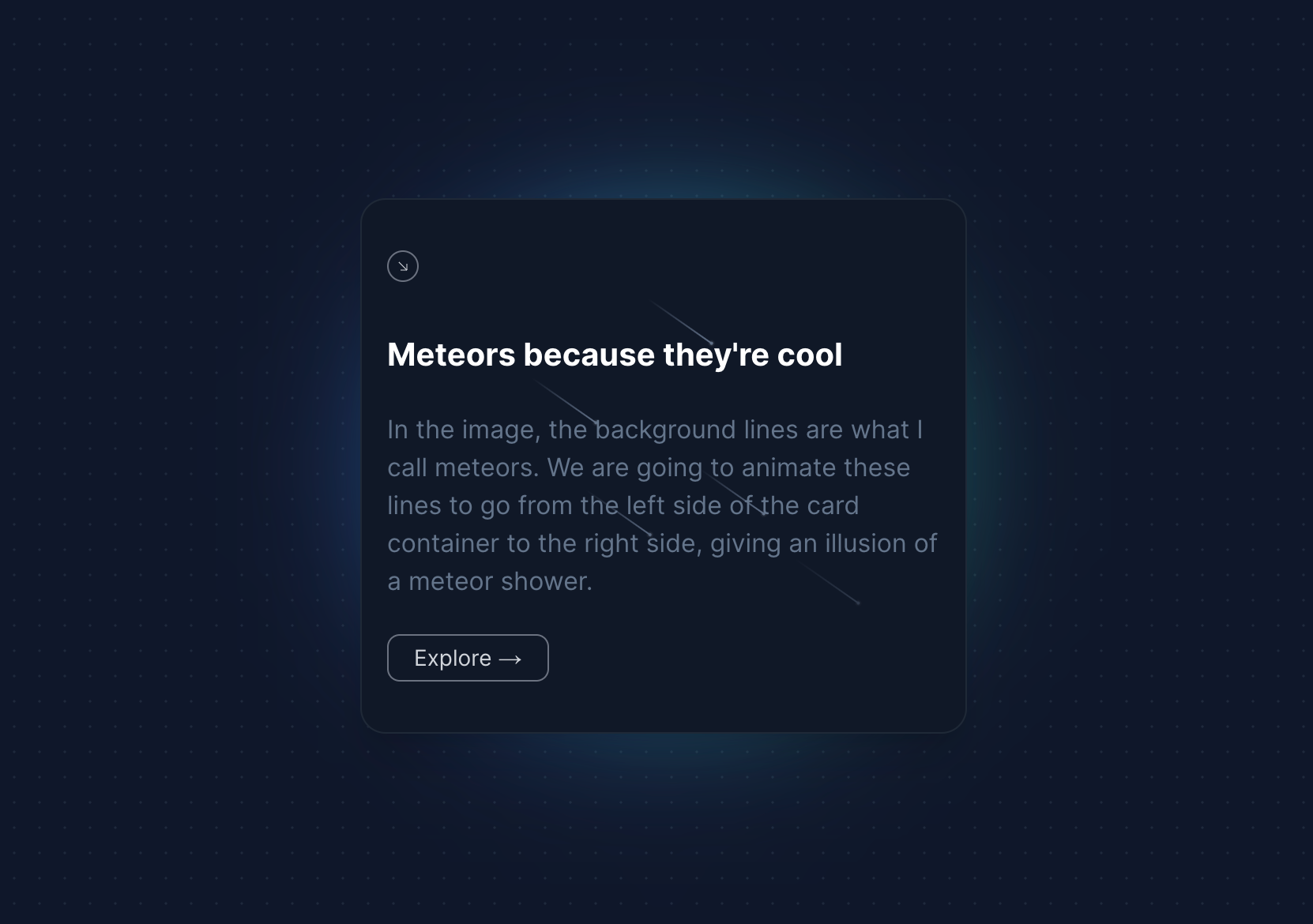 the cool lines at the background are meteors
A Meteor (as I call it, you can call it anything really) is basically a UI element with a head and a tail. It's a sort of beam which has a gradient.
In the image, the background lines are what I call meteors. We are going to animate these lines to go from the left side of the card container to the right side, giving an illusion of a meteor shower.
We are going to build:
- A beautiful Card Component
- A Meteor component to add to the card
But before we build the core Meteor component, let's create the container that holds the meteors.
How to Create the Card Container
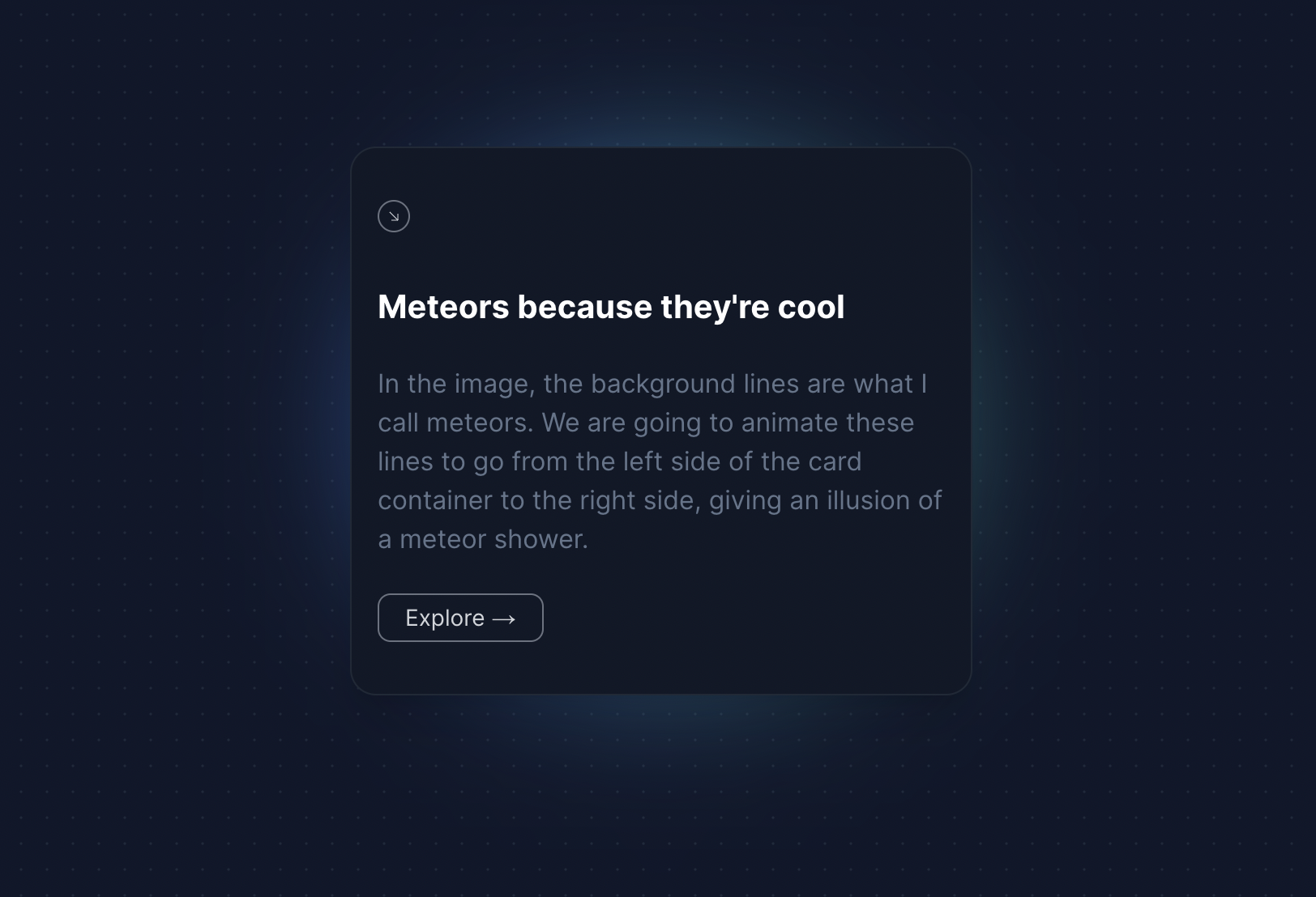 The card container we'll build here
Before we create the Meteor component, let's first create the Container that will hold down our meteors.
The Card Container has four parts to it:
- An SVG icon
- A headline
- Content Section
- Call to Action
We are going to style this card with TailwindCSS and give it a background gradient too so that it looks good.
import React from "react";
export const MeteorPreview = () => {
return (
<div className=" h-[40rem]">
<div className=" h-3/4 md:h-1/2 w-3/4 relative max-w-sm">
<div className="absolute inset-0 h-full w-full bg-gradient-to-r from-blue-500 to-teal-500 transform scale-[0.80] bg-red-500 rounded-full blur-3xl" />
<div className="relative shadow-xl bg-gray-900 border border-gray-800 px-4 py-8 h-full overflow-hidden rounded-2xl flex flex-col justify-end items-start">
<div className="h-5 w-5 rounded-full border flex items-center justify-center mb-4 border-gray-500">
<svg
xmlns="http://www.w3.org/2000/svg"
fill="none"
viewBox="0 0 24 24"
stroke-width="1.5"
stroke="currentColor"
className="h-2 w-2 text-gray-300"
>
<path
stroke-linecap="round"
stroke-linejoin="round"
d="M4.5 4.5l15 15m0 0V8.25m0 11.25H8.25"
/>
</svg>
</div>
<h1 className="font-bold text-xl text-white mb-0 mt-4 relative z-50">
Meteors because they're cool
</h1>
<p className="font-normal text-base text-slate-500 mb-4 relative z-50">
I don't know what to write so I'll just paste something cool here.
One more sentence because lorem ipsum is just unacceptable.
</p>
<button className="border px-4 py-1 rounded-lg !text-sm border-gray-500 text-gray-300">
Explore →
</button>
</div>
</div>
</div>
);
};
Firstly, we created a container that holds the content of the card. This container contains the following:
- An SVG Icon at the top of the container
- A headline, which is a one liner that shows the purpose of the card
- Some content, which is contained in a paragraph tag explaining the contents of the card
- CTA, which is a button element that takes the user to some other part of the website.
Now that we have the Card component in place (the container), lets create the Meteor component.
How to Build the Meteor Component
Like I explained before, a meteor is nothing but a UI element with a head and a tail that has a gradient. We are going to build exactly that here.
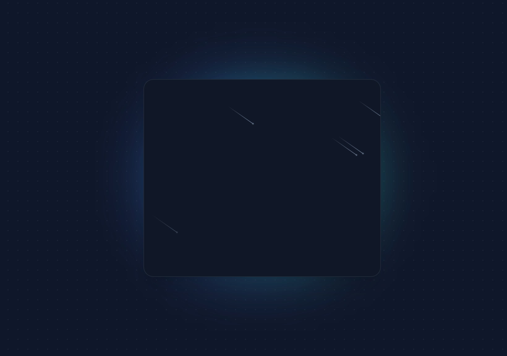 Standalone meteors
Every meteor will have:
- A tail of width of
50px - A tail height of
1px - A background gradient (for the tail) which goes from
#64748btotransparent - A head of height and width
2px
import clsx from "clsx";
import React from "react";

export const Meteors = ({ number }: { number?: number }) => {
  const meteors = new Array(number || 20).fill(true);
  return (
    <>
      {meteors.map((el, idx) => (
        <span
          key={"meteor" + idx}
          className={clsx(
            "animate-meteor-effect absolute top-1/2 left-1/2 h-0.5 w-0.5 rounded-[9999px] bg-slate-500 shadow-[0_0_0_1px_#ffffff10] rotate-[215deg]",
            "before:content-[''] before:absolute before:top-1/2 before:transform before:-translate-y-[50%] before:w-[50px] before:h-[1px] before:bg-gradient-to-r before:from-[#64748b] before:to-transparent"
          )}
          style={{
            top: 0,
            left: Math.floor(Math.random() * (400 - -400) + -400) + "px",
            animationDelay: Math.random() * (0.8 - 0.2) + 0.2 + "s",
            animationDuration: Math.floor(Math.random() * (10 - 2) + 2) + "s",
          }}
        ></span>
      ))}
    </>
  );
};
Let's understand the Meteor component.
- The
Meteorcomponent takes in a prop ofnumbers. This is created in such a way that if you pass the numbers, the meteors increase. The default is set to 20. - We create a
spanelement which will essentially be our meteor that goes from left to right. - the
before:class creates a pseudo before element which is essentially thelinepart of the meteor. We are giving it a linear gradient and a width of50px. - The
styletag decides where the meteor is currently in the DOM. We are going to useMath.random()to randomly place meteors on the background. - To actually animate the meteors, we are using the class of
animate-meteor-effect. This class is actually added in thetailwind.config.jsfile to add moving animation.
 theme: {
    extend: {
      animation: {
        "meteor-effect": "meteor 5s linear infinite",
      },
      keyframes: {

        meteor: {
          "0%": { transform: "rotate(215deg) translateX(0)", opacity: 1 },
          "70%": { opacity: 1 },
          "100%": {
            transform: "rotate(215deg) translateX(-500px)",
            opacity: 0,
          },
        },
      },
    },
  },
Here, we are basically moving the beam to negative 500px in a span of 5 seconds. This is what causes the meteor to move from left to right. It also nicely animates the opacity from visible to hidden (when we are 70% of the way through).
How to Use the Meteor Component
Now since we have the Meteor component in place, we can easily embed it into our card component that we created previously:
import React from "react";
import { Meteors } from "./Meteors";
export const MeteorPreview = () => {
return (
<div className=" h-[40rem]">
<div className=" h-3/4 md:h-1/2 w-3/4 relative max-w-sm">
<div className="absolute inset-0 h-full w-full bg-gradient-to-r from-blue-500 to-teal-500 transform scale-[0.80] bg-red-500 rounded-full blur-3xl" />
<div className="relative shadow-xl bg-gray-900 border border-gray-800 px-4 py-8 h-full overflow-hidden rounded-2xl flex flex-col justify-end items-start">
<div className="h-5 w-5 rounded-full border flex items-center justify-center mb-4 border-gray-500">
<svg
xmlns="http://www.w3.org/2000/svg"
fill="none"
viewBox="0 0 24 24"
stroke-width="1.5"
stroke="currentColor"
className="h-2 w-2 text-gray-300"
>
<path
stroke-linecap="round"
stroke-linejoin="round"
d="M4.5 4.5l15 15m0 0V8.25m0 11.25H8.25"
/>
</svg>
</div>
<h1 className="font-bold text-xl text-white mb-0 mt-4 relative z-50">
Meteors because they're cool
</h1>
<p className="font-normal text-base text-slate-500 mb-4 relative z-50">
I don't know what to write so I'll just paste something cool here.
One more sentence because lorem ipsum is just unacceptable.
</p>
<button className="border px-4 py-1 rounded-lg !text-sm border-gray-500 text-gray-300">
Explore →
</button>
{/* Meaty part - Meteor effect */}
<Meteors number={10} />
</div>
</div>
</div>
);
};
Here, we are embedding the <Meteor /> component with a number={10} prop to only have 10 meteors in our component.
The final component looks like this:
 The final Card Component with Meteors
Conclusion
It is really easy to create beautiful components that stand out with TailwindCSS
I loved creating this component from scratch and hope it helps you make your components stand out.
If you'd like to see more of these cool TailwindCSS and Framer motion components, let me know on Twitter and I'd be more than happy to work on it. :)
Happy coding! ✨