
In this beginner-friendly guide, you'll learn how to create a responsive email template. You'll follow step-by-step instructions with code snippets to design an email template that looks great on any device.
This project is perfect for newcomers eager to master email design basics!
Step 1: Set Up the Basic Structure
To build an email template, you can start with a basic HTML structure. This includes a DOCTYPE declaration for emails, defining the head and body sections, and using meta tags in the head section to ensure proper mobile rendering and zooming.
<!DOCTYPE html>
<html lang="en">
<head>
    <meta charset="UTF-8">
    <meta name="viewport" content="width=device-width, initial-scale=1.0">
    <title>Responsive Email Template</title>
</head>
<body>
    <!-- Email content goes here -->
</body>
</html>
Step 2: Create the Email Structure
Use tables to create the basic structure of your email. This will ensure compatibility across different email clients.
<table width="100%" cellpadding="0" cellspacing="0" border="0">
    <tr>
        <td align="center">
            <table width="600" cellpadding="0" cellspacing="0" border="0">
                <!-- Email content goes here -->
            </table>
        </td>
    </tr>
</table>
Step 3: Add Content and Inline Styles
Email clients vary in how they render CSS, so it's safer to use inline styles. Here's an example of a simple email body:
<body style="font-family: 'Poppins', Arial, sans-serif">
<table width="100%" border="0" cellspacing="0" cellpadding="0">
<tr>
<td align="center" style="padding: 20px;">
<table class="content" width="600" border="0" cellspacing="0" cellpadding="0" style="border-collapse: collapse; border: 1px solid #cccccc;">
<!-- Header -->
<tr>
<td class="header" style="background-color: #345C72; padding: 40px; text-align: center; color: white; font-size: 24px;">
Responsive Email Template
</td>
</tr>
<!-- Body -->
<tr>
<td class="body" style="padding: 40px; text-align: left; font-size: 16px; line-height: 1.6;">
Hello, All! <br>
Lorem odio soluta quae dolores sapiente voluptatibus recusandae aliquam fugit ipsam.
<br><br>
Lorem ipsum dolor sit amet consectetur adipisicing elit. Veniam corporis sint eum nemo animi velit exercitationem impedit. Incidunt, officia facilis atque? Ipsam voluptas fugiat distinctio blanditiis veritatis.
</td>
</tr>
<!-- Call to action Button -->
                    <tr>
                        <td style="padding: 0px 40px 0px 40px; text-align: center;">
                            <!-- CTA Button -->
                            <table cellspacing="0" cellpadding="0" style="margin: auto;">
                                <tr>
                                    <td align="center" style="background-color: #345C72; padding: 10px 20px; border-radius: 5px;">
                                        <a href="https://www.yourwebsite.com" target="_blank" style="color: #ffffff; text-decoration: none; font-weight: bold;">Book a Free Consulatation</a>
                                    </td>
                                </tr>
                            </table>
                        </td>
                    </tr>
                    <tr>
<td class="body" style="padding: 40px; text-align: left; font-size: 16px; line-height: 1.6;">
Lorem ipsum dolor sit amet consectetur adipisicing elit. Veniam corporis sint eum nemo animi velit exercitationem impedit.
</td>
</tr>
<!-- Footer -->
<tr>
<td class="footer" style="background-color: #333333; padding: 40px; text-align: center; color: white; font-size: 14px;">
Copyright © 2024 | Your brand name
</td>
</tr>
</table>
</td>
</tr>
</table>
</body>
Here's a breakdown of the main elements and their functions:
Body Tag and Font Setup
<body style="font-family: 'Poppins', Arial, sans-serif">
This sets the default font for the email to 'Poppins', with fallbacks to Arial and sans-serif if 'Poppins' isn't available.
Table Structure
<table width="100%" border="0" cellspacing="0" cellpadding="0">
This is the outermost table that takes up 100% of the email's width. The border, cellspacing, and cellpadding are set to 0 to remove default styling and spacing.
Nested inside this table is another <table class="content"> with a fixed width of 600px, centered by its parent with td align="center".
This inner table includes a border and specific styling, defining it as the main content area.
The Header Section
The header is styled with a dark blue background using inline CSS (#345C72), white text color, and larger text size (24px). It’s designed to grab attention right at the beginning of the email.
Note: You can customize this section with your brand name or logo instead.
The Body Content
The body section contains the main message of the email, set in a font size of 16px and line height of 1.6 for better readability. The content is aligned to the left, and the use of <br> tags helps in spacing out the lines.
Call to Action (CTA) Button
<!-- Call to action Button -->
<tr>
<td style="padding: 0px 40px 0px 40px; text-align: center;">
<!-- CTA Button -->
<table cellspacing="0" cellpadding="0" style="margin: auto;">
<tr>
<td align="center" style="background-color: #345C72; padding: 10px 20px; border-radius: 5px;">
<a href="https://www.yourwebsite.com" target="_blank" style="color: #ffffff; text-decoration: none; font-weight: bold;">Book a Free Consulatation</a>
</td>
</tr>
</table>
</td>
</tr>
<tr>
The CTA button here is designed to stand out with a background color that matches the header, rounded corners (border-radius: 5px), and bold, white text.
The <a> tag within the button is styled to remove the default underline (text-decoration: none) and is linked to a webpage where recipients can "Book a Free Consultation."
Footer
The footer repeats the styling approach of the header but uses a darker background (#333333) and smaller font size (14px). It can contain copyright information and links or other contact details.
Illustration
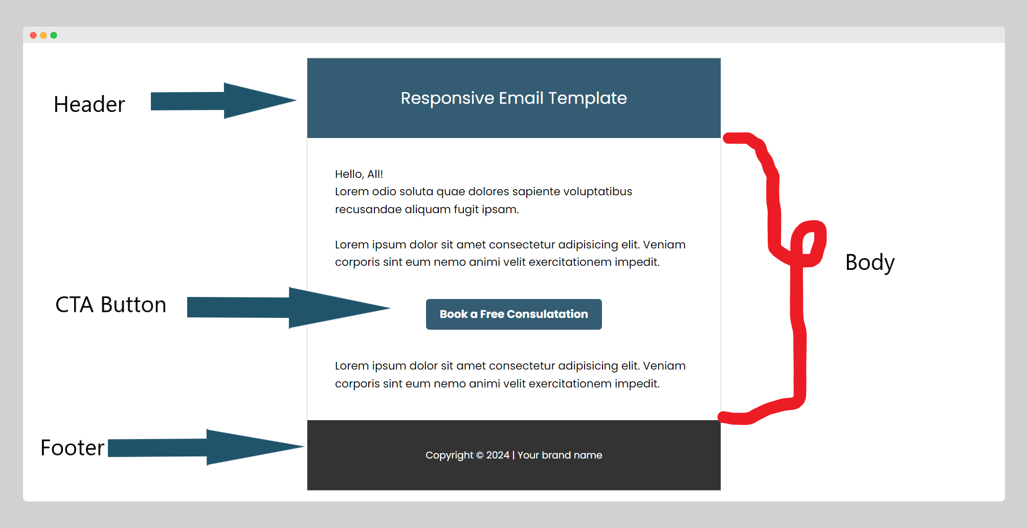 illustration of the different parts of the template: header, CTA button, and footer
Step 4: Make It Responsive
To ensure the email looks good on mobile devices, you can use CSS media queries. While most of the styling are inline, for responsive behavior, you'll need to add a <style> block in the head.
Media queries adjust styles based on the device's width.
<style>
  @media screen and (max-width: 600px) {
    .content {
        width: 100% !important;
        display: block !important;
        padding: 10px !important;
    }
    .header, .body, .footer {
        padding: 20px !important;
    }
  }
</style>
Here’s a breakdown of this specific CSS snippet:
@media screen and (max-width: 600px) { ... }
This media query targets screens with a maximum width of 600 pixels. It applies the following styles only when the email is viewed on devices with a screen width of 600px or less, which typically includes smartphones and some smaller tablets.
Styles within the media query classes:
.content
width_: 100% !important;_: This style changes the width of the.contenttable to use the full width of the screen instead of the 600px specified in the HTML. The!importantrule is used to override any other conflicting styles.display: block !important;: Although<table>elements are naturally block-level elements, settingdisplay: blockexplicitly can help in some email clients to ensure the element behaves as expected.padding: 10px !important;: Adds padding around the content within the.contenttable, reducing it from the original 40px in the HTML to make better use of the reduced screen space on smaller devices.
.header, .body, .footer
padding: 20px !important;: This style uniformly sets the padding of the header, body, and footer sections to 20px on all sides, optimizing the spacing for smaller screens. It overrides the various padding settings defined in the HTML, which include larger values in some cases.
In the context of email design, the use of !important is fairly common to ensure that the styles are applied as intended, overriding both default styles and other potentially conflicting styles that might be applied by the email client itself.
Step 5: Test Across Email Clients
It's crucial to test your email template across different email clients (like Gmail, Outlook, and Apple Mail) and devices to ensure compatibility and responsiveness. Tools like Litmus or Email on Acid can help with this.
Step 6: Adding Google Font
Incorporating Google Fonts into an HTML email template can improve its visual appeal significantly.
However, it's important to note that not all email clients support web fonts. Some, like Apple Mail, do support Google Fonts, but others like Gmail do not. To ensure your email looks great to all recipients, always provide a fallback font.
Here's how you can add a Google Font to your email template, along with a fallback option for clients that don't support it:
Choose Your Google Font
First, visit the Google Fonts website and choose a font. For this example, let's use "Poppins".
Add the Font Link to Your Email Head
Include the link to the Google Font in the <head> of your HTML document. Since this might not be supported in all email clients, ensure you have a suitable fallback font in your styles.
<link rel="preconnect" href="https://fonts.googleapis.com">
<link rel="preconnect" href="https://fonts.gstatic.com" crossorigin>
<link href="https://fonts.googleapis.com/css2?family=Poppins:ital,wght@0,100;0,200;0,300;0,400;0,500;0,600;0,700;0,800;0,900;1,100;1,200;1,300;1,400;1,500;1,600;1,700;1,800;1,900&display=swap" rel="stylesheet">
Apply the Font in Your Styles
Use inline CSS to apply the Google Font to your HTML elements, and always include a generic fallback font. In email templates, it's safer to apply styles inline due to varying support for <style> tags across email clients.
Here's how to apply the font to the body of your email and include a fallback:
<body style="font-family: 'Poppins', Arial, sans-serif;">
    <table width="100%" cellspacing="0" cellpadding="0">
        <!-- Email content -->
    </table>
</body>
What We Created
Below is a screenshot of the email template we designed. It features a professional layout with a header containing a logo placeholder, a main body section for your message, and a dark footer with contact and subscription management links.
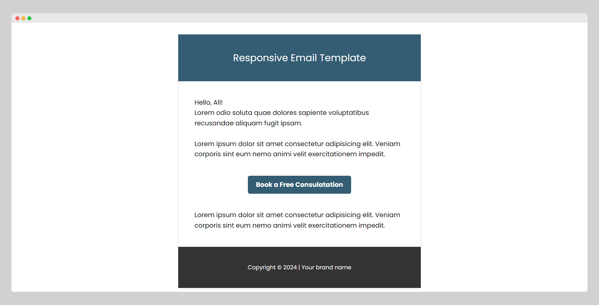 screenshot of the email template
Additional Tips:
- Keep your CSS inline as much as possible, because many email clients do not support
<style>tags. - Use web-safe fonts to ensure that your text appears correctly in all email clients.
- Always provide a plain text version of your email for clients that don't support HTML, or have HTML disabled.
I hope this guide provides you with a basic framework for creating a responsive email template. As you become more comfortable with email design, you can experiment with more complex layouts and styles.
Happy Coding!