By Yazdun Fadali
If you're looking to add some polished animations to your React apps, Framer Motion is the tool for the job.
In this tutorial, I'll walk you through creating a fully animated mobile menu using Framer Motion in React.
What Are We Going to Build?
In this tutorial, I'll guide you step by step through implementing a complete animated and responsive mobile menu component in React using Framer Motion.
You can also checkout this in-depth video tutorial I have created based on this article.
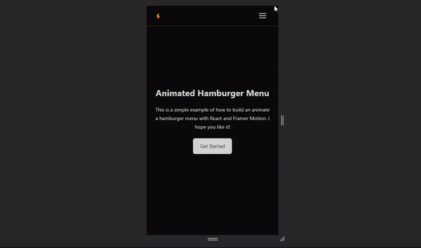 Responsve navbar with a fully animated mobile menu
Prerequisites
While prior familiarity with Framer Motion is not required to get started with this tutorial, it is important to have a foundation in React, as I won't cover basic React concepts in detail here.
Throughout this tutorial, you'll be utilizing the following tools:
- React 18.2.0: React is a JavaScript library used for building user interfaces. It allows developers to create reusable UI components and efficiently update the UI based on data changes.
- Framer Motion: Framer Motion is a popular animation library for React. It provides an easy-to-use interface for creating smooth, interactive animations and transitions in web applications.
- Vite: Vite is a fast development server and build tool for modern web applications.
- Tailwind: You will be using Tailwind to apply styles to your React components in this tutorial.
Getting Started
To get started with this tutorial, I've prepared a boilerplate project for you which contains all the required dependencies, so you don't need to set up your project from scratch.
Simply clone the starter boilerplate from the GitHub repository and then follow along with the tutorial.
- Starter Boilerplate: View on GitHub
- Final Version: View on GitHub
How to Create a Simple Navbar in React
Before you start creating the animated mobile menu, it's important to first address the desktop navbar. You want to ensure that your navbar not only remains responsive but also looks good on desktop devices.
I've already set up a routes directory for you, containing an array with all the necessary routes for your app. You can easily display these routes by importing the array and mapping through it whenever needed.
//📂./src/routes.ts

import { BiHomeAlt2 } from "react-icons/bi";
import { FiSearch } from "react-icons/fi";
import { PiChatCircleBold } from "react-icons/pi";
import { IoPricetagsOutline } from "react-icons/io5";

export const routes = [
  {
    title: "Home",
    href: "#",
    Icon: BiHomeAlt2,
  },
  {
    title: "Explore",
    href: "#",
    Icon: FiSearch,
  },
  {
    title: "Pricing",
    href: "#",
    Icon: IoPricetagsOutline,
  },
  {
    title: "About",
    href: "#",
    Icon: PiChatCircleBold,
  },
];
Each object within the routes array includes an icon imported from the React Icons library, a clear title, and an href that signifies the route's path.
Let's display the routes array on the navbar. Open up ./src/components/nav-desktop and add the following code:
//📂./src/components/nav-desktop.tsx

import { routes } from "../routes";

export const NavDesktop = () => {
  return (
    <ul className="hidden lg:flex lg:items-center gap-5 text-sm">
      {routes.map((route) => {
        const { Icon, href, title } = route;
        return (
          <li>
            <a
              href={href}
              className="flex items-center gap-1 hover:text-neutral-400 transition-all"
            >
              <Icon />
              {title}
            </a>
          </li>
        );
      })}
    </ul>
  );
};
The NavDesktop component renders an unordered list (ul) containing routes. It uses the routes array imported from the ../routes file to dynamically generate list items (li) with links (a) and icons.
 Desktop Navigation
You've just built a beautiful desktop navigation bar, awesome! 🎉
Now that you have your desktop navbar in place, it's time to create the animated mobile menu.
How to Create an Animated Hamburger Icon in React
First, let's create a button with a hamburger icon. This button will allow users to toggle your mobile menu's visibility.
Hamburger React is an incredibly lightweight React library that provides a wide array of animated hamburger icons for smooth integration into your React applications.
While you certainly have the option to create your own animated hamburger icons from the ground up, in this tutorial, you'll utilize Hamburger React to implement the animated hamburger icon and move on to building the animated mobile menu.
Open up ./src/components/nav-mobile.tsx and add the following code:
//📂./src/components/nav-mobile.tsx

import { useClickAway } from "react-use";
import { useRef } from "react";
import { useState } from "react";
import { Squash as Hamburger } from "hamburger-react";
import { AnimatePresence, motion } from "framer-motion";
import { routes } from "../routes";

export const NavMobile = () => {
  const [isOpen, setOpen] = useState(false);

  return (
    <div className="lg:hidden ">
      <Hamburger toggled={isOpen} size={20} toggle={setOpen} />
    </div>
  );
};
This React component creates a button that opens and closes a menu. The button starts as closed (isOpen is false). When clicked, it toggles the menu's visibility.
Additionally, the NavMobile component will remain hidden on larger screens, as you've already implemented the desktop navbar component.
 Clickable hamburger icon. Toggling between open and closed states with smooth animations.
How to Create an Animated Mobile Menu in React
Let's enhance the functionality of your mobile menu and display the navigation routes once the user clicks on the hamburger button.
Open up ./src/components/nav-mobile.tsx and add the following code:
//📂./src/components/nav-mobile.tsx

import { useClickAway } from "react-use";
import { useRef } from "react";
import { useState } from "react";
import { AnimatePresence, motion } from "framer-motion";
import { Squash as Hamburger } from "hamburger-react";
import { routes } from "../routes";

export const NavMobile = () => {
  const [isOpen, setOpen] = useState(false);
  const ref = useRef(null);

  useClickAway(ref, () => setOpen(false));

  return (
    <div ref={ref} className="lg:hidden ">
      <Hamburger toggled={isOpen} size={20} toggle={setOpen} />
      {isOpen && (
        <div className="fixed left-0 shadow-4xl right-0 top-[3.5rem] p-5 pt-0 bg-neutral-950 border-b border-b-white/20">
          <ul className="grid gap-2">
            {routes.map((route) => {
              const { Icon } = route;

              return (
                <li
                  key={route.title}
                  className="w-full p-[0.08rem] rounded-xl bg-gradient-to-tr from-neutral-800 via-neutral-950 to-neutral-700"
                >
                  <a
                    onClick={() => setOpen((prev) => !prev)}
                    className={
                      "flex items-center justify-between w-full p-5 rounded-xl bg-neutral-950"
                    }
                    href={route.href}
                  >
                    <span className="flex gap-1 text-lg">{route.title}</span>
                    <Icon className="text-xl" />
                  </a>
                </li>
              );
            })}
          </ul>
        </div>
      )}
    </div>
  );
};
Here's a simplified explanation of the component so far:
Setting up State and Refs:
- The component starts by creating two variables:
isOpenandref. isOpenkeeps track of whether the menu is open or closed.refis like a label that we attach to an element in the HTML. In this case, it's used to reference the menu container.
Handling Clicks Outside the Menu:
- The component uses
useClickAwayhook from React-Use library to detect when a user clicks outside the menu. When this happens, it triggers a function that closes the menu by settingisOpentofalse.
Rendering the Hamburger Button:
- The component renders a button that looks like a hamburger icon. This button serves as a toggle switch for opening and closing the menu.
- When the button is clicked, it toggles the value of
isOpen, which controls whether the menu is displayed or not.
Displaying the Menu:
- If
isOpenistrue, it means the menu should be displayed. In this case, a list of links and icons is shown. - Each link represents a different page or section. When a link is clicked, it updates
isOpento close the menu.
That's the basic flow of this React component! It sets up state to keep track of the menu's open/closed status, handles clicks outside the menu, renders a button to toggle the menu, and displays the menu content when it's supposed to be open.
 Hamburger Menu Toggle Functionality
Now, let's use Framer Motion to animate the mobile menu. Open up ./src/components/nav-mobile.tsx and add the following code:
//📂./src/components/nav-mobile.tsx

import { useClickAway } from "react-use";
import { useRef } from "react";
import { useState } from "react";
import { AnimatePresence, motion } from "framer-motion";
import { Squash as Hamburger } from "hamburger-react";
import { routes } from "../routes";

export const NavMobile = () => {
  const [isOpen, setOpen] = useState(false);
  const ref = useRef(null);

  useClickAway(ref, () => setOpen(false));

  return (
    <div ref={ref} className="lg:hidden ">
      <Hamburger toggled={isOpen} size={20} toggle={setOpen} />
      <AnimatePresence>
        {isOpen && (
          <motion.div
            initial={{ opacity: 0 }}
            animate={{ opacity: 1 }}
            exit={{ opacity: 0 }}
            transition={{ duration: 0.2 }}
            className="fixed left-0 shadow-4xl right-0 top-[3.5rem] p-5 pt-0 bg-neutral-950 border-b border-b-white/20"
          >
            <ul className="grid gap-2">
              {routes.map((route, idx) => {
                const { Icon } = route;

                return (
                  <motion.li
                    initial={{ scale: 0, opacity: 0 }}
                    animate={{ scale: 1, opacity: 1 }}
                    transition={{
                      type: "spring",
                      stiffness: 260,
                      damping: 20,
                      delay: 0.1 + idx / 10,
                    }}
                    key={route.title}
                    className="w-full p-[0.08rem] rounded-xl bg-gradient-to-tr from-neutral-800 via-neutral-950 to-neutral-700"
                  >
                    <a
                      onClick={() => setOpen((prev) => !prev)}
                      className={
                        "flex items-center justify-between w-full p-5 rounded-xl bg-neutral-950"
                      }
                      href={route.href}
                    >
                      <span className="flex gap-1 text-lg">{route.title}</span>
                      <Icon className="text-xl" />
                    </a>
                  </motion.li>
                );
              })}
            </ul>
          </motion.div>
        )}
      </AnimatePresence>
    </div>
  );
};
Let's break down the motion-related parts:
AnimatePresence:
The AnimatePresence component is a special container provided by the framer-motion library. It manages the lifecycle of animations for elements entering and leaving the DOM.
In this code, it wraps around the menu content, indicating that it should be animated when it appears or disappears.
Menu Content Animation:
The menu content (the part that appears when the menu is open) is given animation instructions. These instructions include:
initial: This defines the starting state of the animation. Here, it's set to start with no opacity (completely invisible).animate: This defines how the animation progresses. It specifies that the opacity should go to 1 (fully visible), creating a fade-in effect.exit: This defines how the animation behaves when the menu content is removed from the DOM. Here, it sets the opacity to 0, creating a fade-out effect.transition: This controls how the animation behaves over time. In this case, it's set to have a duration of 0.2 seconds, meaning it takes 0.2 seconds for the animation to complete.
Link Item Animation:
Each individual link item in the menu is given animation instructions. These instructions include:
initial: This sets the starting state of the animation. It begins with the item small (scale 0) and completely invisible (opacity 0).animate: This defines how the animation progresses. It specifies that the item should grow to its regular size (scale 1) and become fully visible (opacity 1).transition: This determines the animation behavior. It's set to a "spring" animation, which gives a bouncy effect. Thestiffnessanddampingvalues control the bounciness, whiledelaycreates a staggered effect, causing each item to start its animation slightly later than the previous one.
These animations add visual flair to the menu and menu items, making them transition smoothly when opening and closing.
Animated Menu Items
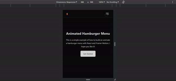
Congratulations, now you have a fully animated Hamburger Menu, great job! 🎉
Conclusion
In this tutorial, we integrated Framer Motion to craft a dynamic animated hamburger menu in React. By applying the techniques covered, you now possess the skills to enhance user navigation with smooth animations and interactive elements.
You can follow me on Twitter where I share more useful tips on web development. Happy coding!