
Bootstrap is a popular front-end framework for web development. It contains pre-built components and design elements to style HTML content. Modern browsers such as Chrome, Firefox, Opera, Safari, and Internet Explorer support Bootstrap.
Bootstrap includes a responsive grid system for varying layouts. It is a great starting point for building a mobile friendly website. It also includes optional JavaScript functionality, such as collapsible content, carousels, and modals.
Why Use Bootstrap?
Bootstrap provides an easy solution both for design and responsiveness. It is packed with beautiful elements that can be further styled with your own custom CSS, as well as a full grid system to keep your website responsive across all screens while using a clean and understandable syntax. You can build a professional looking website without any CSS or JavaScript and easily customize the elements if needed
Version History
Twitter originally developed the Bootstrap framework as an internal tool. They released it as an open source project in August of 2011.
Bootstrap 2 was released in January 2012. One of the primary features was the introduction of the 12 column responsive grid system. Bootstrap 3 appeared in August of 2013, switching to a flat design and a mobile-first approach. Bootstrap 4 is available in beta as of August 2017, and now includes Sass and Flexbox.
Bootstrap 4 was in development for two years before releasing some beta versions during 2017, while the first stable release was out in January 2018. Some notable changes include:
- Moved from Less to Sass;
- Moved to Flexbox and improved grid system;
- Added cards (replacing wells, thumbnails, and panels);
- And much more!
At the time of writing, Bootstrap's latest release is 4.1.3. If you would like to keep up with any news of announcements, follow them here.
Boostrap Features
- Bootstrap 3 supports the latest versions of Google Chrome, Firefox, Internet Explorer, Opera and Safari (except on Windows). It additionally supports back to IE8 and the latest Firefox Extended Support Release (ESR).[12]
- Since 2.0, Bootstrap supports responsive web design. This means the layout of web pages adjusts dynamically, taking into account the characteristics of the device which is being used (desktop, tablet, mobile phone).
- Starting with version 3.0, Bootstrap adopted a mobile-first design philosophy, emphasizing responsive design by default.
- Version 4.0 added Sass and flexbox support.
- Version 4.1 Added new custom range form control.
- Bootstrap does not restrict you to a fixed CSS format but allows you to develop quickly allowing style overwrites using cascading to add/edit the default styles.
Get Started
Bootstrap is a free and open source framework developed by Twitter that provides a variety of templates for use with front-end web development. Using Bootstrap makes it easy to design a fully responsive website and is a framework worth learning.
How do I add Bootstrap to my page?
Adding bootstrap to your page is a fast process, just add the following to the <head> tags in your code.
<link rel="stylesheet" href="https://stackpath.bootstrapcdn.com/bootstrap/4.1.3/css/bootstrap.min.css" integrity="sha384-MCw98/SFnGE8fJT3GXwEOngsV7Zt27NXFoaoApmYm81iuXoPkFOJwJ8ERdknLPMO" crossorigin="anonymous">
Note: These are only examples and may change without notice. Please refer to a CDN for current links to include in your project.
Some Bootstrap components require other JavaScript files, check out the Bootstrap documentation here to find the latest scripting files.
You will also need to add the following between the body tags in your code. With bootstrap you'll be using <div> tags when using many of Bootstrap's features, e
<div class="alert alert-success" role="alert">
    <strong>Congratulations!</strong>
    <p>Bootstrap is now working on this page</p>
</div>
Congratulations!
Bootstrap is now working on this page
Installing Bootstrap with a Package Manager
A popular package manager is NPM or Node Package Manager. You will need to install Node.js, which includes the Node Package Manager. Visit Node.js and download the necessary files based on your OS, and then install them.
Once installed and setup, open up the command line or console, and type the following in the the project folder you wish to use Bootstrap with. At the time of writing this will install Bootstrap version 4.0.0
npm install bootstrap@4.0.0 --save
Once NPM has finished downloading and installing Bootstrap 4, there will be a new folder called node_modules within your project folder if it wasn't already there.
/bootstrapwhich contains the CSS and Sass version of our files./jquerywhich is used by Bootstrap in various components./tetherwhich is a library for element positioning.
Grid System
In a nutshell, the Bootstrap grid system helps you create responsive layouts, and it is comprised of a system of rows and columns that helps you structure your content.
Rows are horizontal groups of columns, and each page has a maximum of 12 columns per row. Within each row, the content is placed inside the columns and it can span anywhere between 1 to 12 columns.
Bootstrap has five different types of grid tiers: Extra small, Small, Medium, Large and Extra large. There is a breakpoint defined for each of these grid tiers. Bootstrap uses pixels to define the grid tier breakpoints.
Container
The container is the outer most element that contains your grid. Use container for a fixed-width container in the middle of the screen (add an extra margin on larger screens) or container-fluid for full width.
<div class="container"></div>
Row
Use row to group your columns. This will keep everything lined up properly and help you structure your grid.
<div class="row"></div>
Columns
Column classes indicate the number of columns you’d like to use out of the possible 12 per row. For example col-sm-6 would mean your columns use up half the width of the row on a small screen, and col-lg-4would use up a third on a large screen.
Here is how you would define a class prefix to use up one column width on the various screen sizes:
- Extra Small
col-1 - Small
col-sm-1 - Medium
col-md-1 - Large
col-lg-1 - Extra Large
col-xl-1
<div class="col-sm-1"></div>
Example
A full width grid that has four columns, each taking up a full row on xs screens, half a row on sm and md screens, and a quarter of the width of the row on screens that are large and above:
<div class="container-fluid">
  <div class="row">
    <div class="col-12 col-sm-6 col-lg-4">First Column</div>
    <div class="col-12 col-sm-6 col-lg-4">Second Column</div>
    <div class="col-12 col-sm-6 col-lg-4">Third Column</div>
    <div class="col-12 col-sm-6 col-lg-4">Forth Column</div>
  </div>
</div>
Note that col-md and col-xl are not defined, where a size is not defined, it will default down to the next smaller size that has been specified.
Bootstrap provides a ready-made 12 column grid system for use in layouts. Consider the following code.
   <div class="container">
    <div class="row">
        <div class="col-md-6">Content</div>
        <div class="col-md-6">Content</div>
    <div>
   </div>
where:
- col = column
- md = screen size
- 6 = column width
As a 12 column grid system, all user defined grid column widths must add up to 12.
Screen size values can be assigned as follows:
- xs - < 768px Phones
- sm - < 992px Tablets
- md - < 1200px Laptops
- lg - > 1200px Desktops
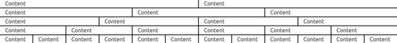
The following code and image shows what is possible using different column widths.
    <div class="container">
        <div class="row">
            <div class="example col-md-6">Content</div>
            <div class="example col-md-6">Content</div>
        <div>
    </div>

    <div class="container">
        <div class="row">
            <div class="example col-md-4">Content</div>
            <div class="example col-md-4">Content</div>
            <div class="example col-md-4">Content</div>
        <div>
    </div>

    <div class="container">
        <div class="row">
            <div class="example col-md-3">Content</div>
            <div class="example col-md-3">Content</div>
            <div class="example col-md-3">Content</div>
            <div class="example col-md-3">Content</div>
        <div>
    </div>

    <div class="container">
        <div class="row">
            <div class="example col-md-2">Content</div>
            <div class="example col-md-2">Content</div>
            <div class="example col-md-2">Content</div>
            <div class="example col-md-2">Content</div>
            <div class="example col-md-2">Content</div>
            <div class="example col-md-2">Content</div>
        <div>
    </div>

    <div class="container">
        <div class="row">
            <div class="example col-md-1">Content</div>
            <div class="example col-md-1">Content</div>
            <div class="example col-md-1">Content</div>
            <div class="example col-md-1">Content</div>
            <div class="example col-md-1">Content</div>
            <div class="example col-md-1">Content</div>
            <div class="example col-md-1">Content</div>
            <div class="example col-md-1">Content</div>
            <div class="example col-md-1">Content</div>
            <div class="example col-md-1">Content</div>
            <div class="example col-md-1">Content</div>
            <div class="example col-md-1">Content</div>
        </div>
    </div>
Buttons
The Bootstrap framework provides you with various styling options for buttons. These styles help you provide a visual representation to the user of what the button may do.
How To Use
To use bootstrap buttons you need to follow the same steps that you would to create a button in HTML, except that you also apply the applicable CSS class to the button. A code example has been provided below.
Code Example:
<button type="button" class="btn btn-primary">Primary</button>
You can also use bootstrap buttons with the <a> and <input> elements as shown in the examples below. As per the Bootstrap documentation,
When using button classes on elements that are used to trigger in-page functionality (like collapsing content), rather than linking to new pages or sections within the current page, these links should be given a role="button"to appropriately convey their purpose to assistive technologies such as screen readers.
<a class="btn btn-primary" href="#" role="button">This button is a link</a>
<input class="btn btn-primary" type="submit" value="Submit">
Button Class List
This is a list of the CSS classes that bootstrap provides for buttons. They give the background color to the buttons.
.btn This is bootstrap's basic button. It is a prerequisite if you want other bootstrap buttons to work properly.
<button type="button" class="btn">Basic</button>
.btn-primary Bootstrap's primary button. Default color displays #007bff.
<button type="button" class="btn btn-primary">Primary</button>
.btn-secondary Bootstrap's secondary button. Default color displays #6c757d.
<button type="button" class="btn btn-secondary">Secondary</button>
.btn-success Bootstrap's success button. Default color displays #28a745.
<button type="button" class="btn btn-success">Success</button>
.btn-info Bootstrap's info button. Default color displays #17a2b8.
<button type="button" class="btn btn-info">Info</button>
.btn-warning Bootstrap's warning button. Default color displays #ffc107.
<button type="button" class="btn btn-warning">Warning</button>
.btn-danger Bootstrap's danger button. Default color displays #dc3545.
<button type="button" class="btn btn-danger">Danger</button>
.btn-link Bootstrap's link button.
<button type="button" class="btn btn-link">Link</button>
.btn-light Bootstrap's light button.
<button type="button" class="btn btn-light">Light</button>
.btn-dark Bootstrap's dark button.
<button type="button" class="btn btn-dark">Dark</button>
.btn-dark This is bootstrap's dark button.
.btn-secondary This is bootstrap's secondary button.
Button Sizes
This is a list of the CSS classes for different size of the buttons.
.btn-lg Bootstrap's large button.
<button type="button" class="btn btn-lg">Large</button>
.btn-md This is bootstrap's medium button.
<button type="button" class="btn btn-md">Medium</button>
.btn-sm Bootstrap's small button.
<button type="button" class="btn btn-sm">Small</button>
.btn-md This is bootstrap's medium button.
.btn-xs This is bootstrap's extra small button.
<button type="button" class="btn btn-xs">Extra Small</button>
.btn-block This is bootstrap's full width button.
Disabled Button State
This is used to show that the button is disabled by fading the button. This can be achieved through adding "disabled" to the <button> tag.
.btn-block This is bootstrap's block level button. They actually span the entire width of their parent element. For example, a form element with a width of 200px, that means the btn-block button would have a width of 200px.
Outlined Buttons
It is possible to also have outlined buttons rather than fully colored buttons. This is achieved by placing the mid fix outline between the button class you want. A sample usage would be as follows:
<button type="button" class="btn btn-outline-primary">Primary</button>
<button type="button" class="btn btn-outline-secondary">Secondary</button>
<button type="button" class="btn btn-outline-success">Success</button>
<button type="button" class="btn btn-outline-danger">Danger</button>
<button type="button" class="btn btn-outline-warning">Warning</button>
<button type="button" class="btn btn-outline-info">Info</button>
<button type="button" class="btn btn-outline-light">Light</button>
<button type="button" class="btn btn-outline-dark">Dark</button>
Outlined buttons are a part of Bootstrap since version 4 - please be sure that you are using the right version if you are unable to get them to work.
Inline Buttons
You can create inline button row by adding .d-inline-block class to the element which sets the display of the button to inline block. For example : <button class="btn btn-primary d-inline-block btn-lg"></button>
Grouping of Buttons
It is possible to group more than one button for certain uses like pagination. Grouping buttons can be done by making a parent div for all buttons you want to group, using the .btn-group class on this div:
<div class="btn-group" role="group" aria-label="Basic example">
  <button type="button" class="btn btn-secondary">Left</button>
  <button type="button" class="btn btn-secondary">Middle</button>
  <button type="button" class="btn btn-secondary">Right</button>
</div>
Dropdowns
Bootstrap provides Dropdowns as a plugin for displaying lists of links. A dropdown is a button which toggles displaying a list of links.
Bootstrap’s dropdowns are designed to be generic and applicable to a variety of situations. For instance, it is possible to create dropdowns that contain search fields or login forms.
<div class="dropdown">
  <button class="btn btn-secondary dropdown-toggle" type="button" id="dropdownMenuButton" data-toggle="dropdown" aria-haspopup="true" aria-expanded="false">
    Dropdown example
  </button>
  <div class="dropdown-menu" aria-labelledby="dropdownMenuButton">
    <a class="dropdown-item" href="#">Action</a>
    <a class="dropdown-item" href="#">Another action</a>
    <a class="dropdown-item" href="#">Something else here</a>
  </div>
</div>
The .dropdown class indicates a dropdown menu.
To open the dropdown menu, use a button or a link with a class of .dropdown-toggle and the data-toggle="dropdown attribute.
The .caret class creates a caret arrow icon (▼), which indicates that the button is a dropdown.
Add the .dropdown-menu class to a unordered list element to actually build the dropdown menu.
Navigation Bar
The Bootstrap framework provides you with a feature called navigation bars. In short, a navigation bar (also referred to as a navbar) is a header at the top of the page to display navigational information.
How To Use
To use Bootstrap Navigation Bars you add a <nav> element to the top inside the <body> element of your webpage. There are various styles you can add to customize the display of your navbars.
This is the code needed to make a basic navbar:
<nav class="navbar navbar-default">
  <div class="container-fluid">
    <div class="navbar-header">
      <a class="navbar-brand" href="#">Site Name</a>
    </div>
    <ul class="nav navbar-nav">
      <li class="active"><a href="#">Home</a></li>
      <li><a href="#">Page 1</a></li>
      <li><a href="#">Page 2</a></li>
      <li><a href="#">Page 3</a></li>
    </ul>
  </div>
</nav>
Navbar Styles
Bootstrap provides a set of classes in the Bootstrap framework to style your navbars. These classes are as followed:
navbar navbar-defaultThis is the default style for your navbars.navbar navbar-inverseThis is similar to the default style except the colors are inverted.
Adding drop-down menus to the navbar
You can include a drop-down menu inside a navbar. This feature requires you to include Bootstrap's javascript file for it to work.
<li class="dropdown">
  <a class="dropdown-toggle" data-toggle="dropdown" href="#">Drop down
    <span class="caret"></span>
  </a>
<ul class="dropdown-menu">
    <li><a href="#">Item 1</a></li>
    <li><a href="#">Item 2</a></li>
    <li><a href="#">Item 3</a></li>
  </ul>
</li>
Adding buttons to the navbar
You can add buttons on the navbar. The existing Bootstrap Button classes work however you'll need to include the class navbar-btn to the end of the class list.
<button class="btn navbar-btn">Button</button>
Adding brand logo or name to the navbar
The navbar-brand class can be applied to most elements, but an anchor works best as some elements might require utility classes or custom styles.
<!-- As a link -->
<nav class="navbar navbar-light bg-light">
  <a class="navbar-brand" href="#">Navbar</a>
</nav>
<!-- As a heading -->
<nav class="navbar navbar-light bg-light">
  <span class="navbar-brand mb-0 h1">Navbar</span>
</nav>
Adding forms to the navbar
You can also add forms to the navbar. This could be used for tasks such as a search field, quick login field, etc.
<form class="navbar-form navbar-right">
  <div class="form-group">
      <input type="text" class="form-control" placeholder="Search">
  </div>
  <button type="submit" class="btn btn-default">Search</button>
</form>
Aligning elements to the right on the navbar
In some cases you might want to align elements in a navbar to the right (for example a login or sign-up button.). To do this you'll need to use the navbar-right class.
<nav class="navbar navbar-default">
  <div class="container-fluid">
    <div class="navbar-header">
      <a class="navbar-brand" href="#">Site Name</a>
    </div>
    <ul class="nav navbar-nav">
      <li class="active"><a href="#">Home</a></li>
      <li><a href="#">Page 1</a></li>
      <li><a href="#">Page 2</a></li>
      <li><a href="#">Page 3</a></li>
    </ul>
    <ul class="nav navbar-nav navbar-right">
      <li><a href="#">Action Link #1</a></li>
      <li><a href="#">Action Link #2</a></li>
    </ul>
  </div>
</nav>
Displaying the navbar independent of scrolling
In some cases you might want to keep the navbar at the top or bottom of the screen regardless of scrolling. You will need to add either the navbar-fixed-top or navbar-fixed-bottom class to the <nav>element.
<nav class="navbar navbar-default navbar-fixed-top">
  <div class="container-fluid">
    <div class="navbar-header">
      <a class="navbar-brand" href="#">Site Name</a>
    </div>
    <ul class="nav navbar-nav">
      <li class="active"><a href="#">Home</a></li>
      <li><a href="#">Page 1</a></li>
      <li><a href="#">Page 2</a></li>
      <li><a href="#">Page 3</a></li>
    </ul>
  </div>
</nav>
Collapsing the navbar
On a small screen (such as a phone or tablet) the navbar is going to take up too much space. Luckily the option to collase the navbar exists. You can accomplish this using the following example.
<nav class="navbar navbar-default">
  <div class="container-fluid">
    <div class="navbar-header">
      <a class="navbar-brand" href="#">Site Name</a>
    </div>
    <ul class="nav navbar-nav">
      <li class="active"><a href="#">Home</a></li>
      <li><a href="#">Page 1</a></li>
      <li><a href="#">Page 2</a></li>
      <li><a href="#">Page 3</a></li>
    </ul>
  </div>
</nav>
Jumbotron
Jumbotron is Lightweight, flexible component for showcasing hero unit style content. Jumbotron is a responsive component which the main goal is to focus visitor's attention or highlight the special piece of information.
Jumbotron make use of almost any other bootstrap code to additionally increase its engagement value. It's operate with images,enlarged fonts,different backgorund styles etc.
Most Attracting features of jumbotron
- Showcase the marketing messages on your site
- Project presentation
- Article introduction
- Image showcase
How to use
Use a <div> element with class .jumbotron to create a jumbotron:
<div class="jumbotron">
  <h1 class="display-4">Hello, world!</h1>
  <p class="lead">This is a simple hero unit, a simple jumbotron-style component for calling extra attention to featured content or information.</p>
  <hr class="my-4">
  <p>It uses utility classes for typography and spacing to space content out within the larger container.</p>
  <a class="btn btn-primary btn-lg" href="#" role="button">Learn more</a>
</div>
Fluid jumbotron
To make the jumbotron full width, and without rounded corners, add the .jumbotron-fluid modifier class and add a .container or .container-fluid within.
<div class="jumbotron jumbotron-fluid">
  <div class="container">
    <h1 class="display-4">Fluid jumbotron</h1>
    <p class="lead">This is a modified jumbotron that occupies the entire horizontal space of its parent.</p>
  </div>
</div>
Forms
Bootstrap framework provides a form feature which you can use to create beautiful HTML forms easily. Using the Bootstrap form gives each individual form element a unified global style. Bootstrap form adds the right spacing and look to each element.
Each Bootstrap form element should have a class form-control. This class is how Bootstrap knows which elements to style. All textual elements like input, textarea and select that have the form-control class will have 100% width by default.
There are two types of Bootstrap forms, which are:
- Inline form - creates the form on a single line. Useful for login forms in a nav bar
- Horizontal form - creates a form with each element in a different row
Example of a basic form
<form>
  <div class="form-group">
    <label for="exampleInputEmail1">Email address</label>
    <input type="email" class="form-control" id="exampleInputEmail1" placeholder="Email">
  </div>
  <div class="form-group">
    <label for="exampleInputPassword1">Password</label>
    <input type="password" class="form-control" id="exampleInputPassword1" placeholder="Password">
  </div>
  <div class="form-group">
    <label for="exampleInputFile">File input</label>
    <input type="file" id="exampleInputFile">
    <p class="help-block">Example block-level help text here.</p>
  </div>
  <div class="checkbox">
    <label>
      <input type="checkbox"> Check me out
    </label>
  </div>
  <button type="submit" class="btn btn-default">Submit</button>
</form>
Example of an inline form
<form class="form-inline">
  <div class="form-group">
    <label for="exampleInputName2">Name</label>
    <input type="text" class="form-control" id="exampleInputName2" placeholder="Jane Doe">
  </div>
  <div class="form-group">
    <label for="exampleInputEmail2">Email</label>
    <input type="email" class="form-control" id="exampleInputEmail2" placeholder="jane.doe@example.com">
  </div>
  <button type="submit" class="btn btn-default">Send invitation</button>
</form>
Example of horizontal form
<form class="form-horizontal">
  <div class="form-group">
    <label for="inputEmail3" class="col-sm-2 control-label">Email</label>
    <div class="col-sm-10">
      <input type="email" class="form-control" id="inputEmail3" placeholder="Email">
    </div>
  </div>
  <div class="form-group">
    <label for="inputPassword3" class="col-sm-2 control-label">Password</label>
    <div class="col-sm-10">
      <input type="password" class="form-control" id="inputPassword3" placeholder="Password">
    </div>
  </div>
  <div class="form-group">
    <div class="col-sm-offset-2 col-sm-10">
      <div class="checkbox">
        <label>
          <input type="checkbox"> Remember me
        </label>
      </div>
    </div>
  </div>
  <div class="form-group">
    <div class="col-sm-offset-2 col-sm-10">
      <button type="submit" class="btn btn-default">Sign in</button>
    </div>
  </div>
</form>
Form Inputs
Bootstrap supports the following form controls:
- input
- textarea
- checkbox
- radio
- select
- range
1. Input
Bootstrap supports all the HTML5 input types: text, password, datetime, datetime-local, date, month, time, week, number, email, url, search, tel, and color.
Note: Inputs will NOT be fully styled if their type is not properly declared!
The following example contains two input elements; one of type text and one of type password:
<div class="form-group">
  <label for="usr">Name:</label>
  <input type="text" class="form-control" id="usr">
</div>
<div class="form-group">
  <label for="pwd">Password:</label>
  <input type="password" class="form-control" id="pwd">
</div>
2. Textarea
The following example contains a textarea:
<div class="form-group">
  <label for="comment">Comment:</label>
  <textarea class="form-control" rows="5" id="comment"></textarea>
</div>
3. Checkboxes
Checkboxes are used if you want the user to select any number of options from a list of preset options.
The following example contains three checkboxes. The last option is disabled:
<div class="checkbox">
  <label>
  <input type="checkbox" value="">Option 1</label>
</div>
<div class="checkbox">
  <label>
  <input type="checkbox" value="">Option 2</label>
</div>
<div class="checkbox disabled">
  <label>
  <input type="checkbox" value="" disabled>Option 3</label>
</div>
Use the .checkbox-inline class if you want the checkboxes to appear on the same line:
<label class="checkbox-inline"><input type="checkbox" value="">Option 1</label>
<label class="checkbox-inline"><input type="checkbox" value="">Option 2</label>
<label class="checkbox-inline"><input type="checkbox" value="">Option 3</label>
4. Radio Buttons
Radio buttons are used if you want to limit the user to just one selection from a list of preset options.
The following example contains three radio buttons. The last option is disabled:
<div class="radio">
  <label><input type="radio" name="optradio">Option 1</label>
</div>
<div class="radio">
  <label><input type="radio" name="optradio">Option 2</label>
</div>
<div class="radio disabled">
  <label><input type="radio" name="optradio" disabled>Option 3</label>
</div>
Use the .radio-inline class if you want the checkboxes to appear on the same line:
<label class="radio-inline"><input type="radio" name="optradio">Option 1</label>
<label class="radio-inline"><input type="radio" name="optradio">Option 2</label>
<label class="radio-inline"><input type="radio" name="optradio">Option 3</label>
5. Select (List)
Select lists are used if you want to allow the user to pick from multiple options.
The following example contains a dropdown list (select list):
<div class="form-group">
  <label for="sel1">Select list:</label>
  <select class="form-control" id="sel1">
    <option>1</option>
    <option>2</option>
    <option>3</option>
    <option>4</option>
  </select>
</div>
6. Range
Select lists are used if you want to allow the user to pick from multiple options.
The following example contains a dropdown list (select list):
<form>
  <div class="form-group">
    <label for="formControlRange">Example Range input</label>
    <input type="range" class="form-control-range" id="formControlRange">
  </div>
</form>
How to make Bootstrap Inputs Accessible
Input fields should have labels or some other form of identifier such as WAI-ARIA tags to meet the Web Content Accessibility Guidelines or WCAG for short. In order for screen readers to accurately convey to a user what labels are associated with which inputs the labels should reference the corresponding input.
This can be done by utlizing the for parameter in the HTML:
<label for="email-input">Enter Email</label>
<input type="email" class="form-control" id="email-input" placeholder="Enter Email">
The label for attribute always references the input field by its ID. This tells the screen reader that this label is definitely for this input field which will minimize confusion for any users who are using a screen reader to visit a web site. In the above example, if a user clicks on the actual word "Enter email", then the user will be able to type. If the 'for' attribute was not attached to the label, then if a user clicks on the words 'Enter email,' nothing would happen. The user would have to click on the actual email input field to be able to type.
Tables
Basic Table
In order to achieve the basic styling example add the base class .table to any <table> element.
<table class="table">
  ...
</table>
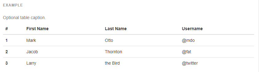
Table Head
You can define separate header section in your table structure. This is example
<table class="table">
    <thead class=theat-dark>
    <tr>
      <th scope="col">#</th>
      <th scope="col">First</th>
      <th scope="col">Last</th>
      <th scope="col">Handle</th>
    </tr>
    </thead>
    <tbody>
    <tr>
      <th scope="row">1</th>
      <td>Bob</td>
      <td>Robo</td>
      <td>@bro</td>
    </tr>
  </tbody>
</table>
Table Striped
In order to achieve the striped row effect (zebra-striping) in tables use .table-striped in addition to .table on any <table> element. Striped tables are styled via the :nth-child CSS selector, which is not available in Internet Explorer 8.
<table class="table table-striped">
  ...
</table>
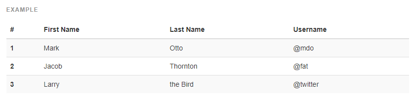
Table Bordered
In order to achieve the bordered table use .table-bordered in addition to .table on any <table>element.
<table class="table table-bordered">
  ...
</table>
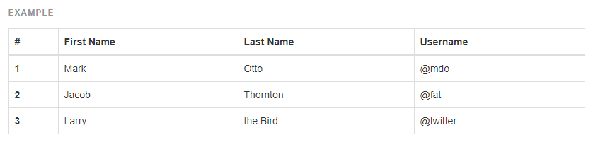
Table Hover
In order to achieve the hover row effect on tables, use .table-hover in addition to .table on any <table> element.
<table class="table table-hover">
  ...
</table>
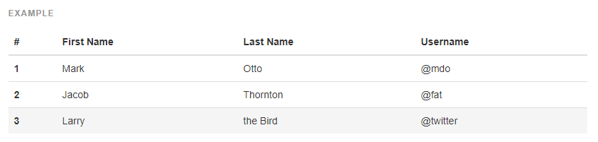
Table Condensed
In order to achieve the condensed table use .table-condensed in addition to .table on any <table>element.
<table class="table table-condensed">
  ...
</table>

Table Responsive
In order to achieve the responsive table by wrapping any .table table in a .table-responsiveelement.

Developers are able to change the style of each individual row <tr> and/or cell <td> by using contextual classes.
.active- Applies the hover color to a particular row or cell.success- Indicates a successful or positive action.info- Indicates a neutral informative change or action.warning- Indicates a warning that might need attention.danger- Indicates a dangerous or potentially negative action
