
By Michael Loscalzo
What happens when preconceived notions take a back seat to the lessons learned from metrics?

Let’s begin at the end…
? My blog metrics indicate that 60% of readers don’t read the full post. So, let’s take an extremely quick look at what I learned from a data-driven website redesign!
TAKEAWAY #1
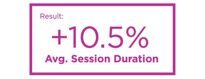
If presented properly, a visitor will spend more time viewing less content. Despite a decrease in the number of pages, and a reduction to the word count per page, I observed an increase in average session duration.
The changes:
- Long blocks of text were reevaluated and truncated into more concise blurbs.
- Consolidated site structure enabled visitors to quickly find relevant content.
TAKEAWAY #2
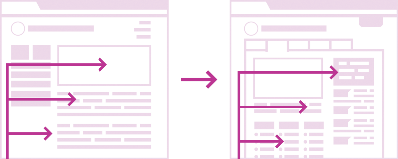
Design patterns work! It may be tempting to break all of the rules, but the truth is, design patterns are familiar to visitors and utilize a composition that takes advantage of a viewer’s natural eye movement.
The changes:
- The revised homepage features a z-shaped pattern (desktop), and prioritizes the most frequently viewed content. On pages with large text blocks, an f-shaped pattern (desktop) was used.
- The primary navigation was revised to be more intuitive and mobile-friendly.
TAKEAWAY #3
Remove steps from the user journey to improve conversion rate. The removal of a single step in the user journey resulted in a large increase in conversions.
Conversions were measured by the percentage of visitors that submitted a questionnaire form.
The changes:
- Fewer steps for a visitor to reach the questionnaire form with adequate information about offerings.
- Increased prominence of the form.
- Instead of one long form (15 questions), the form was broken into three small portions (5 questions per portion).
Thank you for reading this far!
Below, I have provided a much more granular examination of why certain changes were made and the resulting improvements observed in key performance indicators (KPIs).
The client
In 1980, Carol Yilmaz and nine other parents sought an appropriate education for their gifted children. Together, they founded Long Island School for the Gifted (LISG), a private coeducational day school.
The LISG mission statement:
To provide an appropriate education for gifted children in pre-kindergarten through ninth grade, in a nurturing environment where they will be both intellectually challenged and comfortable socially, thereby providing these children with the opportunity to grow and develop to their potential.
The LISG website seeks to provide prospective students and their parents with details of the unique offerings available at the school. A preliminary step in the application process is the “Introductory Questionnaire” form, which can be completed on the website. Additionally, the website would provide valuable information to enrolled students and their parents.
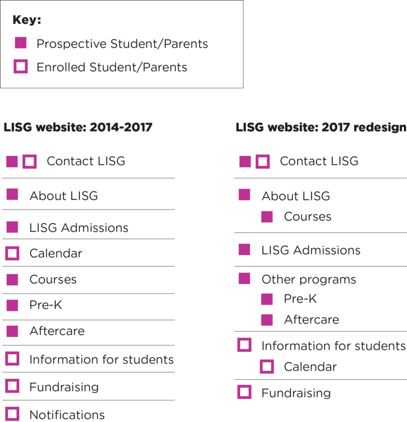
LISG website: 2014-2017
Prior to 2014, the LISG website was largely static. The 2014-2017 website featured a photo carousel, digital student event calendar, and an introductory questionnaire form, which would help prospective parents jump start the application process.
Although the 2014–2017 redesign of the LISG website was an improvement over the previous design, the metrics collected indicated that additional improvements could be made.
THE ANALYTICS TOOLS
- Google Analytics: Measures website, app, digital, and offline data to gain customer insights.
- JotForm: is an online application that allows website administrators to quickly create custom online forms. JotForm offers a form analytics tool.
THE KEY FINDINGS
- Distinct user types: Based on website traffic and the behavior flow, there appears to be two distinct user types with two distinct content needs. The two user types are prospective parents/students and enrolled parents/students.
- Average session duration: The typical visitor is only spending a short time on each page, indicating that long blocks of text are not being read.
- Conversion: Approximately .69% of visitors are completing the introductory questionnaire.
- Rise in mobile traffic: Mobile traffic to the website increased by nearly 50% during a three year period.
LISG website: 2017 redesign
After examining the data from 2014–2017, we began the redesign process with clear goals in mind.
THE GOALS OF THE REDESIGN
- Refine site structure: Consolidate site content and reduce text.
- Improve mobile UI: The increase in mobile traffic highlighted the need for improvements to the mobile navigation.
- Leverage established design patterns: Established design patterns are familiar to visitors and utilize a composition that takes advantage of a viewers natural eye movement.
- Improve the user journey: Remove unnecessary obstacles and enable visitors to quickly and easily find what they are looking for.
- Increase conversions: Improve the visibility of the Introductory Questionnaire form and make it less daunting to fill out.
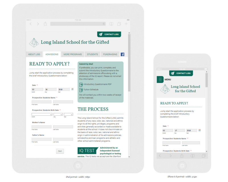
GOAL #1: REFINE SITE STRUCTURE
Although much of the website content can be relevant to both prospective and enrolled students/parents, an effort was made to determine which user type would primarily be interested in each page. Furthermore, content was consolidated or eliminated when appropriate.
This approach enabled us to reduce the size of the website by four pages with the goal of creating a more intuitive site structure.
When we developed the first redesign in 2014, there was a desire to share a lot of information and make the website appear robust. Long blocks of text may have been off-putting to visitors who are likely researching and evaluating several schools in one sitting.

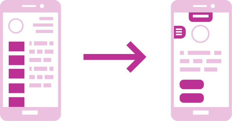
GOAL #2: IMPROVE MOBILE UI
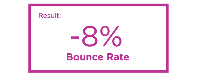
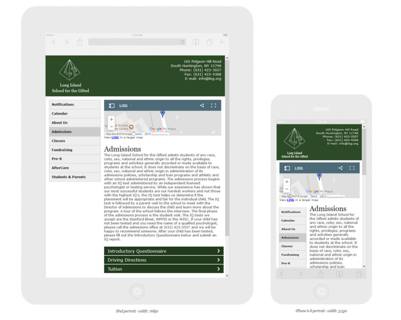
The navigation that appeared on the 2014–2017 website became squished on the left side of the viewport on mobile. Even worse, on several devices, some of the buttons disappeared beneath the fold. These issues likely contributed to an increased bounce rate on smartphones.
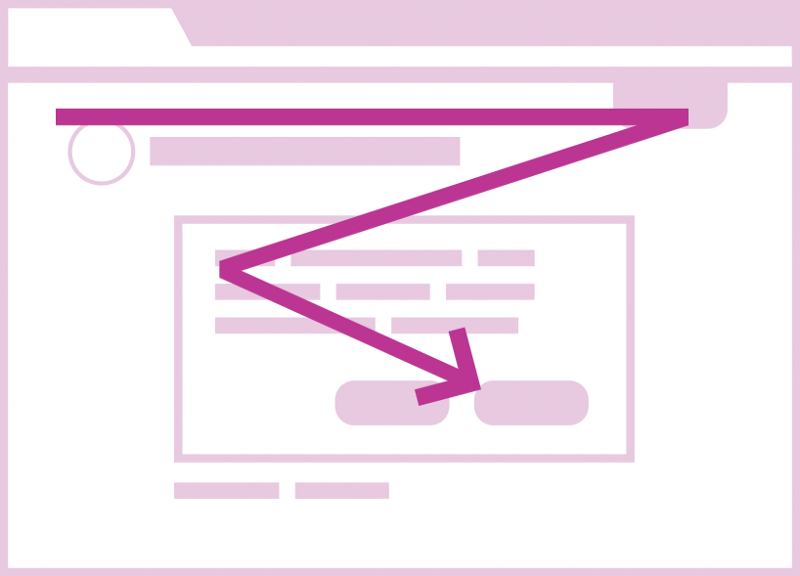
GOAL #3: LEVERAGE ESTABLISHED DESIGN PATTERNS
The use of F and Z patterns can help to create visual hierarchy in web design.
“This [Z-shaped] pattern works because most western readers will scan your page the same way that they would scan a book — top to bottom, left to right.”
— Nick Babich, UX Planet
GOAL #4: IMPROVE THE USER JOURNEY
Based on demographics data and page traffic, we were able to conclude that the majority of website visitors were prospective students/parents. Ideally, a prospective parent is using the website to learn about the school, determine if their child is eligible for admission, and they may even begin the application process by filling out the introductory questionnaire.
“User journeys are the step by step journey that a user takes to reach their goal. This journey will often consist of a number of website pages and decision points that carry the user from one step to another… This journey is then redesigned to form an ‘ideal’ user journey free from frustration.”
Using behavior flow metrics, we could see that it took three interactions before they filled out the introductory questionnaire. With each interaction, there is visitor drop-off.
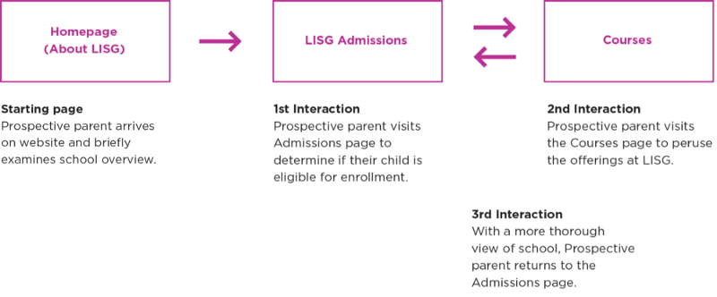
In the 2014–2017 version of the website, the metrics indicate that only around 5% of visitors reach the Admissions page with enough information about the school to confidently determine if they wanted to fill out the introductory questionnaire form or not.
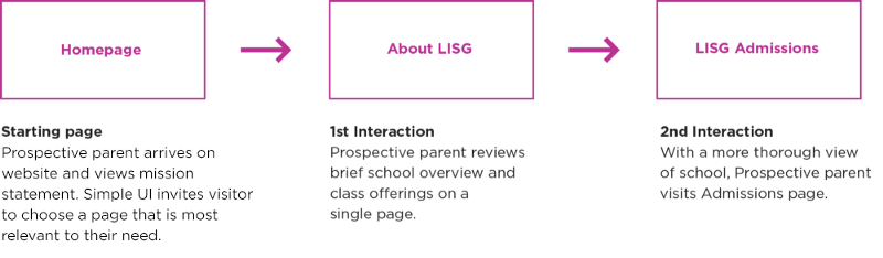
In the 2017 redesign, nearly 15% of visitors reach the admissions page with adequate information about the school.
GOAL #5: INCREASE CONVERSIONS
Based on the 2014–2017 data, we hypothesized that users may have been having difficulty finding the introductory questionnaire form (it was housed within an accordion menu). Additionally, the form may have looked daunting because it was vertically long.
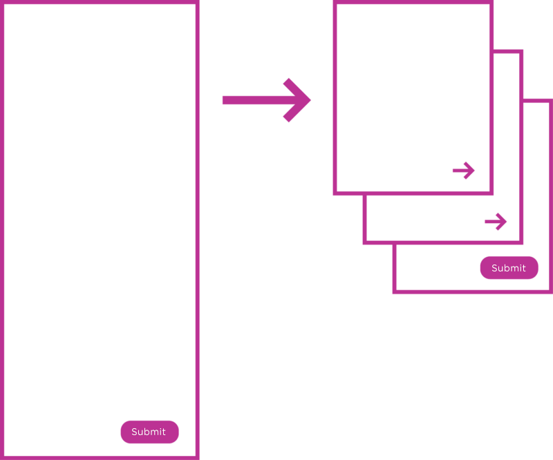
A one page form with 15 questions is less likely to be completed than a 3 page form with 5 questions per page.
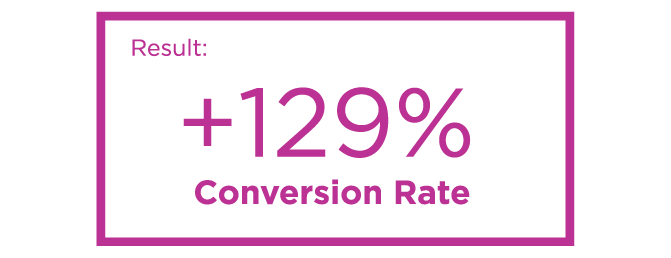
The amount of form submissions increased by 129%. The conversion rate rose from .69% to nearly 1.6%.
And that’s how we completed a successful redesign. Thank you for reading! If you enjoyed this story you can Read more or Follow me on Twitter.