CSS transform allows you to translate, rotate, skew, scale, or add perspective effects to HTML elements.
This tutorial discusses everything you need to know to transform HTML elements like a pro.
Table of Contents
CSS Rotate Functions vs.
rotateProperty: What's the Difference?CSS
scale()Function vs.scaleProperty: What's the Difference?CSS Translate Functions vs.
translateProperty: What's the Difference?CSS
perspective()Function vs.perspectiveProperty: What's the Difference?
So, without further ado, let's discuss the CSS transform property.
What Is the CSS transform Property?
The CSS transform property specifies the transformational effect you wish to apply to an HTML element.
Here's the syntax:
html-element {
  transform: value;
}
The CSS transform property accepts the following values:
inherit: Transforms the element with its parent element'stransformvalue.initial: Transforms the HTML element with its defaulttransformvalue.matrix(): Transforms the element two-dimensionally with a matrix of six values.matrix3d(): Transforms the HTML element three-dimensionally with a 4x4 matrix of sixteen values.none: Applies no transformation to the HTML element.perspective(): Transforms a 3D transformed element with a perspective view.rotate(): Transforms the element by rotating it two-dimensionally.rotate3d(): Transforms the element by rotating it three-dimensionally.rotateX(): Transforms the element by rotating it three-dimensionally along the X-axis.rotateY(): Transforms the element by rotating it three-dimensionally along the Y-axis.rotateZ(): Transforms the HTML element by rotating it three-dimensionally along the Z-axis.scale(): Transforms the element by scaling it two-dimensionally.scale3d(): Transforms the element by scaling it three-dimensionally.scaleX(): Transforms the element by scaling it along the X-axis.scaleY(): Transforms the element by scaling it along the Y-axis.scaleZ(): Transforms the HTML element by scaling it three-dimensionally along the Z-axis.skew(): Transforms the element by skewing it two-dimensionally along the X- and Y-axis.skewX(): Transforms the element by skewing it two-dimensionally along the X-axis.skewY(): Transforms the element by skewing it two-dimensionally along the Y-axis.translate(): Transforms the HTML element by translating (moving) it two-dimensionally.translate3d(): Transforms the element by translating it three-dimensionally.translateX(): Transforms the element by translating it along the X-axis.translateY(): Transforms the element by translating it along the Y-axis.translateZ(): Transforms the element by translating it three-dimensionally along the Z-axis.
Note: The transform property accepts one or more CSS transform functions. For instance, here's a valid transform declaration:
div {
  transform: perspective(370px) scaleZ(5) rotate(17deg);
}
In the snippet above, we assigned three transform functions to the transform property. Let's talk more about some of transform's values.
What is the CSS rotate() Function?
rotate() transforms an element by rotating it two-dimensionally around a fixed point.
Note:
"Transform origin" is the fixed point around which an element rotates.
You can define your element's fixed point using the CSS
transform-originproperty. But the default iscenter.
Syntax of the CSS rotate() function
rotate() accepts a single argument. Here is the syntax:
element {
  transform: rotate(angle);
}
Note the following:
The
rotate(angle)function is equivalent torotate3d(0, 0, 1, angle)orrotateZ(angle).The
angleargument specifies the element's angle of rotation.An
angleargument consists of a number followed by the unit you wish to use—for instance,45deg.Your browser's writing direction determines the element's direction of rotation.
A positive angle will rotate the element clockwise in a left-to-right writing direction. But a negative angle will do a counterclockwise rotation.
A positive angle will rotate the element counterclockwise in a right-to-left writing context. But a negative angle will do a clockwise rotation.
Examples of the CSS rotate() function
Below are some examples of how the CSS rotate() function works.
How to do a zero-degree rotation in CSS:
img {
  transform: rotate(0deg);
  width: 80%;
}
The snippet above used the rotate() function to specify a zero-degree (0⁰) rotation for the image element.
How to do a 45-degree rotation in CSS:
img {
  transform: rotate(45deg);
  width: 80%;
}
The snippet above used the rotate() function to specify a forty-five-degree (45⁰) rotation for the image element.
How to do a negative seventy-degree rotation in CSS:
img {
  transform: rotate(-70deg);
  width: 80%;
}
The snippet above used the rotate() function to specify a negative seventy-degree (70⁰) rotation for the image element.
What is the CSS rotateX() Function?
rotateX() transforms an element by rotating it three-dimensionally around the X-axis.
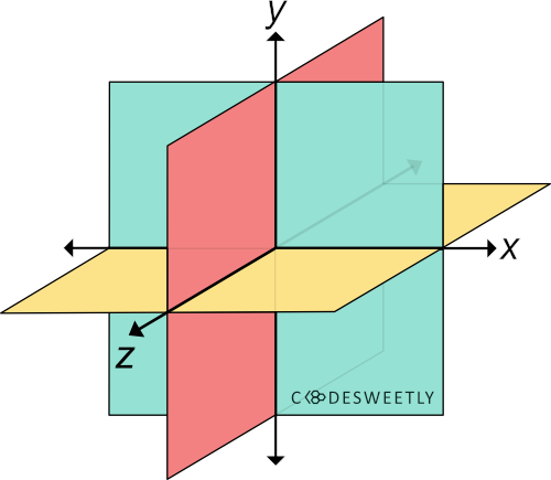
A three-dimensional Cartesian coordinate system showing the X-, Y-, and Z-axis
Syntax of the CSS rotateX() function
rotateX() accepts a single argument. Here is the syntax:
element {
  transform: rotateX(angle);
}
Note the following:
The
rotateX(angle)function is equivalent torotate3d(1, 0, 0, angle).The
angleargument specifies the element's angle of rotation.anglecan be in degree, gradian, radian, or turn.An
angleargument consists of a number followed by the unit you wish to use—for instance,45deg.
Examples of the CSS rotateX() function
Below are some examples of how the CSS rotateX() function works.
How to do a zero-degree rotation around the X-axis:
img {
  transform: rotateX(0deg);
  width: 80%;
}
The snippet above used the rotateX() function to specify a zero-degree (0⁰) rotation for the image around the X-axis.
How to do a 70-degree rotation around the X-axis:
img {
  transform: rotateX(70deg);
  width: 80%;
}
The snippet above used the rotateX() function to specify a seventy-degree (70⁰) rotation for the image around the X-axis.
What is the CSS rotateY() Function?
rotateY() transforms an element by rotating it three-dimensionally around the Y-axis.
Syntax of the CSS rotateY() function
rotateY() accepts a single argument. Here is the syntax:
element {
  transform: rotateY(angle);
}
Note the following:
The
rotateY(angle)function is equivalent torotate3d(0, 1, 0, angle).The
angleargument specifies the element's angle of rotation.anglecan be in degrees, gradians, radians, or turns.An
angleargument consists of a number followed by the unit you wish to use—for instance,45deg.
Examples of the CSS rotateY() function
Below are some examples of how the CSS rotateY() function works.
How to do a zero-degree rotation around the Y-axis:
img {
  transform: rotateY(0deg);
  width: 80%;
}
The snippet above used the rotateY() function to specify a zero-degree (0⁰) rotation for the image around the Y-axis.
How to do a 70-degree rotation around the Y-axis:
img {
  transform: rotateY(70deg);
  width: 80%;
}
The snippet above used the rotateY() function to specify a seventy-degree (70⁰) rotation for the image around the Y-axis.
What is the CSS rotateZ() Function?
rotateZ() transforms an element by rotating it three-dimensionally around the Z-axis.
Syntax of the CSS rotateZ() function
rotateZ() accepts a single argument. Here is the syntax:
element {
  transform: rotateZ(angle);
}
Note the following:
The
rotateZ(angle)function is equivalent torotate3d(0, 0, 1, angle)orrotate(angle).The
angleargument specifies the element's angle of rotation.anglecan be in degrees, gradians, radians, or turns.An
angleargument consists of a number followed by the unit you wish to use—for instance,45deg.
Examples of the CSS rotateZ() function
Below are some examples of how the CSS rotateZ() function works.
How to do a zero-degree rotation around the Z-axis:
img {
  transform: rotateZ(0deg);
  width: 80%;
}
The snippet above used the rotateZ() function to specify a zero-degree (0⁰) rotation for the image around the Z-axis.
How to do a 70-degree rotation around the Z-axis:
img {
  transform: rotateZ(70deg);
  width: 80%;
}
The snippet above used the rotateZ() function to specify a seventy-degree (70⁰) rotation for the image around the Z-axis.
What is the CSS rotate3d() Function?
rotate3d() transforms an element by rotating it three-dimensionally around the x-, y-, and z-axis.
Syntax of the CSS rotate3d() function
rotate3d() accepts four arguments. Here is the syntax:
element {
  transform: rotate3d(x, y, z, angle);
}
Note the following:
The
x,y, andzarguments are numbers specifying the x-, y-, and z-coordinates.The coordinates are the axis around which the element will rotate.
The
angleargument specifies the element's angle of rotation.anglecan be in degrees, gradians, radians, or turns.An
angleargument consists of a number followed by the unit you wish to use—for instance,45deg.
Examples of the CSS rotate3d() function
Below are some examples of how the CSS rotate3d() function works.
How to do a 70-degree rotation around the Z-axis:
img {
  transform: rotate3d(0, 0, 1, 70deg);
  width: 80%;
}
The snippet above used the rotate3d() function to specify a seventy-degree (70⁰) rotation for the image around the Z-axis.
How to do a 70-degree rotation around the X-, Y-, and Z-axis:
img {
  transform: rotate3d(1, 1, 1, 70deg);
  width: 80%;
}
The snippet above used the rotate3d() function to specify a seventy-degree (70⁰) rotation for the image around the x-, y-, and z-axis.
CSS Rotate Functions vs. rotate Property: What's the Difference?
CSS rotate functions and CSS rotate property provides two similar ways to specify rotation transformations.
The main differences between the two rotation techniques are as follows:
The CSS
rotateproperty allows rotating an element without using the CSStransformproperty.The CSS
rotateproperty's syntax is shorter than its function alternative.The CSS
rotateproperty saves you from remembering the specific order to position the transform functions.Browsers calculate the transform functions' matrix in the order you assigned them to the CSS
transformproperty—from left to right.Browsers calculate the transform properties' matrix in the following transformation matrix order:
translaterotatescale
Below are some examples.
How to use CSS rotate property vs. function to do a 45-degree rotation
img {
  rotate: 45deg; /* Equivalent to a transform: rotate(45deg) property */
  width: 80%;
}
The snippet above used the rotate property to specify a forty-five-degree (45⁰) rotation for the image element.
How to use CSS rotate property vs. function to do a 70-degree rotation around the X-axis
img {
  rotate: x 70deg; /* Equal to a transform: rotateX(70deg) property */
  width: 80%;
}
The snippet above used the rotate property to specify a seventy-degree (70⁰) rotation for the image around the X-axis.
How to use CSS rotate property vs. function to do a 70-degree rotation around the Y-axis
img {
  rotate: y 70deg; /* Equal to a transform: rotateY(70deg) property */
  width: 80%;
}
The snippet above used the rotate property to specify a seventy-degree (70⁰) rotation for the image around the Y-axis.
How to use CSS rotate property vs. function to do a 70-degree rotation around the Z-axis
img {
  rotate: z 70deg; /* Equal to a transform: rotateZ(70deg) property */
  width: 80%;
}
The snippet above used the rotate property to specify a seventy-degree (70⁰) rotation for the image around the Z-axis.
How to use CSS rotate property vs. function to do a 70-degree rotation around the X-, Y-, and Z-axis
img {
  rotate: 1 1 1 70deg; /* Equal to a transform: rotate3d(1, 1, 1, 70deg) property */
  width: 80%;
}
The snippet above used the rotate property to specify a seventy-degree (70⁰) rotation for the image around the x-, y-, and z-axis.
Note: A none value tells browsers not to rotate the selected element.
What is the CSS scale() Function?
scale() transforms an element by resizing (scaling) it two-dimensionally from a fixed point.
Note:
"Transform origin" is the fixed point from which the computer scales an element.
You can define your element's fixed point using the CSS
transform-originproperty. But the default iscenter.
Syntax of the CSS scale() function
scale() accepts two arguments. Here is the syntax:
element {
  transform: scale(x, y);
}
Note the following:
The
xargument can be a number or percentage. It specifies the element's scaling factor along the x-axis.The
yargument can also be a number or percentage. It defines the element's scaling factor along the y-axis.Y-axis' default value is
x. Therefore, if you do not provide ayargument, the browser automatically usesx's value.Suppose
xandyare equal. In that case, browsers will scale your element uniformly and preserve its aspect ratio.
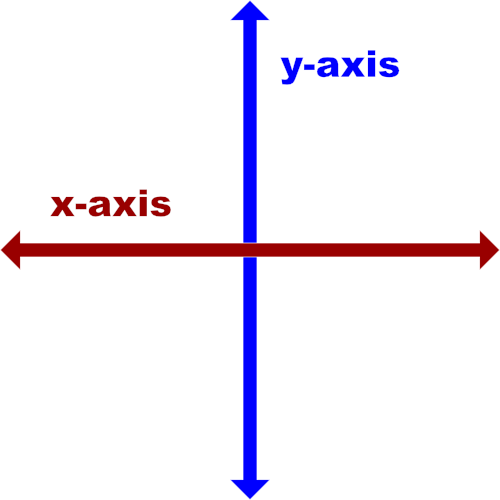
A two-dimensional Cartesian coordinate system showing the X- and Y-axis
Examples of the CSS scale() function
Below are some examples of how the CSS scale() function works.
How to scale an element uniformly along the X- and Y-axis in CSS:
img {
  transform: scale(0.3);
  transform-origin: left;
}
The snippet above used the scale() function to specify a 0.3 scaling factor for the image element along the X- and Y-axis.
Note:
scale(0.3)is equivalent toscale(0.3, 0.3).The percentage equivalence of
scale(0.3)isscale(30%).
How to scale an element non-uniformly along the X- and Y-axis in CSS:
img {
  transform: scale(0.3, 65%);
  transform-origin: top left;
}
The snippet above used the scale() function to specify a 0.3 scaling factor for the image along the X-axis and 65% along the Y-axis.
How to scale an element along only the X-axis:
img {
  transform: scale(0.3, 1);
  transform-origin: top left;
}
The snippet above used the scale() function to specify a 0.3 scaling factor for the image along only the X-axis.
Note:
A scale factor of
1or100%tells browsers not to apply any scaling effect on the selected element.scale(0.3, 1)is equivalent toscaleX(0.3).
How to scale an element along only the Y-axis:
img {
  transform: scale(100%, 0.2);
  transform-origin: top left;
}
The snippet above used the scale() function to specify a 0.2 scaling factor for the image along only the Y-axis.
Note:
A
100%or1scale factor tells browsers not to apply any scaling effect on the selected element.scale(100%, 0.2)is equivalent toscaleY(0.2).
CSS scale() Function vs. scale Property: What's the Difference?
The CSS scale() function and the CSS scale property provide two similar ways to specify a scale transformation.
The main differences between the two scaling techniques are as follows:
The CSS
scaleproperty allows scaling an element without using the CSStransformproperty.The CSS
scaleproperty's syntax is shorter than its function alternative.The CSS
scaleproperty saves you from remembering the specific order to position the transform functions.Browsers calculate the transform functions' matrix in the order you assigned them to the CSS
transformproperty—from left to right.Browsers calculate the transform properties' matrix in the following order:
translaterotatescale
Here's an example:
Use the CSS scale property to scale an element nonuniformly along the X- and Y-axis.
img {
  scale: 0.3 65%; /* Equal to a transform: scale(0.3, 65%) property */
  transform-origin: top left;
}
The snippet above used the scale property to specify a 0.3 scaling factor for the image along the X-axis and 65% along the Y-axis.
Note: A none value tells browsers not to scale the selected element.
What is the CSS scaleZ() Function?
scaleZ() transforms an element by resizing (scaling) it three-dimensionally from a fixed point along the z-axis.
Note:
"Transform origin" is the fixed point from which the computer scales an element.
You can define your element's fixed point using the CSS
transform-originproperty. But the default iscenter.
Syntax of the CSS scaleZ() function
scaleZ() accepts a single argument. Here is the syntax:
element {
  transform: scaleZ(number);
}
Note:
The
scaleZ(number)function is equivalent toscale3d(1, 1, number).The
numberargument specifies the element's scaling factor along the z-axis.
Examples of the CSS scaleZ() function
We often use scaleZ() with other CSS functions such as perspective(), translateZ(), and rotateX(). Below are some examples.
How to use scaleZ() with CSS perspective() and rotateX() functions:
img {
  transform: perspective(370px) scaleZ(5) rotateX(17deg);
  width: 80%;
}
Here's what we did in the snippet above:
We used the
perspective()function to define a370pxdistance between the user and the z=0 plane.The
scaleZ()function specifies a scale factor of5for the image along the z-axis.We used the
rotateX()function to rotate the image seventeen-degree (17⁰) around the x-axis.
Note:
List
perspective()first whenever you chain it with other CSS transform functions. Otherwise, browsers might transform the selected element incorrectly.List the
scaleZ()function beforerotateX(). Otherwise, the browser will not scale the element.
How to use scaleZ() with CSS perspective() and translateZ() functions:
img {
  width: 40%;
}

.second-image {
  transform: perspective(370px) scaleZ(5) translateZ(30px);
}
Here's what we did in the snippet above:
We used the
perspective()function to define a370pxdistance between the user and the z=0 plane.The
scaleZ()function specifies a scale factor of5for the image along the z-axis.We used the
translateZ()function to reposition thesecond-imagethirty pixels (30px) away from its original position along the z-axis.
What is the CSS scale3d() Function?
scale3d() transforms an element by resizing (scaling) it three-dimensionally from a fixed point along the x-, y-, and z-axis.
Note:
"Transform origin" is the fixed point from which the computer scales an element.
You can define your element's fixed point using the CSS
transform-originproperty. But the default iscenter.
Syntax of the CSS scale3d() function
scale3d() accepts three arguments. Here is the syntax:
element {
  transform: scale3d(x, y, z);
}
The x, y, and z arguments are numbers specifying the x-, y-, and z-coordinates. The coordinates are the axis along which browsers will scale the element.
Examples of the CSS scale3d() function
Below are some examples of how the CSS scale3d() function works.
How to use scale3d() with CSS perspective() and rotateX() functions:
img {
  transform: perspective(370px) scale3d(1, 1, 5) rotateX(17deg);
  width: 80%;
}
Here's what we did in the snippet above:
We used the
perspective()function to define a370pxdistance between the user and the z=0 plane.The
scale3d()function specifies a scale factor of1,1, and5for the image along the x-, y-, and z-axis.We used the
rotateX()function to rotate the image seventeen-degrees (17⁰) around the x-axis.
Note:
A scale factor of
1will apply no scaling effect on the element.List
perspective()first whenever you chain it with other CSS transform functions. Otherwise, browsers might transform the selected element incorrectly.List the
scale3d()function beforerotateX(). Otherwise, the browser will not scale the element.
How to scale elements three-dimensionally:
img {
  width: 40%;
}

.second-image {
  transform: scale3d(5, 3, 0.05);
  transform-origin: top left;
}
We used the scale3d() function to specify a scale factor of 5, 3, and 0.05 for the image along the x-, y-, and z-axis.
What is the CSS skew() Function?
skew() transforms an element by slanting (skewing) it two-dimensionally around a fixed point.
Note:
"Transform origin" is the fixed point from which the computer skews an element.
You can define your element's fixed point using the CSS
transform-originproperty. But the default iscenter.
Syntax of the CSS skew() function
skew() accepts two arguments. Here is the syntax:
element {
  transform: skew(aX, aY);
}
Note the following:
The
aXargument specifies the element's skewing angle along the x-axis.The
aYargument specifies the element's skewing angle along the y-axis.aXandaYcan be in degrees, gradians, radians, or turns.An
angleargument consists of a number followed by the unit you wish to use—for instance,45deg.aYis an optional argument.
Examples of the CSS skew() function
Below are some examples of how the CSS skew() function works.
How to skew an element along only the X-axis:
img {
  transform: skew(30deg);
  transform-origin: top;
  width: 80%;
}
The snippet above used the skew() function to apply a thirty-degree (30⁰) slant on the image along only the x-axis.
Note: skew(30deg) is equivalent to skewX(30deg).
How to skew an element along only the Y-axis:
img {
  transform: skew(0, 40deg);
  transform-origin: top left;
  width: 80%;
}
The snippet above used the skew() function to apply a forty-degree (40⁰) slant on the image along only the y-axis.
Note:
A zero (
0) skew degree tells browsers not to apply any skewing effect on the selected element.skew(0, 40deg)is equivalent toskewY(40deg).
How to skew an element along the X- and Y-axis:
img {
  transform: skew(30deg, 40deg);
  transform-origin: top left;
  width: 80%;
}
The snippet above used the skew() function to apply a thirty-degree (30⁰) slant on the image along the x-axis. And forty-degree (40⁰) along the y-axis.
What is the CSS translate() Function?
translate() transforms an element by repositioning (translating) it two-dimensionally.
Syntax of the CSS translate() function
translate() accepts two arguments. Here is the syntax:
element {
  transform: translate(x, y);
}
Note the following:
The
xargument can be a length or percentage value. It specifies the distance you wish to move the element from its original x-axis position.The
yargument can be a length or percentage value. It defines the distance you wish to move the element from its original y-axis position.yis an optional argument.
Examples of the CSS translate() function
Below are some examples of how the CSS translate() function works.
How to translate an element along only the X-axis:
img {
  transform: translate(150px);
  width: 80%;
}
The snippet above used the translate() function to reposition the image 150px away from its original position along the x-axis.
You can also write it like this, specifying the X:
img {
  transform: translateX(150px);
  width: 80%
Note: translate(150px) is equivalent to translateX(150px).
How to translate an element along only the Y-axis:
img {
  transform: translate(0, 55%);
  width: 80%;
}
The snippet above used the translate() function to reposition the image 55% away from its original position along the y-axis.
Note:
A zero (
0) translate distance tells browsers not to apply any translating effect on the selected element.translate(0, 55%)is equivalent totranslateY(55%).
How to translate an element along the X- and Y-axis:
img {
  transform: translate(60%, 300px);
  width: 80%;
}
The snippet above used the translate() function to reposition the image 60% away from its original position along the x-axis and 300px from its y-axis.
What is the CSS translateZ() Function?
translateZ() transforms an element by repositioning (translating) it three-dimensionally along the z-axis.

A three-dimensional Cartesian coordinate system showing the X-, Y-, and Z-axis
Syntax of the CSS translateZ() function
translateZ() accepts a single argument. Here is the syntax:
element {
  transform: translateZ(length);
}
The length argument specifies the distance you wish to move the element from its original z-axis position.
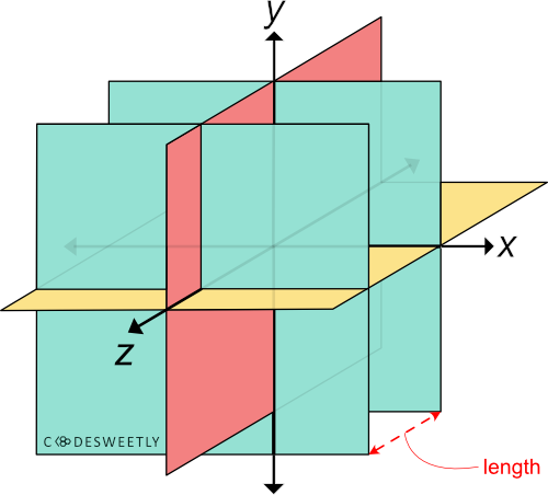
A three-dimensional Cartesian coordinate system with a red arrow defining the green plane's translateZ length
Examples of the CSS translateZ() function
We often use translateZ() with the perspective() function. Below are some examples.
How to use translateZ() with the CSS perspective() function:
img {
  width: 40%;
}

.second-image {
  transform: perspective(33px) translateZ(10px);
}
Here's what we did in the snippet above:
We used the
perspective()function to define a33pxdistance between the user and the z=0 plane.We used the
translateZ()function to reposition thesecond-imageten pixels (10px) away from its original position along the z-axis.
Note:
Suppose the
second-image's z-axis position is larger than or equal to theperspective()function's argument. In that case, the image will disappear as though it is behind the user. In other words, the selected item disappears when the user is in the same position as the element (or when the element is behind the user).The larger the user's distance to the element's z-axis position, the less intensive the perspective effect will be, and vice-versa.
How to use translateZ() with a 70px perspective:
img {
  width: 40%;
}

.second-image {
  transform: perspective(70px) translateZ(10px);
}
Here's what we did in the snippet above:
We used the
perspective()function to define a70pxdistance between the user and the z=0 plane.We used the
translateZ()function to reposition thesecond-imageten pixels (10px) away from its original position along the z-axis.
What is the CSS translate3d() Function?
translate3d() transforms an element by repositioning (translating) it three-dimensionally along the x-, y-, and z-axis.
Syntax of the CSS translate3d() function
translate3d() accepts three arguments. Here is the syntax:
element {
  transform: translate3d(x, y, z);
}
Note the following:
The
xargument can be a length or percentage value. It specifies the distance you wish to move the element from its original x-axis position.The
yargument can be a length or percentage value. It defines the distance you wish to move the element from its original y-axis position.zcan only be a length—not a percentage. It defines the distance you wish to move the element from its original z-axis position.
Examples of the CSS translate3d() function
Below are some examples of how the CSS translate3d() function works.
How to translate an element along only the X-axis
img {
  transform: translate3d(150px, 0, 0);
  width: 80%;
}
The snippet above used the translate3d() function to reposition the image 150px away from its original position along the x-axis.
Note: translate3d(150px, 0, 0) is equivalent to translateX(150px).
How to translate elements three-dimensionally:
img {
  width: 40%;
}

.second-image {
  transform: perspective(300px) translate3d(15%, 45%, 200px);
}
The snippet above used the translate3d() function to reposition the image 15% away from its original position along the x-axis, 45% from its y-axis, and 200px from its z-axis.
CSS Translate Functions vs. translate Property: What's the Difference?
The CSS translate functions and the CSS translate property provide two similar ways to specify a translation transformation.
The main differences between the two translation techniques are as follows:
The CSS
translateproperty allows translating an element without using the CSStransformproperty.The CSS
translateproperty's syntax is shorter than its function alternative.The CSS
translateproperty saves you from remembering the specific order to position the transform functions.Browsers calculate the transform functions' matrix in the order you assigned them to the CSS
transformproperty—from left to right.Browsers calculate the transform properties' matrix in the following order:
translaterotatescale
Below are some examples.
How to use CSS translate property vs. function to translate an element along the X- and Y-axis
img {
  translate: 60% 300px; /* Equal to a transform: translate(60%, 300px) property */
  width: 80%;
}
The snippet above used the translate property to reposition the image 60% away from its original position along the x-axis. And 300px from its y-axis.
Note: Suppose you wish to translate an element along the z-axis. In that case, set a perspective property on the "parent element" of the element you want to translate. Otherwise, the element will not move along its z-axis.
How to use CSS translate property vs. function to translate an element along the Z-axis
img {
  width: 40%;
}

div {
  perspective: 35px;
}

.second-image {
  translate: 0px 0px 17px; /* Equal to a transform: translateZ(17px) property */
}
Here's what we did in the snippet above:
We used the
perspectiveproperty to define a35pxdistance between the user and the z=0 plane.We used the
translateproperty to reposition thesecond-imageseventeen pixels (17px) away from its original position along the z-axis.
How to use CSS translate property vs. function to translate an element three-dimensionally
img {
  width: 40%;
}

div {
  perspective: 300px;
}

.second-image {
  translate: 50% 25% 200px; /* Equal to a transform: translate3d(50%, 25%, 200px) property */
}
The snippet above used the translate property to reposition the image 50% away from its original position along the x-axis, 25% from its y-axis, and 200px from its z-axis.
Note: A none value tells browsers not to translate the selected element.
What is the CSS perspective() Function?
perspective() transforms an element by adding some perspective effects to it.
Syntax of the CSS perspective() function
perspective() accepts only one argument. Here is the syntax:
element {
  transform: perspective(length);
}
The length argument specifies the user's distance to the z=0 plane.
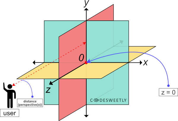
A three dimensional Cartesian coordinate system with a red arrow defining the distance between the user and the z=0 plane
Examples of the CSS perspective() function
We often use perspective() with other CSS functions such as translateZ(), rotateX(), and rotateY(). Below are some examples.
How to use perspective() with the CSS translateZ() function:
img {
  width: 40%;
}

.second-image {
  transform: perspective(33px) translateZ(10px);
}
Here's what we did in the snippet above:
We used the
perspective()function to define a33pxdistance between the user and the z=0 plane.We used the
translateZ()function to reposition thesecond-imageten pixels (10px) away from its original position along the z-axis.
Note the following:
Suppose the
second-image's z-axis position is larger than or equal to theperspective()function's argument. In that case, the image will disappear as though it is behind the user. In other words, the selected item disappears when the user is in the same position as the element (or when the element is behind the user).The larger the user's distance to the element's z-axis position, the less intensive the perspective effect will be, and vice-versa.
How to use perspective() with the CSS rotateY() function:
img {
  width: 40%;
}

.second-image {
  transform: perspective(33px) rotateY(-10deg);
}
Here's what we did in the snippet above:
We used the
perspective()function to define a33pxdistance between the user and the z=0 plane.We used the
rotateY()function to rotate thesecond-imagenegative ten-degree (-10⁰) around the y-axis.
How to use perspective() with the CSS rotateX() function:
img {
  width: 40%;
}

.second-image {
  transform: perspective(33px) rotateX(17deg);
}
Here's what we did in the snippet above:
We used the
perspective()function to define a33pxdistance between the user and the z=0 plane.We used the
rotateX()function to rotate thesecond-imageseventeen-degree (17⁰) around the x-axis.
CSS perspective() Function vs. perspective Property: What's the Difference?
The CSS perspective() function and the perspective property provide two similar ways to add perspective effects to HTML elements.
The main differences between the two perspective techniques are as follows:
We apply the
perspective()function "directly on the element" we want to add some perspective effects to.We apply the
perspectiveproperty "on the parent element" of the element we want to add some perspective effects to.The
perspective()function works as atransformproperty's value.The CSS
perspectiveproperty allows you to create perspective effects without using the CSStransformproperty.
Here's an example:
Use CSS perspective property to add perspective effect to a child element:
img {
  width: 40%;
}

div {
  perspective: 33px;
}

.second-image {
  rotate: x 17deg;
}
Here's what we did in the snippet above:
We used the
perspectiveproperty to define a33pxdistance between the user and the z=0 plane.We used the
rotateproperty to rotate thesecond-imageseventeen-degree (17⁰) around the x-axis.
Note:
The CSS
perspectiveproperty saves you from remembering the specific order to position the transform functions.A
nonevalue tells browsers not to add any perspective effect to the selected element's children.
What is the CSS matrix() Function?
The CSS matrix() function is a shorthand for the following 2D transform functions:
scaleX()skewY()skewX()scaleY()translateX()translateY()
In other words, instead of writing:
img {
  transform-origin: 0 0;
  transform: translateX(100px) translateY(250px) scaleX(2) scaleY(0.9)
    skewX(10deg) skewY(35deg);
  width: 80%;
}
You can alternatively use the matrix() function to shorten your code like so:
img {
  transform-origin: 0 0;
  transform: matrix(2.24693, 0.630187, 0.352654, 0.9, 100, 250);
  width: 80%;
}
The CSS matrix() function's syntax
The matrix() function accepts six values. Here's the syntax:
matrix(scaleX(), skewY(), skewX(), scaleY(), translateX(), translateY())
You can represent the CSS matrix's values as homogeneous coordinates on ℝℙ2 like so:
| scX skX tX | ← x-axis
| skY scY tY | ← y-axis
|  0   0   1 | ← constants
Note the following:
scXandskXare numbers describing an element's scale and skew linear transformation on the x-axis.tXis a number representing an element's translation on the x-axis.skYandscYare numbers describing an element's skew and scale linear transformation on the y-axis.tYis a number representing an element's translation on the y-axis.0,0,1are constants.We do not pass the constants as arguments to the
matrix()function because the computer implies them automatically.
Examples of the CSS matrix() function
Below are some examples of the CSS matrix() function.
How to convert scaleX() to matrix() function:
Consider the following transform property:
img {
  transform-origin: 0 0;
  transform: scaleX(2);
  width: 80%;
}
Here is the matrix() equivalent of the above scaleX() function:
img {
  transform-origin: 0 0;
  transform: matrix(2, 0, 0, 1, 0, 0); /* scX, skY, skX, scY, tX, tY */
  width: 80%;
}
Let's also represent the matrix's values as homogeneous coordinates on ℝℙ2:
| 2 0 0 | ← x-axis
| 0 1 0 | ← y-axis
| 0 0 1 | ← constants
Below is another example.
How to convert translateY() to matrix() function:
img {
  transform-origin: 0 0;
  transform: translateY(250px);
  width: 80%;
}
Here is the matrix() equivalent of the above translateY() function:
img {
  transform-origin: 0 0;
  transform: matrix(1, 0, 0, 1, 0, 250); /* scX, skY, skX, scY, tX, tY */
  width: 80%;
}
Let's also represent the matrix's values as homogeneous coordinates on ℝℙ2:
| 1 0 0   | ← x-axis
| 0 1 250 | ← y-axis
| 0 0 1   | ← constants
Below is a third example.
How to convert translateX() and scale() to matrix() function:
img {
  transform-origin: 0 0;
  transform: translateX(100px) scale(2);
  width: 80%;
}
Here is the syntax for converting the above transform property's value to matrix():
matrix = (translateX's homogeneous coordinates) x (scale's homogeneous coordinates)
Let's begin the conversion by defining translateX(100px)'s homogeneous coordinates:
| 1 0 100 | ← x-axis
| 0 1 0   | ← y-axis
| 0 0 1   | ← constants
Let's also define scale(2)'s homogeneous coordinates:
| 2 0 0 | ← x-axis
| 0 2 0 | ← y-axis
| 0 0 1 | ← constants
It's now time to multiply the two homogeneous coordinates by using the following syntax:
| a d g |   | j m p |   | aj + dk + gl   am + dn + go   ap +dq  + gr |
| b e h | x | k n q | = | bj + ek + hl   bm + en + ho   bp + eq + hr |
| c f i |   | l o r |   | cj + fk + il   cm + fn + io   cp + fq + ir |
Let's implement the above syntax like so:
| 1 0 100 |   | 2 0 0 |   | 2 + 0 + 0   0 + 0 + 0   0 + 0 + 100 |
| 0 1  0  | x | 0 2 0 | = | 0 + 0 + 0   0 + 2 + 0   0 + 0 +  0  |
| 0 0  1  |   | 0 0 1 |   | 0 + 0 + 0   0 + 0 + 0   0 + 0 +  1  |
The next step is to resolve the addition. So, let's do that now.
| 1 0 100 |   | 2 0 0 |   | 2 0 100 |
| 0 1  0  | x | 0 2 0 | = | 0 2  0  |
| 0 0  1  |   | 0 0 1 |   | 0 0  1  |
The addition's result above gives us the homogeneous coordinates of the transform: translateX(100px) scale(2) property.
In other words, the product of (translateX's homogeneous coordinates) and (scale's homogeneous coordinates) equal:
| 2 0 100 | ← x-axis
| 0 2  0  | ← y-axis
| 0 0  1  | ← constants
Therefore, the matrix equivalence of transform: translateX(100px) scale(2) is transform: matrix(2, 0, 0, 2, 100, 0).
img {
  transform-origin: 0 0;
  transform: matrix(2, 0, 0, 2, 100, 0);
  width: 80%;
}
Please note that transform: translateX(100px) scale(2) and transform: scale(2) translateX(100px) return different matrixes. Let's see an example of the second arrangement below.
How to convert scale() and translateX() to matrix() function:
Consider the following transform property:
img {
  transform-origin: 0 0;
  transform: scale(2) translateX(100px);
  width: 80%;
}
Here is the syntax for converting the above transform property's value to matrix():
matrix = (scale's homogeneous coordinates) x (translateX's homogeneous coordinates)
Let's begin the conversion by defining scale(2)'s homogeneous coordinates:
| 2 0 0 | ← x-axis
| 0 2 0 | ← y-axis
| 0 0 1 | ← constants
Let's also define translateX(100px)'s homogeneous coordinates:
| 1 0 100 | ← x-axis
| 0 1  0  | ← y-axis
| 0 0  1  | ← constants
It's now time to multiply the two homogeneous coordinates by using the following syntax:
| a d g |   | j m p |   | aj + dk + gl   am + dn + go   ap +dq  + gr |
| b e h | x | k n q | = | bj + ek + hl   bm + en + ho   bp + eq + hr |
| c f i |   | l o r |   | cj + fk + il   cm + fn + io   cp + fq + ir |
Let's implement the above syntax like so:
| 2 0 0 |   | 1 0 100 |   | 2 + 0 + 0   0 + 0 + 0   200 + 0 + 0 |
| 0 2 0 | x | 0 1  0  | = | 0 + 0 + 0   0 + 2 + 0    0 + 0 + 0  |
| 0 0 1 |   | 0 0  1  |   | 0 + 0 + 0   0 + 0 + 0    0 + 0 + 1  |
The next step is to resolve the addition. So, let's do that now.
| 2 0 0 |   | 1 0 100 |   | 2 0 200 |
| 0 2 0 | x | 0 1  0  | = | 0 2  0  |
| 0 0 1 |   | 0 0  1  |   | 0 0  1  |
The addition's result above gives us the homogeneous coordinates of the transform: scale(2) translateX(100px) property.
In other words, the product of (scale's homogeneous coordinates) and (translateX's homogeneous coordinates) equal:
| 2 0 200 | ← x-axis
| 0 2  0  | ← y-axis
| 0 0  1  | ← constants
Therefore, the matrix equivalence of transform: scale(2) translateX(100px) is transform: matrix(2, 0, 0, 2, 200, 0).
img {
  transform-origin: 0 0;
  transform: matrix(2, 0, 0, 2, 200, 0);
  width: 80%;
}
Notice that transform: scale(2) translateX(100px) equals transform: matrix(2, 0, 0, 2, 200, 0). And transform: translateX(100px) scale(2) is equivalent to transform: matrix(2, 0, 0, 2, 100, 0).
In other words, the order in which you write the transform functions matters. Let's discuss more on this below.
Why Does the CSS Transform Functions' Order Matter?
The order in which you write CSS transform functions matters because of the way browsers calculate the matrix's values.
For instance, consider the following snippet:
div {
  position: absolute;
  width: 100px;
  height: 100px;
  transform-origin: 0 0;
}

.red {
  border: 3px solid red;
  background-color: rgba(255, 0, 0, 0.5);
}

.green {
  border: 3px solid green;
  background-color: rgba(0, 128, 0, 0.5);
  transform: translateX(100px) scale(2);
}

.blue {
  border: 3px solid blue;
  background-color: rgba(0, 0, 255, 0.5);
  transform: scale(2) translateX(100px);
}
The only difference between the green and the blue divs is the order in which we wrote their transform functions.
However, the computer translated the two containers using different values (100px for the green div and 200px for the blue one).
So, why did the transform functions' order affect the divs' translation values? Here's the reason:
- Browsers multiply each transform function's homogeneous coordinates in order—from left to right.
In other words, the computer used the following syntax to compute the green div's matrix:
- Green
div's matrix = (translateX's homogeneous coordinates) x (scale's homogeneous coordinates)
And it used the following syntax to calculate the blue div's matrix:
- Blue
div's matrix = (scale's homogeneous coordinates) x (translateX's homogeneous coordinates)
Therefore, the position of the transform functions determined the matrix's arguments because browsers began the calculation in order from the leftmost function to the right.
Knowing how to convert transform functions to matrix() is beneficial. And having some conversion tools can come in handy. So, let's discuss some helpful tools you can use.
Tools for Converting Transform Functions to matrix()
The two tools you can use to do a quick conversion of transform functions to matrix() are:
JavaScript's
window.getComputedStyle()methodEric Meyer and Aaron Gustafson's matrix resolution tool
How to use window.getComputedStyle() to convert transform functions to matrix()
Suppose you want to convert the following transform functions to matrix:
img {
  transform-origin: 0 0;
  transform: scale(2) translateX(100px);
  width: 80%;
}
You will add an id attribute to the image element:
<img
  src="https://cdn.pixabay.com/photo/2022/09/26/23/26/african-american-7481724_960_720.jpg"
  alt=""
  id="image"
/>
Then, in JavaScript, you will:
Use the
idattribute to get the image element.Use the
window.getComputedStyle()method to get the image'stransformproperty's value.
Here's the code:
// Get the image element by its id name:
const image = document.getElementById("image");

// Get the image element's transform property's value:
const matrix = window.getComputedStyle(image).getPropertyValue("transform");

// Log the matrix variable's value to the console:
console.log(matrix);
Browsers, by default, convert a CSS transform property's value to its matrix equivalent. So, the snippet above returned the image's computed value.
Let's now discuss the second conversion tool.
How to use the matrix resolutions tool to convert transform functions to matrix()
Suppose you want to convert the following transform functions to a matrix():
img {
  transform-origin: 0 0;
  transform: scale(2) translateX(100px);
  width: 80%;
}
You will do the following:
Go to The Matrix Resolutions website: https://meyerweb.com/eric/tools/matrix/.
Paste your transform functions (
scale(2) translateX(100px)) into the first text field.Click "The Red Pill" button to generate the transform functions' matrix equivalence.

Click the red pill button to convert CSS transform functions to a matrix() function
Tip: Use matrix3d() to create a 3D transformation matrix.
Important Stuff to Know about Transforming Elements in CSS
Here are three essential facts to remember when you transform elements in CSS.
1. Transform creates a stacking context
Suppose you set the transform property to any value other than none. In that case, the browser will create a stacking context. And the transformed element will serve as a containing block to any absolute or fixed positioned elements it contains.
2. Scaling and zooming animations cause accessibility issues
Whenever you include scaling or zooming animations in your app, provide users an option to turn off animations. This option is necessary because scaling and zooming animations cause accessibility issues.
3. Not all elements are transformable
You cannot transform the following box models:
Non-replaced inline elements
table-column boxes
Wrapping Up
In this article, we discussed all the CSS transform tools you need to translate, rotate, skew, scale, or add perspective effects to HTML elements.
I hope you've found this article helpful.
Thanks for reading!
If you like this tutorial, you will enjoy my CSS Flexbox book. It is a handy quick reference guide that uses images and live examples to explain Flexbox.