By Elliot Dahl
Web typography is confusing. Do you know the best practices?
When I started looking around at popular websites to figure out the best practices for web typography, I must admit I was baffled. Below are some examples of typography scales I pulled from a few popular websites and design systems. Can you find the unifying pattern?
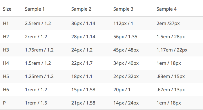
Clearly there are different approaches to type systems. The reality is that as a web community we don’t all agree. However, like most design problems, it really starts by addressing the user’s needs.
The three archetypes of typography systems
Here are three general typography system archetypes. Most companies will utilize all three of these at some point but it’s important to recognize the underlying user needs being addressed by each orientation.
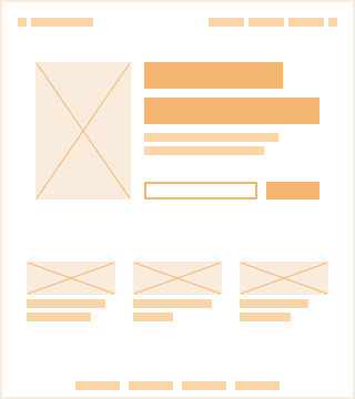
Marketing site
- Purpose: Built to tell a specific story and inspire visitors to spend their time and/or money on the site.
- Requirements: Each typeface will need its own set of styles and the variety of sizes will be based on art direction more than element fitting.
- Responsive use case: The system will need to flex through multiple sizes from mobile up to desktop.
Web experiences geared to pitch you something end up in this category. The ambitious ones break all the rules of typography to create compelling and captivating experiences.
While a lot of thought goes into these sites, the focus is on making a splash rather than an extensible system that can be built upon in the future. These sites generally have a short shelf life and are discarded entirely for a top-to-bottom redesign.
An advanced example of this is the interpolation function used by Leigh Taylor and Nick Jones on Invision’s landing page.
The <h1> has a font-size: calc(32px + ((24 * (100vw — 800px))/799));. The typography on the page is meticulously calculated to work at every screen size.
“Using math to do dynamic art direction” — Leigh Taylor
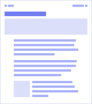
Blog/Info site
- Purpose: To convey a large amount of text-based information.
- Requirements: The main reading area may utilize a ratio based line-height system, just like this Medium article does.
- Responsive use case: Will likely be responsive but maintaining focus on readability.
This Medium article is an example of a web experience built for long-form reading.
The focus is not about interpreting little visualizations or filling out forms. The size ratios they’ve chosen are specifically built for readability constrained to get the desired line-length. I can comfortably read each line because the typography has been carefully crafted to fit my needs as a reader.
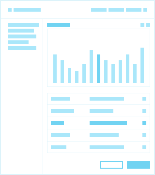
Product
- Purpose: Built to solve a user problem like filing taxes, managing a git repo, or visualizing performance metrics.
- Requirements: Text must fit nicely into the element hierarchy. Text is mostly utilized for labels, instructions, and displayed data.
- Responsive use case: Minimally responsive. Highly developed products will be utilizing adaptive design meaning different experiences for mobile and desktop. The focus is on the hierarchy of elements that support the user experience.
Google’s Material Design is a popular design language that is applicable to many product use cases.
Material’s spacing method is based on an 8pt component grid system and a 4pt baseline grid for typography. They try to scale line-heights with increments of 4. Scaling by increments of 8 with your baseline grid can be difficult because the available line-heights are too far apart for some text sizes.
Allowing some of the font-sizes to be accompanied with a more appropriate line-height is a great path forward. You can always bump the spacing above or below a given line by 4px to make it align with the greater atomic grid.
When applied, the baseline grid system has the ability to align the element spatial system (8pt grid) with the typography system to create a compelling vertical rhythm in the design.
Implementation of web typography — in reality
It is possible to have an opinionated and structured UI adhering to an 8pt grid that also has a long-form reading area.
Allow the fixed baseline grid system to handle the text inside of your structured components and use a modular scale to create an optimal reading experience for the blog or docs you’ve added onto your site.
Most digital product companies do this already between their marketing landing page, the digital product, and their documentation. Making the decision to structure these typographic realms separately can free you from an unsustainable complexity.

The pitfall — Ems, rems, and pixels oh my!
To express a clear and consistent system, typography measurements need to be easily interpreted by the product team building it.
Relative units like rems and ems are sometimes misunderstood and, in my experience, this leads to an unsustainable typography system. For example, the ratio between 14px font-size and a 20px line-height shouldn’t be captured in relative units because that ratio should change as the font-size increases.
Defining a line-height of 1.4285714286em is ridiculous, because most folks can’t do that kind of math in their head. If the font-size increases to 16px the browser will render a line-height of 22.857142px and that kind of pixel splitting is a headache waiting to happen. This creates confusion and is a misuse of relative units. See a complete list of absolute vs relative units here.
Why are so many design systems based on relative sizing today? The answer is “accessibility”.
However, browsers don’t scale the base font-size when you zoom in with command +. There are accessibility tools that will scale base font-sizes for users who need it. I recommend properly testing it to make sure it’s the experience you want users to have. Check-the-box accessibility can hurt more than it helps.
Utilizing rems and ems in your site/app is amazingly powerful. There are many very interesting use cases and they should be an important part of your toolkit.
My suggestion is to use them sparingly until you have a solid use for them. Baking them into the core of your typography system can open you up to confusion and unexpected user experiences.
8pt Grid Typography
The most powerful part of the 8pt grid concept is its ability to drive consistency throughout your designs. You will need to assess the needs of your users and the best way to scale your typography to meet those needs.
I highly encourage design and engineering to collaborate on finalizing these standards for a company/product.
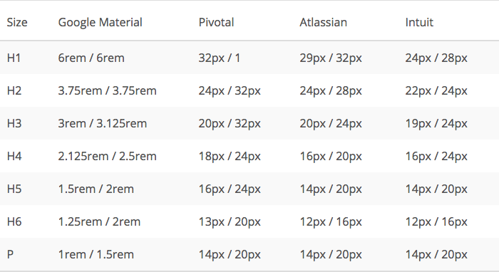
Here are samples from a few familiar names: Google Material, Pivotal, Atlassian, Intuit.
References and Related Reading
- Priyanka Godbole: A framework for creating a predictable & harmonious spacing system for faster design-dev handoff
- Richard Rutter: The Elements of Typographic Style Applied to the Web
- Ian Yates: How to Establish a Modular Typographic Scale
- Nathan Curtis: Space in Design Systems
- Vincent De Oliveira: Deep dive CSS: font metrics, line-height and vertical-align
- Kezz Bracey: Why You Should Be Using Rem-Based Layouts
Previous 8-Point Grid Articles:
Questions:
This is something I am still exploring. Do you have a good example to share? Do you have a different approach to an 8pt typography system?
If you’ve got thoughts, please leave a comment or reach out on Twitter.
