
By Maciej Nowakowski
“That’s interesting…” I thought when I first read about styled-components. And then I went right back to my tried-and-tested React components.
But then Max Stoiber, the co-creator of styled-components, showed us his new library at the React in Flip Flops coding bootcamp. “That’s interesting” turned into “That’s mind-blowing!”
I could hardly contain my excitement. I finally understood the concept behind styled-components. It opened so many new possibilities for how to style components. It simplified the way to structure web applications. And it enforced the consistency into the styling of React apps.
It all started with tagged template literals
You might think I’m a bit old school but I believe that if you want to truly understand any idea, you need to wrap your head around the underlying concepts. We could dive straight into styled components. But first, let’s find out what sparked Max and Glen’s curiosity before they started the project and actually built styled-components.
ES6’s template literals simplify the way how you can mix variables and text. If you take two variables: name and mood, with assigned values of “Alice” and “happy” respectively, the template literal:
const sentence = `${name} is ${mood}.`;
will produce a sentence: “Alice is happy.”
Tagged template literals take the syntax a step further.
Tags are JavaScript functions. But there are two essential differences in comparison to regular functions:
- tag functions are called using backticks notation instead of parentheses. In the example below, we are calling the
greetingTagfunction by wrapping the arguments in backticks:
greetingTag`${name} is ${mood}.`;
- JavaScript treats the template literal — everything between backticks — as function arguments. In the first step, JavaScript transforms the template literal into an array of strings. The strings are followed by extracted variables. If we take the example above, the transformed arguments passed to the
greetingTagfunction will look as follows:
["", " is ", "."], name, mood
The first argument, an array, contains all strings that we placed before, between and after the name and the mood variables. In our example, the first string is empty because there is nothing before the name. The next two arguments, name and mood, were extracted from the template literal as variables.
Now, the greetingTag function can apply any logic to the texts’ array and the name and mood variables and return the desired outcome.
Let’s create a tag function, the greetingTag, that will take three arguments: a texts array, a name, and a mood variables. And here is the logic it will use: if the value of mood is "happy”, it will return a regular greeting sentence. In all other cases, it will return the cheer-up version of the greeting:
const greetingTag = (texts, name, mood) => { if (mood === 'happy') { return `Hi ${name}!`; } else { return `Hi ${name}, you are awesome!`; } } const greeting = greetingTag`${name} is ${mood}.`;
Now, if we assigned “Alice” to the name and “happy” to the mood, the greetingTag function would return: “Hi Alice!”. If we changed the value of the mood to any other word than “happy” - say “excited” or “cat” —the greetingTag would return: “Hi Alice, you are awesome!”.
But how can you use this knowledge to style React components?
Styled components
This exact question puzzled Max and Glenn while they were looking for a better and more consistent way of styling React components. The Aha! moment came when they realized that tagged template literals accept not only variables but also functions. Like in the example below:
const greeting = greetingTag`${ name => `Hi ${name}!` }`;
Here, the greetingTag receives a template literal with a function. Once the function is executed by the greetingTag, the greetingTag can apply further logic to the returned value and return an outcome.
Styled components are also tag functions. But instead of accepting greeting patterns, they accept template literals that contain CSS styles. And instead of greeting sentences, they return React components.
Let me show you how it works.
Side note: The code examples below are interactive. You can play around with them, add styles and change assigned values. You can inspect different files by clicking on their tabs. Or press the orange, blue-orange or blue button at the top to switch between different views.
If you want to use styled components in your application, you have to install styled-components first:
npm install --save styled-components
Below, I created a styled component Title:
The styled.h1 is a tag function. It returns a React component that is identical to the one below:
import React from 'react'; const Title = ({children}) => <h1>{children}</h1>
The beauty of this solution is that styled-components do the heavy lifting for you — your component Title will have the color of royalblue.
I know what you’re thinking: if we had to write styles of every single component in this way, that wouldn’t be much different from writing CSS classes. Thankfully, styled components are much smarter!
Imagine that you would like to keep your headers black most of the time and only sporadically highlight them using a different color. With styled components, we can create a color-aware Title that will be black by default and change to royalblue whenever we pass it a primary prop:
You can pass props to the Title like to any other React component. Here, the second Title receives the primary prop. We can access the props inside a styled component declaration. That opens a whole new world of possibilities.
Above, I defined the styled component Title. Because the props are accessible inside the styled component declaration, we can decide which color our component will be. The function uses the ternary operator and returns royalblue when the primary property is true and black otherwise.
You don’t have to write it explicitly as in:
<Title primary={true}>Hi Bob, you are awesome!</Title>
Passing the primary prop without an assignment is like passingprimary={true}.
Since the door is now wide open, let’s make our Title more universal. Sometimes you may need your Title to use smaller fonts and sometimes bigger. Sometimes you may want it to have a normal weight and sometimes you may want it to stand out and give it a bold font weight. And sometimes you may want to capitalize or uppercase the Title.
Styled components allow you to create a single universal component. Then you can use it everywhere without thinking about styles anymore:
In the example above, the font-size is assigned explicit values: 48px or 32px. Such code is hard to maintain when the codebase grows.
Themes
When you create a set of styled components for later use, you want to enforce consistent styling across the application. It’s always worthwhile to set the styling rules. Preferably, in a separate file. Later, when you have to change the styles, instead of re-visiting all your components, you can alter styling in just one place.
Styled components give you a tool to do exactly that — themes.
A theme is a JavaScript object where you can define styling parameters:
const theme = { colors: { primary: "royalblue", secondary: "teal", text: "black" }, fontSize: { xl: "2.4rem", lg: "1.8rem", md: "1.3rem", nm: "1rem", sm: "0.75rem" } }
The theme above defines colors and fontSize properties. You will be able to access them in all styled components across the application.
But first, you need to make the application aware of the theme. You have to pass it as a prop to the ThemeProvider — a wrapper component provided by styled components:
import { ThemeProvider } from "styled-components"; import theme from "./theme.js";
const App = () => ( <ThemeProvider theme={theme}> <div> <Title>Hi, Alice!</Title> </div> </ThemeProvider> )
Let’s take the previous example to learn how to use a theme and how to access its properties inside styled components.
In the Title, you can access the theme object via the props.theme. For example, to select the Title's color, you check first if a given attribute has been passed to the Title (primary or secondary). Then return the corresponding color value declared in the theme. If none has been passed, you return a standard text color.
The Title can now decide also about its font sizes. It checks first if an xl, lg, md or sm prop has been passed and — based on that — assigns appropriate value to the font-size property. If no prop has been passed, it will assign the value of fontSize.nm defined in the theme.
We have just created a flexible Title component. Now, you can use it without having to worry about CSS. You can decide on its look exclusively by passing a specific set of props.
Extending styled-components
Creating just one Title component is not enough. For example, on a blog page, you will need an h1 tag for a post title and an h2 tag for subtitles. You need also paragraphs to display text.
Styled components are easily extendable. You can create a new Subtitlecomponent with an h2 tag and copying and pasting all the styling rules from the Title. Or you can extend the Title component with the withComponenthelper method. The Subtitle will have all the properties of a Title but will use an h2 tag:
const Subtitle = Title.withComponent("h2");
You can extend the Title to create the Text component with a p tag and — at the same time — fix its color as a theme.text and set the line-height to 1.65? Here, too, styled-components shine:
const Paragraph = Title.withComponent("p");const Text = Paragraph.extend` color: ${props => props.theme.colors.text}; line-height: 1.65;
First, we created an intermediary Paragraph component that will have all the styling rules of the Title. However, we will use the p tag and then the Textcomponent that extends the Paragraph and sets its color and line-heightproperties. Below you can inspect the code for the Title, Subtitle, and Text components:
Styled components allow you to write a regular CSS in JavaScript. Additionally, you can nest the CSS styles and pseudo-classes. You can add media-queries and attributes. Finally using the injectGlobal helper method, you can inject global styling rules and import fonts.
Pseudo-classes
To learn how to use the pseudo-classes, let’s create a Button component that will change the color when we hover the mouse over it.
Above, I nested the &:hover pseudo-class to change the color whenever you hover the mouse over the button. You can use any pseudo-class available in CSS in the same way.
Injecting global styles with styled-components
Instead of importing the global styles file, you can use the injectGlobal helper to add global styles to your application. First, you have to import the injectGlobal helper:
import styled, { ThemeProvider, injectGlobal } from "styled-components";
In the example below, I am using injectGlobal to:
- import fonts and set the
font-familyfor all elements to “Montserrat”. - reset margins, paddings, and borders.
- change the root element
font-sizeusing the media-query for the screen size lower thanscreen.mediumandscreen.mobile.Both are defined in thetheme.
Styled components themes enforce consistency. To learn more, explore one of the best documentations I’ve ever seen: Styled Components Docs.
Thanks to Max and Glen’s curiosity, styled components offer you an amazing set of tools to style React applications. The styled components ecosystem is booming. Visit the Ecosystem page to explore the ready-to-use components and grid systems. Examine the many other tools built with styled components.
Conclusion
In this tutorial, you’ve learned how the tagged template literals work. You’ve also learned how to use styled components to build universal React components. You now understand know how to use a theme to implement the consistent styles of your next application.
Styled components is a new way of styling React applications. Out of the box, styled components:
- let you build reusable and universal components
- enforce the consistency of styling
- allow you to nest styles
- add vendor prefixes when necessary
- are simply awesome!
If you liked this article, ? even 50 times — I would really appreciate it and it makes a huge difference to me.
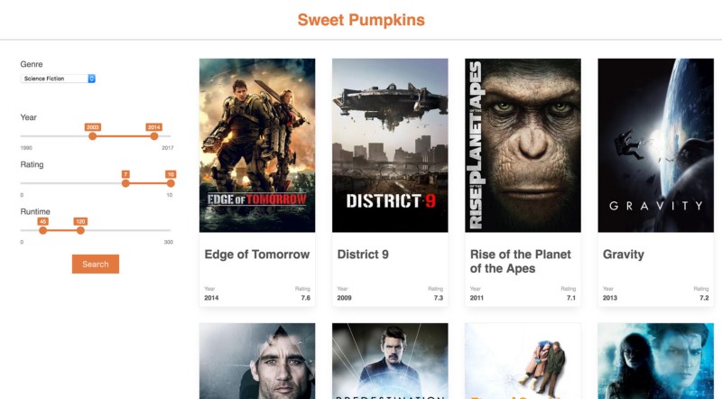
I published recently a free React tutorial for beginners. If you want to learn how to build a web application from scratch it’s a great starting point. You will learn how to build an app to help you find the best movie to watch ? Sweet Pumpkins