
By Dominic Fraser
When researching examples for a first ever Android contribution, few examples existed for animations written in Kotlin. There were also few code examples of accessibility considerations within native animations.
So here we go! Let’s look at writing a native ‘expand’ animation in Kotlin, and talk about how to assist those with TalkBack or enlarged text turned on. All code is available in this example repo, creating a single activity with an animated view within it. The code this is based on was co-written with Calum Turner.
Android accessibility (a11y)
All Android devices come with a built in screen reader named TalkBack. This can be turned on from the device’s settings, and also has a first time use guide built in. Gestures are used to navigate around the page, with descriptions of focused elements read aloud. Without this, an app becomes unusable for many visually impaired users.
Of key importance is that the correct elements are focusable, have descriptions, and changes to the view are announced.
Within the same settings menu the default base font size can be adjusted, scaling from 1.0. Views should react to this change in font size, with all elements still present and functioning.
Layout
We won’t look at the styling specifics of the layout here as they are fairly unique to this example, but the accessibility touches are worth highlighting.
Two properties are used: android:contentDescription and android:importantForAccessibility.
The contentDescription is what is read when an element gains focus. For any ImageView that gains focus this is essential, otherwise a screen reader will instead read the useless ‘unlabelled’ to the user.
If this was a button it would read ‘ button, double tap to activate’ by default, but for our ImageView icon we manually specify the action as we do not have this default.
android:contentDescription="tap to toggle extra person information"
We also use importantForAccessibility:no to turn OFF focus for the ‘+’ TextView, as the text beneath the two badges provides a description and so the ‘+’ is more confusing than helpful if read aloud.
For both of these, manual testing on a real device with TalkBack turned on is the best indication of whether the context makes sense without visuals.
Expand Animation
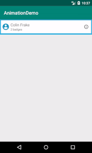
Our animation will activate on an ‘info’ icon tap, toggling the expanding of a details section.
We will do this all inside a single activity to allow focus simply on the animation code. In a real world app, the view this is applied to is more likely to be within its own fragment or recycler view, so a more abstracted code structure would be used.
Setting a listener
Within our example activity’s onCreate we must first set a listener on our icon and pass in the view that is to be toggled.
infoIcon.setOnClickListener { toggleCardBody(root.personEntryBody) }
We also set up a variable within the class to track if the view is toggled, setting it to initially be closed.
private var isToggled = false
Toggle expand animation
Within our layout, we have set the height of personEntryBody to 0dp.
To toggle this open we need to know the new height to set it to, how long the animation should be, and what height it should be at each moment of the animation.
We then need to set isToggled to its inverse, and ensure that when tapped again it does the reverse.
private fun toggleCardBody(body: View) {
    body.measure(ViewGroup.LayoutParams.MATCH_PARENT, ViewGroup.LayoutParams.WRAP_CONTENT)
    val maxHeight = body.measuredHeight + body.paddingTop + body.paddingBottom
    val startHeight = if (isToggled) maxHeight else 0
    val targetHeight = if (isToggled) 0 else maxHeight

    val expandAnimator = ValueAnimator
        .ofInt(startHeight, targetHeight)
        .setDuration(200)

    expandAnimator.addUpdateListener {
        val value = it.animatedValue as Int
        body.layoutParams.height = value
        body.requestLayout()
    }

    expandAnimator.doOnEnd {
        isToggled = !isToggled
    }

    expandAnimator.start()
}
As the height when the view is initially drawn is 0, we must calculate its new size by remeasuring its layout.
As described in the Android view layout docs, we can use measure() along with the layout params we assigned to the view to remeasure each time the info icon is tapped.
To calculate the max height we must manually add the top and bottom padding to this, as these are not included in the measured height.
Depending on isToggled we then know if we are starting from 0 or starting from the expanded max height, and so the opposing target height.
We use a Value Animator to move from the starting value to the target end value, and set the duration in ms. This duration is based purely on later manual testing for UX feel.
ValueAnimator
        .ofInt(startHeight, targetHeight)
        .setDuration(200)
We tie the duration to the height with an update listener, requesting a new layout to be drawn after each update and adjusting the height each time.
    expandAnimator.addUpdateListener {
        val value = it.animatedValue as Int
        body.layoutParams.height = value
        body.requestLayout()
    }

    expandAnimator.doOnEnd {
        isToggled = !isToggled
    }

    expandAnimator.start()
As we are using Kotlin, we also add the [androidx](https://developer.android.com/kotlin/ktx#core-packages) library to our build.gradle to benefit from its doOnEnd extension. This allows us to very easily inverse the isToggled variable.
Finally we start our animation! Already we have a body that expands and contracts on an icon touch!
Smoother animations
While our animation technically works as is, a nice extra step is to add an interpolator so that the movement feels more natural.
expandAnimator.interpolator = FastOutSlowInInterpolator()
Increasing our accessibility
We’ll add two final things to hopefully help our a11y users.
First we can help with navigation using an [AccessibilityEvent](https://developer.android.com/reference/android/view/accessibility/AccessibilityEvent) .
expandAnimator.doOnEnd {
    if (!isToggled)       body.sendAccessibilityEvent(AccessibilityEvent.TYPE_VIEW_FOCUSED)
    isToggled = !isToggled
}
This means that when the animation moves from closed to open, the focus will immediately jump to the focus on the first item in the body, in this case the description. In the layout, we set the description of the info icon action, but as we may not be able to rely on a visual indicator for the user to move to the next item we can handle this for them.
Second we allow for different font sizes. The measured height returned from measure() does not account for font scaling set in the devices accessibility settings, and so when at a large scale the bottom of the description will be cropped as it is too large to fit.
We can access the font scale programmatically, and scale our height based on this. We convert it to an integer as the font scale may result in a float which would not work as a layout height.
val a11yFontScale = body.context.resources.configuration.fontScale
val maxHeight = ((body.measuredHeight + body.paddingTop + body.paddingBottom) * a11yFontScale).toInt()
Finished!

And there we have it, we have arrived at our final animation! With just a few extra lines we have greatly increased its a11y coverage and have a smooth expanding section revealing a Kotlin and Android badge ?
Thanks for reading ?
Here are a couple of other things I’ve written recently:
Useful Extras
- Joe Birch’s great androidx post on Exploring KTX for Android
- Android Accessibility Tutorial: Getting Started