
Bootstrap is one of the fastest ways to, well, bootstrap a project. The library includes a lot of helpful CSS utility classes to get a responsive, mobile first layout up and running quickly.
But what if you start adding your own CSS rules to the mix, but they don't seem to have any affect on the layout? Is it Bootstrap overwriting your styles? Or something else?
For example, say you want to increase the height of a row, and also resize and image.
Here is your HTML:
<div class="container">
  <div id="divheight">
    <div class="row bg-info text-white">
      <div class="col-sm-2 align-middle">
        <img src="https://static-cdn.jtvnw.net/jtv_user_pictures/freecodecamp-profile_image-d9514f2df0962329-300x300.png" </img>
      </div>
      <div class="col-sm-3 align-middle">
        <label>freecodecamp</label>
      </div>
      <div class="col-sm-7 align-middle">
        <label>Greg working on Electron-Vue boilerplate w/ Akira #programming #vuejs #electron</label>
      </div>
    </div>
  </div>
</div>
And CSS:
#divheight {
  heights: 120px;
}

img {
  width: 50px;
  height: 50px;
}
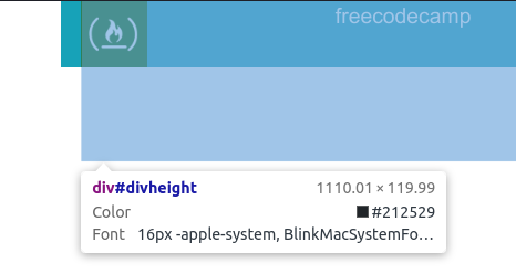
The problem is that, for some reason, the height of the row is 50px like the image, not 120px:

Solution
There are a couple of reasons this is happening. First, did you notice the typo above?
Fix that and your CSS will look like this:
#divheight {
  height: 120px;
}

img {
  width: 50px;
  height: 50px;
}
But your row still isn't 120px. If you inspect #divheight, you'll see that it's just under 120px:
Instead of targeting #divheight, go down to the next div element and target the class row:
.row {
  height: 120px;
}

img {
  width: 50px;
  height: 50px;
}
Then the row will be 120px like you expect: