

Tabs are more than mere UI elements – they're the backbone of user navigation and content organization in many applications. In React, crafting a tabbed component that's both efficient and responsive is not just an improvement, it's a necessity.
This article takes a deep dive into constructing a React tab component that excels in performance and user experience. We'll cover how to create, optimize, and animate tabs effectively.
You'll also learn how to leverage the Profiler in Dev Tools to pinpoint and reduce unnecessary re-renders, and how to apply Framer Motion to elevate your tabs beyond the functional to make them delightful.
Prerequisites
- Fundamentals of HTML and CSS
- Fundamentals of ES6 JavaScript
- Fundamentals of React and Framer Motion.
What We'll Cover:
- How to set up an environment
- The Heart of the Tab component
- How to build the Tab component
– How to build the UI
– How to implement the Tab functionality
– How to optimize the Tab component
– How to animate the component - Other methods you can use to fine-tune for high performance
- Conclusion
How to Set Up an Environment
To build a high-performance React tab component, the first thing to do is set up a clean development environment.
Before you dive into creating React components, make sure to install Node.js on your computer. This sets the stage for an efficient development process.
How to Create a React Project
After installing Node.js, use Vite (a modern build tool for React projects) to create a new React project. In your local terminal, run the command:
npm create vite@latest
Select React as your framework and your preferred variant.
 React app setup
Then to install the necessary packages, run npm install and open it in your IDE.
At the moment, your app should look like this:
 React app setup complete
Finally, start up the dev server by running npm run dev and go to the given port.
The Heart of the Tab Component
Imagine the tab component like a smart switchboard, smoothly guiding you through different content sections—similar to flipping TV channels or tuning in to radio stations.
Two main parts make this happen:
- Tab Buttons: These act like selector switches, holding individual tabs ready for your clicks. Clicking on these tabs is like choosing different views or content channels.
- Tab Panels: Think of these as the content broadcasts linked to each tab. Only the content connected to the active tab is in the spotlight, just like tuning into a specific channel for clear viewing.
How to Build the Tab Component
This section includes 4 parts:
- Building the UI
- Implementing the tab functionality
- Optimizing the tab component
- How to Animate the Component
How to Build the UI
This section includes all of the mockups and styling needed to render your component on the page. Here’s a step-by-step walkthrough of the process:
First, create an array containing all the data used by your app in your App component.
import "./App.css";

function App() {
  const petData = [
    {
      animal: "Cheetah",
      fact: "Cheetahs are the fastest land animals, capable of reaching speeds up to 75 mph.",
      image: "../src/assets/6.svg",
    },
    {
      animal: "Koala",
      fact: "Koalas sleep around 20 hours a day and are known for their eucalyptus diet.",
      image: "../src/assets/3.svg",
    },
    {
      animal: "Elephant",
      fact: "Elephants have the largest brains among land animals and demonstrate remarkable intelligence.",
      image: "../src/assets/1.svg",
    },
    {
      animal: "Zebra",
      fact: "Zebras have distinctive black and white stripes that act as a natural defense against predators.",
      image: "../src/assets/7.svg",
    },
    {
      animal: "Horse",
      fact: "Horses have excellent memory and are capable of recognizing human emotions.",
      image: "../src/assets/5.svg",
    },
  ];

  return (
    <div className="main__container">
      <h1>Choose your pet</h1>
    </div>
  );
}

export default App;
Then create two components TabButtons and TabContent which will control the Tab and display the Tab’s content, respectively. Then import them into the App component.
Next, pass the data array from your app component into both components using props.
// Rest of app component
return (
    <div className="main__container">
      <h1>Choose your pet</h1>
      <TabButtons

        petData={petData}
      />
      <TabContent petData={petData} />
    </div>
  );
Then loop over the data in both components to create the buttons that'll be used to control the component and the data shown with respect to each tab.
For the TabButtons component:
export default function TabButtons({ petData }) {
  return (
    <div className="tab__header">
      {petData.map((item, index) => (
               <li
          className={`tab__button`}
          key={item.animal}
                 >
          {item.animal}
        </li>
      ))}
    </div>
  );
}
The TabContent component:
export default function TabContent({ petData}) {
  return (
    <div className="tab__container ">
      <div className="tab__content">
        {petData.map((pet) => (
          <div key={pet}>
            <img src={pet.image} alt="" />
            <p>{pet.fact}</p>
          </div>
        ))}
      </div>
    </div>
  );
}
For styling, use this CSS which contains all the styles needed for the entire app in your App.css file:
@import url("https://fonts.googleapis.com/css2?family=Space+Grotesk:wght@400;600;700&display=swap");

* {
  margin: 0;
  padding: 0;
  box-sizing: border-box;
}

html {
  font-size: 62.5%;
}

:root {
  --text-color: #9eb25d;
  --bg-color: rgba(238, 252, 206, 0.4);
}

body {
  font-family: "Space Grotesk", sans-serif;
  height: 100dvh;
  display: grid;
  place-items: center;
}

.main__container {
  border-radius: 2rem;
  display: flex;
  margin-top: 4rem;

  flex-direction: column;
  gap: 4rem;

  align-items: center;
  font-family: "Space Grotesk", sans-serif;
  width: max-content;
  padding: 8rem;
  color: var(--text-color);
  background: var(--bg-color);
  box-shadow: 3px 3px 5px rgba(0, 0, 0, 0.2);
}

h1 {
  font-size: 4rem;
}
.tab__header {
  display: flex;
  list-style: none;
  gap: 2rem;
}

.tab__header li {
  flex: 1;
  cursor: pointer;
  padding: 2rem;
  border: 2px solid var(--text-color);
  text-align: center;
  border-top-right-radius: 100%;
  border-top-left-radius: 100%;
  font-size: 2rem;
}

.tab__container {
  display: flex;
  flex-direction: column;
  font-size: 2rem;
  width: 80rem;
  border-radius: 2rem;
  padding: 4rem;
  box-shadow: inset -3px -3px 3px rgba(0, 0, 0, 0.2),
    inset 3px 3px 3px rgba(0, 0, 0, 0.2);
  gap: 2rem;
}

.tab__content {
  padding: 2rem;
  min-height: 25rem;
  border: 2px solid var(--text-color);
  display: flex;
  justify-content: space-between;
  flex-direction: column;
  align-items: center;
  gap: 4rem;
  background: #fff;
  border-radius: 2rem;
}

.tab__content img {
  max-width: 31rem;
  max-height: 20rem;
  width: 100%;
}

.tab__content p {
  text-align: center;
}

.active {
  background: var(--text-color);

  color: #fff;
  font-weight: 600;
}

@media screen and (max-width: 1000px) {
  .main__container {
    gap: 2rem;
    padding: 1rem;
    width: 95%;
    margin: 5rem auto;
  }

  h1 {
    font-size: 3rem;
  }

  .tab__header {
    flex-wrap: wrap;
  }

  .tab__content {
    gap: 2rem;
    min-height: 35rem;
  }
  .tab__header li {
    font-size: 1.6rem;
  }

  .tab__container {
    width: 100%;
    padding: 2rem;
  }

  .tab__content img {
    max-width: 150px;
  }

  .tab__content p {
    font-size: 1.6rem;
  }
}
Or you can alternatively go here for the stylings: CSS File
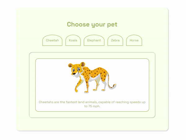
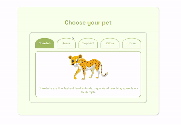
At the moment, your page should look like this:
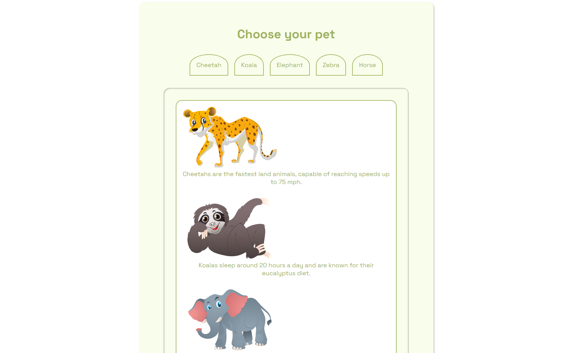 Initial page after looping over data array
How to Implement the Tab Functionality
To create a tab component that functions smoothly, you need to manage which tab is currently active. Think of it as showing only one content section at a time.
To achieve this, start by establishing a 'state' in the App component. This state will keep track of the currently active tab.
const [activeTab, setActiveTab] = useState(0);
The active state is initialized with the index of the tab you want to start with.
Then it's used to show only the the data associated with that index.
export default function TabContent({ petData, activeTab }) {
  return (
    <div className="tab__container ">
      <div className="tab__content">
        {/ Using the active index to select a particular data /}
        <img src={petData[activeTab].image} alt="" />
        <p> {petData[activeTab].fact}</p>
      </div>
    </div>
  );
}
Which shows just the first item from the data array:
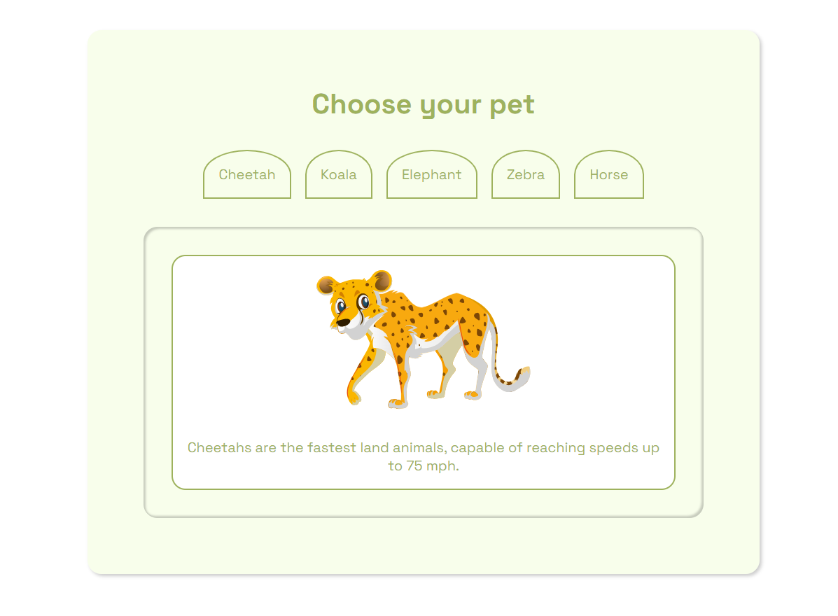 Showing one data item from the array
You can achieve the tab switching functionality by updating the state of the active tab using its setter function.
Start by passing the setter function and the active tab state into the tab buttons via props.
function App() {
  const [activeTab, setActiveTab] = useState(0);
  const petData = [ //...data ];

  return (
    <div className="main__container">
      <h1>Choose your pet</h1>
      <TabButtons
        activeTab={activeTab}
        setActiveTab={setActiveTab}
        petData={petData}
      />
      <TabContent activeTab={activeTab} petData={petData} />
    </div>
  );
}
export default App;
Then use the setter function to set the value of the active state into the corresponding data via the index.
export default function TabButtons({ petData, activeTab, setActiveTab }) {
  return (
    <div className="tab__header">
      {petData.map((item, index) => (
               <li
          className={`tab__button`}
          key={item.animal}
          onClick={() => setActiveTab(index)}>
          {item.animal}
        </li>
      ))}
    </div>
  );
}
With that, your tab component works and can display dynamic data based on the button you click on. Congrats!
 Testing out the tab functionality
To improve the UX, add an active class to the currently clicked tab using its index. This applies the active class to the tab whose index value is the same as the value stored in the active state.
export default function TabButtons({ petData, activeTab, setActiveTab }) {
  return (
    <div className="tab__header">
      {petData.map((item, index) => (
        <li
          // Adding an active class where the current index matches the currently active tab
          className={`${index === activeTab && "active"} tab__button`}
          key={item.animal}
          onClick={() => setActiveTab(index)}>
          {item.animal}
        </li>
      ))}
    </div>
  );
}
Which yields the following result:
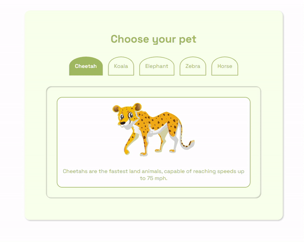 Tab functionality after adding active class to tab
How to Optimize the Tab Component
While your tab component seems ready to go, there are still modifications you can make to better enhance it in terms of performance. For this, you can use React Dev Tools.
This is a browser extension which provides a ton of useful tools React developers can use to inspect and debug their applications. Head over to your browser web store and download the extension.
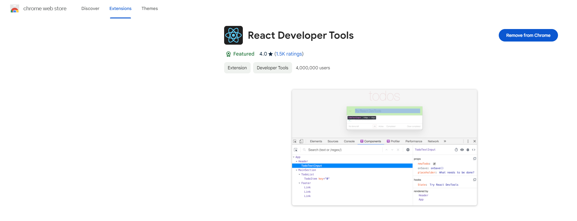 Downloading React dev tools
After you install it, inspecting any React website from your browser dev tools shows two new tabs called ⚛️Components and ⚛️Profiler.
In this application, we’ll be using the Profiler, which is used to measure how many times the React application is rendered, how many components are rendered, and how much time the components take to be rendered.
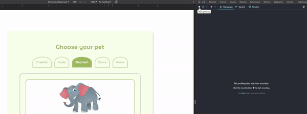
For your application, inspect your React app and open up the profiler from the top right of your screen.
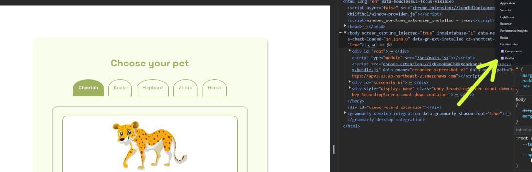 Finding the profiler in dev tools
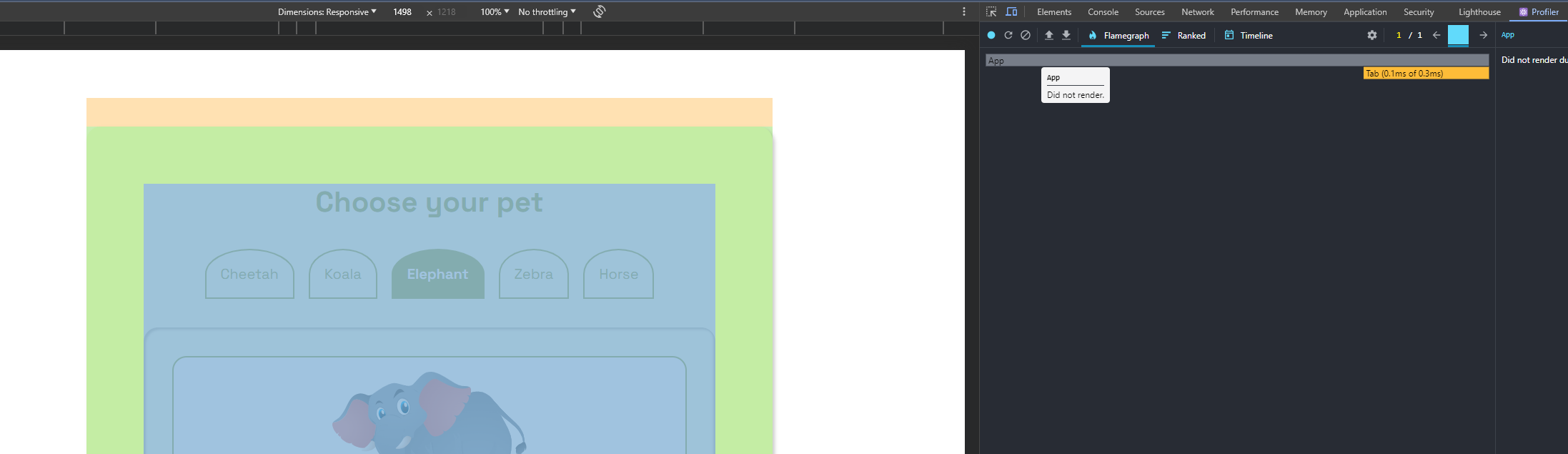
In your profiler, click on the blue record button and start a recording of your React app to track changes and renders.
 Using the profiler to test changes
The result from my end is a total of 0.6ms for the total render time with all 3 components re-rendering (App = 0.2ms, TabButtons = 0.3ms and TabContent = 0.1ms).
The entire render time is quite acceptable, but there is room for improvement.
With the profiler indicating that the app component triggered the re-render, let’s optimize our application to reduce excessive re-renders with the following steps.
Start by creating a Tab component and lifting the data array and the state into that Tab component. You do this because this is the component that consumes the data and state and not the App component.
import { useState } from "react";

const petData = [
  {
    animal: "Cheetah",
    fact: "Cheetahs are the fastest land animals, capable of reaching speeds up to 75 mph.",
    image: "../src/assets/6.svg",
  },
  {
    animal: "Koala",
    fact: "Koalas sleep around 20 hours a day and are known for their eucalyptus diet.",
    image: "../src/assets/3.svg",
  },
  {
    animal: "Elephant",
    fact: "Elephants have the largest brains among land animals and demonstrate remarkable intelligence.",
    image: "../src/assets/1.svg",
  },
  {
    animal: "Zebra",
    fact: "Zebras have distinctive black and white stripes that act as a natural defense against predators.",
    image: "../src/assets/7.svg",
  },
  {
    animal: "Horse",
    fact: "Horses have excellent memory and are capable of recognizing human emotions.",
    image: "../src/assets/5.svg",
  },
];

export default function Tab() {
  const [activeTab, setActiveTab] = useState(0);
  return <></>;
}
Then locally create the JSX for this project. This removes the need for creating excessive components just for JSX.
export default function Tab() {
  const [activeTab, setActiveTab] = useState(0);
  return (
    <>
      <div className="tab__header">
        {petData.map((item, index) => (
          <li
            className={`${index === activeTab && "active"} tab__button`}
            key={item.animal}
            onClick={() => setActiveTab(index)}>
            {item.animal}
          </li>
        ))}
      </div>
      <div className="tab__container ">
        <div className="tab__content">
          <img src={petData[activeTab].image} alt="" />
          <p> {petData[activeTab].fact}</p>
        </div>
      </div>
    </>
  );
}
And now re-running the profiler with your new app structure yields the following:
 Profiler after optimizing app
As you can see, the new rendering time is 0.3ms, improving the speed by 50%, with the app component not re-rendering and the extra JSX elements removed.
It's important to note that this example is relative to the size of the tab component. In larger ones, it’s fairly common to see the tab component broken down into smaller components but in the same file.
How to Animate the Component
For animation, we’ll be using Framer Motion, an open-source animation library designed for React. It delivers a straightforward and expressive API for generating intricate animations.
For a more in-depth explanation of how the library works, check out this guide on using framer motion to animate routes in React.
To use the library, start by installing it in your project using the prompt:
npm i framer-motion
Then import the required properties from the library.
import { AnimatePresence, motion } from "framer-motion";
Next, make all the elements you want to animate motion elements.
export default function Tab() {
  return (
    <>
        <motion.div className="tab__container">
          <div className="tab__header">
            {petData.map((item, index) => (
              <li
                className={`${index === activeTab && "active"} tab__button`}
                key={item.animal}
                onClick={() => setActiveTab(index)}>
                {item.animal}
              </li>
            ))}
          </div>
          <div className="tab__content">
            <motion.img
              src={petData[activeTab].image}
              alt=""
            />
            <motion.p>
              {petData[activeTab].fact}
            </motion.p>
          </div>
        </motion.div>

    </>
  );
}
Then create animation objects for the elements you want to animate. For your tab, this create a scale in animation for the image and a fade and slide animation for the text.
const contentVariants = {
  initial: { y: "100%", opacity: 0 },
  animate: { y: "0", opacity: 1 },
  exit: { y: "100%", opacity: 0 },
};

const imgVariants = {
  initial: { scale: 0.1 },
  animate: { scale: 1 },
  exit: { scale: 0.1 },
};
After that, pass them into the JSX, specifying their initial, animated, and exit states.
export default function Tab() {
  const [activeTab, setActiveTab] = useState(0);
  return (
    <>

        <motion.div className="tab__container" key={activeTab}>
          <div className="tab__header">
            {petData.map((item, index) => (
              <li
                className={`${index === activeTab && "active"} tab__button`}
                key={item.animal}
                onClick={() => setActiveTab(index)}>
                {item.animal}
              </li>
            ))}
          </div>
          <div className="tab__content">
            <motion.img
              src={petData[activeTab].image}
              alt=""
              initial="initial"
              animate="animate"
              exit="exit"
              variants={imgVariants}
              transition={{ duration: 0.5 }}
            />
            <motion.p
              variants={contentVariants}
              initial="initial"
              animate="animate"
              exit="exit"
              transition={{ duration: 0.5 }}>
              {petData[activeTab].fact}
            </motion.p>
          </div>
        </motion.div>

    </>
  );
}
Finally, wrap your component with the AnimatePresence component to detect when you switch between tabs to fire exit animations:
export default function Tab() {

  return (
    <>
      <AnimatePresence mode="wait">
        <motion.div className="tab__container" key={activeTab}>
          <div className="tab__header">
            {petData.map((item, index) => (
              <li
                className={`${index === activeTab && "active"} tab__button`}
                key={item.animal}
                onClick={() => setActiveTab(index)}>
                {item.animal}
              </li>
            ))}
          </div>
          <div className="tab__content">
            <motion.img
              src={petData[activeTab].image}
              alt=""
              initial="initial"
              animate="animate"
              exit="exit"
              variants={imgVariants}
              transition={{ duration: 0.5 }}
            />
            <motion.p
              variants={contentVariants}
              initial="initial"
              animate="animate"
              exit="exit"
              transition={{ duration: 0.5 }}>
              {petData[activeTab].fact}
            </motion.p>
          </div>
        </motion.div>
      </AnimatePresence>
    </>
  );
}
Note: Framer motion uses the key prop to detect changes between elements. The mode prop set to wait in AnimatePresense helps framer motion fire exit animations before entry animations.
And with that, your Tab component is fully functional and animated. Bravo! 🎈
 tabbed component fully functional and animated
For reference, here’s the full code:
import { AnimatePresence, motion } from "framer-motion";

import { useState } from "react";

const petData = [
  {
    animal: "Cheetah",
    fact: "Cheetahs are the fastest land animals, capable of reaching speeds up to 75 mph.",
    image: "../src/assets/6.svg",
  },
  {
    animal: "Koala",
    fact: "Koalas sleep around 20 hours a day and are known for their eucalyptus diet.",
    image: "../src/assets/3.svg",
  },
  {
    animal: "Elephant",
    fact: "Elephants have the largest brains among land animals and demonstrate remarkable intelligence.",
    image: "../src/assets/1.svg",
  },
  {
    animal: "Zebra",
    fact: "Zebras have distinctive black and white stripes that act as a natural defense against predators.",
    image: "../src/assets/7.svg",
  },
  {
    animal: "Horse",
    fact: "Horses have excellent memory and are capable of recognizing human emotions.",
    image: "../src/assets/5.svg",
  },
];

const contentVariants = {
  initial: { y: "100%", opacity: 0 },
  animate: { y: "0", opacity: 1 },
  exit: { y: "100%", opacity: 0 },
};

const imgVariants = {
  initial: { scale: 0.1 },
  animate: { scale: 1 },
  exit: { scale: 0.1 },
};

export default function Tab() {
  const [activeTab, setActiveTab] = useState(0);
  return (
    <>
      <AnimatePresence mode="wait">
        <motion.div className="tab__container" key={activeTab}>
          <div className="tab__header">
            {petData.map((item, index) => (
              <li
                className={`${index === activeTab && "active"} tab__button`}
                key={item.animal}
                onClick={() => setActiveTab(index)}>
                {item.animal}
              </li>
            ))}
          </div>
          <div className="tab__content">
            <motion.img
              src={petData[activeTab].image}
              alt=""
              initial="initial"
              animate="animate"
              exit="exit"
              variants={imgVariants}
              transition={{ duration: 0.5 }}
            />
            <motion.p
              variants={contentVariants}
              initial="initial"
              animate="animate"
              exit="exit"
              transition={{ duration: 0.5 }}>
              {petData[activeTab].fact}
            </motion.p>
          </div>
        </motion.div>
      </AnimatePresence>
    </>
  );
}
Other Methods You Can Use to Fine-Tune for High Performance
While your React tab component is functional and animated, there are opportunities for further optimization to ensure high performance, especially in scenarios involving larger datasets or asynchronous data fetching. Let's explore some strategies to fine-tune your tab component.
Data Considerations
- Size of the Tab Component: Check the size of your tab component, especially if dealing with a large amount of data. Consider lazy-loading or pagination to improve initial rendering times.
- Asynchronous Data Loading: If your data is asynchronous, implement loading states to enhance user experience. Optimize the rendering logic to handle data loading efficiently.
React Profiler
- Identifying and Reducing Unnecessary Re-renders: Outside leveraging React DevTools Profiler to analyze component rendering behaviour, use React hooks like React.memo and React.callback to optimize and cache your data.
Component Structure
- Granular Component Structure: For larger tab components, consider breaking down the structure into smaller, granular components. This allows for better maintainability and can improve rendering performance.
Code Splitting
- Dynamic Imports for Code Splitting: Implement dynamic imports for code splitting, especially if your React application becomes more complex. This ensures that only the necessary code loads when a specific tab is selected.
Responsive Design
- Optimizing for Different Viewports: Ensure your tab component is responsive to different screen sizes. Consider media queries and adaptive design to provide an optimal experience across various devices.
Browser Caching
- Optimizing Assets with Browser Caching: Leverage browser caching for static assets, such as images, to reduce load times. Consider optimizing and compressing images to cut their impact on performance.
Testing and Profiling
- Continuous Testing and Profiling: Test your tab component under various conditions and profiles. Use tools like Lighthouse or Web Vitals to track performance metrics and address any issues that may arise.
By implementing these strategies, you can elevate your React tab component from merely functional to highly performant, ensuring a smooth user experience across different scenarios and datasets.
Here’s a link to the repository: GitHub
And the live version: Live Demo
Conclusion
You've successfully built React tabs that are more than just functional – they're optimized for a smooth user experience. From setting up the environment to adding animations, you've covered the essentials.
As you refine and optimize your tabs, remember they play a crucial role in user navigation. Keep coding and may your React tabs deliver a dependable and user-friendly experience.
Happy coding!🌟
Contact Information
Want to connect or contact me? Feel free to hit me up on the following:
- Twitter / X: @jajadavid8
- LinkedIn: David Jaja
- Email: Jajadavidjid@gmail.com