By Vincent Humeau
In this article, we are going to create a small 3D scene, where the user can scroll on the z-axis. You can find the final code of this tutorial on GitHub, and the demo if you follow this link.
This article assumes that you already have some knowledge about CSS and JavaScript. We are going to use CSS custom properties, so if you are not familiar with this you can read CSS custom properties — Cheatsheet.
Introduction to CSS 3D
When speaking of CSS 3D, we’re really speaking about CSS3 transform 3D. This method allows us to use the transform CSS property to set perspective or rotation on the z-axis to our DOM elements.
The transform CSS property lets you rotate, scale, skew or translate an element. It modifies the coordinate space of the CSS visual formatting model. transform — MDN
To be allowed to render our Dom elements in a 3D space we need to have a look at the following properties:
- Perspective
- Perspective origin
- Transform Z
Perspective
perspective is a CSS property that set the distance between z=0 and the user. The smaller is the perspective value, and the greater will be the distortion of our scene. (Try to change the value of scenePerspective in the codePen example below).
.container-scene { perspective: 100px; }
The value of perspective is a length unit.
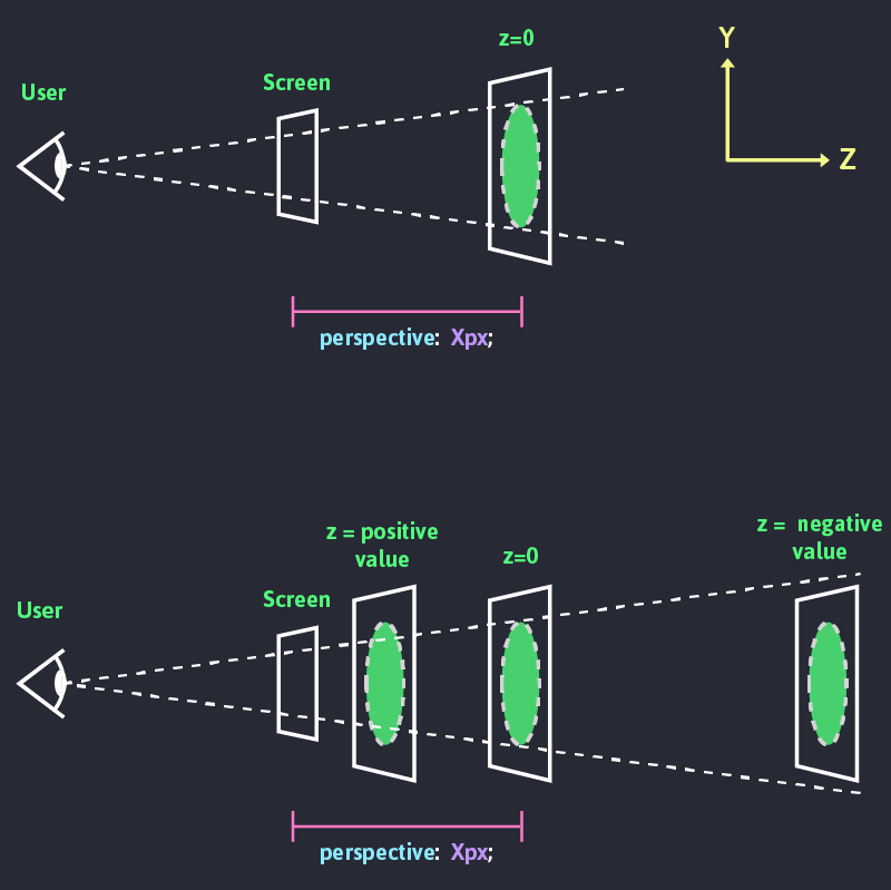
Try to set the value of scenePerspective to 0 and 70 in the example below. You can notice that our cube gets no perspective at all if its value is set to 0. If the value is set to 70, you can see a really strong distortion of the cube perspective. The smaller the perspective value is, the deeper it is.
To be able to render a 3D space, we need to specify transform-style: preserve-3d; on the child elements. In the above example, it set to our .cube. By default, the elements are flattened.
.container-scene {
  perspective: 400px;
}
.container-scene .cube {
  transform-style: preserve-3d;
}
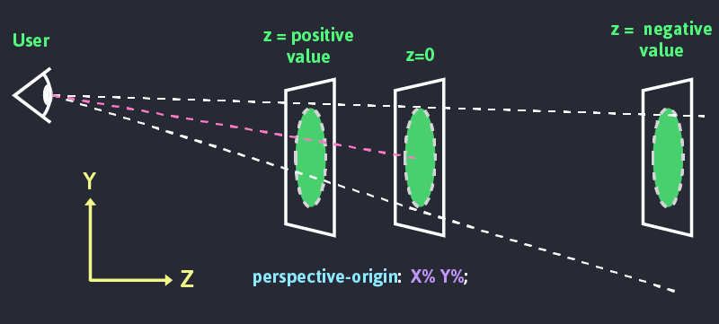
Perspective origin
The
perspective-originCSS property determines the position at which the viewer is looking. It is used as the vanishing point by the perspective property. MDN
This property basically allows us to move the vanishing point of our 3D scene.
.container-scene {
  perspective: 400px;
  perspective-origin: 50% 100%; /*X position value, Y position value*/
}

.container-scene .cube {
  transform-style: preserve-3d;
}
For both x and y we can set the position using percentages. But we can as well use the following values:
x position:
left= 0%center= 50%right= 100%
y position
top= 0%center= 50%bottom= 50%
In the following example, you can change the value of perspectiveOriginX and perspectiveOriginY.
Transform Z
We already mentioned earlier that the transform CSS property allows us to set our elements in a 3D space.
Transform comes with different functions to transform our elements in 3D:
- rotateX(angle) — MDN
- rotateY(angle) — MDN
- rotateZ(angle) — MDN
- translateZ(tz) — MDN
- scaleZ(sz) — MDN
As we saw in the illustration in the perspective section, translateZ() allows us to position an element along the z-axis of the 3D space. Alternately we can use the translate3D(x, y, z) CSS function.
In the following example, you can play with the Z-axis position of the .cube and .face- by changing the value of cubeTranslateZ and cubeFacesTranslateZ.
Now that we have a good understanding of how CSS 3D works we are going to create a 3D scene, where we are going to be able to scroll on the z-axis.
Set the scene
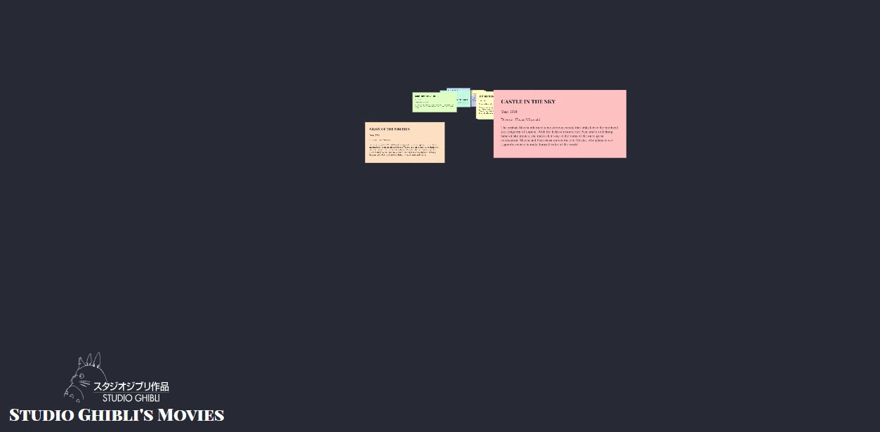
We are going to create a page that lists out all the films of Studio Ghibli. Each film is going to be a card positioned on the z-axis of our scene. Feel free to fork or download the following codepen as a starter material to follow along. I’m using axios with Studio Ghibli API to populate this page.
If you want to follow along with your own content we will need the following markup:
<div class="viewport">
  <div class="scene3D-container">
    <div class="scene3D">
      <div>Card1</div>
      <div>Card2</div>
      <!--Etc.-->
    </div>
  </div>
</div>
Styling
First, we are going to set our CSS custom properties (CSS variables). Some of these variables are going to be transformed using JS. They are going to help us to interact with the scene.
:root {
 --scenePerspective: 1;
 --scenePerspectiveOriginX: 50;
 --scenePerspectiveOriginY: 30;
 --itemZ: 2; // Gap between each cards
 --cameraSpeed: 150; // Where 1 is the fastest, this var is a multiplying factor of --scenePerspective and --filmZ
 --cameraZ: 0; // Initial camera position
 --viewportHeight: 0; // Viewport height will allow us to set the depth of our scene
}
.viewport will allow us to set the height of the window. We will later use it to set the depth of the scene and use the scrollbar to navigate in the z-axis.
.viewport {
  height: calc(var(--viewportHeight) * 1px);
}
.scene3D-container sets the scene perspective and the perspective origin. It is position fixed so it stays always on screen. We are as well going to set the perspective origin.
.viewport .scene3D-container {
 position: fixed;
 top: 0;
 left: 0;
 width: 100%;
 height: 100%;
 perspective: calc(var(--scenePerspective) * var(--cameraSpeed) * 1px);
 perspective-origin: calc(var(--scenePerspectiveOriginX) * 1%) calc( var(--scenePerspectiveOriginY) * 1% );
 will-change: perspective-origin;
 transform: translate3d( 0, 0, 0 ); //Allows Hardware-Accelerated CSS, so transitions are smoother
}
.scene3D sets the position of our scene on the z-axis, This will behave a bit like moving a camera on the z-axis. But really we are moving the scene and the camera (viewport) is fixed. In the rest of this article, we are going to use the camera comparison. .scene3D takes the full height and width of the viewport.
.viewport .scene3D-container .scene3D {
 position: absolute; top: 0;
 height: 100vh;
 width: 100%;
 transform-style: preserve-3d;
 transform: translateZ(calc(var(--cameraZ) * 1px));
 will-change: transform;
}
Last but not least we are going to position our cards in the scene. All items are position absolute. Odd items are positioned on the left, even ones on the right.
We use SCSS to programmatically translate each item. On the X and Y axis, we randomly translate them between -25% and 25% for X, between -50% and 50% for Y. We use a @for loop so each item can be translated on the z-axis multiply by their indexes.
.viewport .scene3D-container .scene3D {
 > div {
  position: absolute;
  display: block;
  width: 100%;
  top: 40%;
  @media only screen and (min-width: 600px) {
    width: 45%;
  }
  &:nth-child(2n) { left: 0; }
  &:nth-child(2n + 1) { right: 0; }
  @for $i from 0 through 25 {
   &:nth-child(#{$i}) {
    transform: translate3D( random(50) - 25 * 1%, random(100) - 50 * 1%, calc(var(--itemZ) * var(--cameraSpeed) * #{$i} * -1px) );
   }
  }
 }
}
The CSS is now done, and we have a 3D scene. In the following parts of this article, we are going to write some JavaScript that is going to allow us to navigate in the scene.
To be able to scroll, we need first to set the value of --viewportHeight which emulates the depth of the scene.
The depth of the scene is equal to the addition of the following:
- The height of the user window
- The
.scene3D-containerperspective => var(--scenePerspective) * var(--cameraSpeed) - The translated z value of our last item =&g
t; var(--itemZ) * var(--cameraSpeed) * items.length
Let’s create a setSceneHeight() function that will update the value of --viewportHeight on load.
document.addEventListener("DOMContentLoaded", function() {
  setSceneHeight();
});

function setSceneHeight() {
  const numberOfItems = films.length; // Or number of items you have in `.scene3D`
  const itemZ = parseFloat(
    getComputedStyle(document.documentElement).getPropertyValue("--itemZ")
  );
  const scenePerspective = parseFloat(
    getComputedStyle(document.documentElement).getPropertyValue(
      "--scenePerspective"
    )
  );
  const cameraSpeed = parseFloat(
    getComputedStyle(document.documentElement).getPropertyValue("--cameraSpeed")
  );

  const height =
    window.innerHeight +
    scenePerspective * cameraSpeed +
    itemZ * cameraSpeed * numberOfItems;

  // Update --viewportHeight value
  document.documentElement.style.setProperty("--viewportHeight", height);
}
Our page has now a scrollbar, but we are still unable to scroll. We need to add an event listener that will listen to the user scrolling. The scroll event will call a moveCamera() function. It will update the value of --cameraZ with the value of window.pageYOffset.
document.addEventListener("DOMContentLoaded", function() {
  window.addEventListener("scroll", moveCamera);
  setSceneHeight();
});

function moveCamera() {
  document.documentElement.style.setProperty("--cameraZ", window.pageYOffset);
}

function setSceneHeight() {
  // ...
}
Move camera angle
Finally, let’s make our scene a bit more dynamic. On mousemove event we are going to change the values of scenePerspectiveOriginX and scenePerspectiveOriginY. This will give the illusion that the camera moves. The items will stay straight in the scene. If you want to give a more realistic camera rotation movement, you could apply rotate3d() on the scene.
First, we are going to store the initial values of these two variables in a perspectiveOrigin object. We are going to set a perspectiveOrigin.maxGap value which is going to limit the maximum and minimum values of the variables. For example, if scenePerspectiveOriginY is equal to 50%. On mousemove, the new value will be between 40% and 60%.
const perspectiveOrigin = {
  x: parseFloat(
    getComputedStyle(document.documentElement).getPropertyValue(
      "--scenePerspectiveOriginX"
    )
  ),
  y: parseFloat(
    getComputedStyle(document.documentElement).getPropertyValue(
      "--scenePerspectiveOriginY"
    )
  ),
  maxGap: 10
};
If the user’s cursor is at the center of the screen, we will set the values of --scenePerspectiveOriginX and --scenePerspectiveOriginX as the initial ones. The further the cursor moves away from the center, the more these values will increase/decrease. If the user moves to the top left corner the values will increase, and at the bottom right corner they will decrease.
The moveCameraAngle() function is going to update the values:
xGapandyGapreturn the mouse position of the user in a percentage on the X and Y axis, compared to the center of the window.newPerspectiveOriginXandnewPerspectiveOriginYreturn the new perspective origin.
document.addEventListener("DOMContentLoaded", function() {
  window.addEventListener("scroll", moveCamera);
  window.addEventListener("mousemove", moveCameraAngle);
  setSceneHeight();
});

function moveCameraAngle(event) {
  const xGap =
    (((event.clientX - window.innerWidth / 2) * 100) /
      (window.innerWidth / 2)) *
    -1;
  const yGap =
    (((event.clientY - window.innerHeight / 2) * 100) /
      (window.innerHeight / 2)) *
    -1;
  const newPerspectiveOriginX =
    perspectiveOrigin.x + (xGap * perspectiveOrigin.maxGap) / 100;
  const newPerspectiveOriginY =
    perspectiveOrigin.y + (yGap * perspectiveOrigin.maxGap) / 100;

  document.documentElement.style.setProperty(
    "--scenePerspectiveOriginX",
    newPerspectiveOriginX
  );
  document.documentElement.style.setProperty(
    "--scenePerspectiveOriginY",
    newPerspectiveOriginY
  );
}
Our scene is now finished. I hope you enjoyed this article.
Resources
- perspective — Codrops
- perspective — MDN
- transform-style — Codrops
- transform-style — MDN
- perspective-origin — MDN
- Things to Watch Out for When Working with CSS 3D — CSS-tricks
Read more of my blog articles at vinceumo.github.io.