
Today we're gonna learn how to use CSS's box-shadow property to make beautiful website components. Along the way, we'll create a button and get hands-on experience using this property. Let's get started. 🎖️
Table of Contents
- Why you should use the CSS box-shadow property
- The syntax of the box-shadow property
- How to make a button using the box-shadow property
- Additional Resources
- What is inset in CSS Box shadow property?
You can watch this tutorial on YouTube as well if you like:
Why Should You Use The CSS box-shadow Property?
Attention to small details separates a good website from an excellent looking website. If you want to add those small details to your website, you should definitely use this property along with many other properties.
Let's took at some examples. 👇
 A Website Design
Pay close attention to the button components in the image above. You'll see that we have some drop shadows. ☝
Let's examine these buttons even further: 👇
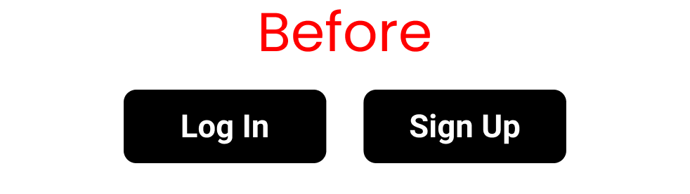 Button with no box-shadow property
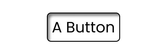
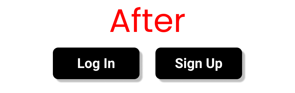 Button using the box-shadow property
You can tell that the latter one looks more dynamic and interesting, as it has more attention to detail. This is called a drop shadow effect. Let's see how we can implement it in our code.
Project Setup
HTML
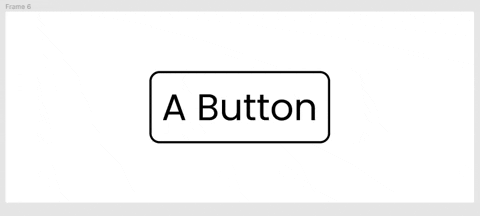
Write this code inside the body tag: 👇
<div class="box-1"> A Button </div>
CSS
Clear your default browser settings like this:
*{
   margin: 0px;
   padding: 0px;
   box-sizing: border-box;
   font-family: sans-serif;
}
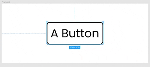
Now, let's create a button with the following code:👇
.box-1{
   margin: 100px 0 0 100px;
   height: 80px;
   width: 200px;
   border: 2px solid black;
   border-radius: 8px;
   font-size: 40px;

   display: grid;
   place-content: center;
}
We're all set, now let's start coding!
The Syntax of the box-shadow Property
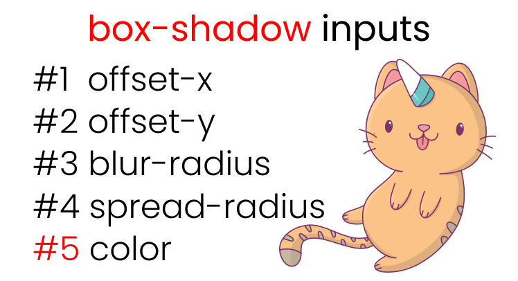 All the inputs of box-shadow property
Here's the syntax for the box-shadow property: 👇
box-shadow: offset-x | offset-y | blur-radius | spread-radius | color ;
Let's look at each part in more detail.
How to Use Offset-x in the box-shadow Property
You'll use the offset-x property to move the shadow left and right along the X-Axis. Here's a demo to show you how that looks:👇
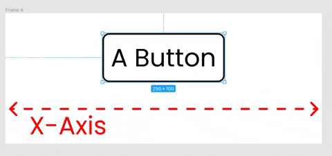 We can move the shadow left & right
The recreate these results, write the following code in your CSS: 👇
/* offset-x | offset-y | color */
.box-1{
   box-shadow: -50px 0px rgba(0,0,0,0.5);
}

/*Or, you can write*/

.box-1{
   box-shadow: 50px 0px rgba(0,0,0,0.5);
}
How to Use Offset-y in the box-shadow Property
You'll use the offset-y property to move the shadow up and down along the Y-Axis. Here's a demo of how that looks:👇
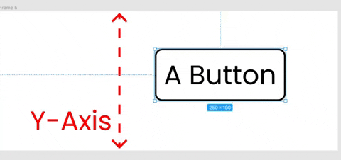 We can move the shadow top & bottom
To recreate these results write the following in your CSS: 👇
/* offset-x | offset-y | color */
.box-1{
   box-shadow: 0px -50px rgba(0,0,0,0.5);
}

/*Or, you can write*/

.box-1{
   box-shadow: 0px -50px rgba(0,0,0,0.5);
}
How to Combine Both offset-x and offset-y
Write the following code in your CSS: 👇
.box-1{
   box-shadow: 10px 10px rgba(0,0,0,0.5);
}
Here's the result with the box shadow showing on the right and bottom of the button: 👇
 Our button with box shadow
How to Use blur-radius in the box-shadow Property
The blur-radius property will blur the color around our button, like this:👇
 Experimenting w/ blur radius
To duplicate the results, write the following in your CSS: 👇
/* offset-x | offset-y | blur-radius | color */

.box-1{
/* play around with 👇 this */
   box-shadow: 0 0 50px rgba(0,0,0,0.8);
}
How to Use spread-radius in the box-shadow Property
This value spreads our shadow around our button, like this: 👇
 Experimenting w/ spread radius
Let's recreate the results with the following CSS code:
/* offset-x | offset-y | blur-radius | spread-radius | color */

.box-1{
/*  play around with 👇 this */
   box-shadow: 0 0 0 50px rgba(0,0,0,0.5);
}
How to Add a Drop Shadow to a Button
Let's put together what we've learned so far and add a drop shadow effect to our button: 👇
.box-1{
   box-shadow: 8px 10px 10px 1px rgba(0,0,0,0.5);
}
The result looks like this: 👇
 The result
Additional Resources
- [GetCssScan] - To get readymade box shadows
- [keyframes.app] - to test and practice these properties in real time
- flatuicolors - Beautiful color palettes
✨ Bonus Tip ✨
What is Inset in the CSS box-shadow Property?
There's a keyword named inset that you can use with the box-shadow property. This puts the shadow inside our button instead of spreading it around the outside. Write this CSS code to experiment with it:👇
.box-1{
   box-shadow: inset 8px 10px 10px 1px rgba(0,0,0,0.5);
}
Here's the result: 👇
 Effect of the inset keyword
Conclusion
Now you can confidently use the box-shadow property to add not only drop shadows but also to add more attention to detail to your projects.
Here's your medal for reading till the end. ❤️
Suggestions and criticisms are highly appreciated ❤️
- YouTube / Joy Shaheb
- LinkedIn / JoyShaheb
- Twitter / JoyShaheb
- Instagram / JoyShaheb