

Today we're going to learn CSS Grid properties so that you can make your own responsive websites. I'll explain how each of Grid's properties work along with a CheatSheet that covers everything you can do with Grid. Let's go. 🎖️
Table of Contents:
- CSS Grid Architecture
- CSS Grid Chart
- Grid Parent Properties
- Child Properties in CSS Grid
- Shorthand for Grid
- Conclusion
You can watch this tutorial on YouTube as well if you like:
First, What is CSS Grid?
Grid is a blueprint for making websites.
The Grid model allows you to layout the content of your website. Not only that, it helps you create the structures you need for building responsive websites for multiple devices. This means your site will look good on desktop, mobile, and tablet.
Here's a simple demo which I created using Grid as the main blueprint.
Desktop View

Mobile View

CSS Grid Architecture
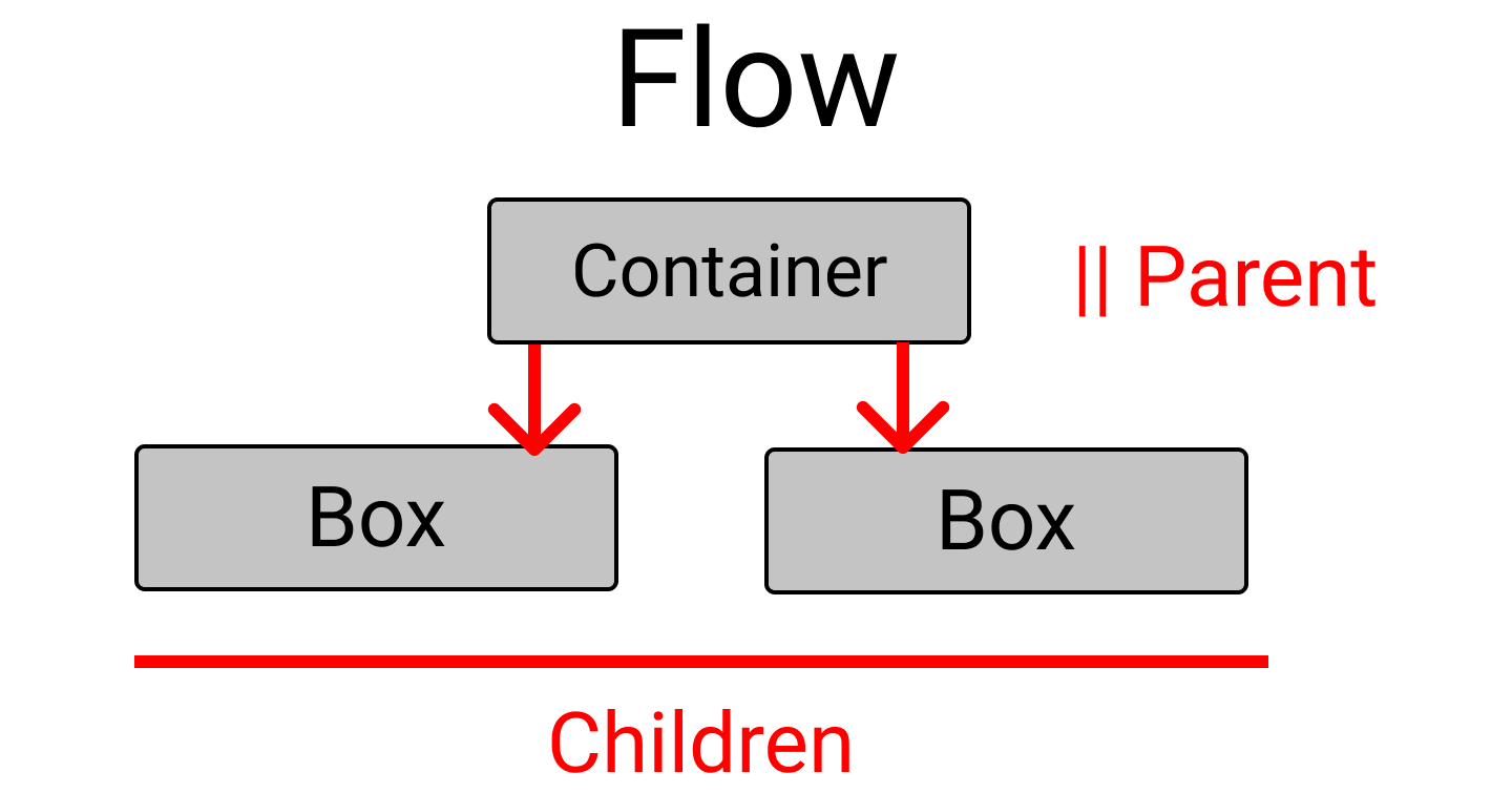
So how does Grid architecture work? The Grid items [Contents] are distributed along the main axis and cross axis. Using various Grid properties, you can manipulate the items to create your website layouts.
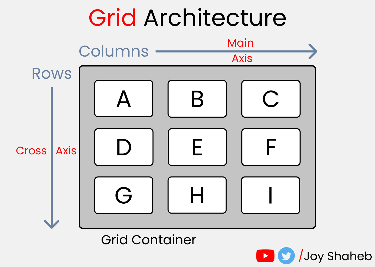 grid architecture
By the way, you can join multiple rows and columns, just like in Excel software, which gives you more flexibility and options than Flexbox.
By the way, here's a CheatSheet I made for Flexbox if you want to learn more about that.
CSS Grid Chart

This chart contains every possible property you can use when using grid. Grid properties are divided into:
- Parent properties
- Child Properties
Note: The red colored text denotes the shorthand properties:
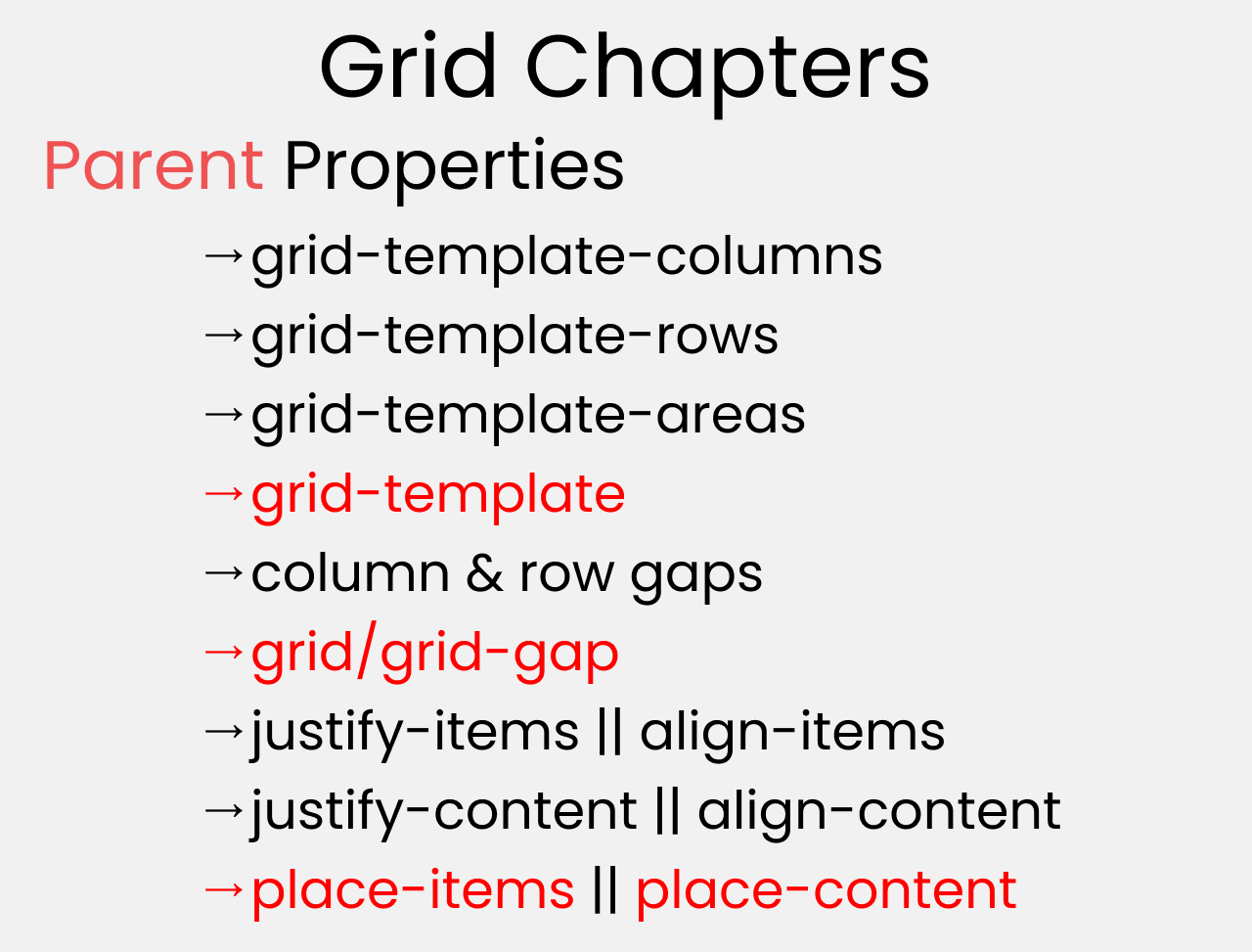
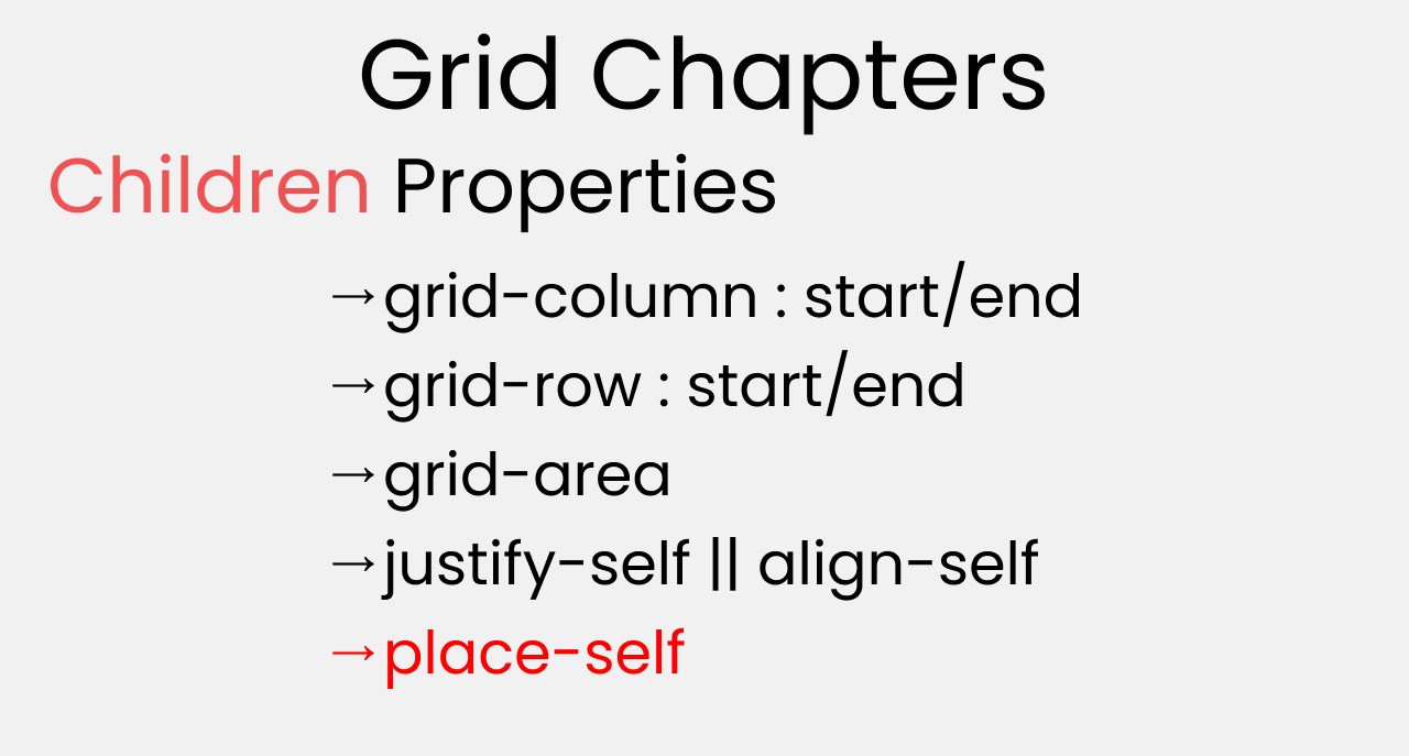
By the end of this tutorial, you'll have a clear understanding of how to use all of those properties.
How to Set Up the Project

For this project, you need to know little bit of HTML, CSS, and how to work with VS code. Follow along with me as we complete the following tasks:
- Create a folder named "Project-1" and Open VS Code
- Create index.html and style.css files
- Install Live Server and run it.
Or, you can just open Codepen and start coding.
At the end of this tutorial, you will be able to make accurate and beautiful website layouts.
And...we're all set! Let's start coding. 😊

HTML
Create three boxes inside the body tag, like this 👇
<div class="container">
  <div class="box-1"> A </div>
  <div class="box-2"> B </div>
  <div class="box-3"> C </div>
</div>
CSS
Step 1
Let's clear out our default browser styles. Follow me 👇
*{
  margin: 0px;
  padding: 0px;
  box-sizing: border-box;
}
Step 2
Inside the body selector, do these adjustments:
body {
  font-family: sans-serif;
  font-size: 40px;
  width: 100%;
  min-height: 100vh;
}
Step 3
Now, let's style our boxes by selecting all of them together ->
[class^="box-"] {
  background-color: skyblue;

/* To place the letter at the center */
  display: grid;
  place-items: center;
}
Note: Don't worry, we'll discuss those grid properties in detail later.
Step 4
Now, place some gaps between our boxes like this 👇
.container {
  display: grid;
  gap: 20px;
}
But Wait....

Before starting, you need to understand the relationship between parent and child classes.
For the Grid parent property, we will write inside the .container class. For the Grid child property, we will write in the .box-* classes.
CSS Grid Parent Properties

First, let's learn about CSS Grid's parent properties!
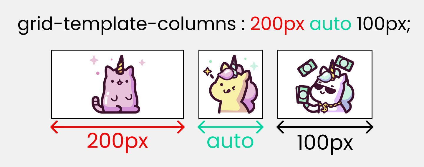
The grid-template-columns property
You use this property to define the number and width of columns. You can either individually set the width of each column, or set a uniform width for all columns using the repeat() function.
 grid-template-columns
To recreate these results, write the following CSS lines ->
.container {
  display: grid;
  gap: 20px;

/*  Change the values     👇 to experiment */
  grid-template-columns: 200px auto 100px;
}
Note:
- The pixel values will be an exact measurement. The "auto" keyword will cover the available space.
- If you use fr (fraction unit) as a unit of measurement, all the boxes will be equal in size.
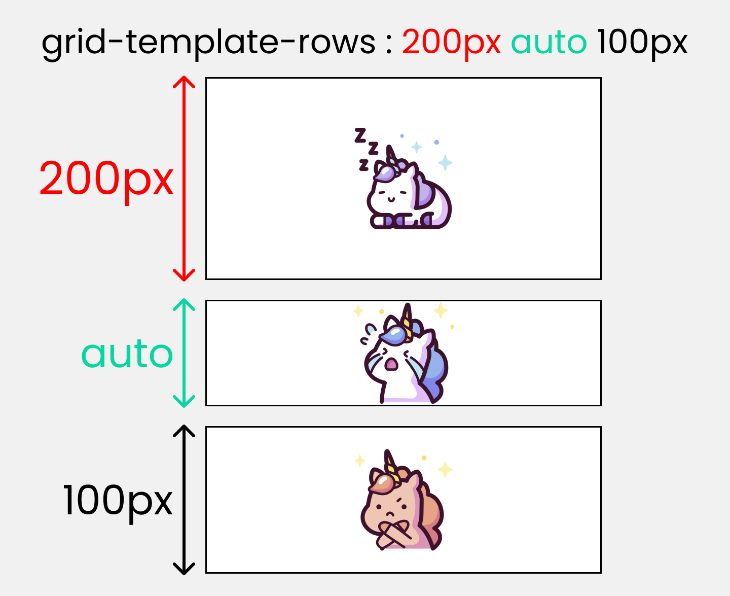
The grid-template-rows property
You use this property to define the number and height of rows. You can either individually set the height of each row, or set a uniform height for all rows using the repeat() function.
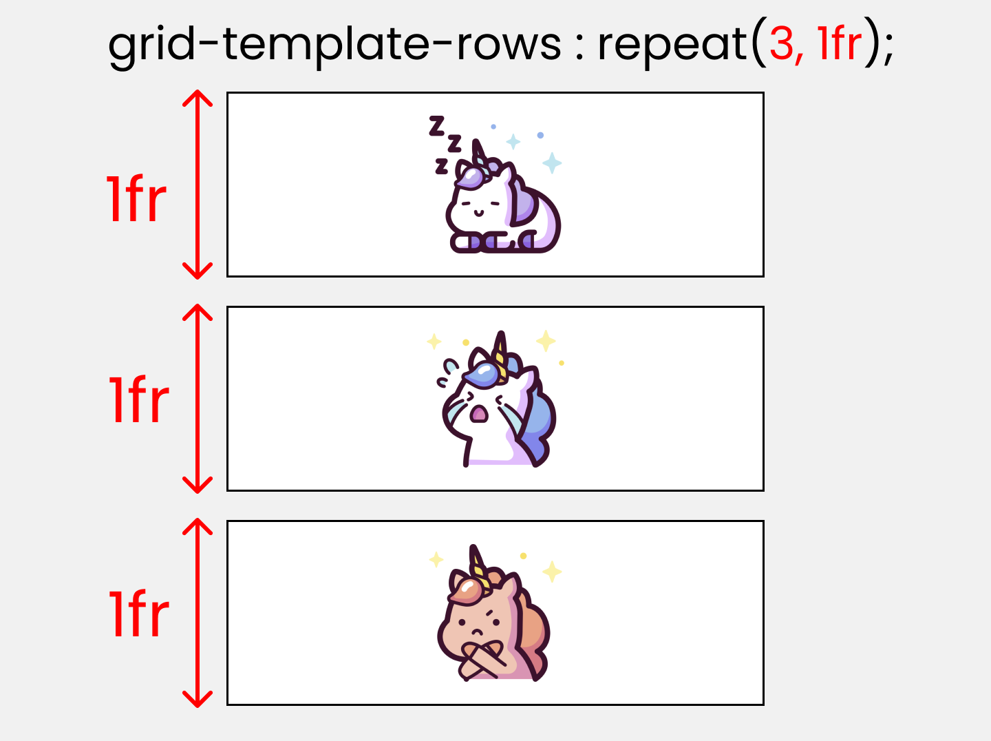 grid-template-rows
To test these results, write the following CSS code ->
.container {
  display: grid;
  gap: 20px;
  height: 100vh;

/* Change the values  👇 to experiment */
  grid-template-rows: 200px auto 100px;
}
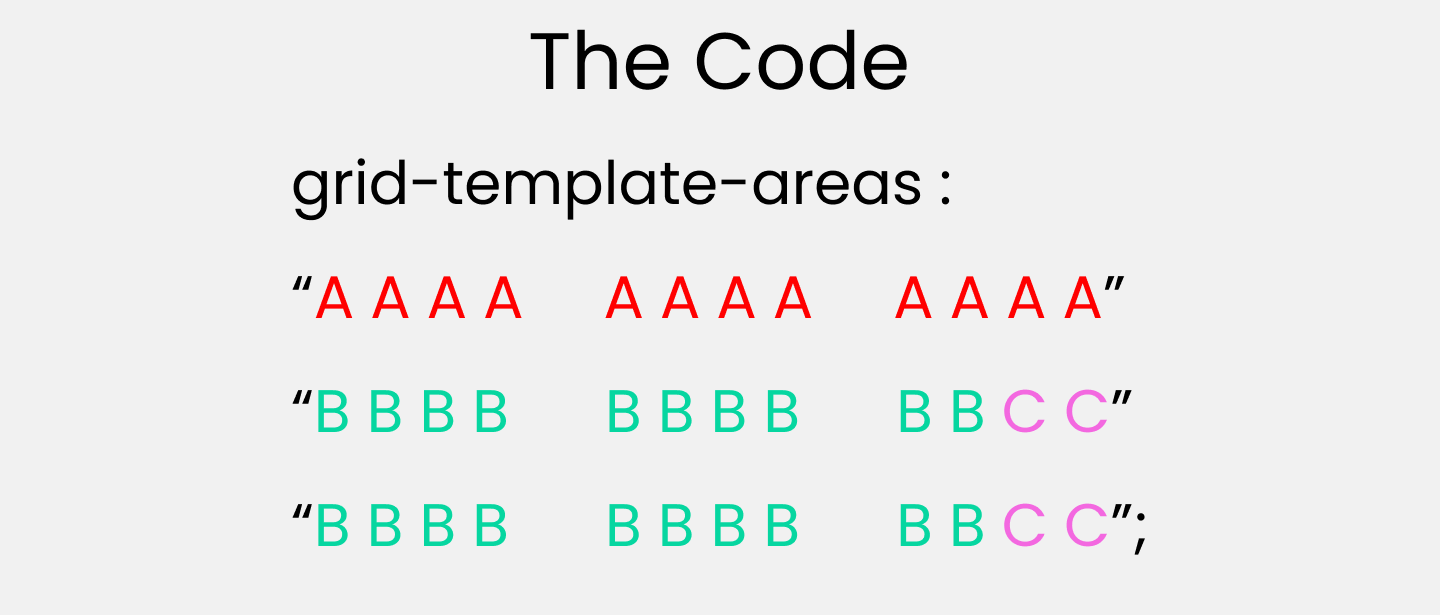
The grid-template-areas property
You use this property to specify the amount of space a grid cell should carry in terms of columns and rows across the parent container. Life's much easier with this property as it allows us to see visually what we're doing.
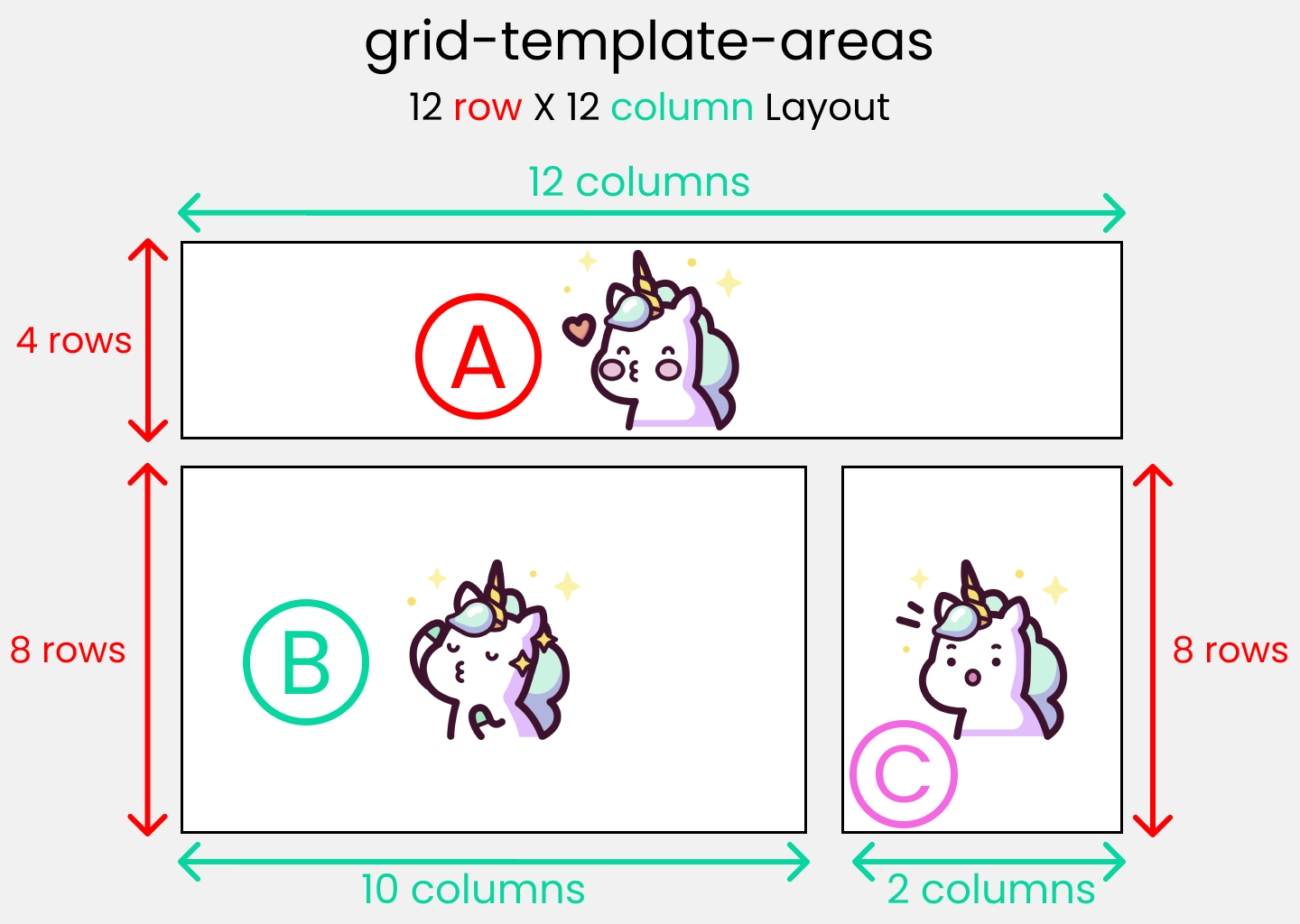 Standard 12X12 layout
Call it the blueprint(template) of our layout👇
 The blueprint
To experiment with this, you need to understand both the parent and child properties:
- grid-template-areas: The parent property that will create the blueprint
- grid-area: the child property that will follow the blueprint.
First, create the blueprint
Like this 👇 inside the parent .container class:
.container {
  display: grid;
  gap: 20px;
  height: 100vh;

  grid-template-areas:
    "A A A A   A A A A   A A A A"
    "B B B B   B B B B   B B C C"
    "B B B B   B B B B   B B C C";
}
Implement the blueprint
Target all our child .box-* classes and set the values like this ->
.box-1{
  grid-area: A;
}
.box-2{
  grid-area: B;
}
.box-3{
  grid-area: C;
}
Note: I'll discuss the grid-area property again in the grid child property section.
The column-gap property
You use this property to place a gap between Columns inside the grid 👇
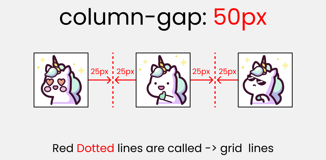 column-gap
To test this, write the following in CSS 👇
.container {
  display: grid;
  height: 100vh;

  grid-template-columns: 100px 100px 100px;
//Change values👇 to experiment
  column-gap:  50px;
}
Note: column-gap works with grid-template-columns.
The row-gap property
You use this property to place a gap between Rows inside the grid 👇
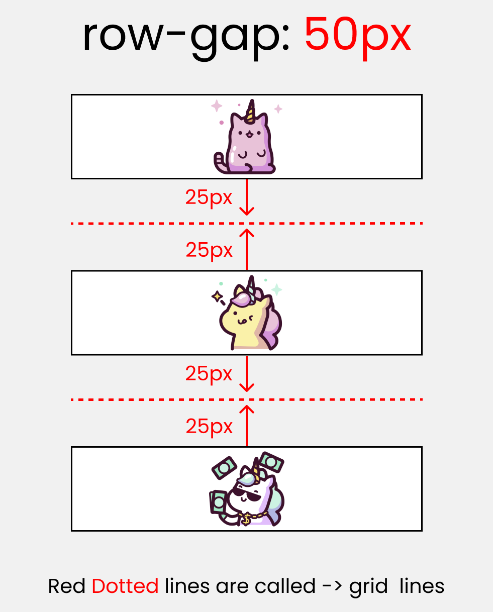 row gap
Let's test this 👇
.container {
  display: grid;
  height: 100vh;

  grid-template-rows: 100px 100px 100px;
// Change   👇  values to experiment
  row-gap:  50px;
}
Note: row-gap works with grid-template-rows.
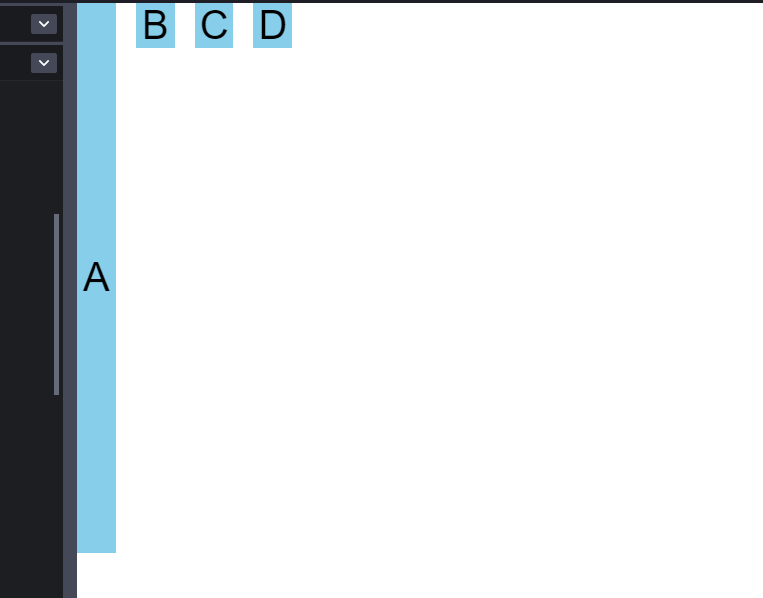
The justify-items property
You use this property to position grid-items (children) inside grid containers along the X-Axis [Main Axis]. The 4 values are 👇
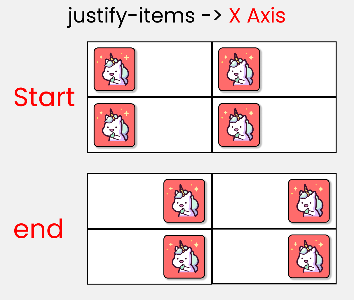
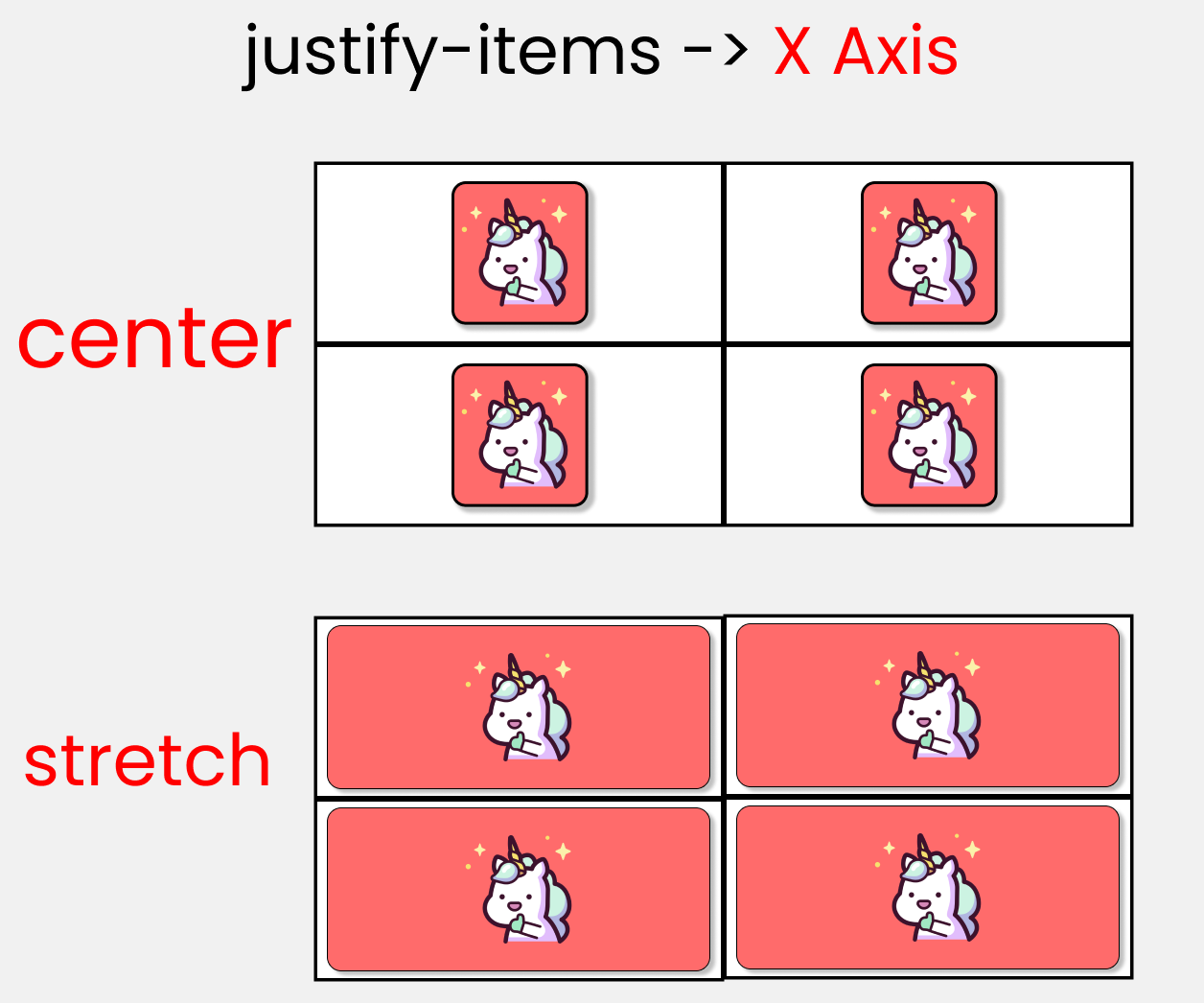 justify-items
If you want to test this, then add 1 more box inside the HTML ->
<div class="container">

  <!--Other boxes - A, B, C are here-->

  <div class="box-4"> D </div>
</div>
and in the CSS ->
.container {
  display: grid;
  gap: 50px;
  height: 100vh;

// each box is 200px by 200px
  grid-template-rows: 200px 200px;
  grid-template-columns: 200px 200px;

//  Change values 👇  to experiment
  justify-items : end;
}
The align-items property
You use this property to position grid-items (children) inside the grid container along the Y-Axis [Cross Axis]. The 4 values are 👇
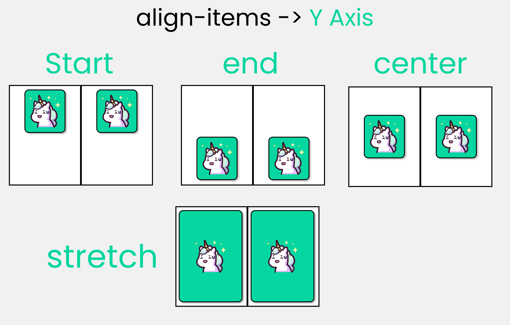 align-items
Don't change anything in the HTML, but in the CSS write ->
.container {
  display: grid;
  gap: 50px;
  height: 100vh;

// each box is 200px by 200px
  grid-template-rows: 200px 200px;
  grid-template-columns: 200px 200px;

//  Change values 👇  to experiment
  align-items: center;
}
The justify-content property
You use this property to position your grid [Basically everything] inside the grid container along the X-Axis [Main Axis]. The 7 values are 👇
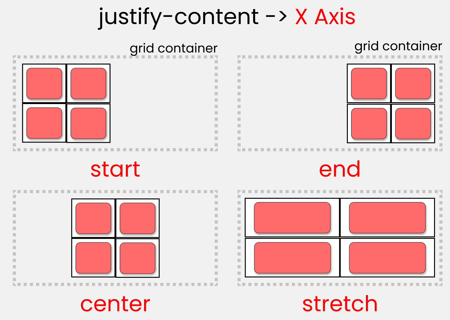
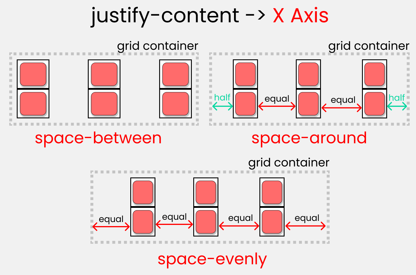 justify-content
Don't change anything in the HTML, but in the CSS write ->
.container {
  display: grid;
  gap: 50px;
  height: 100vh;

// each box is 200px by 200px
  grid-template-rows: 200px 200px;
  grid-template-columns: 200px 200px;

//  Change  values  👇  to experiment
  justify-content: center;
}
The align-content property
You use this property to position our grid [Basically everything] inside the grid container along the Y-Axis [Cross Axis]. The 7 values are 👇
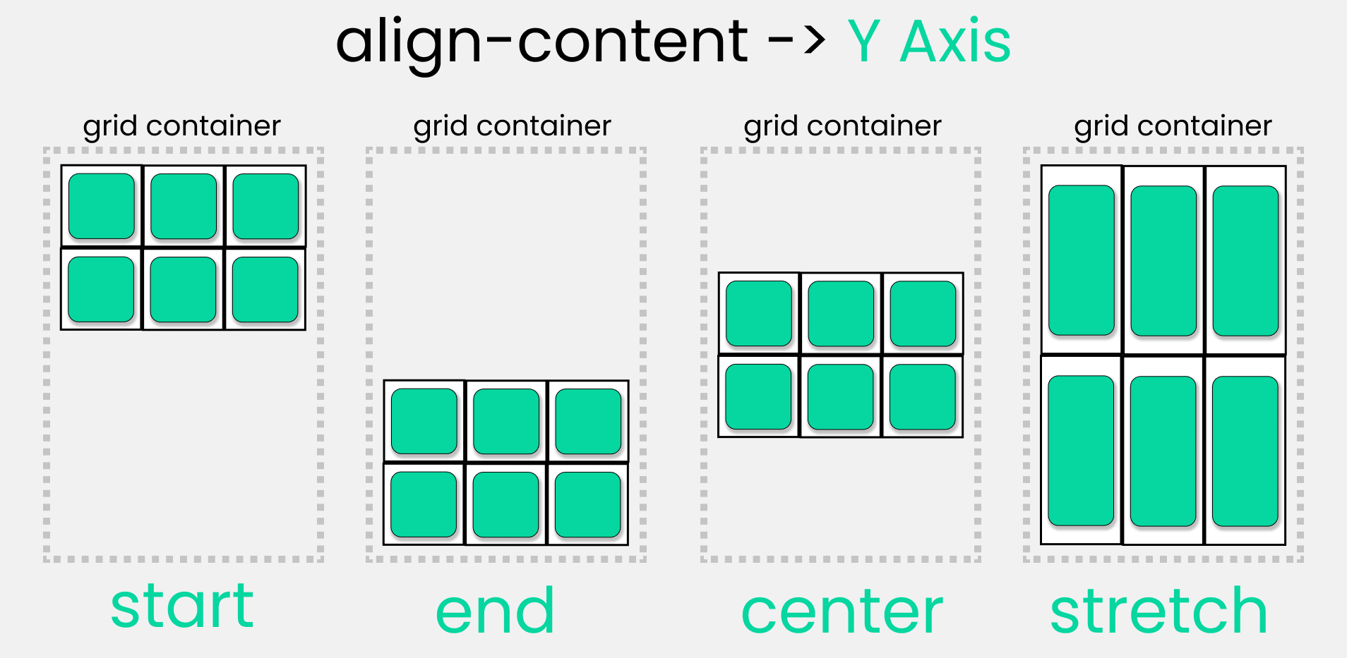
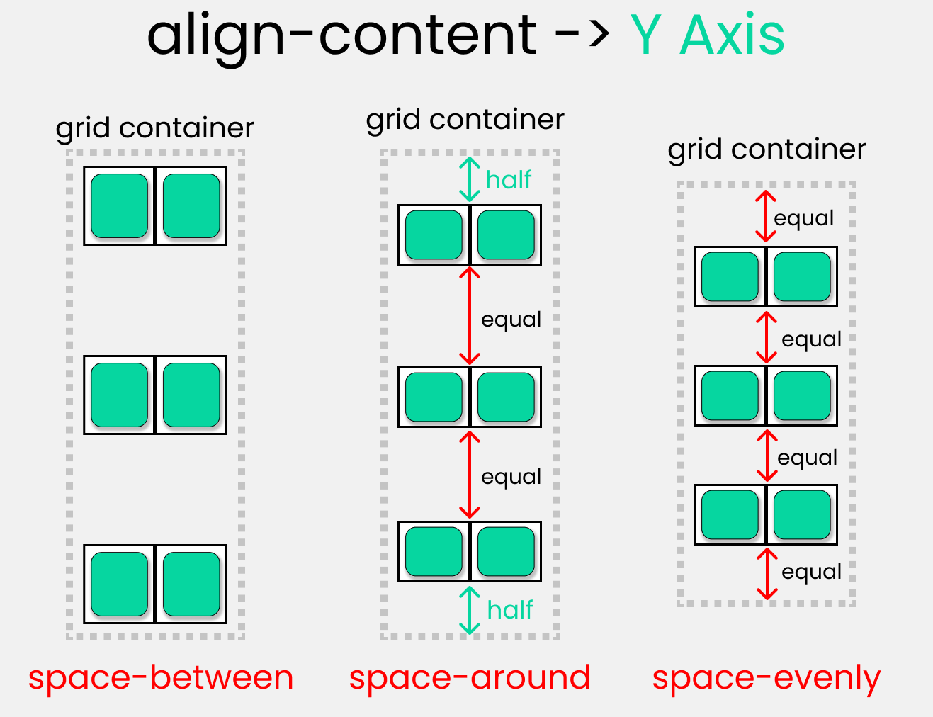 align-content
Don't change anything in the HTML, but in the CSS write ->
.container {
  display: grid;
  gap: 50px;
  height: 100vh;

// each box is 200px by 200px
  grid-template-rows: 200px 200px;
  grid-template-columns: 200px 200px;

//  Change  values 👇  to experiment
  align-content : center;
}
Take a Break
So far so good! Take a break, you deserve it.

CSS Grid Child Properties

Now, let's look at Grid child properties.
The CSS Grid Scale
I made this grid scale to demonstrate the calculations of how rows and columns are joined together. We can use any 1 of the 2 types of measurement:
- The digit [1,2,3,4, etc...]
- The span keyword
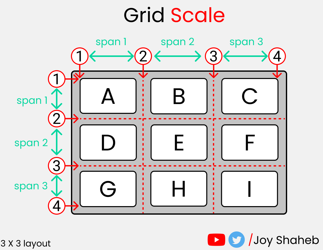 The Grid Scale
You'll get a clear picture of how this guide works ☝️ when we write code in just a short moment.
The illustration below 👇 shows the start and end points of rows and columns of a single cell.
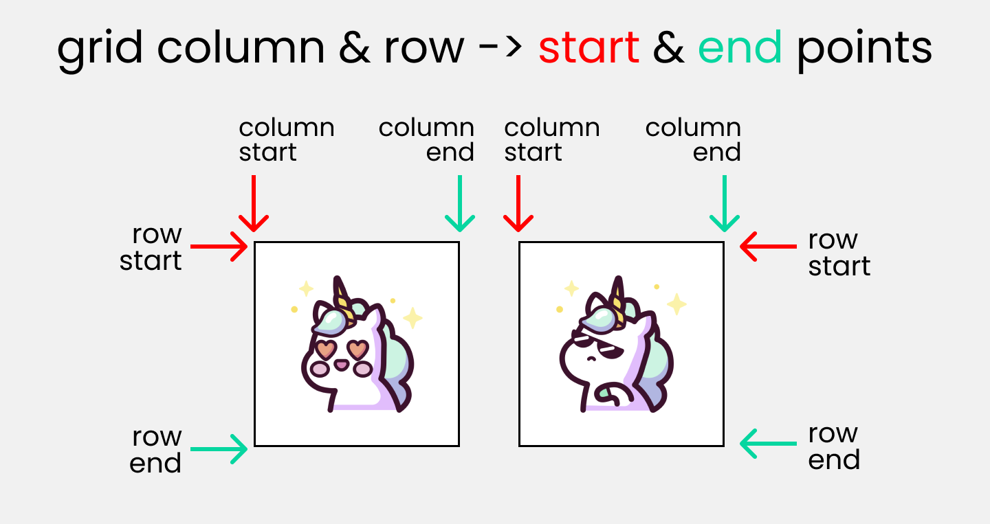 Grid column & row -> start & end points
HTML
To experiment with the grid scale and understand the following properties, make 4 boxes inside body tag:
<div class="container">
  <div class="box-1"> A </div>
  <div class="box-2"> B </div>
  <div class="box-3"> C </div>
  <div class="box-4"> D </div>
</div>
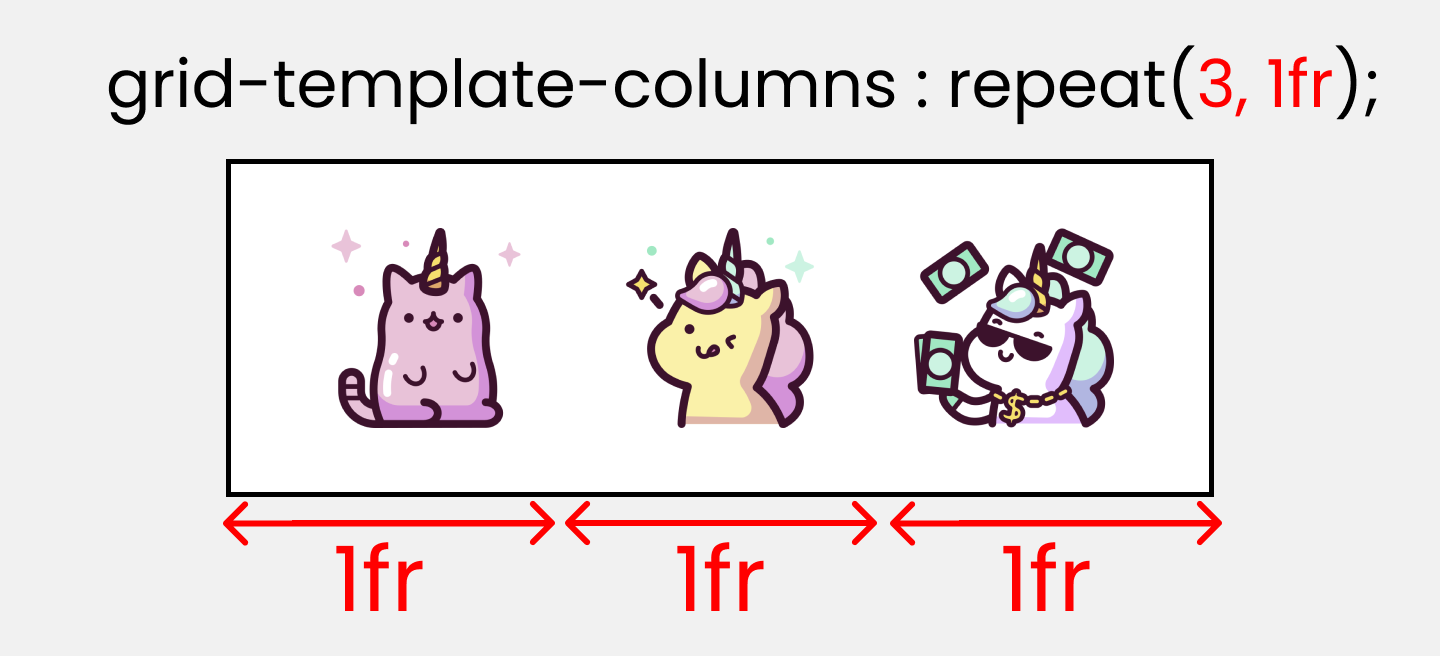
We're gonna utilize the repeat() function. It repeats our code a certain number of times. Here's an example 👇
grid-template-columns : repeat(5,1fr);
This ☝️ is the equivalent to writing this:👇
grid-template-columns : 1fr 1fr 1fr 1fr 1fr ;
A Quick Note

When we use the fr [ Fraction ] unit, we are dividing the screen area into equal proportions.
grid-template-columns: repeat(5, 1fr);
This ☝️ code is dividing our screen width into 5 equal parts.
We're set, let's start!
The grid-column: start/end properties
You use these two properties to join multiple COLUMNS together. It is a shorthand of 2 properties:
- grid-column-start
- grid-column-end
Write this code in your CSS:
.container {
  display: grid;
  gap: 20px;
  height: 100vh;

  grid-template-columns: repeat(12, 1fr);
  grid-template-rows: repeat(12, 1fr);
}
The result looks like this:
Here, we are dividing our screen [ both width and height ] into 12 equal parts. 1 box is occupying 1 part, or you can call it 1fr [ 1 fraction ]. The remaining 8 fractions along the width are empty.
As we are dealing with child properties, we need to target our .box-* classes like this:
.box-1{}
.box-2{}
.box-3{}
.box-4{}
You can experiment with any or all of these boxes, I'll stick with .box-1.
Let's bring our grid scale. We are dealing with columns – just focus on the columns, not rows.
The Grid Scale
The default scale of every .box-* class is:
grid-column-start : 1;
grid-column-end : 2;

/* The shorthand -> */
 grid-column : 1 / 2
We can write this ☝️ in the span unit as well, like this 👇
grid-column : span 1;
Let's assign the empty 8 fractions to .box-1 like this 👇
.box-1{
grid-column : 1/10
}
The result looks like this:👇
A quick note

How did I do the calculation? The box-1 occupies 1 box itself. And over that, we are adding more 8 boxes. At the last, you must add 1 to indicate the end so, 8+1+1 = 10.
How to use the span keyword
If you're confused by the first property, you can use the span keyword as it is easier to understand.
We need to add 8 boxes to .box-1 which already occupies one box. So, we have to do 8+1 = 9.
.box-1{
  grid-column : span 9;
}
This is gonna output the same result.
The grid-row: start/end properties
You use these two properties to join multiple ROWS together. It is shorthand of 2 properties:
- grid-row-start
- grid-row-end
Let's experiment with it! Here, I'll stick with .box-1, and here's our grid guide. Now, only focus on the row scale, not the column.
The Grid Scale
Let's join 9 boxes to .box-1 along the row.
Write this code: 👇
.box-1{
  grid-row : 1/11;
}
The calculation looks like this -> .box-1 holds 1 box, and you add 9 more boxes, plus a mandatory 1 at the last position to indicate the end which gives you 9+1+1=11.
Here's the alternative 👇 using the span keyword:
.box-1{
  grid-row : span 10;
}
And here's that calculation -> .box-1 holds 1 box, and you add 9 more boxes
9+1=10.
Here's the result so far: 👇
The grid-area property
First, we need to set up grid-template-areas ☝️ Once we've done that, we have to specify the names used in parent class inside the children classes, like this:👇
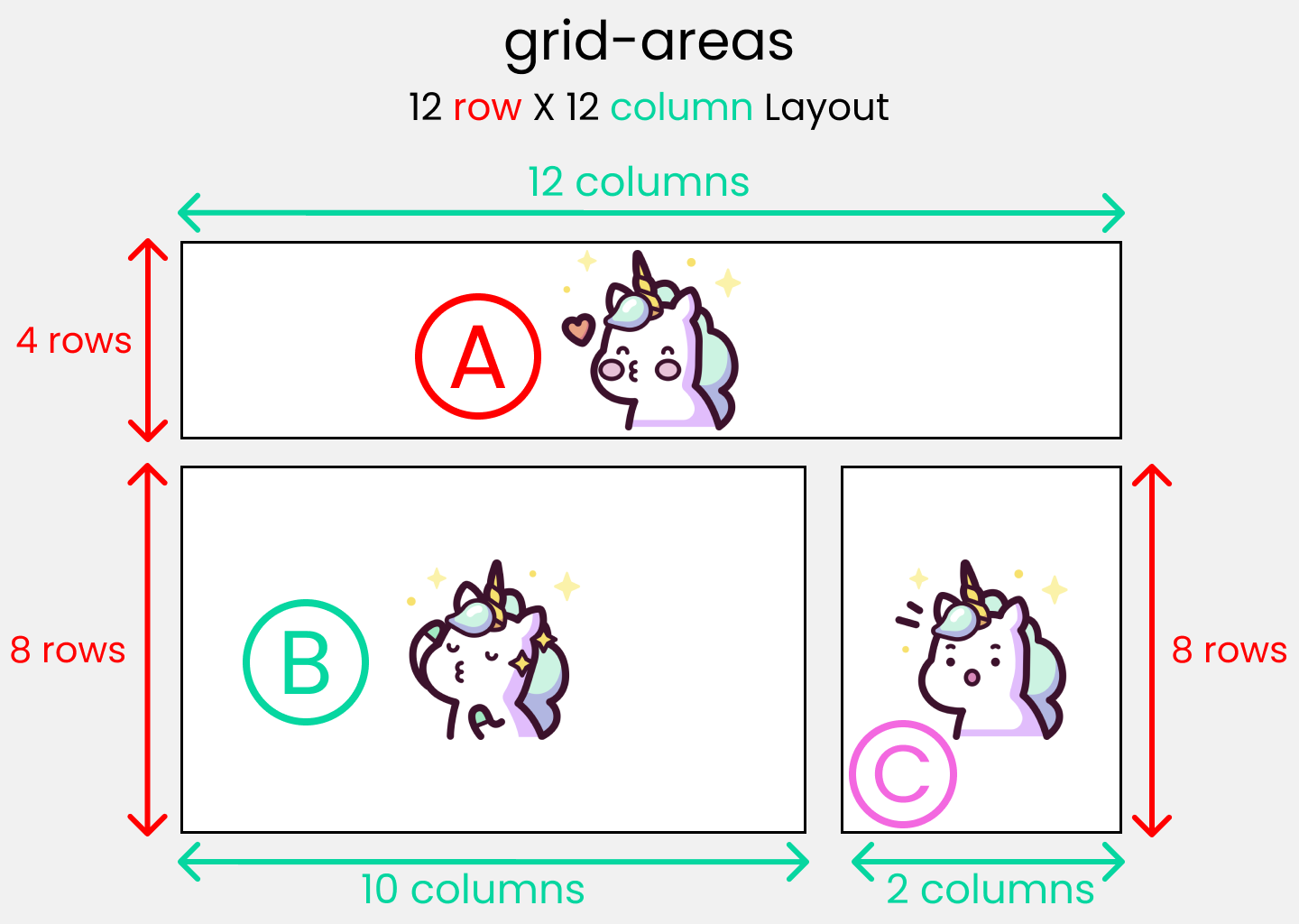 Standard 12X12 layout
Then we need to specify grid-template-areas inside parent container: 👇
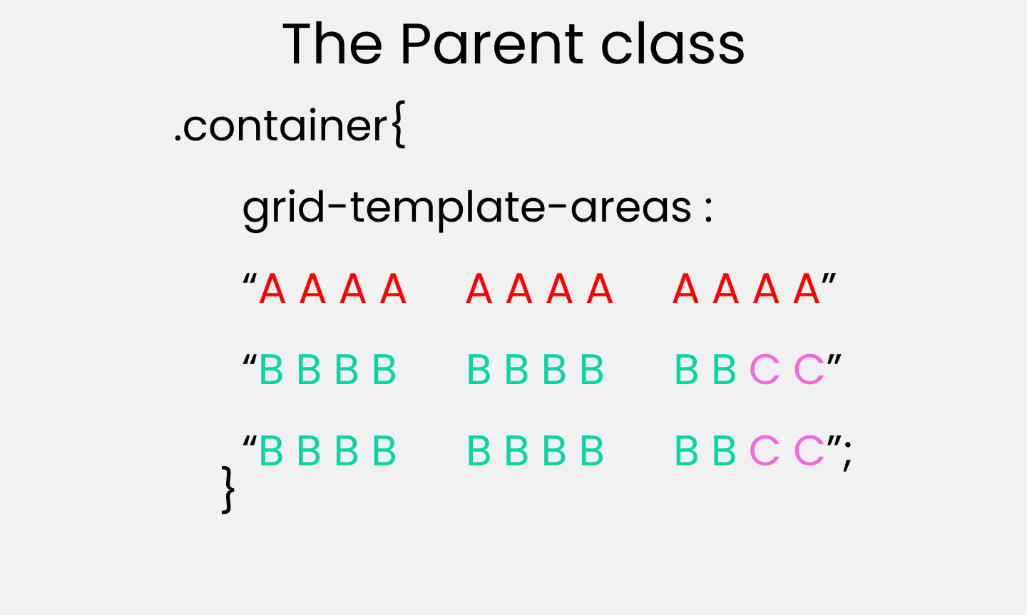
Like this 👇 inside the parent class:
.container {
  display: grid;
  gap: 20px;
  height: 100vh;

  grid-template-areas:
    "A A A A   A A A A   A A A A"
    "B B B B   B B B B   B B C C"
    "B B B B   B B B B   B B C C";
}
Then we specify the names used in the parent container inside the child classes with grid-areas👇
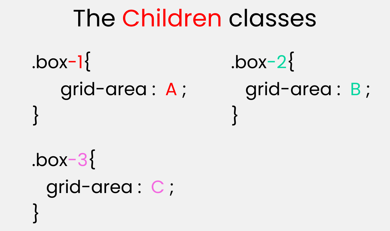
Like this 👇 inside the children classes:
.box-1{
  grid-area: A;
}
.box-2{
  grid-area: B;
}
.box-3{
  grid-area: C;
}
The justify-self property
You use this property to position 1 individual grid-item (child) inside a grid container along the X-Axis [Main Axis]. The 4 values are 👇
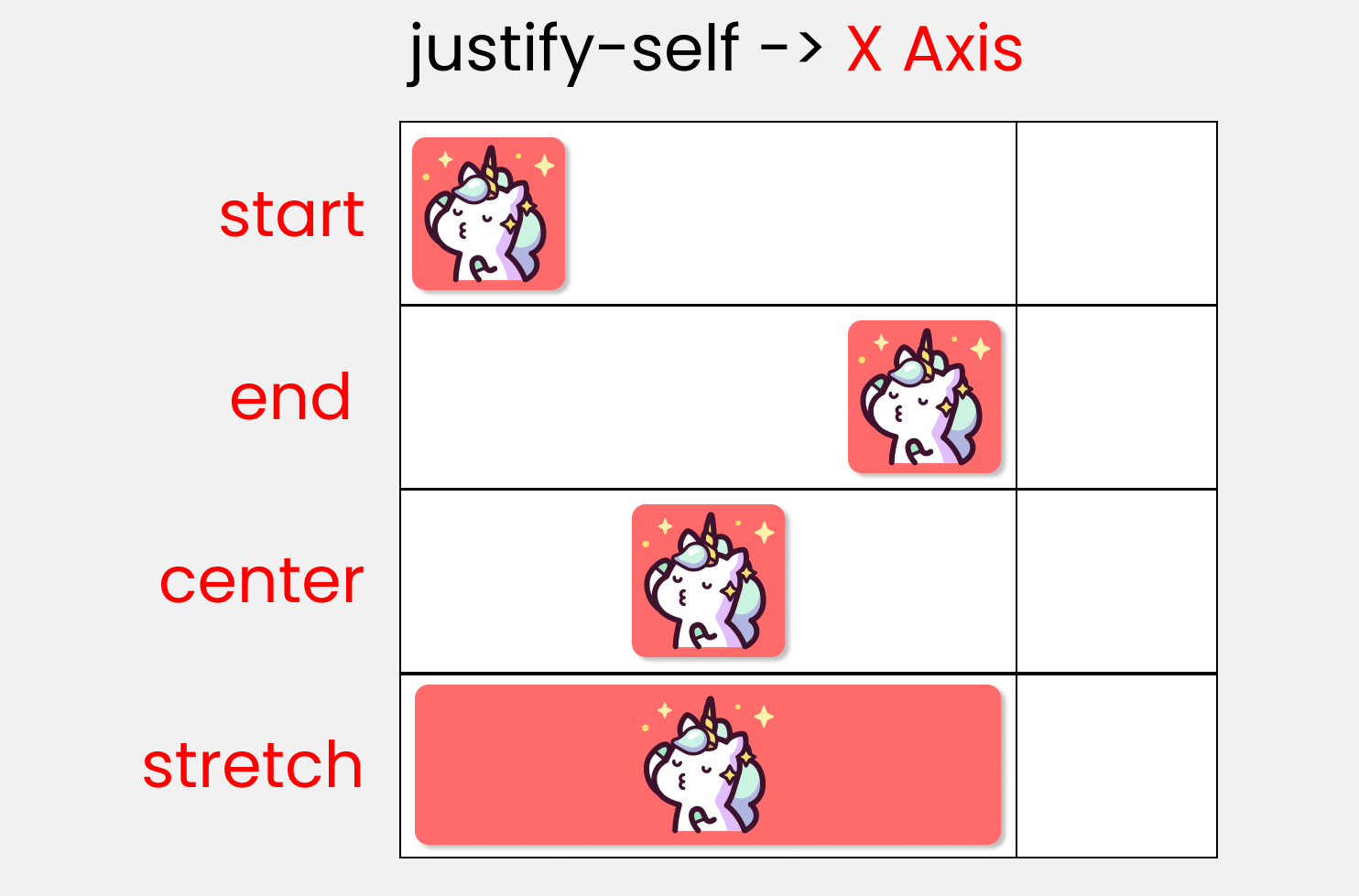 Justify-self
Write this code to experiment with the values 👇
.container {
  display: grid;
  gap :25px;
  height: 100vh;

/* // each box has equal size */
  grid-template-rows: 1fr 1fr;
  grid-template-columns: 1fr 1fr;
}
Remember! This only works on the child classes. So, target any .box-* class. I'll target the first box:
.box-1 {
/*  Change values 👇  to experiment */
  justify-self : start;
}
The align-self property
You use this property to position 1 individual grid-item (child) inside a grid container along the Y-Axis [Cross Axis]. The 4 values are 👇
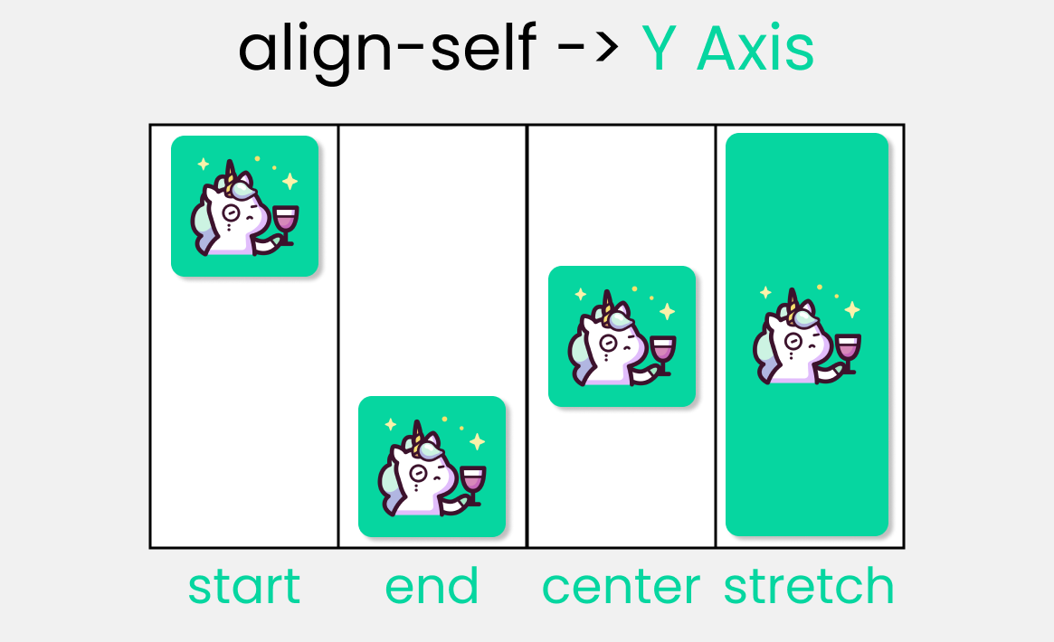 align-self
Let's experiment with the values 👇
.container {
  display: grid;
  gap :25px;
  height: 100vh;

/* // each box has equal size */
  grid-template-rows: 1fr 1fr;
  grid-template-columns: 1fr 1fr;
}
Remember! This only works on the child classes. So, target any .box-* class. I'll target the 1st box:
.box-1 {
/*  Change values 👇  to experiment */
  align-self : start;
}
Shorthand for CSS Grid Properties

Let's look at these Grid shorthand properties:
place-contentplace-itemsplace-selfgrid-templategap/grid-gap
place-content
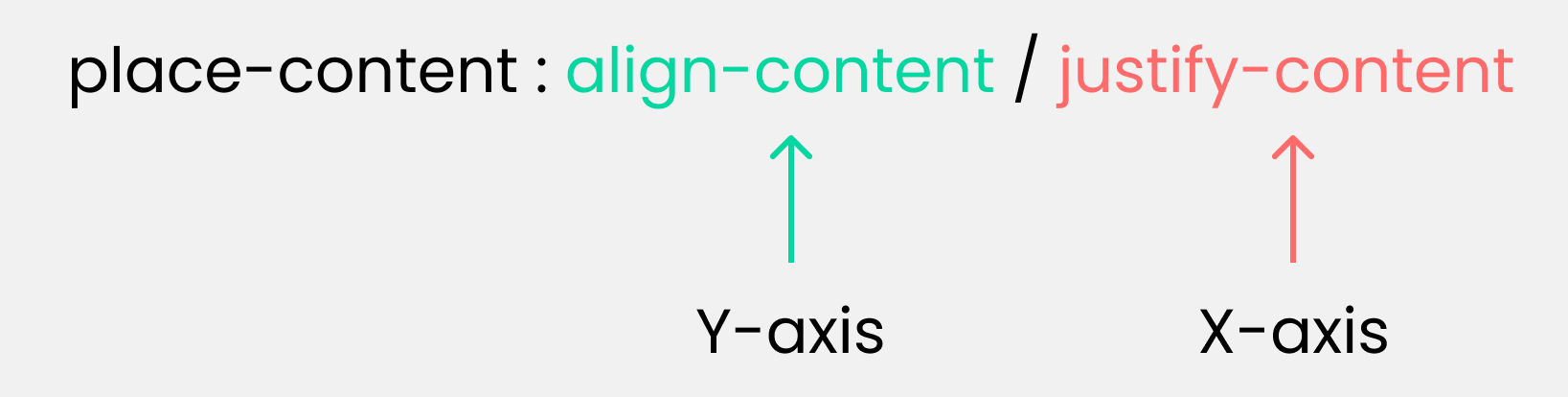 place-content
This is the shorthand of 2 properties:
- align-content
- justify-content
An example
align-content : center;
justify-content : end;

/* The shorthand */
place-content : center / end ;
place-items
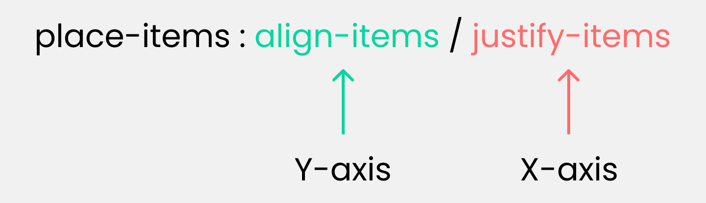 place-items
This is the shorthand of 2 properties:
- align-items
- justify-items
An example
align-items : end;
justify-items : center;

/* The shorthand */
place-items : end / center ;
place-self
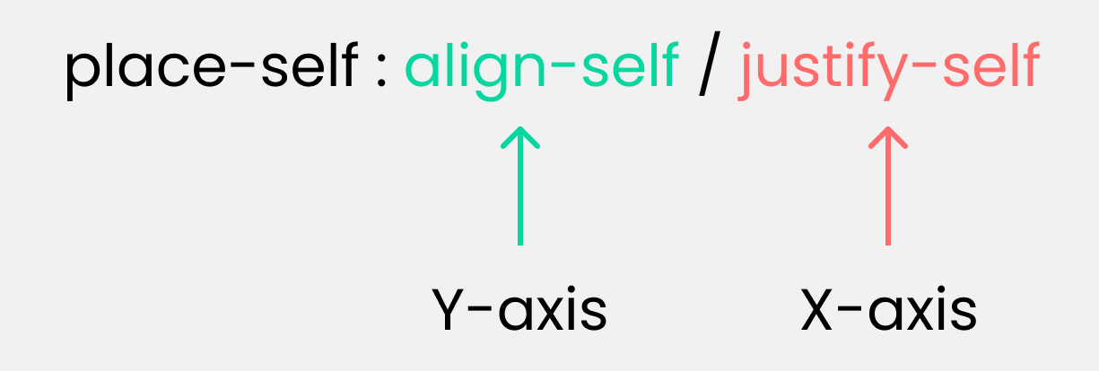 place-self
This is the shorthand of 2 properties:
- align-self
- justify-self
An example
align-self : start ;
justify-self : end ;

/* The shorthand */
place-self : start / end ;
grid-template
 grid-template
This is the shorthand of 2 properties:
- grid-template-rows
- grid-template-columns
An example
grid-template-rows : 100px 100px;
grid-template-columns : 200px 200px;

/* The shorthand */
grid-template : 100px 100px / 200px 200px;
gap/grid-gap
Gap and grid-gap are the same thing and do the same work. You can use either of them.
 gap
gap
This is the shorthand of 2 properties:
- row-gap
- column-gap
An example
row-gap : 20px ;
column-gap : 30px ;

/* The shorthand */
gap : 20px  30px;
Credits
Conclusion
Now, you can confidently make responsive website layouts using your grid knowledge!
Here's your medal for reading until the end ❤️
Suggestions & Criticisms Are Highly Appreciated ❤️
YouTube / Joy Shaheb
LinkedIn / Joy Shaheb
Twitter / JoyShaheb
Instagram / JoyShaheb