
In this article, I'll teach you CSS Flexbox basics so you can make your own responsive sites. I'll explain how each of Flexbox's properties work, and I'll give you a cheatsheet that covers everything you can do with Flexbox. Let's Go 🎖️
Table of Contents
- Flexbox Architecture
- flex-direction
- justify-content
- align-content
- align-items
- align-self
- flex - grow | shrink | wrap | basis
- Shorthands
- Conclusion
You can watch this tutorial on YouTube as well if you like:
First, What is Flexbox?
When you're building a house, you need a blueprint. In the same way, we need a blueprint when we're making websites. And Flexbox is the blueprint.
The Flexbox model allows us to layout the content of our website. Not only that, it helps us create the structures needed for creating responsive websites for multiple devices.
Here's a demo which I created using Flexbox as the main blueprint.

This project is a part of this article.
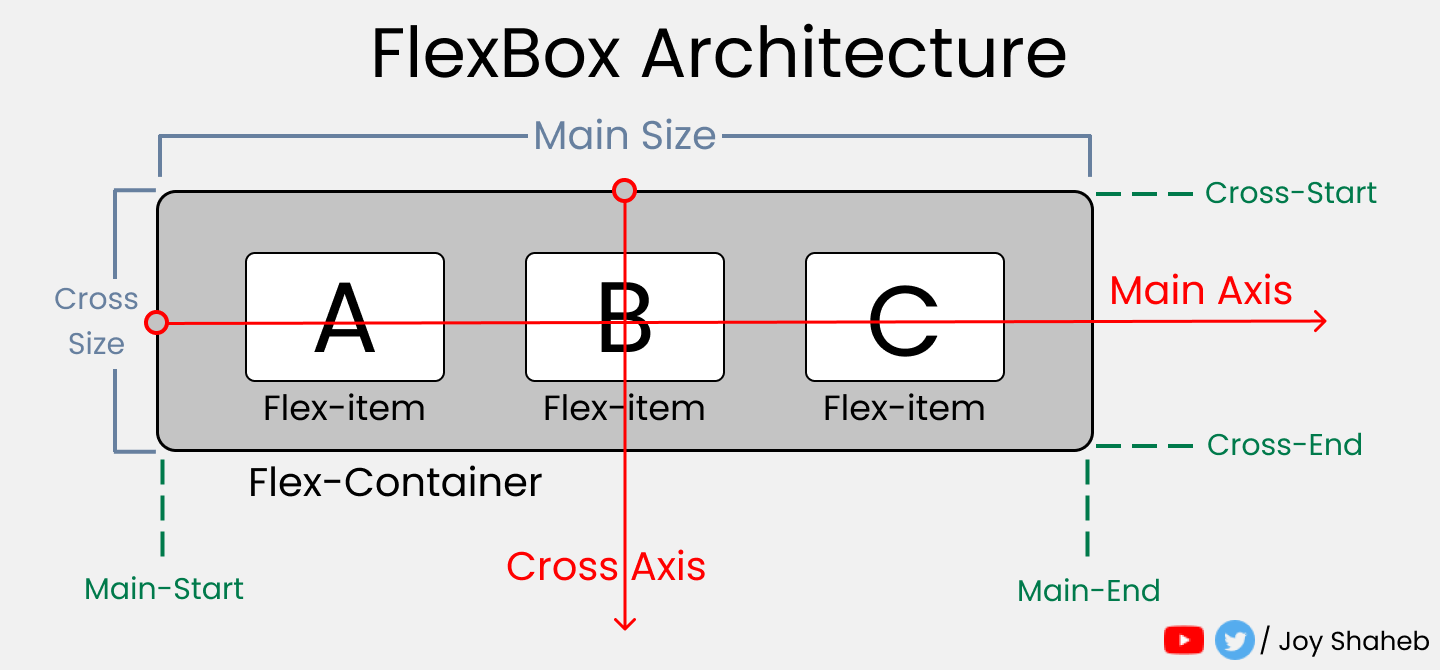
Flexbox Architecture
So how does Flexbox architecture work? The flex-items [Contents] are distributed along the main axis and cross axis. And, depending on the flex-direction property, the layout position changes between rows and columns.
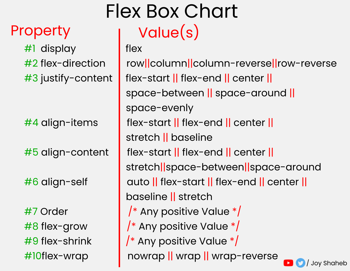
Flexbox Chart
This chart contains every possible property and value you can use when you're working with Flexbox. You can reference it while doing your projects and experiment with different values.
How to Set Up the Project

For this project, you need to know little bit of HTML, CSS, and how to work with VS code. Follow along with me as we complete the following tasks:
- Create a folder named "Project-1" & Open VS Code
- Create
index.htmlandstyle.cssfiles - Install Live Server and run it.
Or, you can just open Codepen and start coding.
At the end of this tutorial, you will be able to make accurate and beautiful website layouts.
HTML
In HTML, write these lines of code inside the body tag 👇
<div class="container">
    <div class="box-1"> A </div>
    <div class="box-2"> B </div>
    <div class="box-3"> C </div>
</div>
CSS
Target the .container class and all the boxes. Then style the boxes so that all of them look similar, like this: 👇
Note: don't forget to put the height of the container.
.container{
   height : 100vh;
}

[class ^="box-"]{
    width: 140px;
    height: 140px;
    background-color: skyblue;
    border: 2px solid black;

// To view the letter better
    font-size: 65px;
}
But Wait....

Before starting, you need to understand the relationship between parent and child classes.
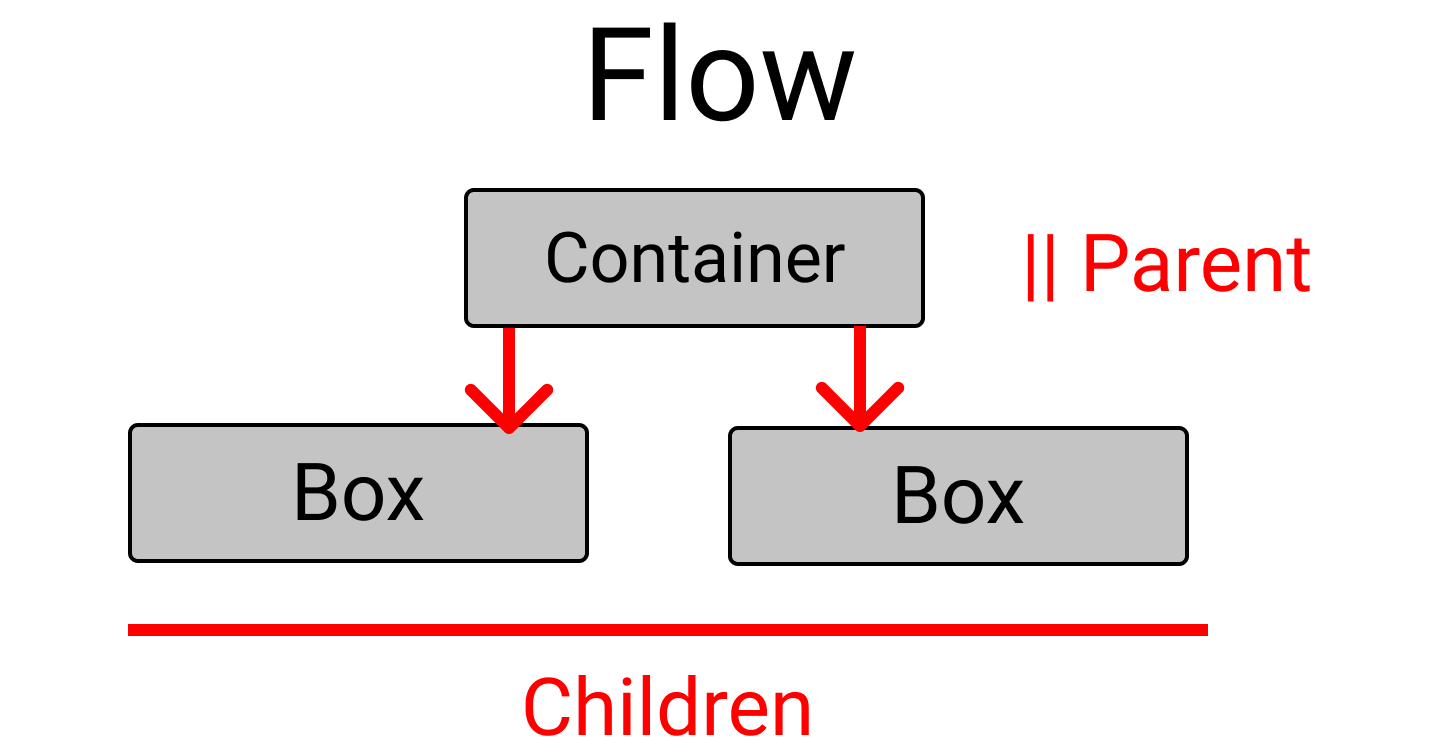
Flexbox works on the parent class, not on the child classes.
Here, the .container class is the parent and our .box-* classes are our children.
So, apply the display: flex inside the .container class. And place the letters at the center of the box like this:
.container{
    display : flex;
    height : 100vh;

// To place some gap between boxes
    gap : 25px;
}
[class ^="box-"]{
// Code from previous step are here

// Placing text at center
    display : flex;
    justify-content : center;
    align-items : center;
}
And...we're all set! Let's start coding. 😊

flex-direction property
This property allows us to set the direction and orientation in which our flex-items should be distributed inside the flex-container.
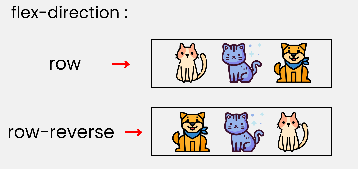
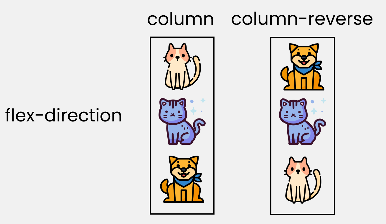
To recreate these results, let's write these lines in our CSS:
Please note that we'll write them inside the .container class.
.container{
//code from setup stage are here

// Change the value  👇 here to see results
    flex-direction : row;
}
justify-content property
This property arranges flex-items along the MAIN AXIS inside the flex-container.
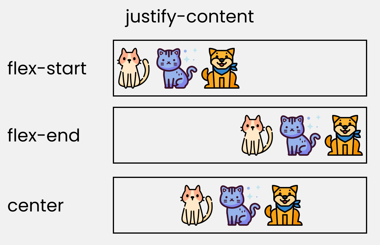
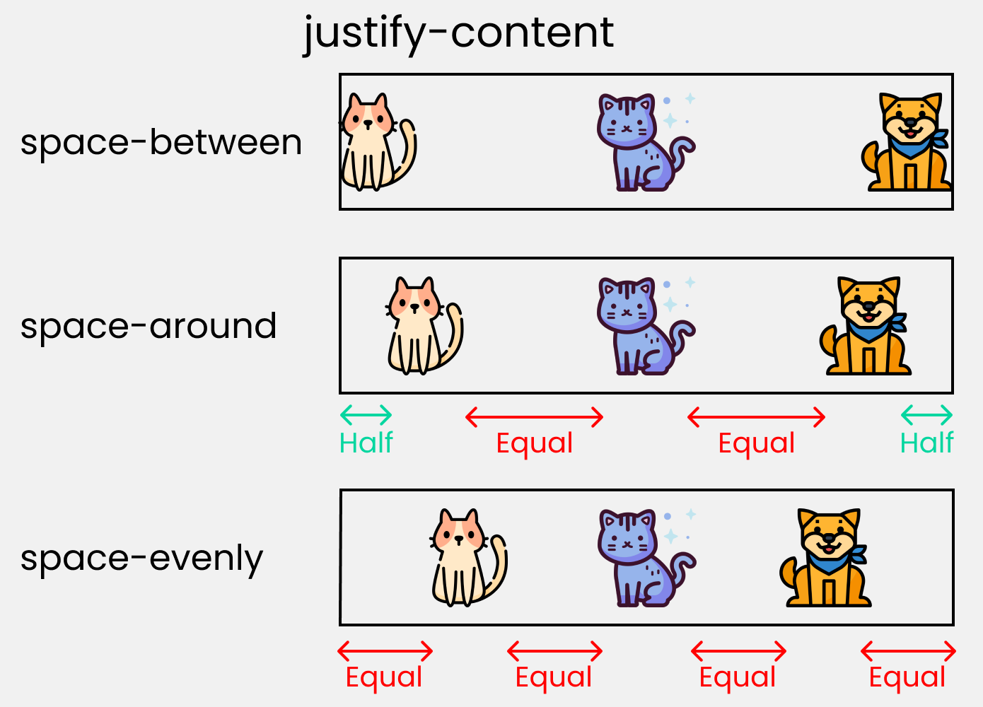
To recreate these results, write these lines in your CSS:
.container{
//code from setup stage are here

//  Change the value  👇 here to see results
    justify-content: flex-start;
}
align-content property
This property arranges flex-items along the CROSS AXIS inside the flex-container. This is similar to justify-content.
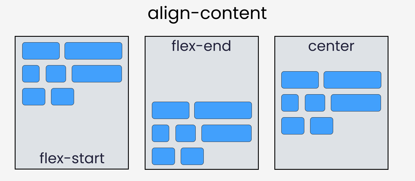
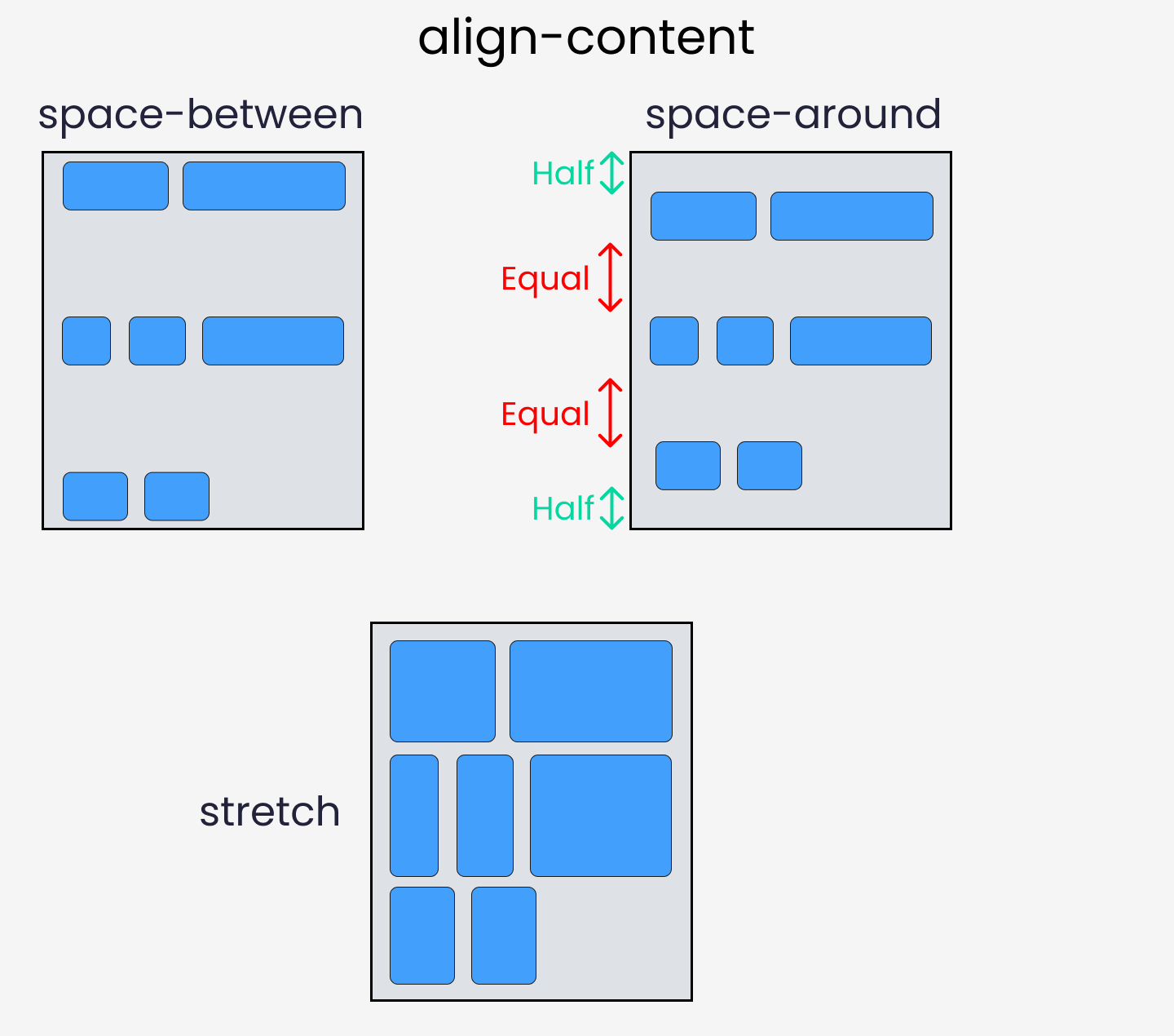
Please note that without the flex-wrap property, this property doesn't work. Here's a demo:
.container{

//  Change the value  👇 here to see results
    align-content: center;

// without this line, align-content won't work
    flex-wrap: wrap;
}
align-items property
This property distributes Flex-items along the Cross Axis.
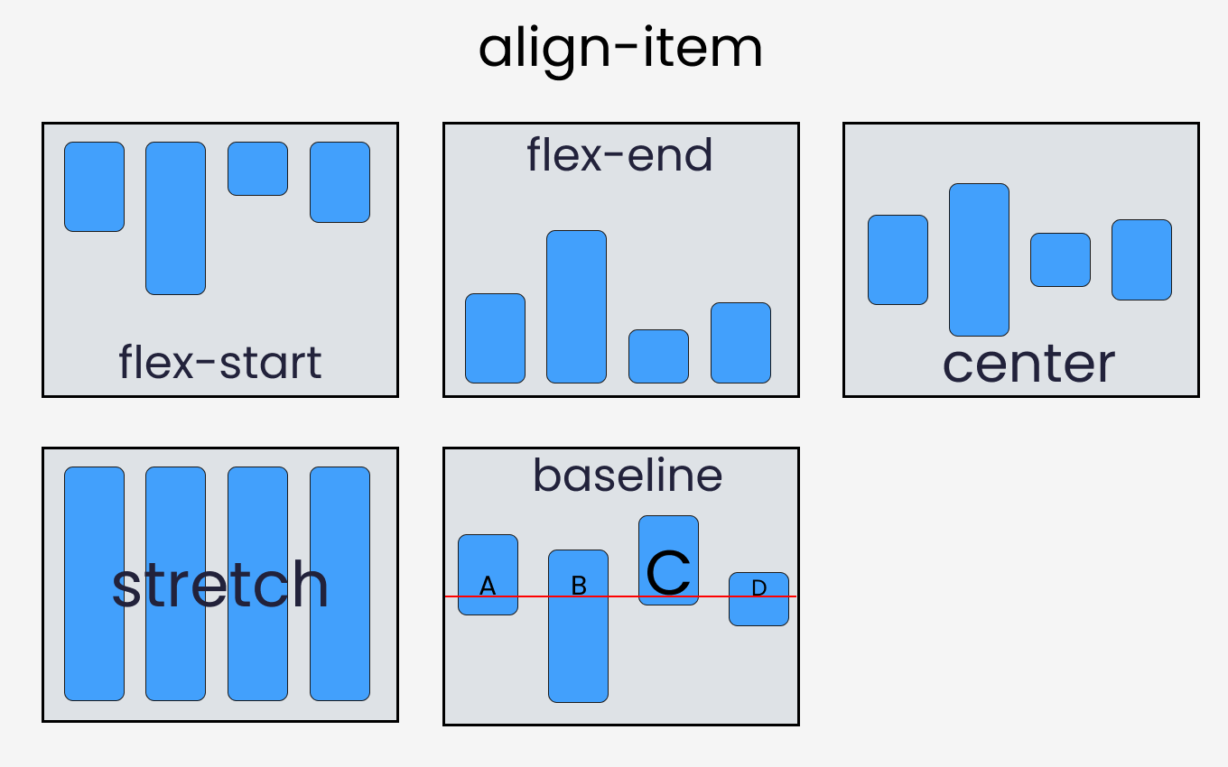
To recreate these results, let's write the following code in CSS:
.container{
//code from setup stage are here

// Change the value 👇 here to see results
    align-items: flex-end;
}
align-self property
This property works on the child classes. It positions the selected item along the Cross Axis.
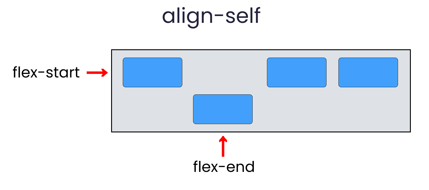
In total we have 6 values:
- flex-start
- flex-end
- center
- baseline
- stretch
- auto
To recreate the results, select any .box-* and write the following code:
.box-2{
// Change the value 👇 here to see results
     align-self : center;
}
Take a Break
So far so good. Take a break!

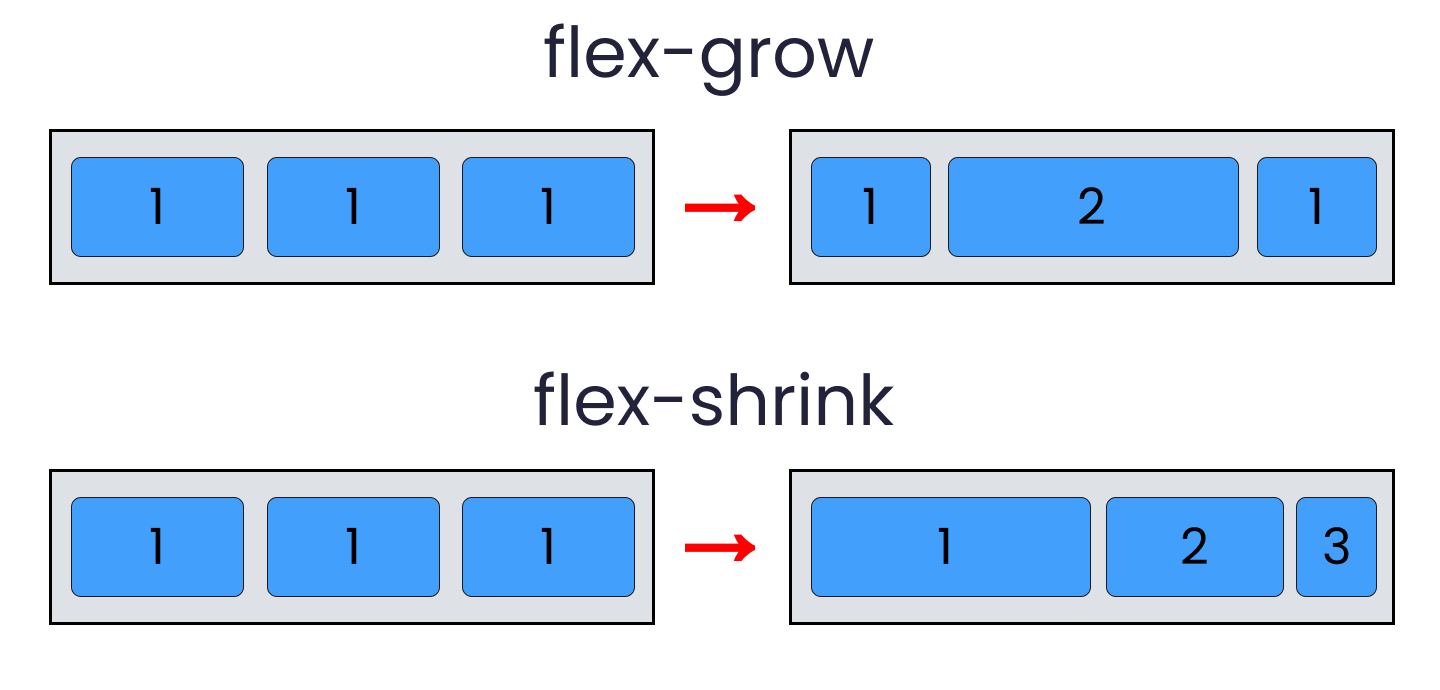
flex - grow | shrink | wrap | basis properties
The properties we'll discuss now will work when we resize the window. Let's dive right in.
flex-grow
This property grows the size of a flex-item based on the width of the flex-container.
flex-shrink
This property helps a flex item shrink based on the width of the flex-container. It's the opposite of flex-grow.
To achieve these results, follow me.
Please note that flex-grow and flex-shrink work on child classes. So, we will target all our boxes like this:
.box-1{
    flex-grow: 1;
}
.box-2{
    flex-grow: 5;
}
.box-1{
    flex-grow: 1;
}
Resize the window and you'll see the results.
To duplicate the result of flex-shrink, write the following code:
Please note that you need to delete the flex-wrap property first, otherwise it won't work.
.box-1{
    flex-shrink: 1;
}
.box-2{
    flex-shrink: 5;
}
.box-1{
    flex-shrink: 1;
}
Now, resize the window and you'll see the results.
flex-wrap
This property helps you set the number of flex-items you want in a line or row.
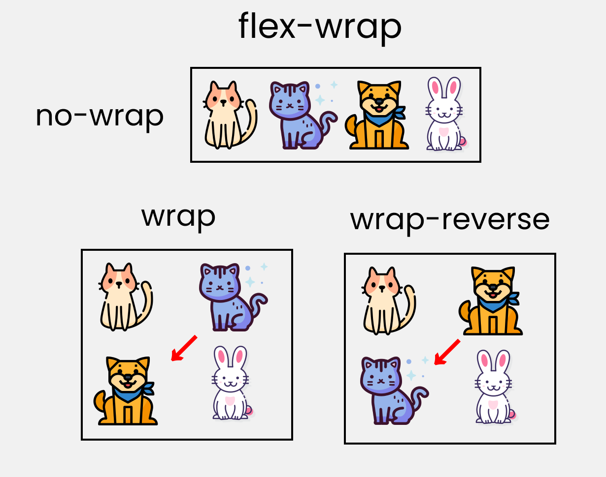
This works on the .container parent class. So, write the following code:
.container{
    //other codes are here

// Change value 👇 here to see results
    flex-wrap : wrap;
flex-basis
This is similar to adding width to a flex-item, but only more flexible. flex-basis: 10em, for example, will set the initial size of a flex-item to 10em. Its final size will be based on the available space, flex-grow, and flex-shrink.
Shorthand Flexbox Properties
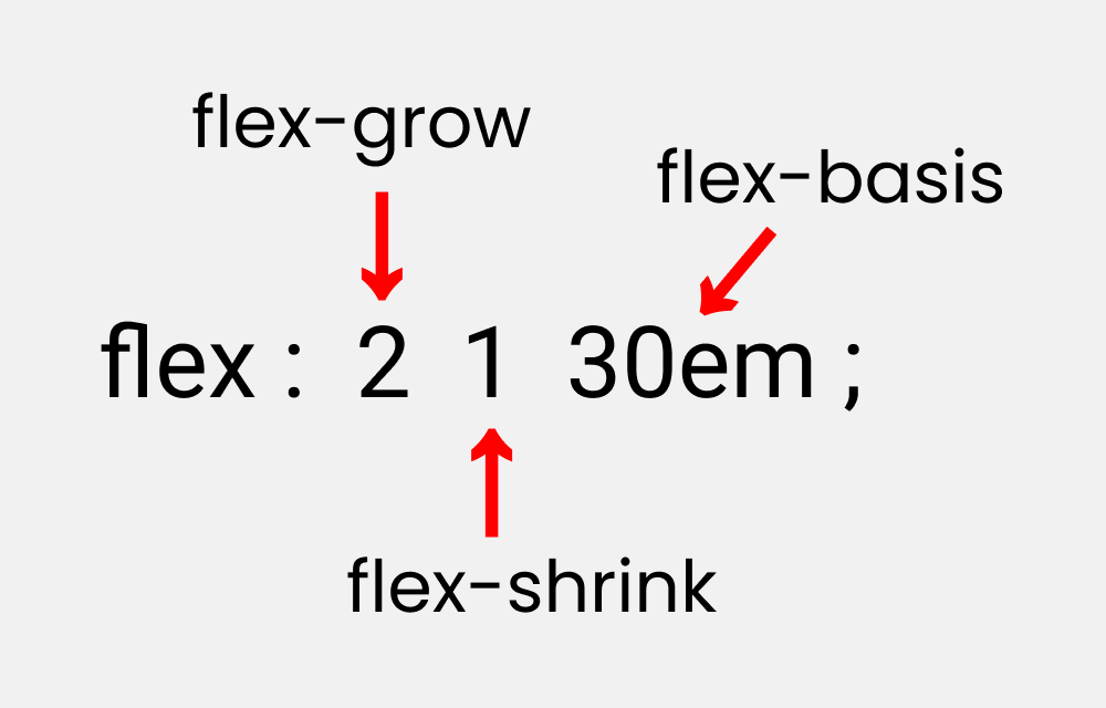
flex shorthand
This is the shorthand for the flex-grow, flex-shrink and flex-basis properties combined.
You can try this by writing the following code:
Please note that it only works on the child classes:
.box-2{
    flex : 2 1 30em;
}
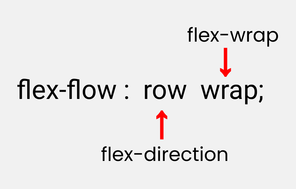
flex-flow
This is the shorthand for the flex-direction and flex-wrap properties:
You can try this by writing the following code:
Please note that it only works on the parent class.
.container{
    flex-flow : row wrap;
}
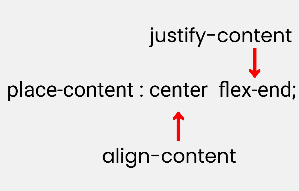
place-content
This is the shorthand for the justify-content and align-content properties:
Let's duplicate the results:
Please note that it works on the parent class.
.container{
    place-content : center flex-end;
}
More Resources
If you want to exercise your Flexbox knowledge, you can read this article of mine where you'll be building five responsive layouts using Flexbox. Here's a demo:

Conclusion
Here's your medal for reading till the end ❤️
Suggestions & Criticisms Are Highly Appreciated ❤️
YouTube / Joy Shaheb
Twitter / JoyShaheb
Instagram / JoyShaheb
Credits